A Guide To Designing For Mobile (iOS, Android)
Guidelines and pointers for mobile design for iOS and Android — with useful resources on layout, grid, colors, typography, icons and components for iOS and Android.

How To Make A Strong Case For UX Research
Getting a buy-in for UX research is often remarkably difficult. Here’s how to flag assumptions, manage objections and explain the value of UX research.

Stop Tracking NPS (Net Promotion Score)
Good research is always rooted in the past, not in the future. NPS isn’t a reliable metric, it has plenty of drawbacks and there are better alternatives.

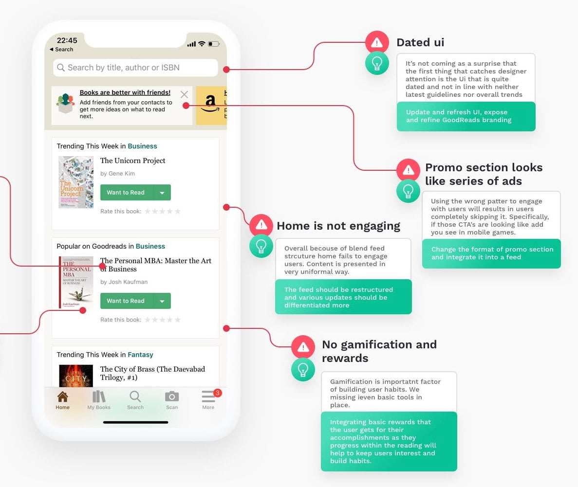
How To Fix a Bad User Interface
UX is not just what happens when everything goes as planned. It’s also what customers experience when things break unexpectedly. Let’s see how we can be better prepared for situations when things go south.
