Designing Better Links UX
Too often it’s difficult to tell what is a link, and what isn’t. Let’s explore a few usability guidelines with link underlines, focus, active and visited states, and link accessibility.
Too often, links on the web don’t get the attention they deserve. Their appearance often follows the brandbook, and interaction seems to be so obvious that it doesn’t even come up in design discussions. Let’s fix it — and explore how we can make links better.
1. Link Underlines Remove Ambiguity #
Link underlines are often dismissed, yet they are the clearest and simplest way to help users discover links. By default they can be too thick and appear too heavy, especially when in mega-drop-down menus, but we can make them a bit thinner with the text-decoration-thickness property in CSS.

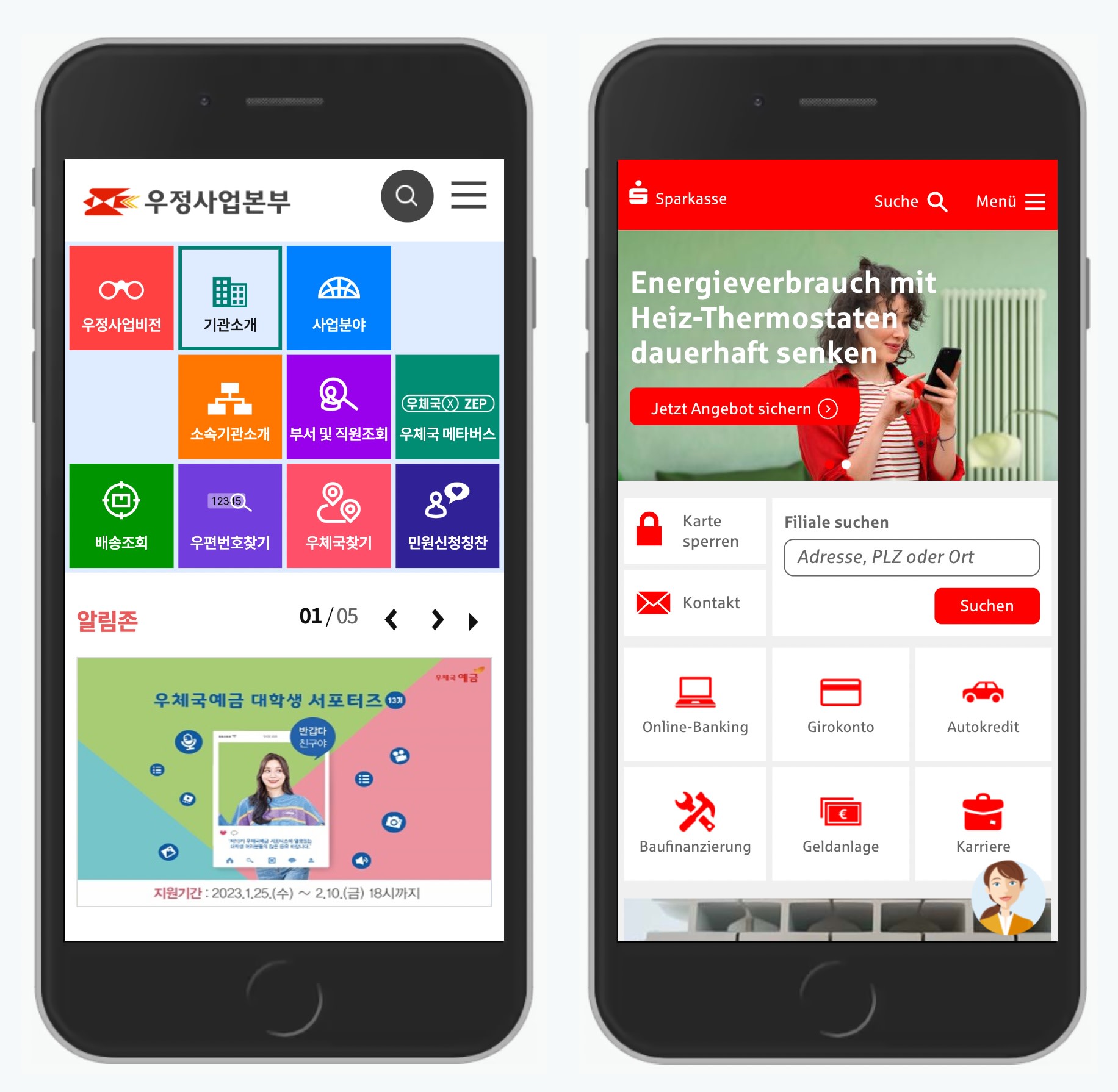
For Vodafone, we can simplify the design quite significantly by adding link underlines where they belong.

What is a link and what isn’t? Instead of relying on arrows, we can use link underlines: it’s less clutter and more obvious this way.
In the example above, rather than using arrows to indicate a link and mixing them with chevrons indicating accordions, we can underline links and remove arrows altogether.
This helps especially in navigation menus when we want to make it very clear which action opens an accordion and which action drives users to a category. Underlining links often solves this problem for good.
2. Focus and Active Styles Boost Confidence #
It’s not uncommon for users to get lost on a page. Not because the page is confusing, but because the UI doesn’t provide any noticeable feedback upon user’s action. That’s when people accidentally click twice or refresh the page, and when they experience rage clicks and rage taps.

NHS.uk prominently highlights focused and active states with a bright yellow background and a slightly thicker underline.
Keyboard users often have issues following links as they tab through them; mobile users can’t see past their non-translucent fingers, and often it’s not clear if you actually missed the target, or it’s just the slow connection. Focus and active styles help in these situations. Bright yellow background is usually a good choice as it helps the link stand out.
There are ways of designing better focus styles. In Tips For Focus Styles and custom :focus styles, Nic Chan and Lari Maza highlight a few helpful tips on how to improve focus styles with better affordance and a bit of padding, offset, and outlines.
3. There Is No Harm in Visited State #
Is it a good idea to communicate to users that they’ve visited a link already? It might be, especially when we expect users to click through many links in a list. If anything, a visited state will help a user to re-find a section that they’ve visited before.

Gov.uk changes the color of a link to violet with a heavier underline for visited links, while the other links are blue — except the focused one.
4. Meaningful Link Labels and Link Accessibility #
Link labels matter. The more contextual they are, the more obvious it is for users to make a choice between navigation options. Thoughtfully composed links express respect to readers, whereas jumbled-up ones cause confusion and suspicion. For example, “click here” and “this link” are ambiguous and confusing choices that miss context.
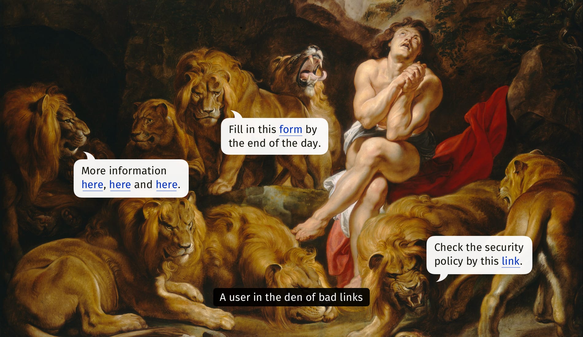
A well-composed link should make sense alone. In this case it doesn’t.
As Slava Shestopalov writes in his article, concise self-explanatory phrases inform people about the destination; they are actionable and clear. A well-composed link makes sense out of context and typically combines a topic (e.g. security, brand, marketing) and the format (questionnaire, request form, guideline, policy etc.).

Well-composed links typically avoid generic words like 'this' or 'here'.
It’s also a good idea to indicate if the link will guide users towards a PDF or any other downloadable file, so indicating the file size, or the types of content available (HD, SD) is reasonable as well.
5. Should Links Open In New Tabs By Default? #
Probably not. Ideally we would leave it to users to choose how to open a link, as they might want to open an external link in the same tab, rather than seeing it appearing in a new tab and then returning back to close the old tab.
If we have an external link, we can indicate it with an icon, but open it in the same page by default. From Smart Interface Design Patterns.
In general, it’s a good idea to always open links in the same tab, unless you are absolutely certain that the user will appreciate a new tab. This makes sense when a click on a link would disrupt a process (e.g. help-links), or a user might lose data, or it’s a link to an external downloadable file. But in general: leave links be, and let users choose how to open them.
Wrapping Up #
An underline is the clearest indicator of a link. Surely they aren’t always necessary but they are always helpful. For navigation menus, we can use links to distinguish between accordions and category links. With :focus, :active and :visited states we make it clear where a user currently is, where a user has been, and where they can navigate to.
Meaningful wording aids accessibility. The more obvious it is where a user can go without reading the entire sentence, the faster the navigation will be. However, links opening in external pages by default would slow them down and confuse them, so opening links in the same window by default is a safer bet.