Never Hide Critical Navigation On Mobile
If navigation is important, we need to show it — especially on mobile. Let’s explore a few simple techniques to make it work.
Every usability study reveals the same story: hiding important navigation is harmful, especially on pages where people tend to navigate a lot. In fact, digital experiences typically have two kinds of pages: navigation pages and content/task pages.
Navigation pages are the journey. There users spend most of their time looking for the next step, exploring and relying on menus, links and buttons. Hiding navigation there is harmful and counter-productive. In fact, we need to show as much forward-facing navigation as possible.
Content/task pages are the destinations. There users spend most of their time consuming content, reading, examining, comparing, completing tasks, but not navigating. Hiding navigation here is sensible, but there still might be some critical navigation to display — table of contents, progress steps etc.
If navigation is important, we need to show it — especially on mobile. Let’s explore a few simple techniques to make it work.
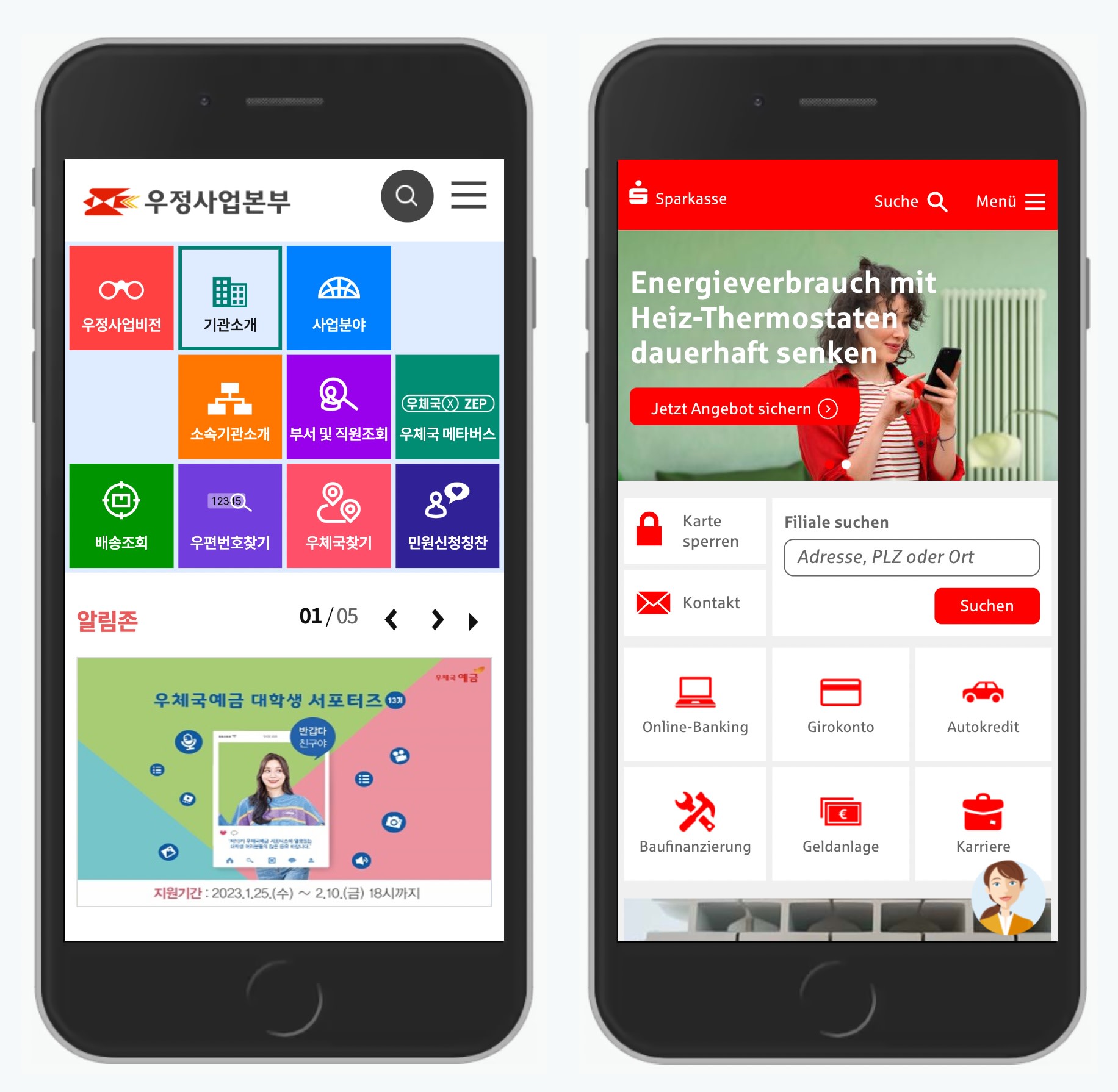
1. Use a Billboard Pattern #
Display important actions as cards or large buttons in a grid. More important sections would be displayed at the top of the screen and take more size — similar to a billboard.
Examples: Koreapost.go.kr and Sparkasse.de.

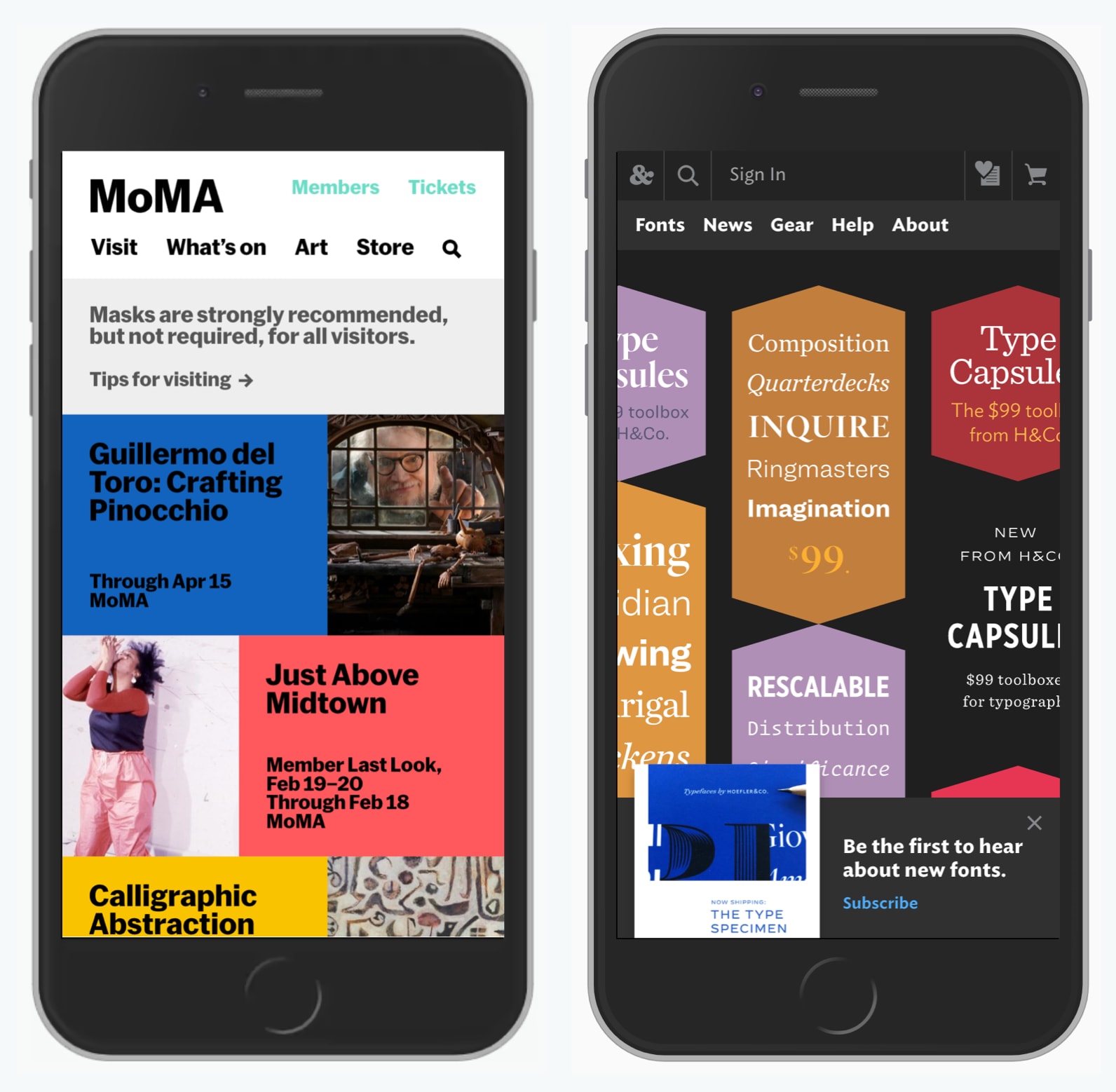
2. Rearrange Navigation in the Header #
Scatter the navigation across the logo in the header, or dedicate an entire bar to display important navigation items. If you don’t have a lot of navigation, this might work well.
Examples: Moma.org and Typography.com.
3. Make Navigation Prominent With Cards #
Sometimes we don’t need to show content on navigational pages. Instead, we can prioritize navigation, and display options as a list of large clickable cards.
Examples: Auswaertiges-amt.de and NHS.uk.

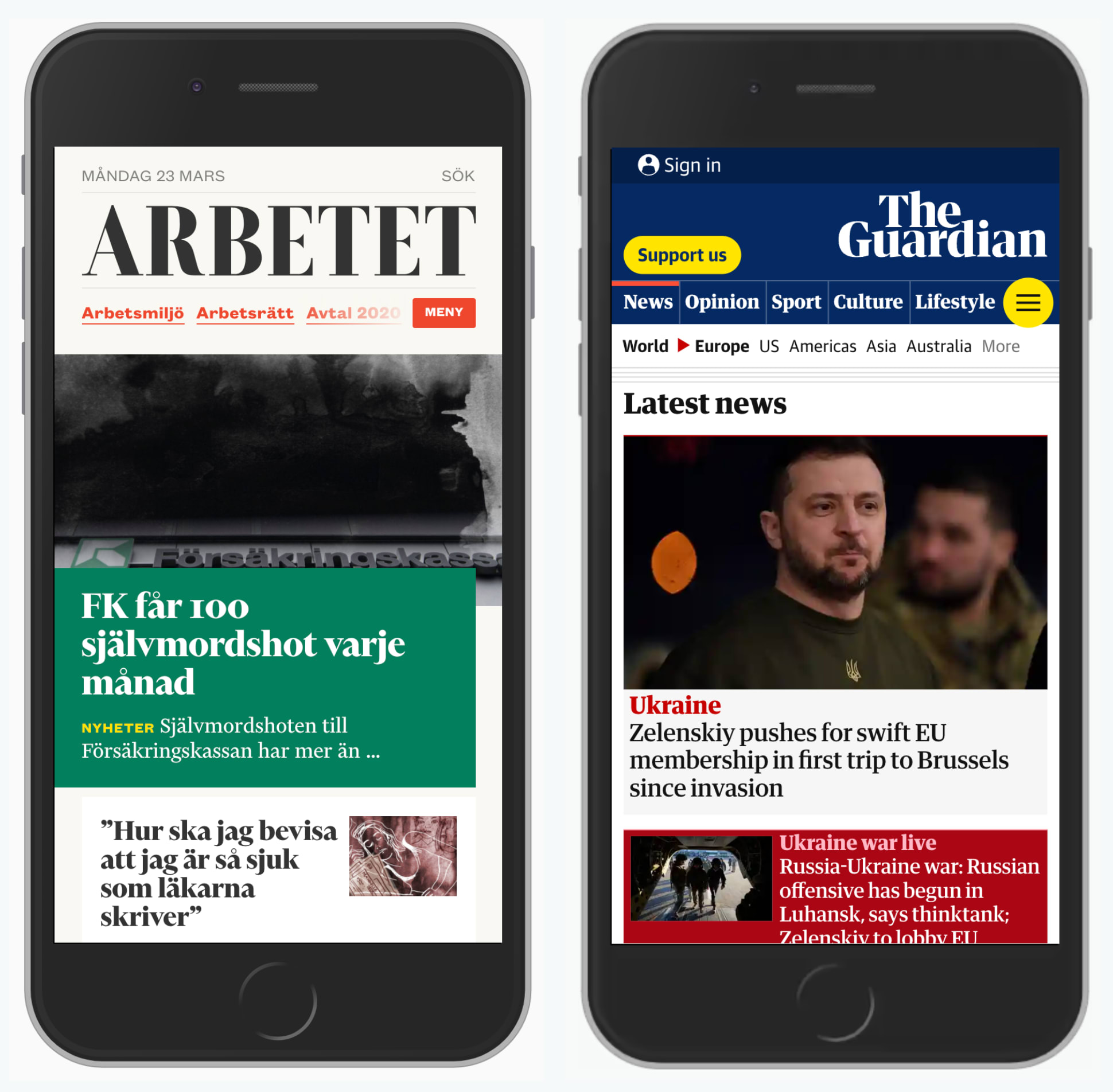
4. Use Progressive Disclosure To Show More and Less #
Display as much as you can, but then allow users to quickly see more navigation options if needed. Important items should be visible at all times.
Examples: Arbetet.se and TheGuardian.com.
5. Use a Sticky Navigation For Top Tasks #
Important items can also be visible at the bottom permanently, especially for items such as tracking delivery on a postal service website, or buying tickets on a museum website. Beware: they can quickly get annoying on content/task pages, so they could be smaller there.
Examples: Posturinn.is and FransHalsMuseum.nl.

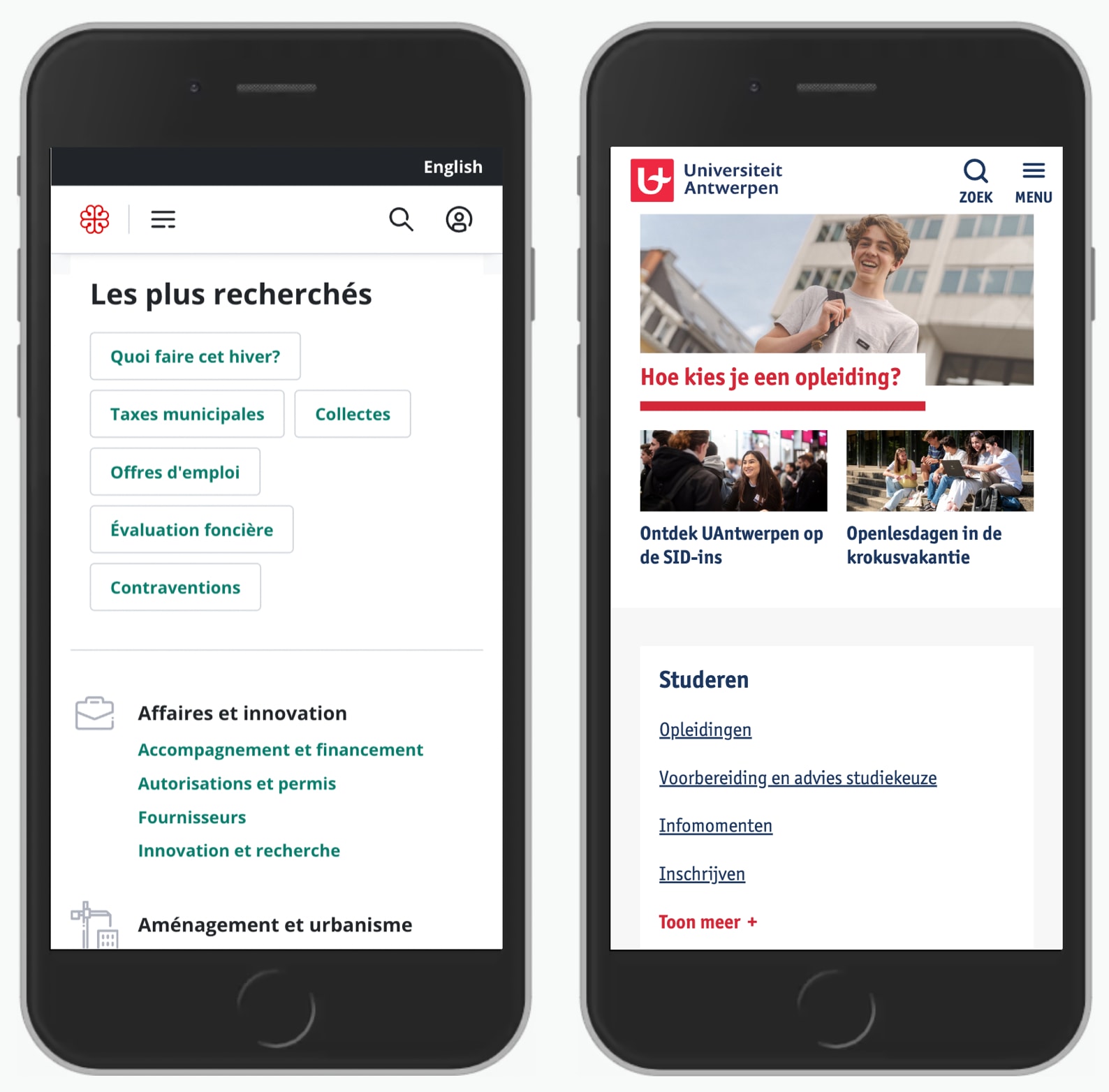
6. Show Navigation as Plain Links #
Cards take quite a bit of space, but links are easier to arrange. Ideally use just one simple column and two if you absolutely must. Each link must look like a link, and have active and focus states.
Examples: Unegui.mn, UAntwerpen.be.

7. Display The Sidebar Navigation on The Top #
Sometimes users need to navigate sideways, exploring a similar section. For important navigation, show it at the very top of the page. Surely it takes space away from the content, but if it’s frequently used, it needs to be visible.
8. Keep the Table of Contents Accessible For Long Documents #
If a page is a part of a guide, or it contains many sections, include a table of contents on the top of the page (as an accordion), or at the bottom, revealing it as users start scrolling up.
Example: Nejm.org.

Wrapping Up #
Never hide critical navigation. Hamburger menus are often cluttered closets of our interfaces. And if something is important, we usually keep it close, nearby and visible, right in front of us instead of hiding it away.
So show navigation when it matters and hide it when it doesn't. And avoid hamburger menus if you can.
