Designing Better Mobile Navigation UX
When it comes to navigation on mobile, we often think about hamburger menus, full-page overlays and good ol’ accordions. However, there is one interesting design pattern that has been showing up recently — and could be used for navigation, filters, overlays, or even language selector: the vertical split pattern.
Vertical Split Navigation #
Many mobile navigation menus show only one level of navigation at a time. You might have seen page takeovers and slide-in menus, overlays and bottom sheets. Often this experience is slow and disorienting. Often users have to go back to move forward. Yet usually we want the opposite: help users navigate between levels faster, not slower.
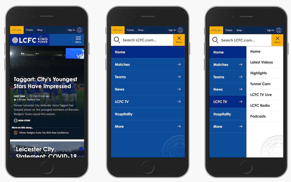
LCFC split the page into two parts, one for each level of navigation.
What if split the screen vertically (pictured above on LCFC, and display two levels of navigation at the same time? To move between levels then we don’t need to close any menus or return back — instead, we move forward and explore.
Curtain Navigation #
And what if you need slightly more space for your lengthy navigation labels? Well, they could wrap onto multiple lines, or we could reduce the width by replacing text labels with icons (as long as they are unambiguous). It might not work for every project, but it seems to work for Playstation (pictured below).
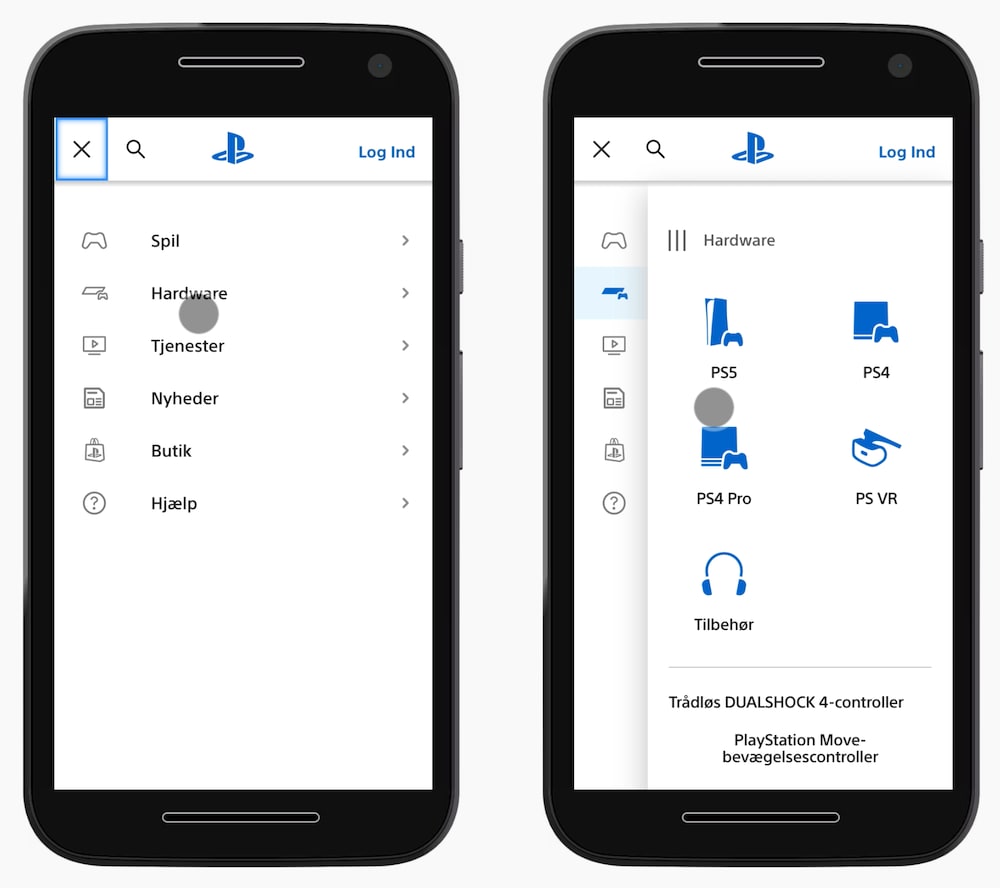
Playstation with the curtain navigation pattern, showing 2 levels of navigation at the same time.
The entire first level of navigation collapses into tabs; yet moving from one level to the other doesn’t require any jumps back. You might be wondering what the three vertical lines represent — ideally, one could drag away the pane, but it doesn’t seem to be working as expected unfortunately.
Better Filtering UX #
We could use the same approach in other contexts, such as filtering. We display all filter attributes on the left, and allow users to choose the specific values for these filters in the second vertical pane. That's what the filtering experience looks like on Myntra, an Indian eCommerce retailer pictured below.
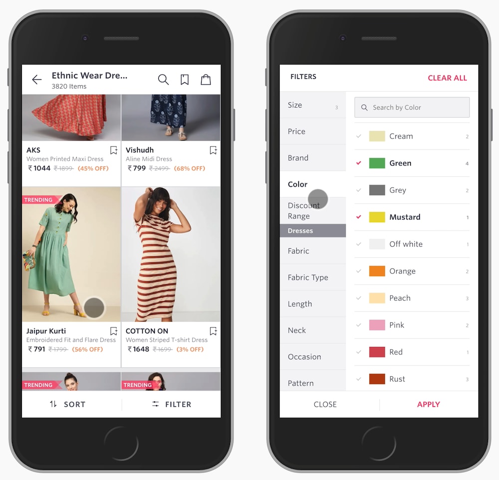
If some filters don’t fit in the right pane, users can scroll to explore more, or even search for a specific filter in the selection. Of course, the "Apply" button has to stay floating. It would be lovely to see the total number of results on that button, too.
Filter Constructor UX #
We could take it even further though. For example, sometimes users need to select filters that are relevant to them, and define their values in the next step. In that case, we group all filters into a few categories or even sub-categories, and then present all categories and all filters in sub-categories side by side.
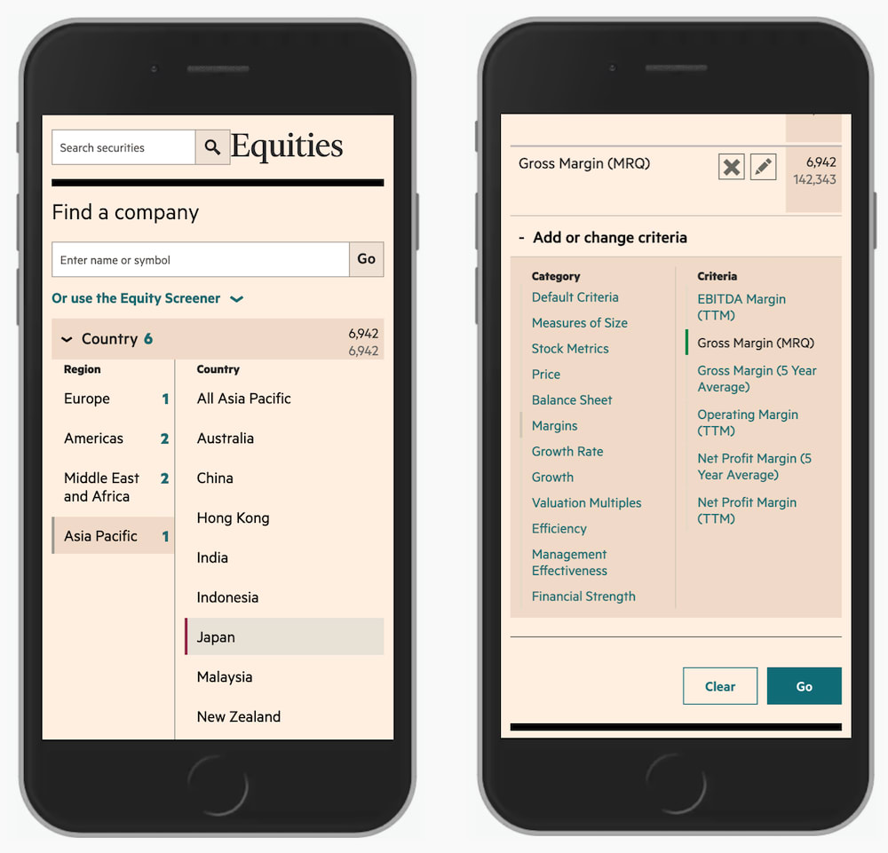
FT Screener with two panes, one for groups and one for specific filters.
With FT Screener, for example, users can add or change criteria by exploring multiple levels at the same time — both the labels for groups and the filters living within those groups. Once a filter has been chosen, it’s being added to the overview on the top. That’s a simple filter constructor for a sophisticated filtering on mobile.
Language Selector UX #
The vertical split could be used to quickly select one important present or make a single choice. That would be the case for a language selector, for example. We could organize all supported countries and languages as cards or accordions, but they could also work as vertical tabs, as it’s done in the footer of Oracle.
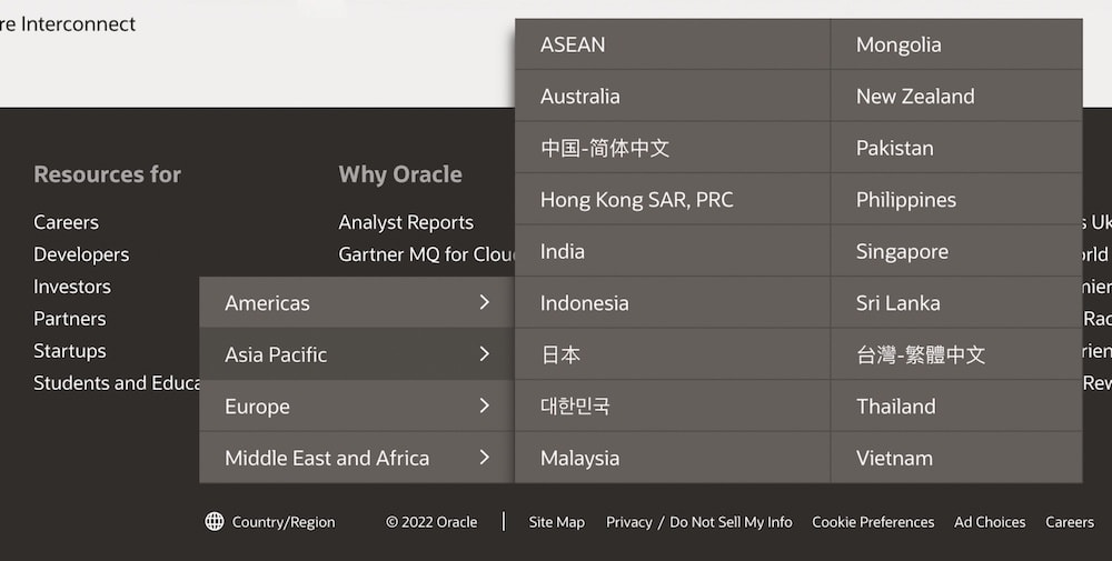
Oracle with a vertical-split menu for the country/region selection in its footer.
This way, we display only options that are relevant to users. They never have to go to irrelevant sections or pages since they get a preview and can navigate away from it quickly, should they wish to do so.
Wrapping Up #
This little technique works very well if we have a quite shallow content architecture, but it can become a bit difficult to manage with three or more levels. In that case, often filters or navigation options are accessible on individual pages, although it could work with an accordion as well.
The best part: vertical split is fast! It shows its strengths when the speed of navigation matters, and when users are likely to jump between sections a lot. It’s way faster than slide-in-menus but less flexible than accordions. Still, a great lil’ helper to keep in mind to make better use of available space on mobile.

