Should Links Open In New Tabs?
UX guidelines on how to open internal and external links without breaking user’s flow and causing frustration.
That’s a question that seems to fuel never-ending discussions year after year. Do we open external links in new tabs by default? Do we mark external links? How do we deal with links to PDFs, videos and audios? Let’s figure it out!
Below are some practical UX guidelines on how to open internal and external links without breaking user’s flow and causing frustration.
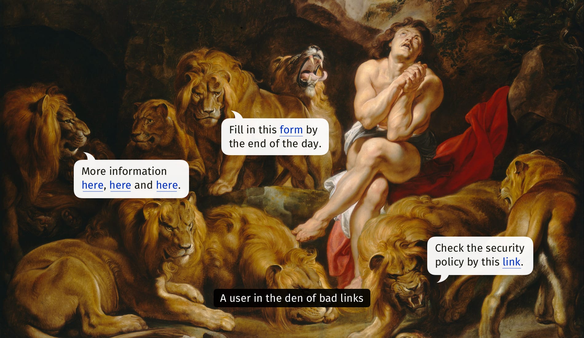
How To Design Better Links, a wonderful article on how to improve links UX, by Slava Shestopalov. Large view.
Things To Keep In Mind #
🚫 Users often get lost and confused in their browser tabs.
🚫 Some users don’t realize that they landed in a new tab.
🚫 Users can’t easily go back when links open in new tabs.
🚫 New tabs are especially frustrating for mobile users.
✅ Task completion improves when users feel in control.
✅ Abrupt interruptions cause errors and delays.
✅ By default, always open links in the same browser tab.
✅ If there is an external link, make it clear in the link text.
✅ If users are in the middle of a process, warn them.
✅ Explaining links in words is more effective than in icons.
✅ Hubs with externals links could open in new tabs.
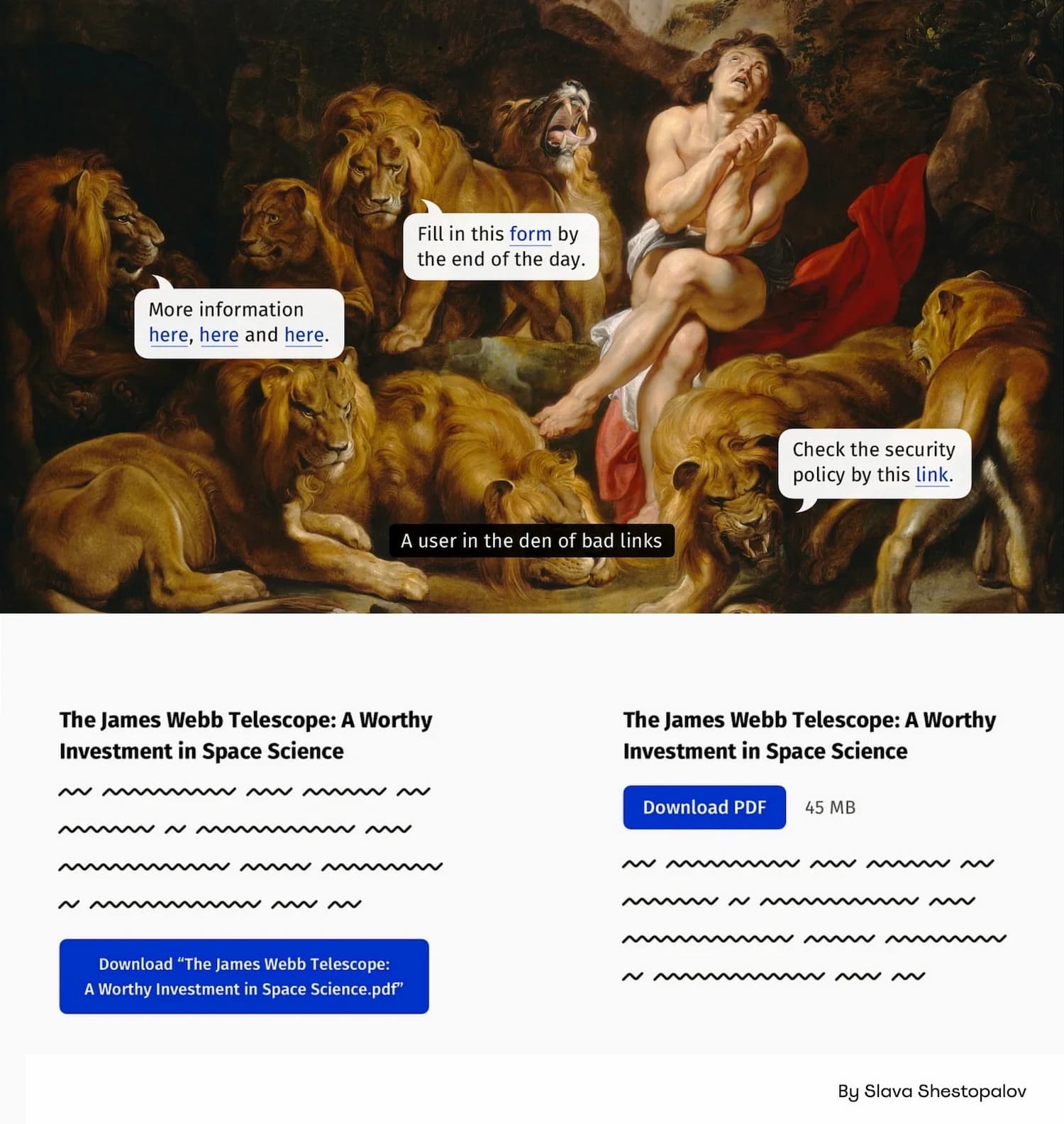
✅ PDF documents could open in new tabs (desktop only).
✅ Clearly mark links to PDFs, video/audio files as such.
🚫 Whenever possible, avoid PDFs and use HTML instead.
Should External Links Be Marked With Icons? #
Not necessarily. As Tim Paul suggests, the icon is often ambiguous and unclear to users as they might confuse it with opening a page in a new window. In general, using a text label to explain that a link will be opened in a new tab is more effective than using an icon.
Personally, I have seen external links with external icons working well in the past, but it might be a good idea to explore if they are actually needed as they can pollute the page quite a bit when you have a hub of external links on your page.
Wrapping Up #
When some links open in new tabs while others do not, users typically tend to complete their tasks slower, paying close attention to the UI and how it works. That’s also when they try to “take over control” of the interaction by using the right-click menu to open links in a way that they prefer.
This isn’t surprising. When links always open in the same tab, users can always choose to open them in a new tab or not. But if some links open in a new tab by default, they don’t have that choice until they’ve realized that they are in a new tab, and have to deal win an unintended action.
New windows or tabs also cause accessibility issues for people with poor vision and screen reader users, especially when they open outside of the area that’s magnified or being read out loudly.
Default behavior works best. It’s accessible, obvious and gives people choice. And that’s exactly what a good UX provides.
Useful Resources #
- How To Design Better Links, by Slava Shestopalov
- WCAG 2.0: Open New Windows and Tabs From a Link Only When Necessary
- PDF: Still Unfit for Human Consumption, by Anna Kaley, Jakob Nielsen
- Do Not Use An External Icon For Links, by Tim Paul
- Links Should Open in the Same Window, by Michael Schofield
- Should Your Website’s Links Open in a New Tab?
You can find more details on usability in the chapters of the video library on Smart Interface Design Patterns 🍣 — with a live UX training that’s coming up later this year.