Designing Sticky Menus: UX Guidelines
Are sticky headers always a good idea? Best practices for designing sticky headers, with examples, UX guidelines and usability considerations.
We often rely on sticky headers to point user's attention to critical features or calls to action. Think of sidebar navigation, CTAs, sticky headers and footers, “fixed” rows or columns in tables and floating buttons. We've already looked into mobile navigation patterns in Smart Interface Design Patterns, but sticky menus deserve a closer look.
As users scroll, a sticky menu always stays in sight — and typically it's considered to be a good feature, especially if the menus are frequently used and especially if we want to speed up navigation.
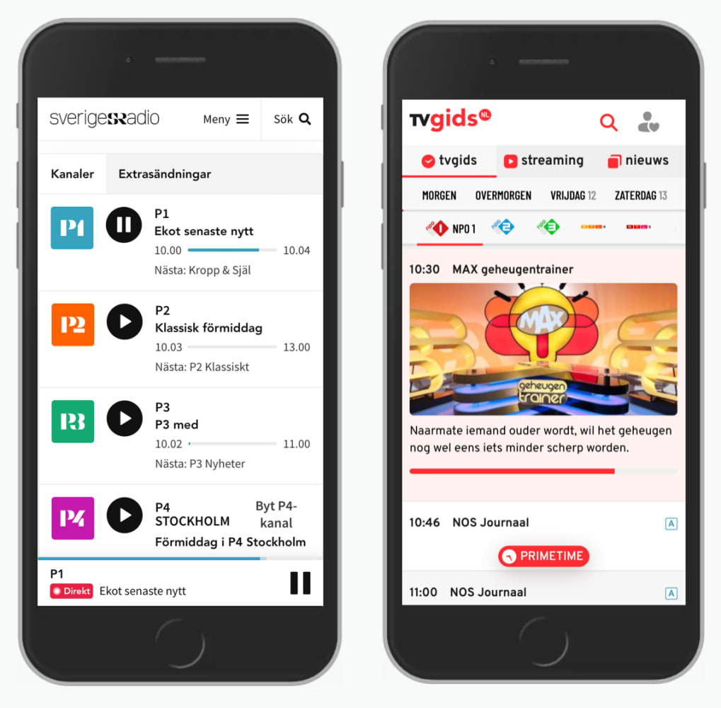
Multiple sticky menus in use: Sverigesradio with a bottom sticky navigation, and TV Gids, with multiple chained sticky menus on the top.
However, sticky menus also come with a few disadvantages. In his recent article on Sticky Menus Are Problematic, And What To Do Instead, Adam Silver argues about some common usability issues of sticky menus — and how to solve them. Let’s take a closer look.
When Sticky Menus Are Useful #
How do we decide if a menu should be sticky or not? This depends on the primary job of a page. If it's designed to primarily convey information and we don't expect a lot of navigation, then sticky menus aren't very helpful.

A helpful sticky bar for navigation through channels on France TV.
However, if we expect users to navigate between different views on a page a lot, and stay on the page while doing so — as it often is on long landing pages, product pages and filters — then having access to navigation, A-Z or tabs can be very helpful.
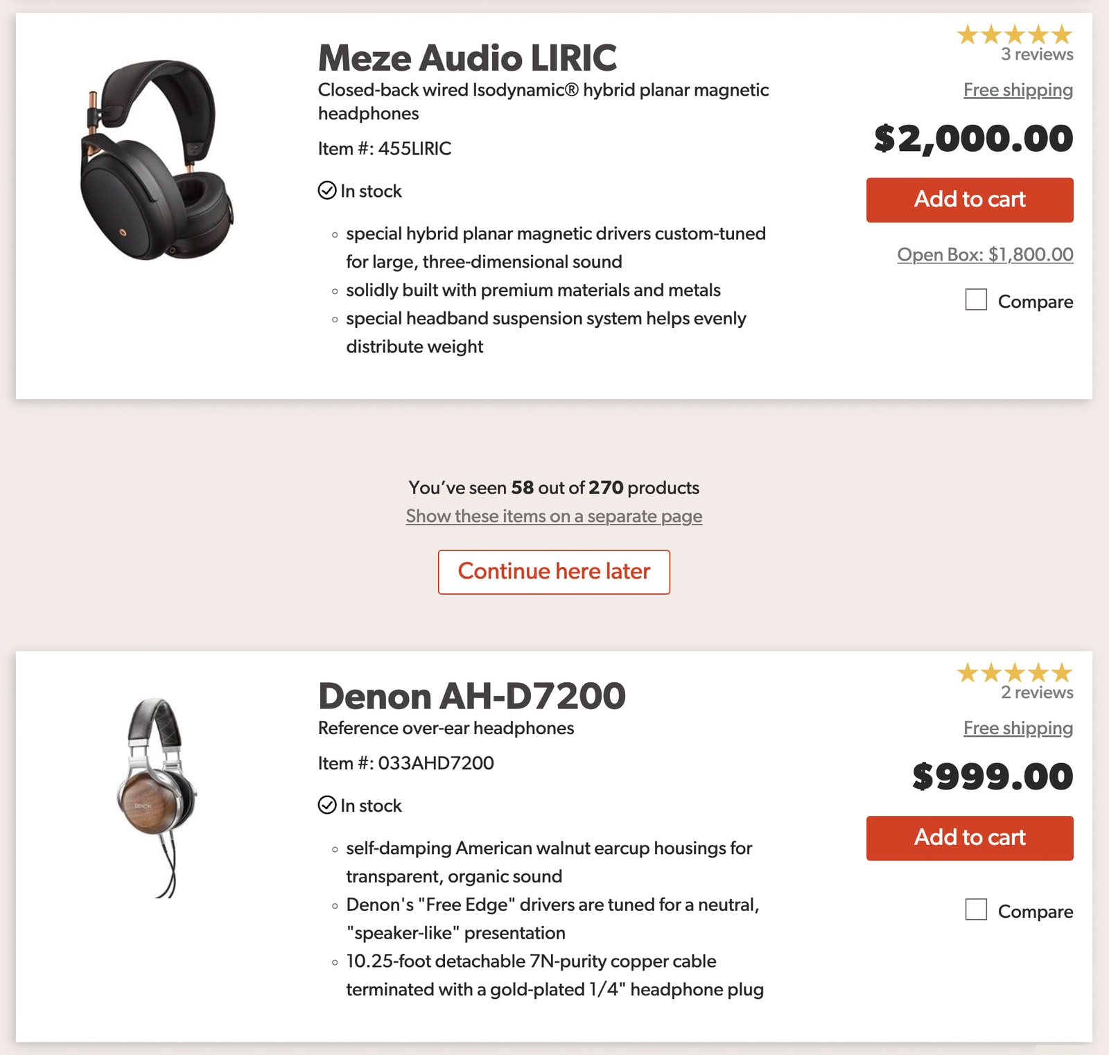
Also, when users compare features in a data table, sticky headers help them verify that they always look at the right piece of data. That's where sticky headers or columns can help and aid understanding. That's why sticky bars are so frequently used in eCommerce, and in my experience, they improve discoverability of content and speed of interaction.
Keep Sticky Headers Small, But Large Enough To Avoid Rage Taps #
The downside of sticky menus is that they typically make it more difficult for users to explore the page as they obscure content. Full width bars on mobile and desktop are common, but they need to be compact, especially on narrow screens — and they need to accommodate for accessible tap sizes to prevent rage taps and rage clicks.

Postal Service from Iceland with 4 items in the sticky bar navigation (now changed).
Typically that means that we can't have more than 5 items in the sticky bar navigation. The choice of the items displayed in the sticky menu should be informed by the most important tasks that users need to perform on the website. If you have more than 5 items, you probably might need to look into some sort of an overflow menu, as displayed by Samsung.

Sometimes sticky menus are used for in-page navigation: a sticky overflow menu at Samsung.
Whenever users have to deal with forms on a page on mobile, consider replacing sticky menus with accordions. Virtual keyboards typically take up to 60% of the screen, and with a sticky bar in a view, filling in a form quickly becomes nothing short of impossible.
Accessibility Issues of Sticky Menus #
By their nature, sticky menus always live on top of the content, and often cause accessibility issues. They break when users zoom in. They often block the content for keyboard users who tab through the content. They obscure links and other focusable elements. And, there is often not enough contrast between the menu and the content area.

Poor contrast between the sticky sub-menu-navigation and the content area can cause accessibility issues. Discovered via NN/Group.
Whenever we implement a sticky menu, we need to make sure that focusable elements are still visible with a sticky menu in action — and this also goes for internal page anchors that need to account for the sticky bar with the scroll-padding property in CSS.
Avoid Multiple Scrollbars Of Long Sticky Menus #
When sticky menus become lengthy, last items on the list become difficult to access. We could make them visible with some sort of an overflow menu, but often they appear as scrollable panes, causing multiple scroll bars.
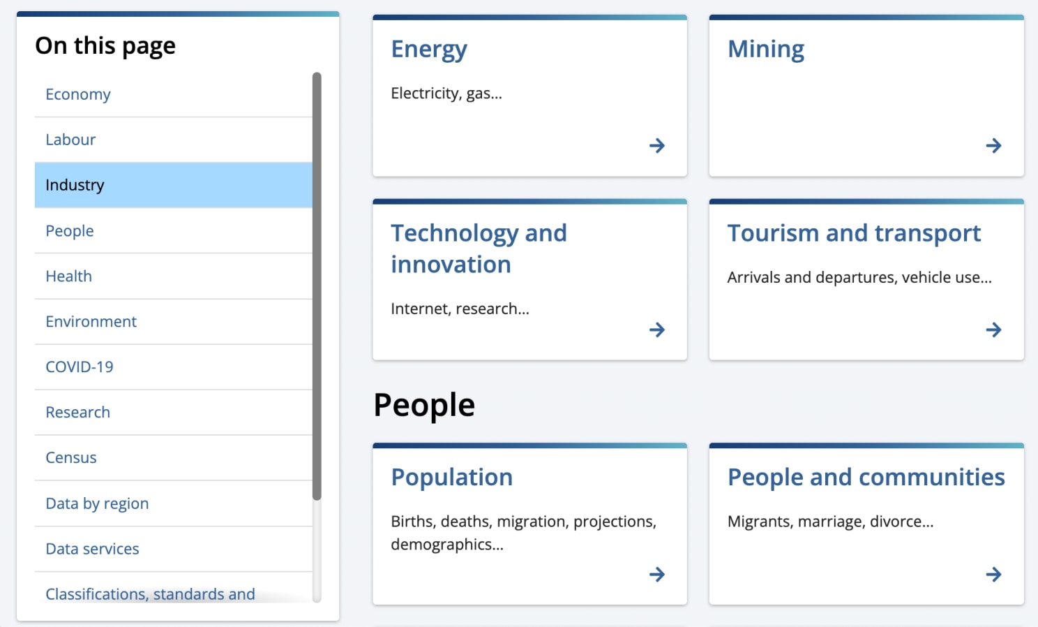
Australian Bureau of Statistics, with a large sticky sidebar navigation that causes a scroll.
Not only does this behaviour cause discoverability issues, it's often a cause for mistakes and repetitive actions on a page. Ideally, we would prevent it by keeping the number of items short, but often it’s not possible, or can’t be managed properly.

No sticky menu in sight: instead, we could show and hide cart details when needed. On Smashing Magazine.
A way out is to show the menu as an accordion instead in situations when the space is limited, especially on mobile devices. That's what we do at Smashing Magazine in the checkout, with a button that reveals and hides the contents of the cart when needed.
Partially Persistent Menus #
Because sticky menus often take too much space, we could reveal them when needed, and hide them when a user is focused on the content. That's the idea behind partially persistent headers: as a user starts scrolling down, the menu disappears, but then any scrolling up prompts the menu to appear again.

A partially persistent sticky menu on CB2 that disappears on scroll down and reappears on scroll up.
The issue with this pattern is that sometimes users just want to jump back to a previous section of the page, or want to double check some details in a previous paragraph, and the menu often gets in the way. Page Laubheimer from NN/Group recommends to use a slide-in animation that is roughly 300–400ms long will preserve the natural feel, without being distracting.
Alternatives To Sticky Menus #
In some situations, we might not need a sticky menu after all. We can avoid their downsides with shorter pages, or lengthy pages which repeat relevant calls-to-actions or navigation within the page.
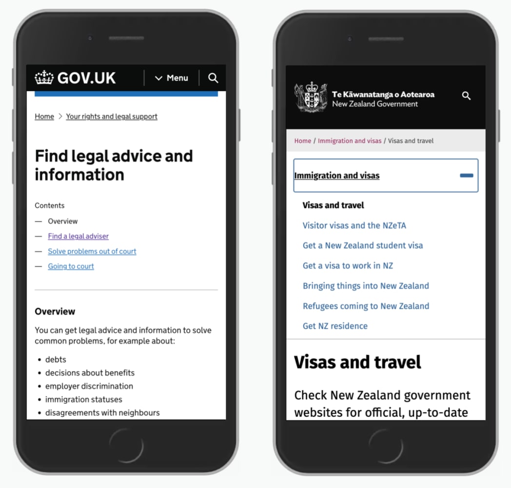
Alternatives to sticky menus: a table of contents displayed on UK Government and New Zealand Government.
We could display a table of contents on the top of the page, and bring user's attention to table of contents with a back-to-top link at the bottom of the page.
Wrapping Up #
Whenever a job of the page is to help users act, save, compare, or we expect users to rely on navigation a lot, we might consider displaying sticky navigation. They are most harmful when there isn't enough space anyway, as it often is with forms on mobile devices.
Sticky menus do come at a cost as we need to account for usability and accessibility issues, especially for zooming, keyboard navigation and anchor jumps. Add them if you need them, but be careful in plugging them in by default.
We need to prioritize what matters and remove what doesn't: and too often, the focus should lie entirely on content, and not navigation.
Further Resources #
Of course, the techniques listed above barely scratch the surface. Here are wonderful articles around sticky headers, from design considerations to technical implementations:
- The Problem With Sticky Menus, and What To Do Instead, by Adam Silver,
- Sticky Headers: 5 Ways to Make Them Better, by Page Laubheimer,
- A different approach to sticky in-page navigation, by Corey Snyder.