Mobile Accessibility Target Sizes Cheatsheet
Practical guidelines to prevent rage taps and rage clicks with accessible tap targets for icons, links and buttons — on desktop and on mobile.
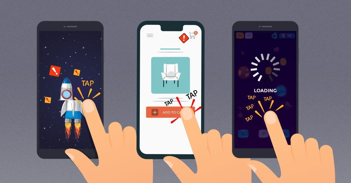
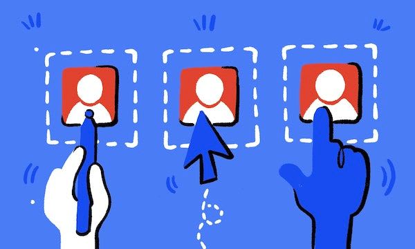
Rage taps are annoying and frustrating. These wonderful occurrences in our interface when we need to tap twice, or sometimes three times to continue our journeys. Of course sometimes they happen because the website is too slow, but sometimes it’s the target size of interactive elements that is the culprit.
Rage Taps, a Metric for User Frustration, by Colin Contreary
So how big should our interactive elements be these days? What would be a reliable size for icons, links and buttons — in navigation and on mobile? How do we make it more difficult for our users to make mistakes? Let’s take a look.
Target Sizes Cheatsheet #
One of the common recommendations for target sizes on mobile is 44×44px. This is a little bit misleading because screen pixels, or at least device-independent pixels (dips) are scaled to a multiple of the display resolution. So pixels are different on different screens, and when we have a conversation about sizes, we probably should be speaking about dips, rather than pixels.
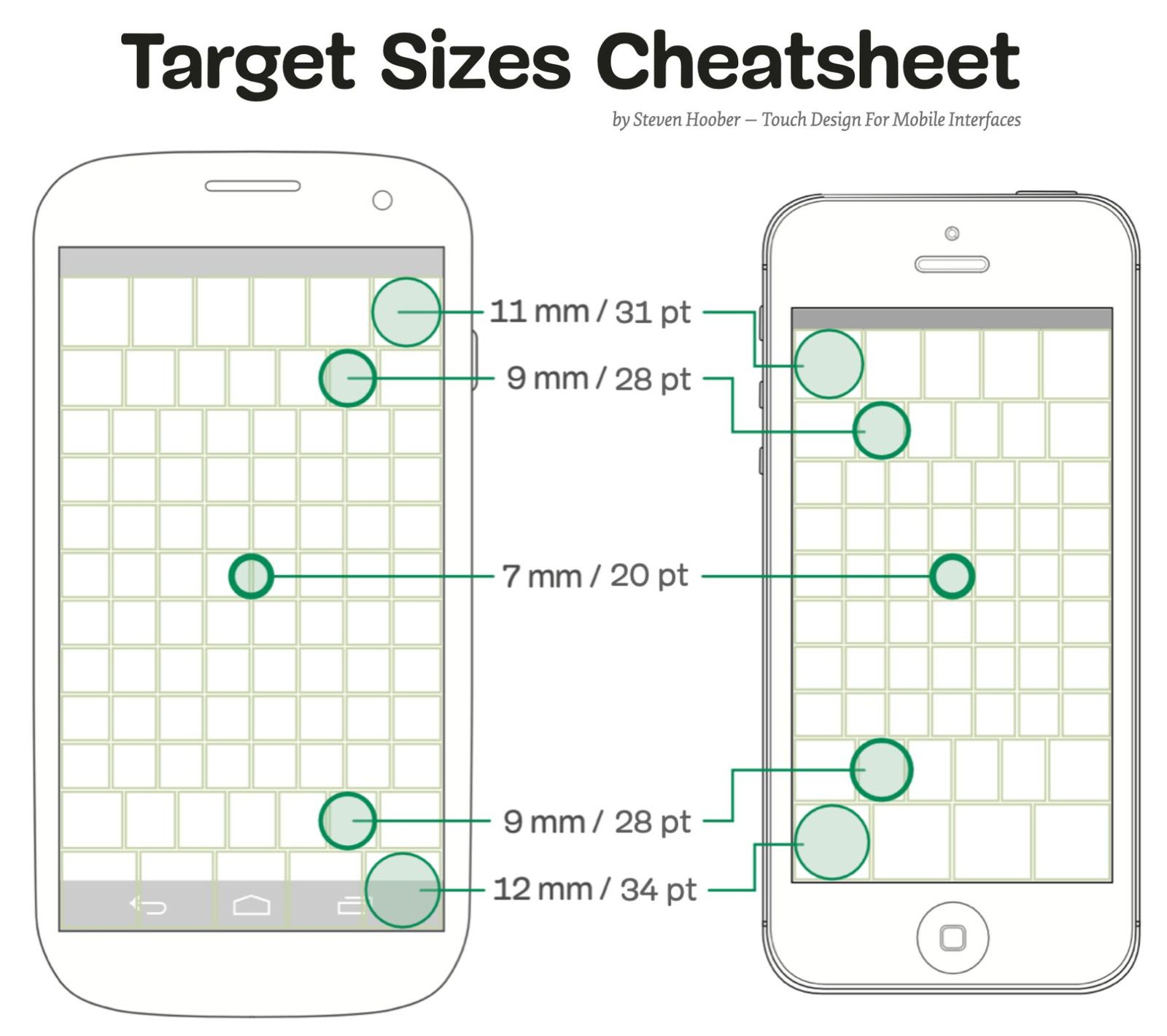
Target Sizes Cheatsheet, researched and designed by Steven Hoober. Large view.
Depending on where an element appears on the screen, it needs more or less padding. In general, we are very precise in our input in the center of the screen, but we are least precise on the edges of the screen (both on the top and at the bottom).
According to Steven Hoober’s research in his book on Touch Design For Mobile Interfaces, to minimize rage taps we need to aim for 11mm (or 31pt / 42px) on the top of the screen, and 12mm (or 34pt / 46px) at the bottom of the screen. In the center though, we could potentially go as low as 7mm (or 20pt / 27px). This includes both the width and padding of an interactive element.
How do point units translate to CSS pixels or Android/iOS units? Fortunately, Steven Hoober provides a helpful conversion table to help you translate from points to px and em units, Android SPs or DPs, iOS points and Windows DIP or px.
Not All Pixels Are The Same #
As we’ve seen above, target sizes change depending on where components appear on the screen. It’s worth noting that according to the WCAG 2.1 AAA level requirements, all targets should measure at least 44 by 44px, except if the target is in a sentence or block of text. For such exceptions, we could be using 27px as a goal, but in general, the larger, the better.
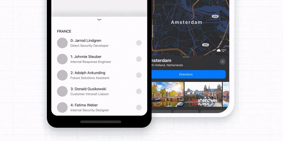
Bottom Sheet Bar navigation might work better if you need to display more than 5 items at the bottom of a mobile screen.
For sticky menus at the top or bottom of the screen, we should probably aim for around 44–46px boxes, or preferably even more. However, for links that appear on the screen as user scroll down the page, we probably will be able to avoid most issues with smaller components.

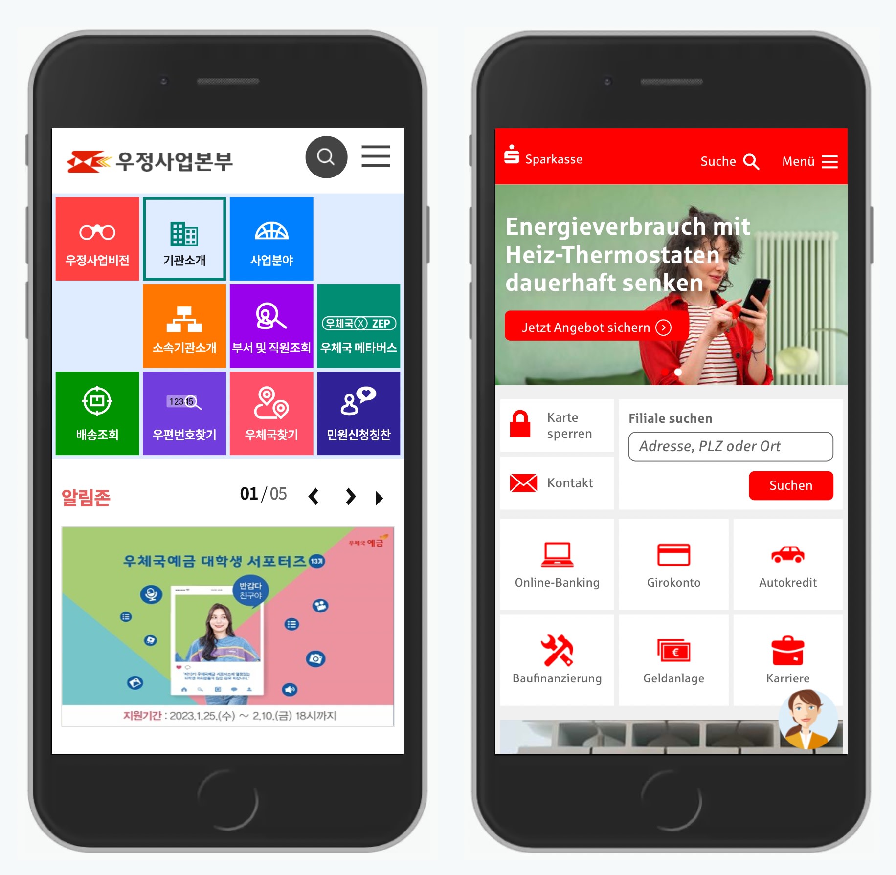
Frans Hals Museum and Danish Public Transport websites with 5 items appearing in the bottom menu.
This is also why we probably will be able to place at most 5 items in the bottom tabs on a mobile phone. Instead, we might need to use a bottom sheet that would slide up from down as an overlay on top of the screen.
Prefer “Actions” Button To Single Icons For Data Tables #
Complex tables typically have hover actions that appear once a user starts hovering over a particular row. They typically include everything from highlight and export to move and delete.
In testing, showing icons on hover produces too many mistakes: not only do users often accidentally jump to a wrong row as they navigate horizontally towards the icons. They also make mistakes by accidentally clicking on the wrong spot and starting all over again.
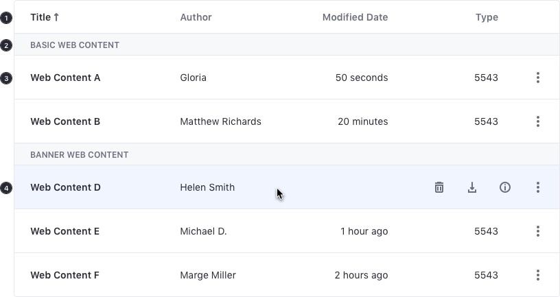
Table view hover for the Liferay design system. Source.
To avoid rage clicks, it might be a good idea to test how well an “Actions” buttons or a “Split”-Button would perform instead. Indeed, that button could live on every row, would open on tap/click and wouldn’t close automatically. It might not be ideal for every use case, but it definitely gives users more sense of control as they need to take an action on a row.

No hover icons in sight; instead, the interface uses an 'Actions' button that shows options in an overlay. Large view.
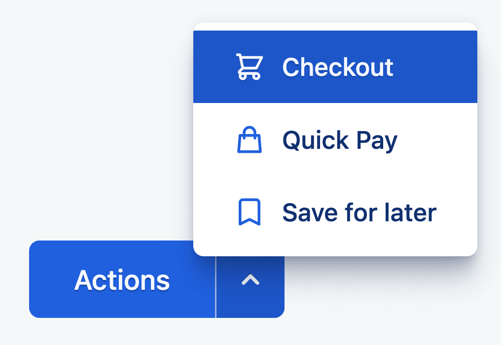
A split-button typically produces fewer rage clicks/taps than small hover action icons.
Provide An Assistant For Complex Manipulations #
With a complex manipulation such as rotation of an image, or selection of a small part of a larger area, we often rely on pinch and zoom, or zoom in/out buttons. These options of course work, but they easily become a bit tedious to use for very precise manipulations — especially if used for a while.

Assistant pattern allows users to navigate an object with a little handle on the right. Example: Tylko.
Instead, we can attach a little handle to allow users to move their selection within the object faster, and with more precision. This is how Tylko allows users to customize their shelves on mobile. Zooming is supported as well, but it’s not necessary to select one of the areas.
When Multiple Taps Are Better Than One #
But what do we do if some tap areas have to be small? Perhaps we can’t reserve 27×27px for each icon — for example, when we suggest a color selection in an eCommerce site? Well, in that case one option to consider would be to prompt a “proper” selection of colors with one additional tap. This might be a bit slower in interaction, but way more accurate.
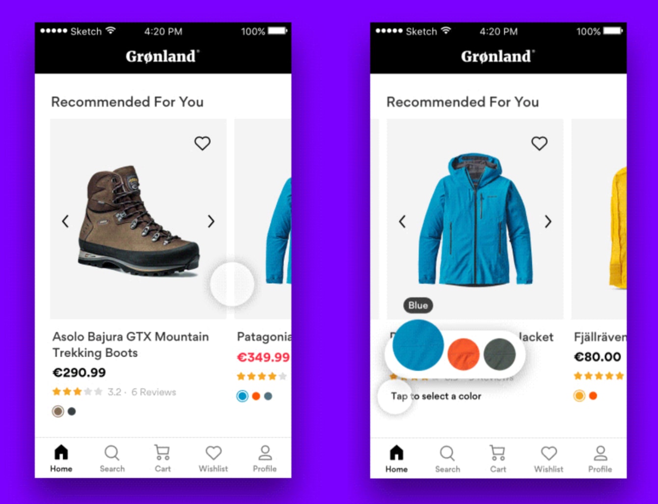
Fewer rage clicks: Grønland Color Picker Microinteraction, designed by Mykolas Puodžiūnas.
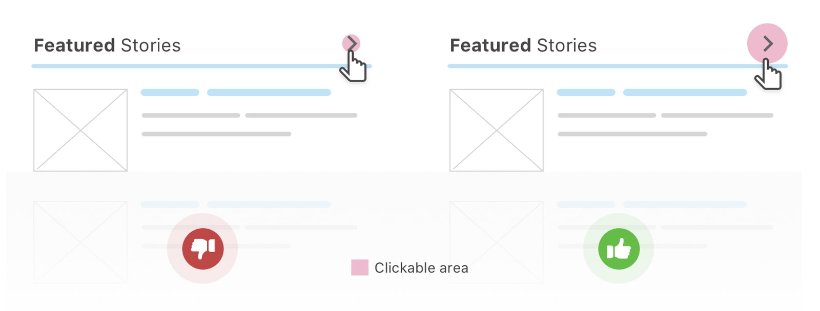
Always Maximize Clickable Area #
Whenever possible, encapsulate the entire element, along with enough padding to ensure that you hit the magical 42–46px size to prevent rage taps for good. This typically means adding enough padding for icons but also preferring full-width or full-height bars for accordions and navigation.
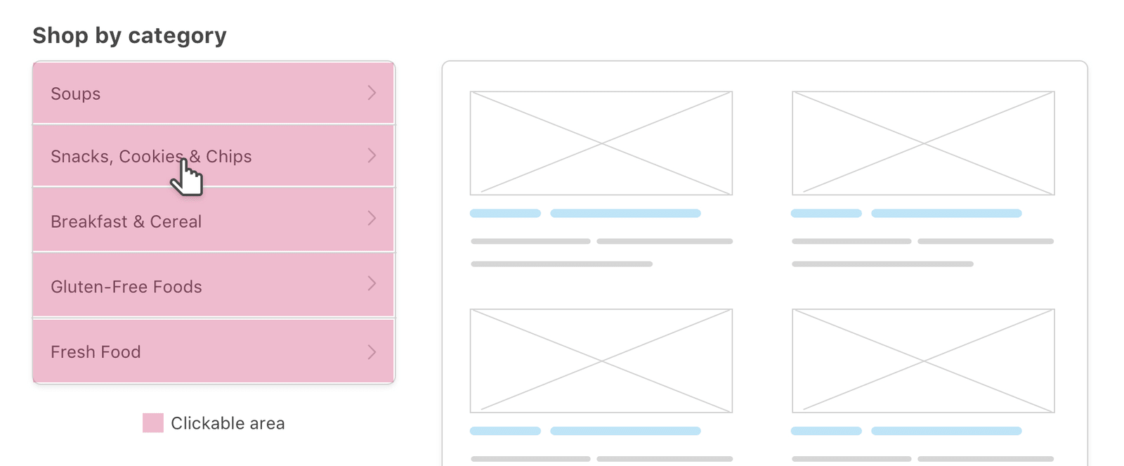
Navigation bars should ideally be full-width, so there is no need to focus specifically on the link area.
Always add enough padding to make it easier to tap an element. Again, we are aiming for interactive area of at least 44px radius for every interactive element.
Ahmad Shadeed presents a few useful examples of using spacing to increase clickable areas and prevent rage clicks. Any Lupe provides even more suggestions in her article on accessible target sizes.
Wrapping Up #
When designing for touch today, we need to use at least 27×27px for small links or icons in the content area, and at least 44×44px for icons at the top and at the bottom of the page.
Padding is always helpful for any kind of input: be it stylus, pointer or a finger. From Accessible Target Sizes, by Amy Lupe
Personally, I would always go up to 30×30px and 48×48px to make sure mistakes are really difficult to make. And of course, always use full width or full height for the clickable areas. Hopefully this will help us remove rage taps from our websites altogether — and many of your users would sincerely appreciate it.
Useful Resources #
There are a few wonderful resources on accessible target sizes that might be helpful if you’d like to dive deeper in the topic:
- Accessible Target Sizes, by Amy Lupe
- Touch Targets on Touchscreens, by Aurora Hailey
- Enhancing the Clickable Area, by Ahmad Shadeed
- WCAG 2.55 for Better Target Sizes, by Todd Libby
- Fitt’s Law In The Touch Era, by Steven Hoober
- Touch Design For Mobile Interfaces, by Steven Hoober
- Type Sizes for Every Device, by Steven Hoober

