Interaction

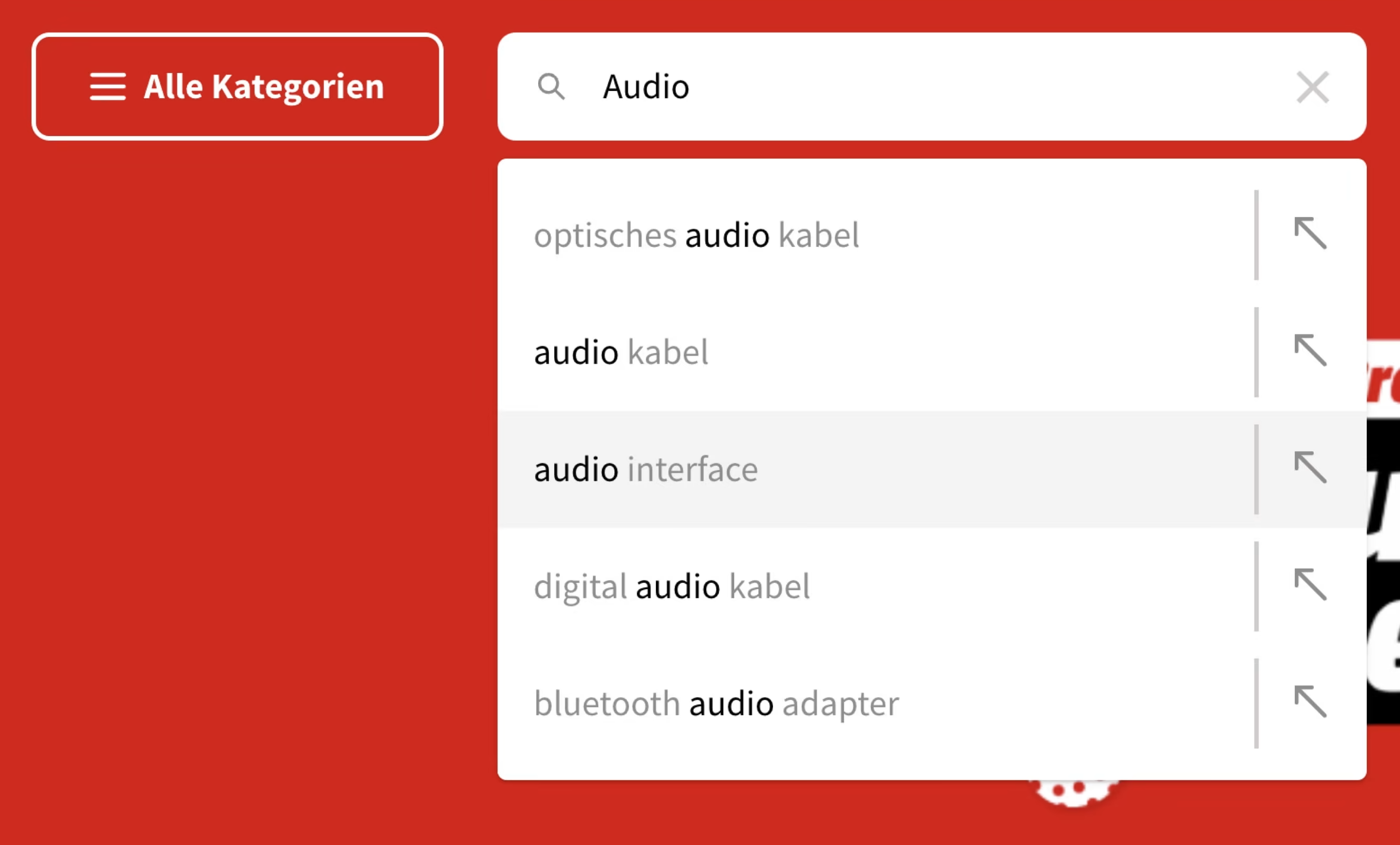
Five Simple Steps For Better Autocomplete UX
Always show autocomplete suggestions on focus, use tap-ahead suggestions and provide autocomplete filters.

Filtering UX
Filters can be complex and intricate, especially in enterprise environments. Let’s figure out how to make them slightly less annoying and slightly more usable.

Disabled Buttons UX
How can we make disabled buttons more inclusive? When do they work well, and when do they fail on us? And finally, when do we actually need them, and how can we avoid them? Let’s find out.

Complex Filters UX
Too often dealing with filters can be frustrating. Let’s get them right. That means never freeze the UI on a single input, provide text input fallback and never auto-scroll users on a single input. Here’s why.
