Disabled Buttons UX
How can we make disabled buttons more inclusive? When do they work well, and when do they fail on us? And finally, when do we actually need them, and how can we avoid them? Let’s find out.
Admittedly, there might be very good reasons for making buttons disabled by default, but there are also scenarios when disabled buttons turn out to be a disastrous design pattern. Let’s look into common usability issues with disabled buttons, how to fix them, and when disabling buttons makes sense.

One of the many. Usually buttons are disabled because the interface requires user’s input. Example: Swedish public transportation website.
The Downsides Of Disabled Buttons #
As designers, we want to make it more difficult for our users to make mistakes and ensure that the input is perfectly correct before the data is even sent to the server. But these good intentions also bring along pitfalls.
Disabled buttons don’t explain what’s wrong. They communicate that something is off, but very often that’s just not good enough. As a result, too often users are left wondering what’s actually missing, and consequently locked out entirely.
And then there is the question of timing. At which point should we enable a disabled button? Most implementations enable the button only if all required input seems to be well-formed, or/and has been verified by an inline validator. But sometimes inline validation is too aggressive, and it’s never bulletproof.

You just want to fix an error in the first input, but then you are penalized in the second. An aggressive inline validation in play here.
Did you have situations when your address didn’t validate although you’ve been living at that address for years? What about phone numbers locked into one specific country, although you have a number from another one? Technically, we should still be able to proceed, but we can’t.
When Disabled Buttons Work Well #
Imagine you want to purchase a pair of jeans online and as you add the item to your cart, you realize that it is no longer available. Making the “add to cart” button disabled when an option isn’t available is reasonable to avoid confusion.
Or if you’re making a transfer from your bank account and accidentally press the “confirm” button twice. A disabled button could prevent this from happening and indicate that the state has changed and that nothing else needs to be done for the operation to proceed. Communicating that something isn’t possible could also come in handy to avoid wrong purchases or double-bookings or to validate magic sign-in and SMS code.
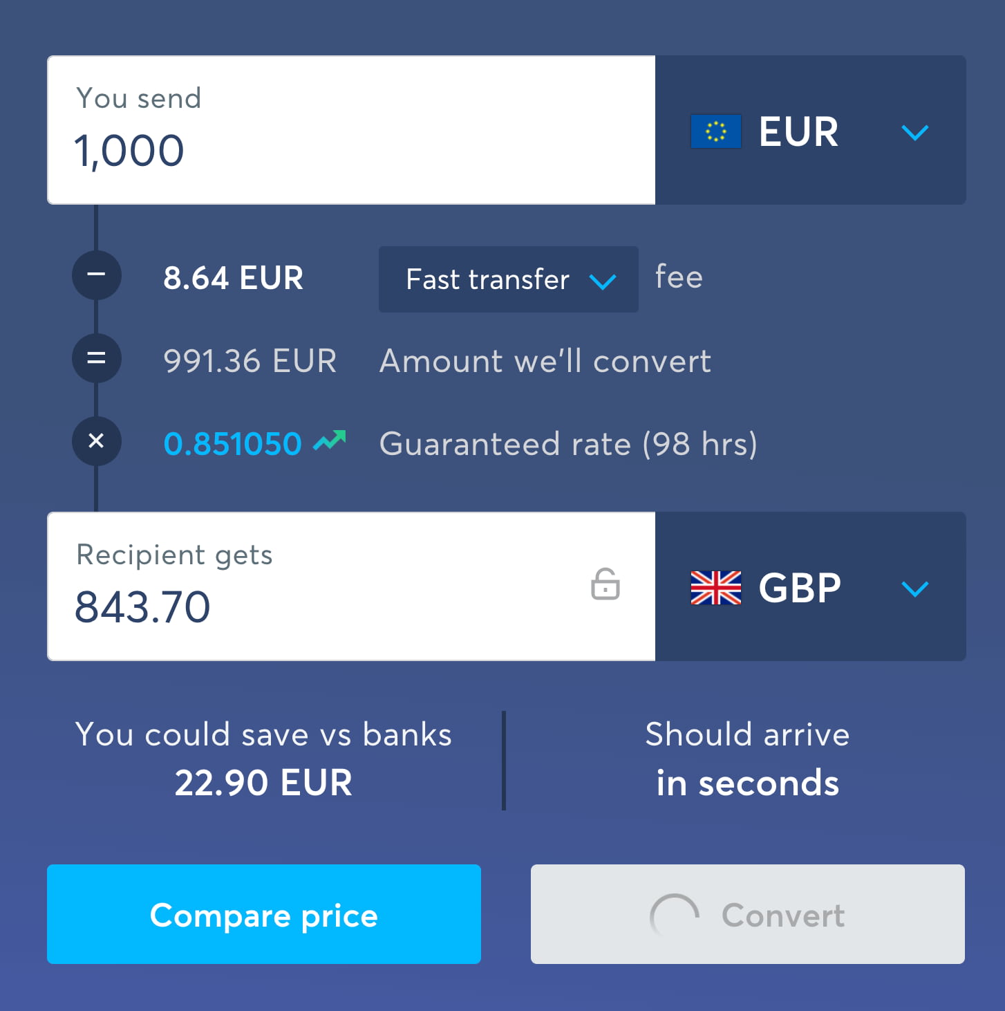
Upon click, Wise disables the “Convert” button without changing the text, but adds a loading indicator and changes a mouse pointer to indicate the change of state.
When an option or a feature isn’t available or something is happening in the background, we need to communicate it early and clearly. A visible change of the button helps there, but we can also explain why the button is disabled and what exactly is happening. For example, we could change the label on the button and add a looping loading indicator to make it more obvious what exactly is happening.
Making Disabled Buttons More Inclusive #
So what if our implementation relies on disabled buttons? How can we make sure to not leave anyone out? In her article “Making Disabled Buttons More Inclusive”, Sandrina Pereira highlights a couple of excellent techniques to make disabled buttons better — by changing the cursor, showing tooltips, or using ARIA live regions to announce dynamic content.

We can use aria-disabled attribute instead of disabled to keep disabled buttons focusable, and show a tooltip on tap/click. By Sandrina Pereira.
An alternative to the classic tooltip could be to guide the user to the errors in the form, either with a link to the error summary at the top of the page or with jump-links to specific input fields that seem to contain errors. And we could just include a hint next to the disabled button to explain why it’s disabled.
Always Provide A Way Out #
It’s incredibly difficult for an interface to predict all the options that customers might want to choose ahead of time. So in the case of an ill-formed input or an error, we should provide a way out to complete the form. A useful technique is to also add a “way out”-link under the hint that explains what’s wrong. The link prompts the customers to get in touch with the customer support in case they can’t proceed.

A 'way out'-link in action. It sends all customer’s details to the customer support, so you can get back to them. A mock-up based on Sj.se.
An Alternative To Disabled Buttons #
To avoid all the hassle customers have to endure with disabled buttons, we could make the experience much more straightforward by keeping the “Continue” button accessible at all times, and using the click to communicate to the user what’s actually wrong.
Keeping the buttons enabled, and showing errors on click. A mock-up by Jordan Moore.
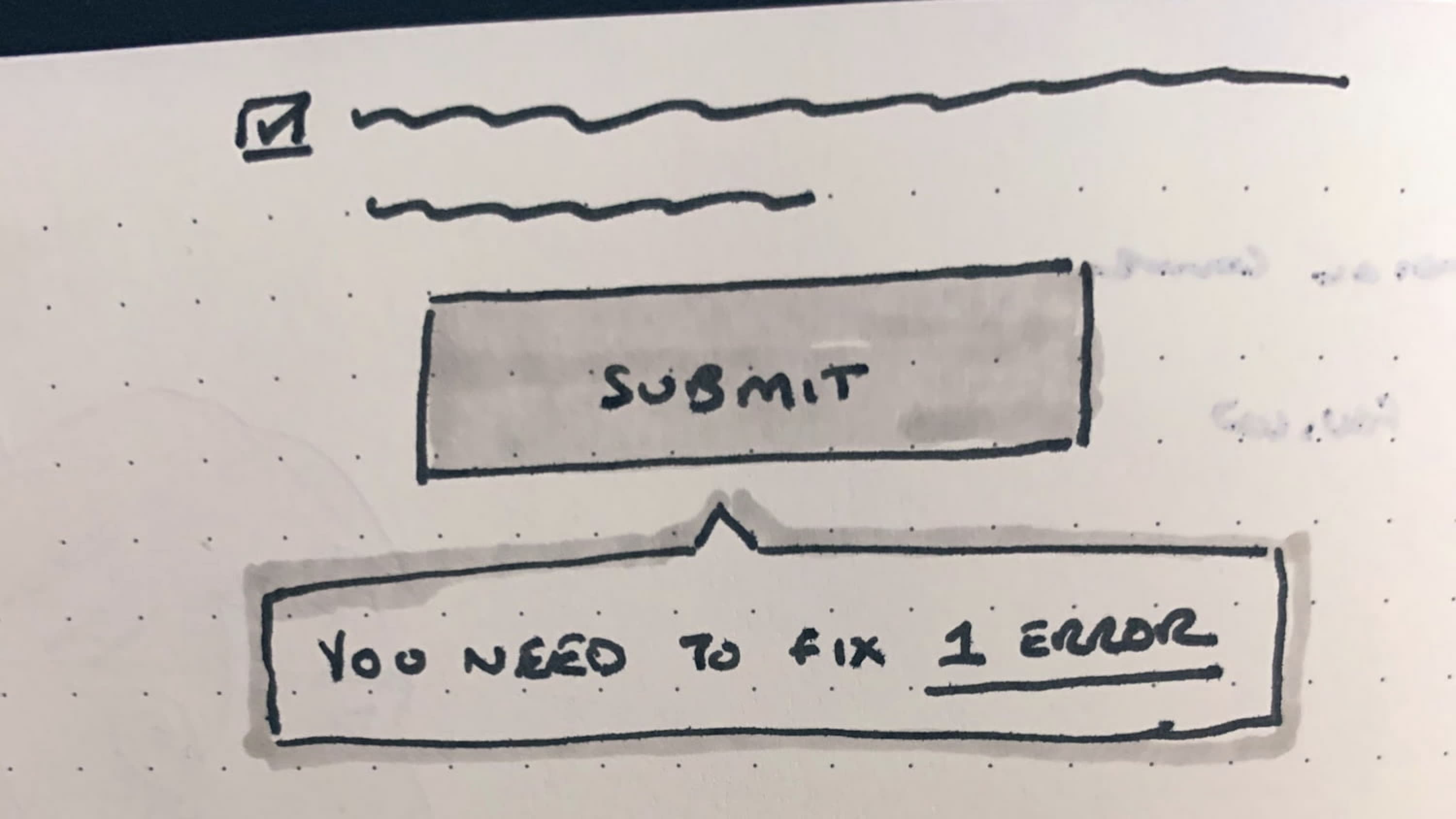
A good overall strategy that always proves to be working without any usability issues is to validate the input on submit, explain that there are errors and show how many errors there are (as a hint or as an error message). If there’s only one error, point users directly to the input field that contains the error (with a text link), or, if there are more errors, show an error summary on top of the page and link to it on submit.
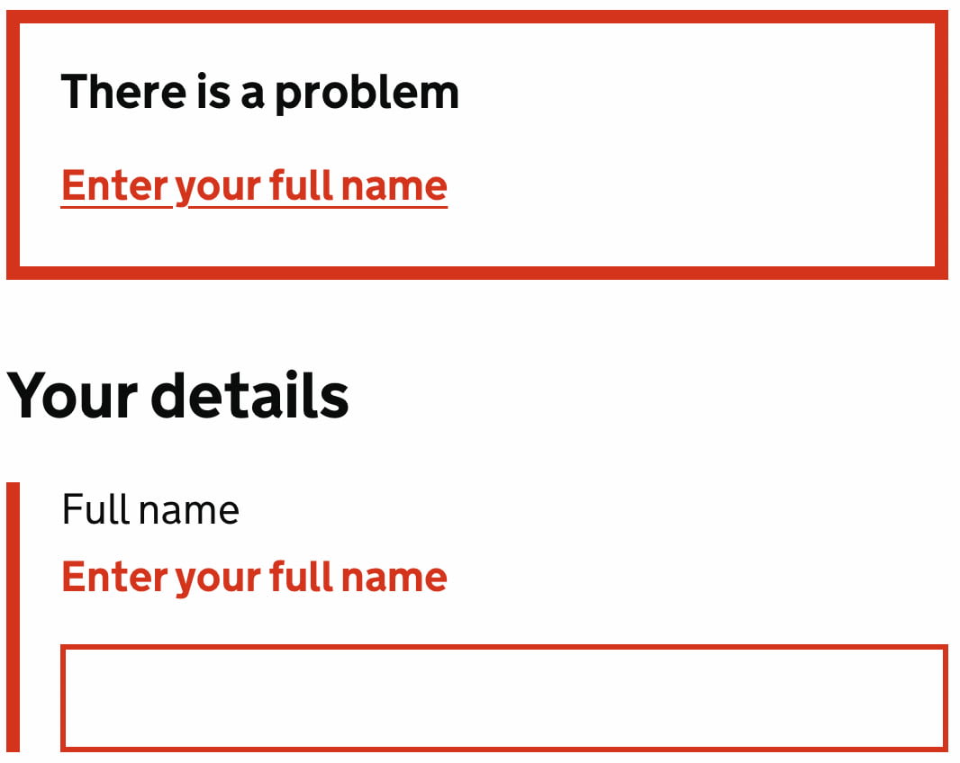
Validate on submit, and show error summary on the top. Gov.uk.
Simple, straightforward, accessible, easy to implement, and without any reliance on code to be working flawlessly to bring a disabled button back to life.
Wrapping Up #
If you need to use disabled buttons, consider ways to make them focusable and useful by also making them more inclusive and providing a way out for customers to send all the details to the customer support.
If you don’t need to make the buttons disabled, consider validating on submit and guide users directly to errors with sensible error messages. Either way, inline validation can be helpful in giving users a sense of progress as they are making their way through the form, but make sure that users can proceed even if inline validation fails.