Inline Validation UX
Inline validation in web forms is useful when it works, but frustrating when it fails. Too often it leads to an endless stream of disruptive error messages or dead-ends without any chance of getting out. Let’s fix it.
Undoubtedly there are major advantages of inline validation in forms. Most importantly, if an input expects a particular type of content, we can flag issues immediately, so users can fix these issues rather than operating under a wrong assumption.
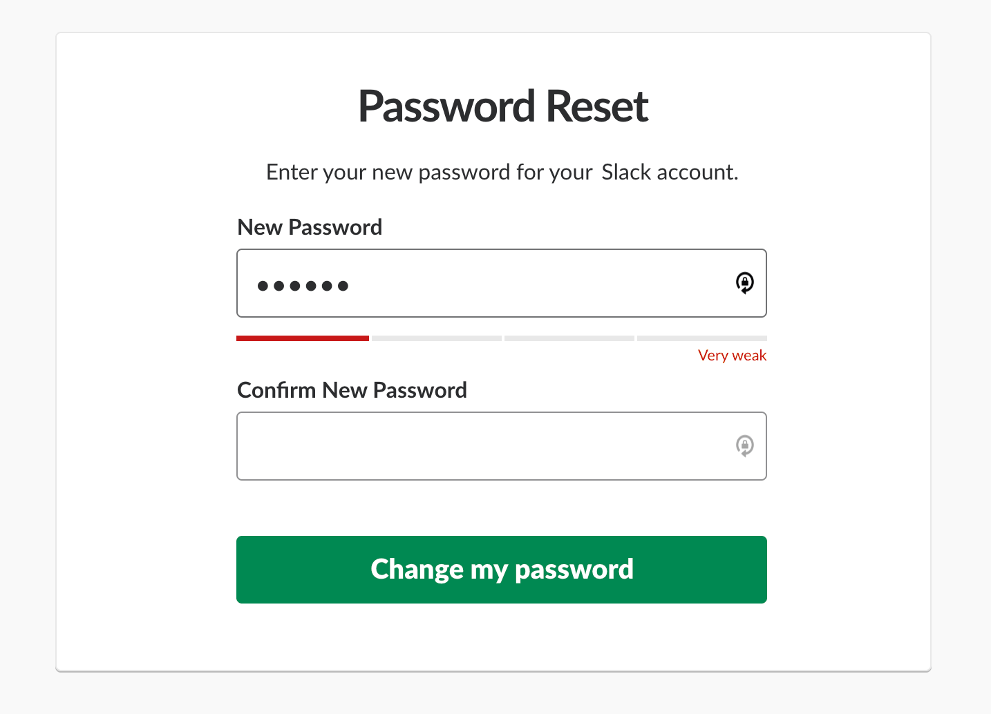
Inline validation works well as a password strength meter.
However, inline validation can be problematic. Mostly because often we can’t really validate just-in-time when errors occur, and the reason for that is that we can’t really know for sure when the user has actually finished their input, unless they explicitly tell us that they have.
Clicking on a “Submit” button is a clear signal that users think they are done, but our implementations usually consider leaving an input field as a strong signal, although it’s merely an assumption, and often a wrong one.
Surely we don’t want to show “wrong” errors — when a user skips a field, or glitches in our interfaces that creep when we bake in some assumptions about what the user behavior is likely to be. The problem is that usually our assumptions are wrong.
How People Fill In Web Forms #
When we think about inline validation, we usually think about the error recovery speed. If we validate as users are typing, we should be able to help them fix errors almost immediately. However, as it turns out, when filling in a particular input, some people never look at the screen — they look at the keyboard, and specifically at the keystrokes that they are about to type.

When should the error message appear? On submitting the data, or when a user leaves the field? From Carbon Design System.
When filling in any complex input — be it lengthy coupon code, VAT number, IBAN number, or a credit card number — we often follow pattern matching. Rather than filling in the entire string at once, we either copy-paste characters in chunks, or fill in the input in steps. Premature inline validation disrupts that pattern, causing errors and a healthy dose of frustration.
Also, inline validation is supposed to help users make sure that they don’t miss anything important, yet just before moving to the next steps, many people — despite green checkmarks all over the fields — review their input meticulously.
Users do trust inline validation, but usually they don’t trust it enough to prevent severe errors — the errors that go beyond simple formatting issues. So users review, field by field, watch out for typos, double check if auto-filled values are right, and try to spot any kind of outdated data. The correct format of data doesn’t mean that the data is accurate.
The Downsides of Inline Validation #
In fact, these are some of the typical problems that often come up with inline validation:
-
Live validation always interrupts users. A user is trying to answer the question, but error messages keep flashing in front of them.
-
Live validation often kicks in too early or too late. Errors appear either when the user hasn’t finished their input yet, or she has moved to the next input field. Both of these options aren’t ideal: the user is focused on the next question, yet we prompt them to fix their previous answer. Live validation is often unreliable. The correct format of data doesn’t mean that the data is accurate. Even though an inline validator might give a user’s input green light, it can still turn into an error once the input has been validated on the server.
-
Validation rules aren’t error-prone to exceptions. They rarely include a wide range of exceptions and custom rules. They are often based on common assumptions that will eventually fail for some users.
-
Often error messages are removed too late. While the user is editing their input, often error messages remain until the user has left the input field. This leaves users in the dark as they think they’ve fixed the problem, but the interface doesn’t react accordingly.
When Inline Validation Works #
We’ve learned over the years that premature validation on focus isn’t useful. When a user just focuses on an empty input field, it doesn’t make sense to display, before users even get a chance to type anything.
So we have only two options: we either validate as users type (live validation), or after they’ve left the input field (late validation). As it turns out, in both cases, the experience can smoothless when there are no errors, and can be somewhat frustrating when things go wrong.
1. Show Errors For Empty Fields Only on Submit #
How and when do we validate an empty input field? The user might have indeed overlooked the input field, so we should be flagging the mistake early. But they might as well just jump in a wrong field and leave it right away. Or they had to jump back from one field to the previous field to correct an error. Or they just had to clear up their input as they copy-pasted the wrong thing.
In my experience, whenever we try to validate empty fields, too often we will be wrong, pointing out mistakes prematurely. Instead we could show error only when a user is certain that they are done with their input.
2. Reward Early, Punish Late Pattern #
If a user chooses to change previously validated input, we need to decide when we start and when we stop validating that input. That means, that we need to track the state and contents of each input field, and have thresholds for when we start validating, and then have rules for changing input fields that have been validated already, or that contain errors.
As Mihael Konjević wrote in his article on the Reward Early, Punish Late pattern, if a user edits an erroneous field, we should be validating immeditely, removing the error message and confirming that the mistake has been fixed as soon as possible (reward early).
However, if the input was valid already and it is being edited, we need to wait until the user moves to the next input field and flag the errors then (punish late).
As it turns out, the implementation isn’t trivial, and making it work in a complex form will require quite a validation logic that might be difficult to maintain if some fields have dependencies or show up only in certain conditions.
3. Allow Users to Override Inline Validation #
Because inline validation is never bulletproof, we could try to give people a way out when inline validation fails. That means adding an option to override validation if the user is confident that they are right.

What happens if the validator doesn’t know the address? We can allow users to override validator in some cases.
Then measure for a few weeks just how much money the company loses due to wrong input and how much money the company earns due to an overly aggressive validator. This will give you a comparison to see how costly inline validation actually is.
4. For Short Forms, Consider Validation on Submit Only #
Inline validation is indeed very helpful, but it might be a good idea to test its alternative — validation on submit only. With it, users are never distracted or annoyed and have full control over when their input is validated.

Many shorter pages tend to perform better than one long page. We can frame them as a part of the journey with a task list pattern.
The pattern doesn’t seem to work well for lengthy pages with many input fields. There, users often end up typing a lot of unnecessary data before they realize that their initial input wasn’t really applicable. Shorter pages usually perform better than one long page.
So for shorter forms, a better way to deal with complex journeys is to simplify them:
-
Split a complex form into small tasks = pages (with the one-thing-per-page pattern;
-
For every page, validate only on submit, as users are moving to the next page;
-
Don’t require a particular format and accept any input that’s unambiguous — the rest can be done as a post-processing step;
-
Provide users with a task list pattern and support navigation between them, with the option to save input and continue later.
Wrapping Up #
Inline validation is useful, but when it fails, its costs can be quite severe. With just-in-time validation, reward-early-punish-late-pattern and validating on submit, we avoid unnecessary distractions, complex logic and layout shifts altogether, and communicate errors without annoying users too early or too late.
The downside is of course the error recovery speed which certainly will be slower. Yet in the end, the number of errors might drop just because users are never distracted as they type. And that might be just enough to reduce the overall frequency of errors and increase completion rates.