Language Selector UX
How difficult can it be to design a bulletproof language selector? We need to avoid redirects, decouple our presets and allow for overrides. It doesn’t sound too complicated, but it can be.
Imagine that you’ve just arrived to Tokyo. Full of impatience and excitement, you are just about to hit the road, yet there it comes: an urgent warning from your mobile provider, nudging you to top up your dwindling balance.
There isn’t anything cryptic on Stripe, with a popover, allowing users to jump to a different country in the footer.
With some justified concern you head to the website, just to be redirected to the Japanese version of the site. You can’t read Japanese just yet, yet there is no option to change the location, and there is no option to change the language either. As the data keeps dwindling, you juggle between auto-translation and your VPN options — just to run out of data in the middle of the session.
So, how do we fix it? By decouping presets, allowing for overrides and providing users with choice.
Decouple Location and Language Selection #
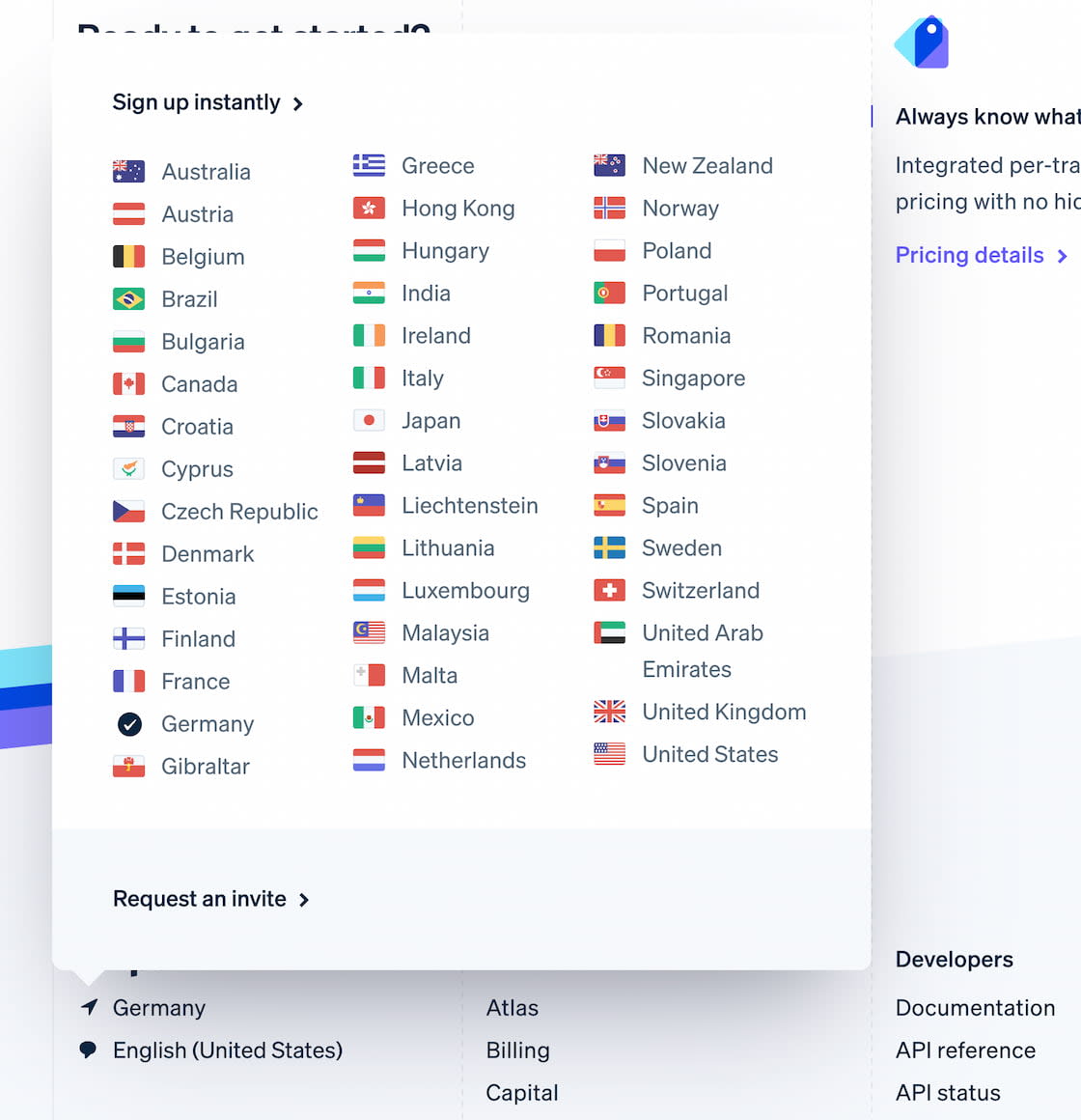
Many websites rely on an assumption that location, language and currency are tightly coupled. After all, if a user chooses a location in Germany, they are very likely to prefer German language and see prices in Euro. However, this is based on assumptions that would work for many people, but break the experience entirely for some others.
The language and country selection are decoupled on AirBnB. Large view.
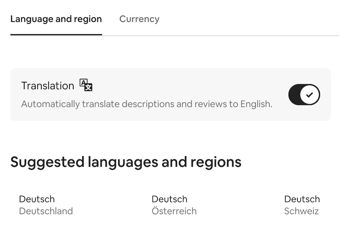
AirBnB suggests languages and regions in groups, but also allows users to adjust their preferences and choose a language and region of their choice. Additionally, users can opt-in to automatically translate descriptions and reviews to English.

SSGA goes an extra mile with settings for roles and types of sites. Large view.
Some slightly different preferences can be defined on the State Street of Global Advisors. On the first visit, a modal window appears explaining to users some of the assumptions that the interface is making about the location and their interests. Within the modal window, users can change a location, specify their role and choose a preferred type of the site for their visit.
Use Flags For Countries, Text Labels For Languages #
When designing a country selector, it feels almost natural to think about the flags they are represented by. After all, compared to just plain text, it should be much easier for users to locate the icon that they can immediately recognize. This is indeed true, however, as James Offer has suggested in his wonderful blog on Flags are not languages, flags are specific to countries, but languages often cross borders.
To avoid misunderstandings, make sure that you use flags if your users need to select a specific country. However, if you’re providing users with a choice of a specific language, then flags are probably not going to work well. There, an autocomplete with all available countries and labels for languages written next to them might work better.
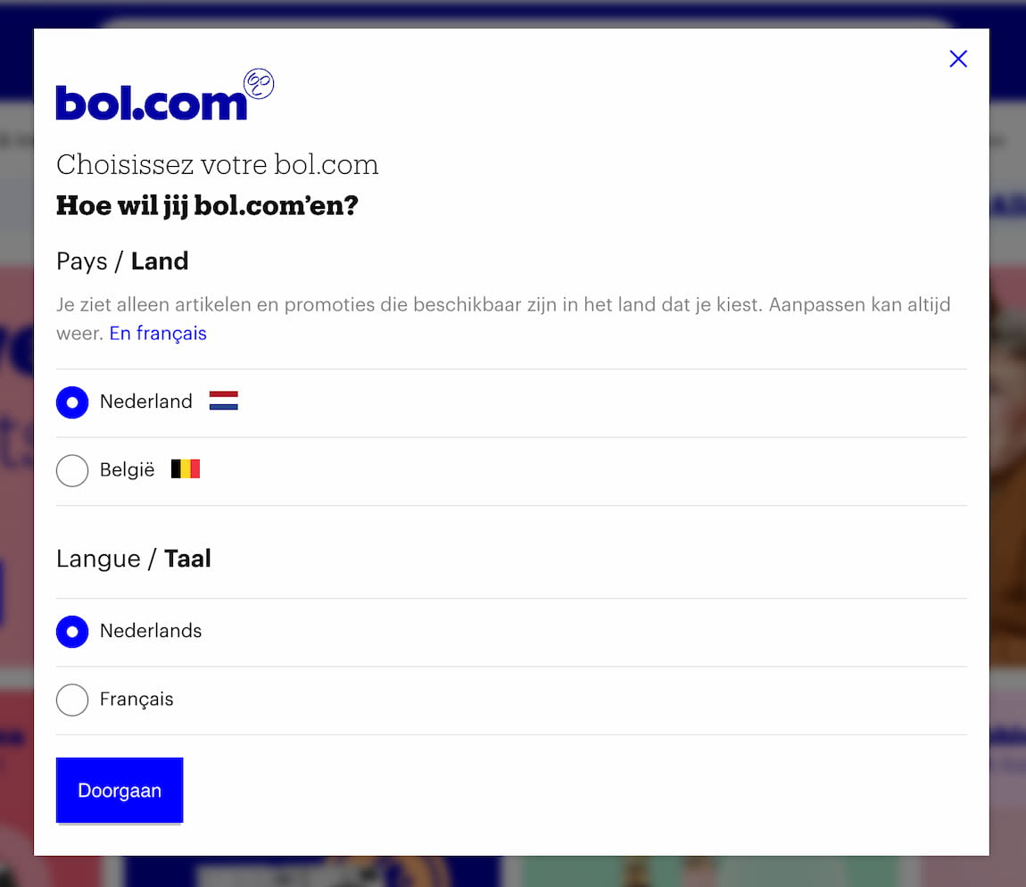
BOL shows a modal window asking for a language and a destination separately. Large view.
Flags for countries, and plain text for languages. Everything seem to be about right on Bol.com. The country selector (with a flag) is located in the right upper corner, where most users expect it.
A Case For Non-Modal Dialogs #
Admittedly, modal windows are rarely a good idea. They are disruptive and annoying as they require immediate attention. They might be appropriate when we need to draw user’s attention to important details, but nonmodal dialogs are less intruding and more friendly.
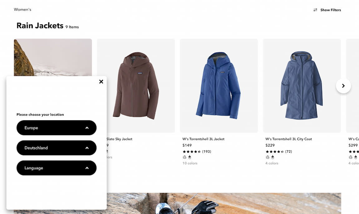
Patagonia uses a nonmodal window, and never blocks scrolling or copy-paste. That’s friendly. Large view.
Upon website entry on Patagonia, a non-modal window appears in the left bottom corner. Users can choose location and language and save their preferences as a cookie. They can also always bring the selection back by accessing the preferences bar in the footer.
Click-Through Menu For Countries #
Navigating dozens of options in a small overlay, or even a large modal will be a bit cumbersome and require a healthy dose of scrolling. So it’s not very surprising that often websites present all available options on separate pages, broken down by regions and sometimes illustrated with country flags.
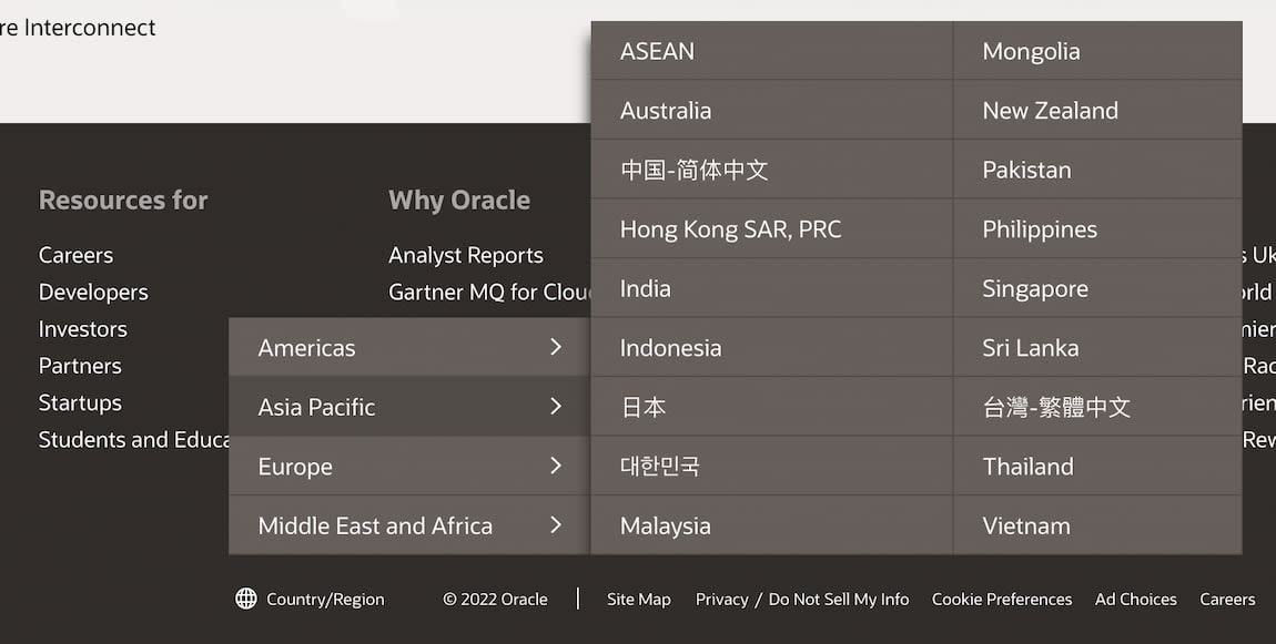
Oracle with a click-through menu located in the footer of each page. Large view.
However, a slightly different kind of country selector on Oracle: a click-through menu that covers the page, with all countries grouped, rather than displaying a standalone page. That’s a very compact and straightforward solution.
Use Autocomplete Suggestions #
Getting autocomplete right isn’t an easy task. For it to work well for a country selector, we need to support frequent abbreviations, endonyms and shorthands for all available options. And then, of course, our autocomplete suggestions should display both countries and languages, with an option to choose one option or another.
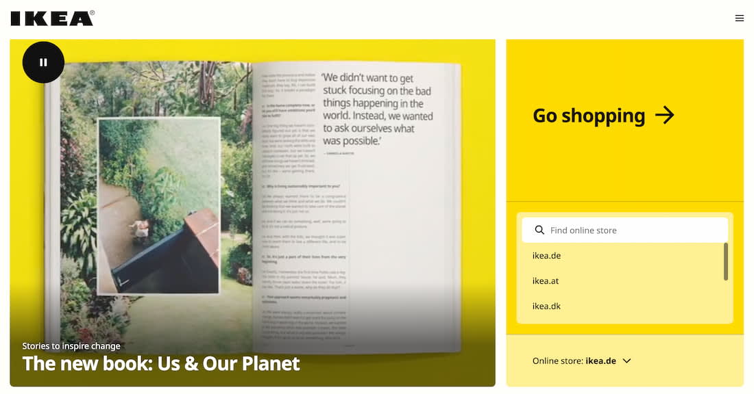
IKEA goes big with its country pre-selector on its homepage. Large view.
IKEA doesn’t use an automatic redirect, but a generous country selector that understands domains, endonyms and languages of the largest countries in the world. The “Go shopping” button might be the biggest button in the world and might deserve a spot in the World Guinness Records Book. Unfortunately, on the site, you can change the country, but not always the language.
The Globe Icon Instead of Flags #
Since flags can be somewhat problematic, what would be a reasonable alternative to them? We can use icons such as “Globe” or “Translate” to indicate the choice of locales. Flags do work slightly better, but both icons are fairly well understood and avoid all the issues outlined above.
Atlassian nudges users to switch to another language, based on their IP. Large view.
On Atlassian, the language selector is tucked at the very end of the page in the footer, with a globe icon indicating the selection. However, if the user with a different browser language preference enters the site, it suggests to change the language at the very top of the page, with a globe icon appearing there, too.
Wrapping Up #
The country and language selector might appear like a quite trivial task, but there are plenty of fine details that make or break the UX. When designing one, always decouple presets and reduce assumptions. Users expect the language selector to be located in the header or in the footer of each page, and they often watch out for flags, “Globe” or “Translate” icons to find it.
If you have just a few languages, a drop-down overlay might be perfectly enough. If you need 10–15 languages, perhaps it’s worth exploring the option of a non-modal overlay with autocomplete. If there are even more options to display, consider using a standalone page, with countries grouped into tabs or accordions.


