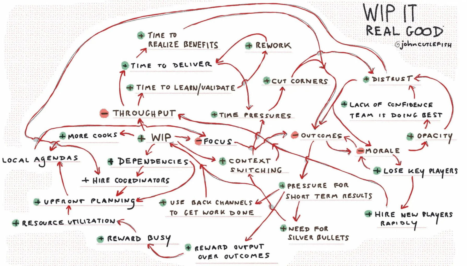
Six Ways To Speed Up Navigation
Navigation often feels extremely slow and frustrating. We can change that with smart breadcrumbs, navigation shortcuts and navigation billboards — so users can move between pages faster. Let’s see how.
In some interfaces, navigation feels extremely slow and frustrating. Users seem to be running in circles, heading through multiple pages, sections and sub-sites, being re-routed and redirected multiple times — often without a clear path forward.
How can we boost the speed of navigation, so users can move from one page to another more predictably, more reliably and more confidently? With smart breadcrumbs, navigation queries, and navigation billboards. Let’s find out how to do just that!
1. Navigation Billboards #
Every usability study reveals the same story: hiding important navigation is harmful, especially on pages where people tend to navigate a lot. On such pages, go an extra mile trying to always display important actions as cards or large buttons.
More important sections would be displayed at the top of the screen and take significantly more space — similar to a billboard.
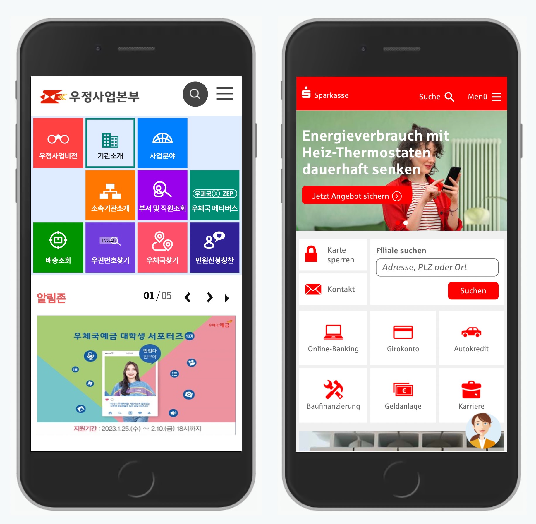
The billboard pattern in use: Koreapost.go.kr and Sparkasse.de.
Alternatively, scatter the navigation across the logo in the header, or dedicate an entire bar to display important navigation items. If you don’t have a lot of navigation, this might work well.
No need for hamburger icons. Display important navigation all the time: Moma.org and Typography.com.
Further reading: Never Hide Critical Navigation on Mobile
2. Breadcrumbs Dropdowns #
Breadcrumbs seem to be quite obvious at first. As users move from one page to the next, they leave traces of navigation, and can use them to return to where they are coming from. In practice, however, breadcrumbs indicate where the page lives, not where the user has been — in fact, they rarely match user’s journey.
Typically big jumps on a site require a mega-menu or search, but we could support more granular jumps by turning every crumb into a dropdown of its own. Users can then navigate between siblings of the current page or all children of its parent page without leaving the actual page. That’s how SBB does it.
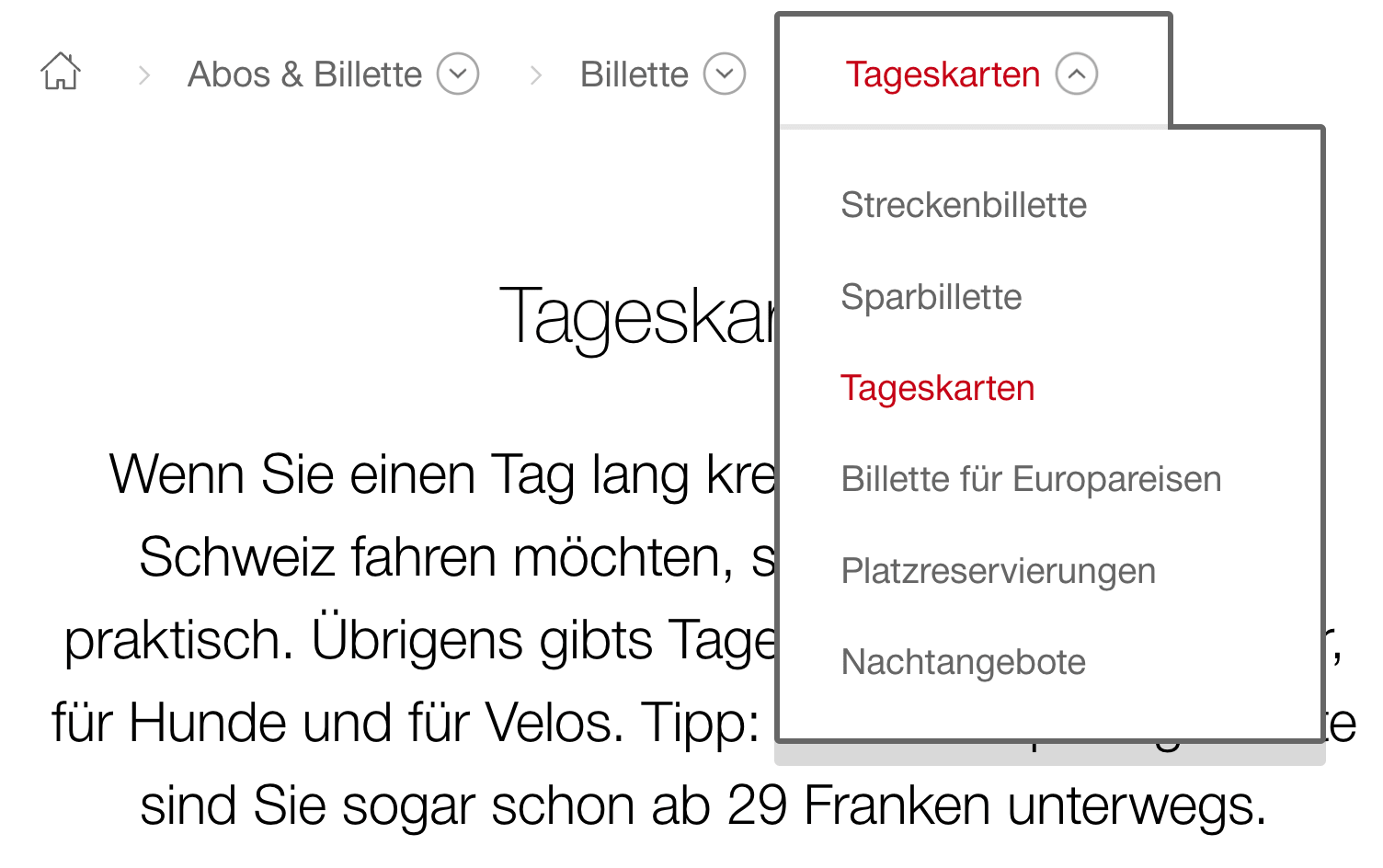
Extended breadcrumbs with drop-downs, allowing users to navigate sideways — all the way to the homepage. Example: SBB.
If you don’t have space to display a large sidebar navigation on your site, this approach can help as well. And it translate well to mobile as well — in pretty much the same way. Note: you need to display full path from the homepage as otherwise top level navigation wouldn’t be accessible.
Further reading: Designing Better Breadcrumbs UX
3. Skip Search Results Pages #
We’ve got accustomed to the idea of driving users to search results pages — pages with a huge list of links to choose from. But sometimes it’s absolutely unnecessary, and users could benefit from more refined jumps instead.

City of Amsterdam allows users to skip keyword search.
The website of the City of Amsterdam allow users to skip search results pages with smart autocomplete suggestions. Instead, users can jump straight to relevant pages or categories or even sub-categories. A good old-fashioned keyword search is supported as well
Further reading: Five Simple Steps For Better Autocomplete UX
4. Navigation Queries #
We can help users construct just the right navigation path for their intent. We could show options to choose from and based on one answer, provide further options, all the way to the point where we bring a user to the page of interest.
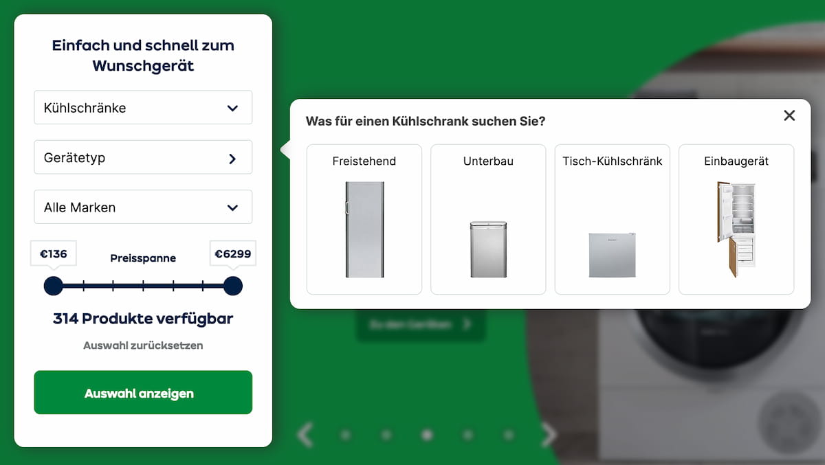
Users could jump straight from the homepage to a relevant selection of items, with filters applied. Navigation shortcuts on AO.de (now offline).
The pattern on AO.de has been providing a shortcut for users to jump from the homepage to a specific selection of relevant products with filters applied. Once an option is selected, another drop-down appears, allowing them to specify their intent even further.
This experience mimics the drill-down navigation with multiple levels. Yet the difference is that users are making small decisions, one after another, without being confronted with the entire navigation at every step of the way.
Further reading: Navigation Queries UX
5. A-Z Index Overlay #
One way to address complex navigation issues is by using an A-Z Index pattern. We identify the top tasks that users perform on the site. For each task, we define a set of keywords that they associate the task with. We run tree testing to ensure that they can find the pages that they are looking for. And then we show the A-Z catalog of keywords in a menu.

Visitors can quickly jump from any page to any other page on the Aarhus University website.
Aarhus University highlights the A-Z index as part of the global navigation. Visitors choose their role first, then choose a letter, and then explore the overview of all options, jumping to a specific department or faculty. The pattern requires rigorous curation and testing, but it can be remarkably fast!
Most importantly, visitors can quickly jump from any page to any other page. In this case, A-Z index is permanently accessible in the header of each page. That’s not something other navigation patterns provide out of the box.
Further reading: A-Z Index Pattern
6. Show (Mostly) Navigation on Navigational Pages #
It sounds almost obvious, but it’s not. On every website, some pages are mostly designed for reading, and others are designed to support navigation. If user’s main goal is navigation, it’s a good idea to show navigation prominently, rather than hiding it behind a "Menu" button.

Sections with links are well-understood, as long as labels are clear and well-tested. Example: University of Antwerpen.
The homepage and category pages are supposed to guide users to their page of interest, yet too often they are packed with carousels, featured items and recent news. University of Antwerpen prominently displays only navigation on navigational pages instead — with plenty of links for users to explore. You really don’t need much more than that.
Further reading: Designing Better Links UX
Wrapping Up #
The patterns above might help you speed up user journeys, but they don’t guarantee successful outcomes. Before exploring design patterns, we always need to spend time refining and testing navigation labels. We also need to indicate where users have been and where they can go next.
And of course, speed isn’t everything. But if we can avoid slowdowns and bring users to success moments faster, we should do so. And hopefully the design patterns above can help us do just that.
You can find more details on navigation UX in the video library on Smart Interface Design Patterns 🍣 — with a live UX training that’s coming up later this year.