Navigation Queries UX
In UX, we can use navigation queries, evaluation journeys, A-Z index and tap-ahead autocomplete to help users get where they want to be, faster. Let’s find out how.
Gerry McGovern once rightfully suggested that more people have been on the top of Mount Everest than have been to the 10th page of Google’s search results. This is probably true, yet usually our interfaces provide long lists of options, rather than a guidance to where the answers are.

Search usually returns a list of pages, but instead, we could display answers or guide people to these answers. Via Marcin Ignac.
As we try to solve a task at hand, we wander from one page to another, surveying the landscape with keywords, clicks, taps and selections. We rarely get the answers we need immediately though; instead, we discover the answers in a long-winded journey between pages and sub-navigation items.
It works, but it’s slow. To minimize the distance between intent and action, we can just ask users what they want and then assist users in their journey. That's when navigation queries come into play.
Navigation Queries #
The idea behind navigation queries is not new. We’ve seen all kinds of variations of madlib pattern and natural language forms, all of which present a human-friendly way to input their intent without having to use input fields or navigation menus.
The idea is to create a “query constructor” for user’s intent. In our interface, we could show options to choose from and based on one answer, provide further options, all the way to the point where we bring a user to the page of interest.

The navigation query pattern on AO.de provides a shortcut for users to jump from the homepage to a specific product of interest. Once an option is selected, another drop-down appears, allowing them to specify their intent even further.
This experience mimics the drill-down navigation with multiple levels. Yet the difference is that users are making small decisions, one after another, without being confronted with the entire navigation at every step of the way.

In the past, a navigation query pattern on Commonbond.co was providing a shortcut for users to jump to a relevant page.

Monday.com asks prospect customers to specify their interests, and then drives them to an onboarding flow that fits their needs best.
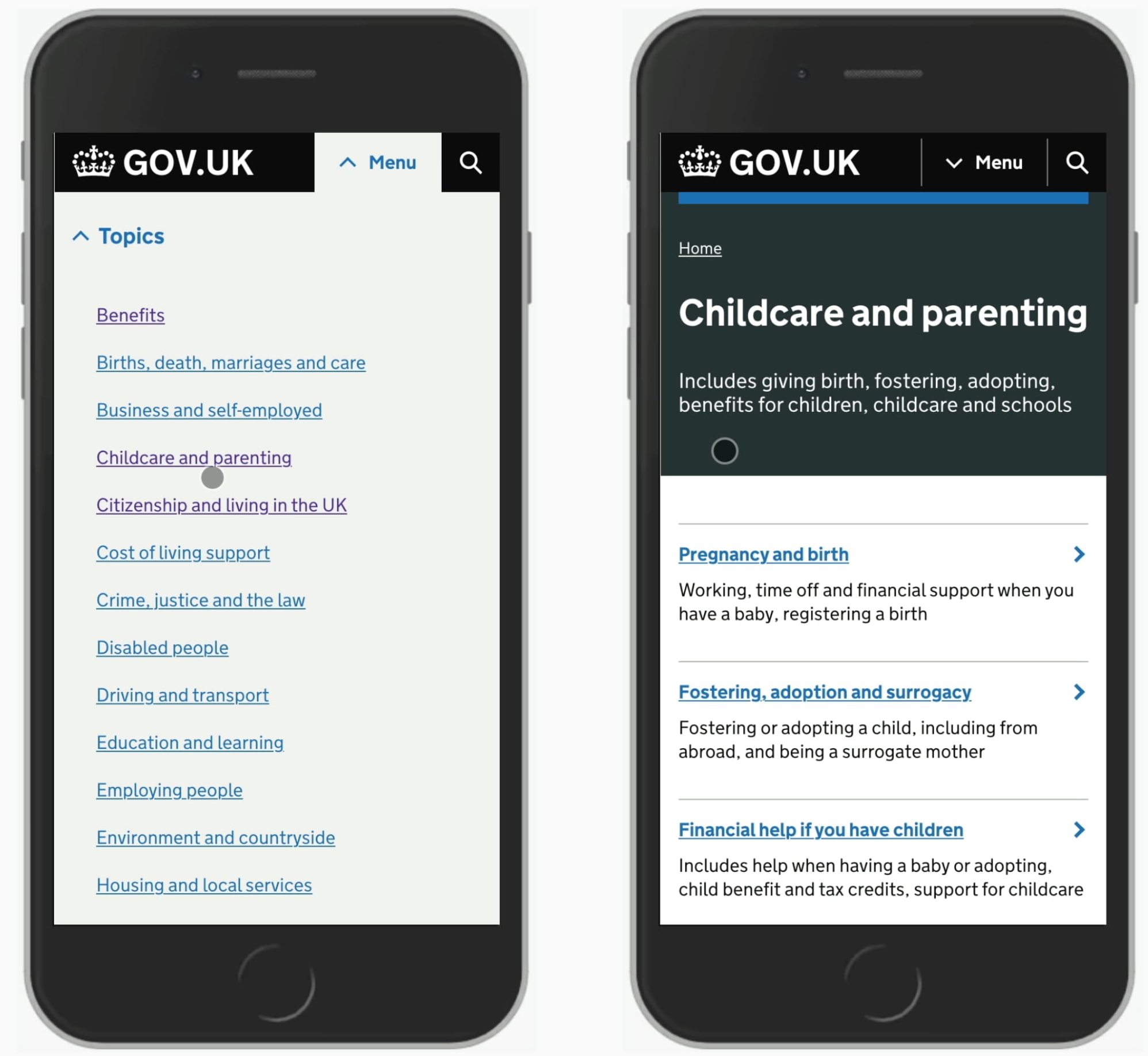
A-Z Index #
One way to address navigation issues on large websites is by using an A-Z Index pattern. We identify the top tasks that users perform on the site. For each task, we define a set of keywords that they associate the task with.
We run tree testing to ensure that they can find the pages that they are looking for. And then we surface the A-Z catalog of questions on a single page.

Visitors can quickly jump from any page to any other page on the [Aarhus University website](https://international.au.dk/
Aarhus University highlights the A-Z index as part of the global navigation. Visitors can choose their role first, then choose a letter, and then explore the overview of all options available, jumping to a specific department or faculty.
Most importantly, visitors can quickly jump from any page to any other page. In this case, A-Z index is permanently accessible in the header of each page. That’s not something other navigation patterns provide out of the box.
Tap-Ahead Autocomplete #
We tend to use autocomplete to highlight relevant keyword suggestions. Sometimes we also drive users directly to relevant categories, specific products or even collections of items or records. We can do even a little bit more than that.
Have you ever clicked on an arrow on the right hand side? That’s tap-ahead autocomplete in action, on Mediamarkt
With tap-ahead autocomplete, we allow users to construct a query based on autocomplete suggestions. As users hit the autocomplete field or start typing a keyword, suggestions appear. Users can either jump directly to the keyword, or append frequently used keyword combinations to their query, hence “constructing” their query based on the suggestions.
Tap-ahead minimizes the amount of effort needed for typing, but also drives customers to relevant results and gives them confidence that they are on the right track.

Stackoverflow allows its users to specify a query right in the search box, without having to rely on filters, tags or any other modes of navigation.
Wrapping Up #
When designing navigation, we often rely on predictable patterns. That’s a good thing as our outcome is usually predictable, familiar and hence obvious to our customers.
However, sometimes navigation might be just a bit too tiring and time-consuming, and in such cases we can use navigation queries to pick up our users whenever they are and gently guide them toward the page that is of interest to them. They are unlikely to help you resolve all IA issues on the site, but they could help users get where they want go be, faster.
A much more detailed article about all the fine details of carousels will be published in Smashing Magazine next week, so please take a look if you are interested.