Designing Better Breadcrumbs UX
Usually breadcrumbs don’t get much attention. But they can be extremely valuable for users when they need to navigate back. Let’s see how we can design a better UX with breadcrumbs.
Nobody gets particularly excited about breadcrumbs. Those tiny little crumbles that illustrate where a user currently is in the intricate hierarchy of the website. They might be unnecessary on smaller websites, but they can make a difference on complex websites.
When users come from search engines, messaging apps or social media, they need to understand where they are on the site. They might need to navigate forwards, backwards or sideways, exploring similar or related pages. In all these cases, breadcrumbs are invaluable.
So how can we make them more useful to our users? Well, here are a few ideas.
Breadcrumbs Work Best Under Global Navigation #
To help users understand where they are, breadcrumbs need to be visible to users. Ideally, we would place them right under the main navigation, or at least above the headings, easy to spot, find and use. This also indicates a clear connection between breadcrumbs and what they refer to, the current page.

On Australia Post Service, for example, various kinds of navigation need to work together. The primary navigation, the breadcrumbs, the sidebar and tabs. Users can jump between various levels, go backwards with breadcrumbs, move forward with horizontal navigation, move sideways with the sidebar navigation and switch contexts within sections with tabs.
Avoid “Disabled” Breadcrumbs #
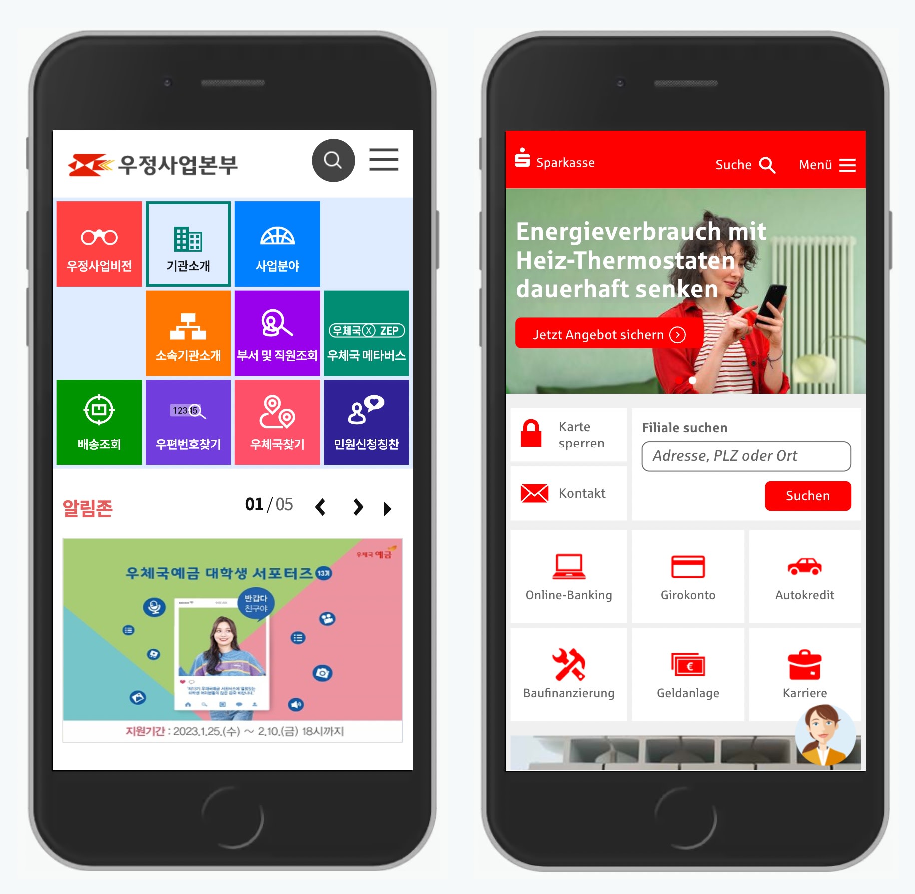
For legacy reasons, every now and again some breadcrumbs appear as links, while others are disabled, merely representing the location of a given page in the overall hierarchy.

In Sparkasse’s breadcrumbs, “Startseite” (Homepage) and “Karten” are actually links, but the sections in between are not. There might be very good reasons for this decision, but the general expectation is very clear: all breadcrumbs should be links, except the last one.
Breadcrumbs Should (Probably) Point To The Right #
In left-to-right-interfaces, relationships are usually indicated with icons pointing to the right. Because we usually consider browsing through pages as a horizontal experience on a timeline, we usually move from left to right.
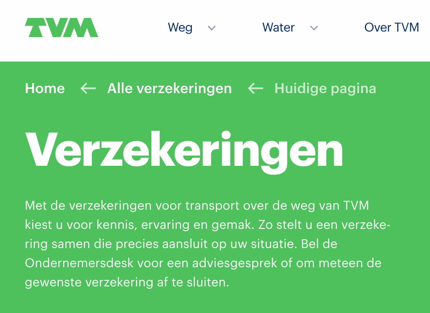
However, sometimes breadcrumbs point to the left, rather than to the right. On TVM, for example, arrows reluctantly point to the left. Since breadcrumbs are usually explored right to left, the icons indicate where a particular section or page belongs to.
We all would probably point to the right, since it’s more conventional. But in usability tests, we couldn’t find any preferences or differences at all. While it might not matter that much, pointing to the right is more familiar to most people.
Distinguish Between Links and Text Labels #
If a component in the UI behaves differently or serves a different purpose, we make it stand out by highlighting it in some way. In the case of breadcrumbs, there are two different types of crumbs: the current page (if we choose to display it), and the breadcrumbs on the path to that page.
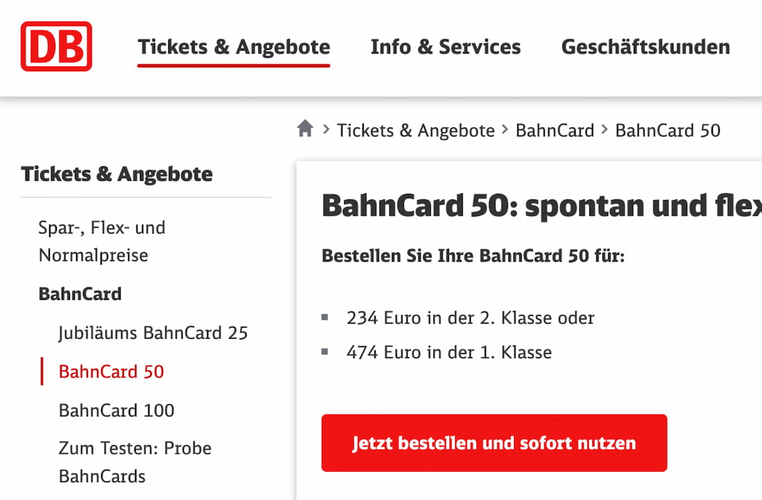
On Deutsche Bahn, the styles for text labels and links are identical — unless you start hovering or tabbing through the sections. Plain underlines would make it slightly more obvious.
Showing Current Page Might Be Unnecessary #
In breadcrumbs, current page shows where a user currently is, and there is no need to navigate there because the user is there already. If breadcrumbs live close to the main heading of the page, repeating them in breadcrumbs might be unnecessary.

Breadcrumbs on Gov.uk don’t include the current page. However, the futher away the breadcrumbs are placed from the main heading of the page, the more likely it is that the current page will need to be present in the breadcrumbs.
On Mobile, Use Breadcrumbs Accordions #
Websites with many levels of navigation often don’t have space to display the entire path with breadcrumbs. One common way to deal with this problem is to truncate intermediate steps in the breadcrumbs navigation, or show just one item at a time. However, this makes previous levels inaccessible.
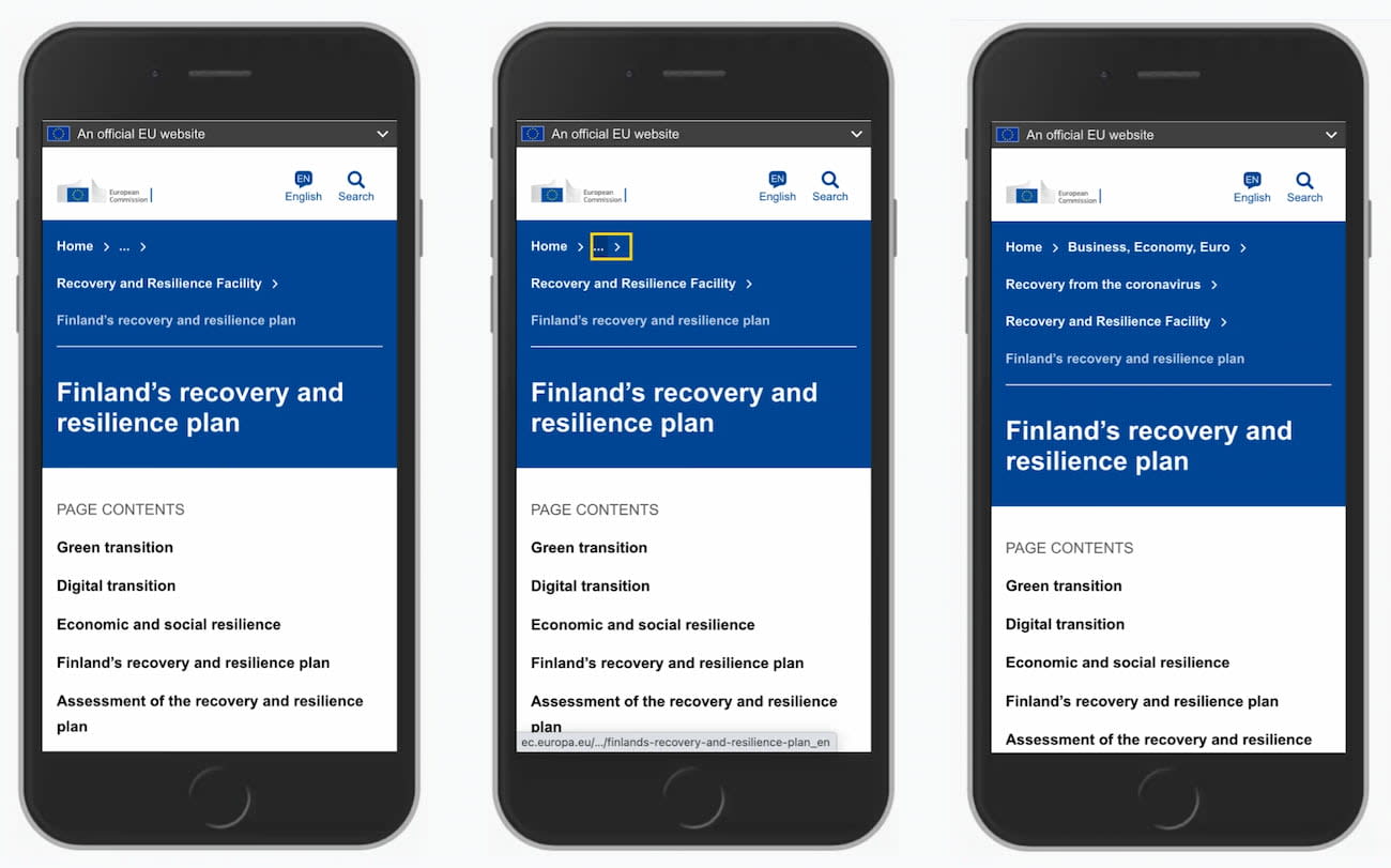
On the European Commission’s website, the parent category of the current page is always displayed in full, but the parents of that section are truncated. When a user taps or activates the truncated area (which is a link), entire breadcrumbs appear. Notice the visual difference between the current page (text label) and breadcrumbs (links).
Curtain Reveal Breadcrumbs #
Another approach on mobile is to try to show as much as possible with an option to show/hide breadcrumbs. This could be with breadcrumbs appearing on the same line, encouraging users to swipe left and right, or by encouraging users to tap around to the point of interest.

Use Sideways Breadcrumbs #
Often, breadcrumbs are mostly a static representation of the information architecture on the site. They support backward navigation, but moving forward or sideways always requires another click. There is an alternative way of helping users move forward faster.
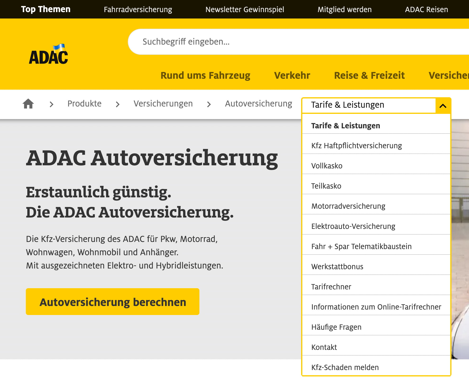
At ADAC, breadcrumbs are sort of extended — with a drop-down that allows users to jump to other sections within the category quickly. The last chevron in breadcrumbs might be missing to make the expected interaction perfectly clear, but the design pattern per se is useful since it significantly speeds up jumps between siblings.
We could even take it to the next level. Federal Administration of Statistics in Switzerland displays global sideways breadcrumbs that help users jump between different departments of the administration. The breadcrumbs are the first thing that users encounter on the site.
Wrapping Up #
Breadcrumbs alone aren’t enough. The aren’t sufficient to navigate the site easily and always complement existing navigation patterns, but can’t really replace them.
Every time we design breadcrumbs, we need to keep them visible without scrolling, create a clear relationship with the main heading and maximize the speed of interaction from intent to result. Not many components can do it as well as breadcrumbs do, so keep them close in your toolbox.