Five Simple Steps For Better Autocomplete UX
Always show autocomplete suggestions on focus, use tap-ahead suggestions and provide autocomplete filters.
Autocomplete! Their design seems to be almost obvious at first, yet there are some common usability issues that appear over and over again, preventing users from using them effectively. Let’s fix that — by exploring 5 autocomplete UX details where the design pattern can be improved.
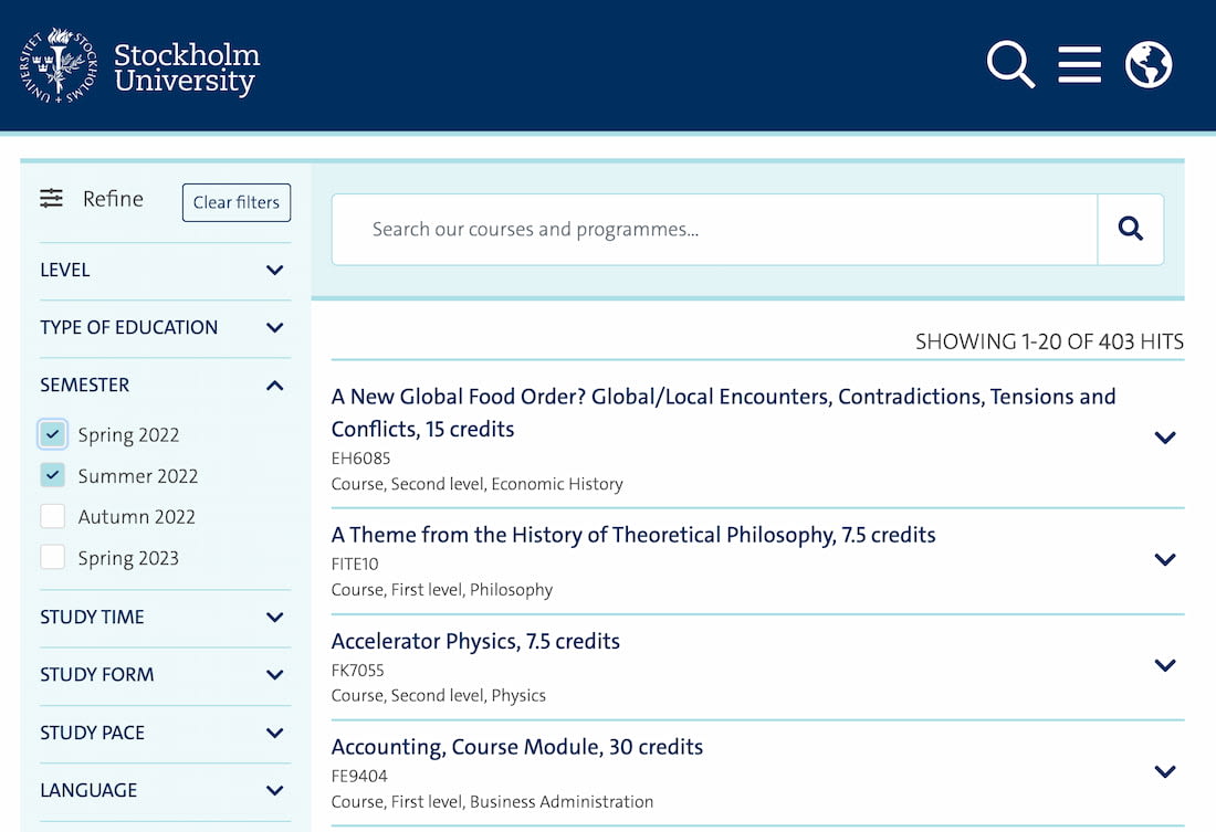
1. Always Show Suggestions On Focus #
When do we start showing suggestions? Typically, this happens after a few first keystrokes — and usually that’s a recipe for trouble. There will always be some portion of users who always look at the keyboard while typing — usually we just don't know how many people do so.

Almost perfect autocomplete UX from a lengthy series on forms by DKO.
Often it’s only after a user finishes at least some part of their input that they will verify it on screen. So if we display autocomplete suggestions too late, some people will never learn that your site provides an excellent autocomplete support.
We can indicate autocomplete with a search icon, or a chevron icon, as well as a sensible placeholder, such as “Select an option...”. It also works best to always display autocomplete suggestions immediately: with frequently used or most relevant options, for example. It’s just more obvious this way.
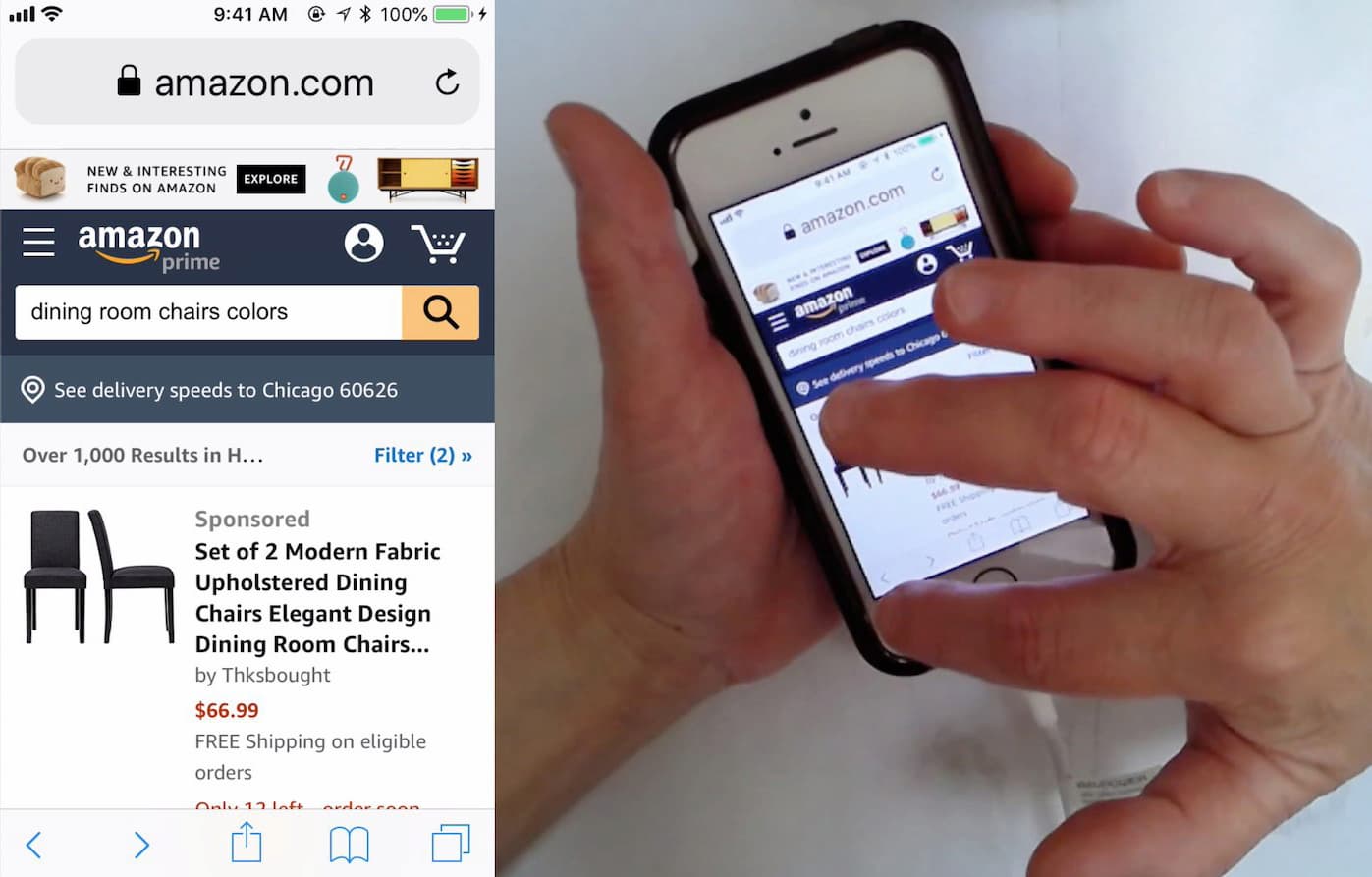
2. Use Tap-Ahead Autocomplete Suggestions #
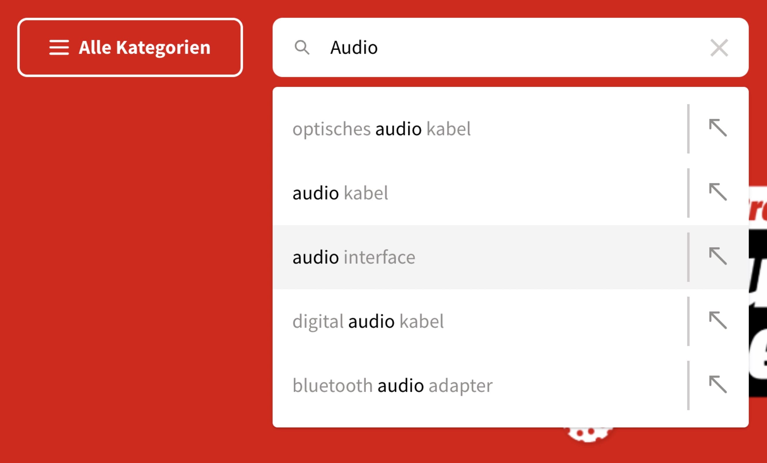
If you take a close look at the example below, can you spot the arrow on the right-hand side of keyword suggestions? Now, do you know exactly what they are, and how they are different from regular keywords? Chances are high that you don't.
One of the many: autocomplete suggestions by Mediamarkt, a German eCommerce retailer.
While the tap or click on the keyword will bring you to a search result page, the click on the arrow appends the search query to the search box, without executing search. So you can gradually construct a more sophisticated search query, relying on relevant suggestions. It’s useful as users can move forward confidently, and never end up on a zero-results page.
A much better way to display tap-ahead suggestions: with pills underneath the search box.
The problem is that this pattern has very low discoverability. Most people just don’t know how it works. A much better way to design this feature is by providing chips or badges underneath the search box, like the newer iteration of Google does. This pattern is often called tap-ahead suggestions — and it’s always a great add-on for every autocomplete.
3. Show A Diversity Of Suggestions #
We often assume that users are just looking for the right search query, but it’s not always true. The search box is often used as a shortcut strategy to get to a particular category or products, and we can help users get there.

Autocomplete can do more than just showing keywords: Prisma.fi, Hema.nl and IKEA
Additionally to keyword suggestions, we can show relevant categories, or even products with thumbnails, availability and pricing. Of course, they also need to include distinct icons and typographic treatment to be recognized as such.
Showing a diversity of suggestions helps users get where they need to go, faster — and it might work very well as an additional way to expose featured products. In fact, users might appreciate this feature very much.
4. Provide Autocomplete Filters #
If a large number of your users are expert users, consider turning the search autocomplete into a sophisticated query builder — with filters, sorting and attributes that can be defined straight from the search box.
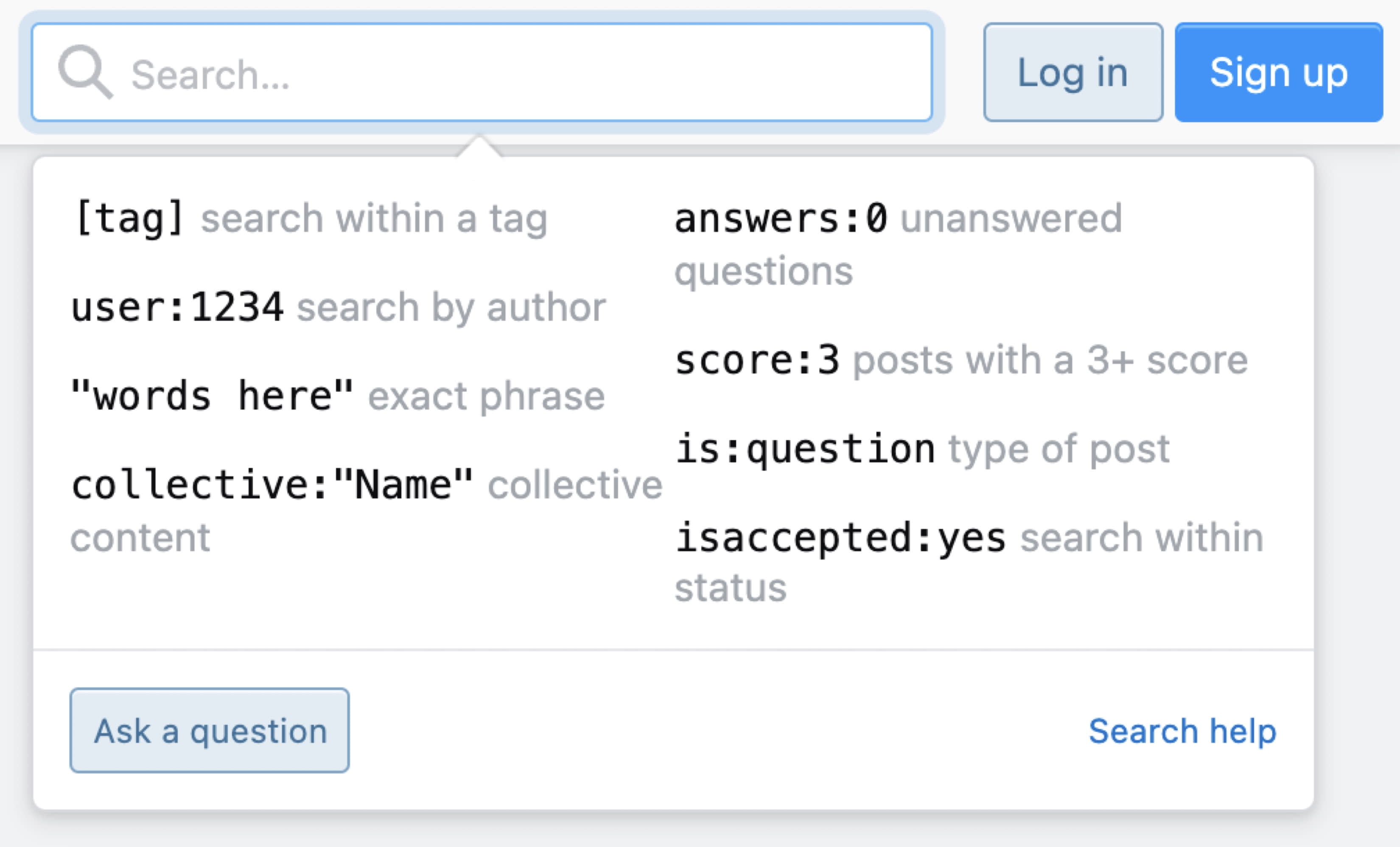
On Stackoverflow, users can define filters for search results directly: by specifying the status of a question asked to tags and the number of answers, with a special pre-defined search query syntax.
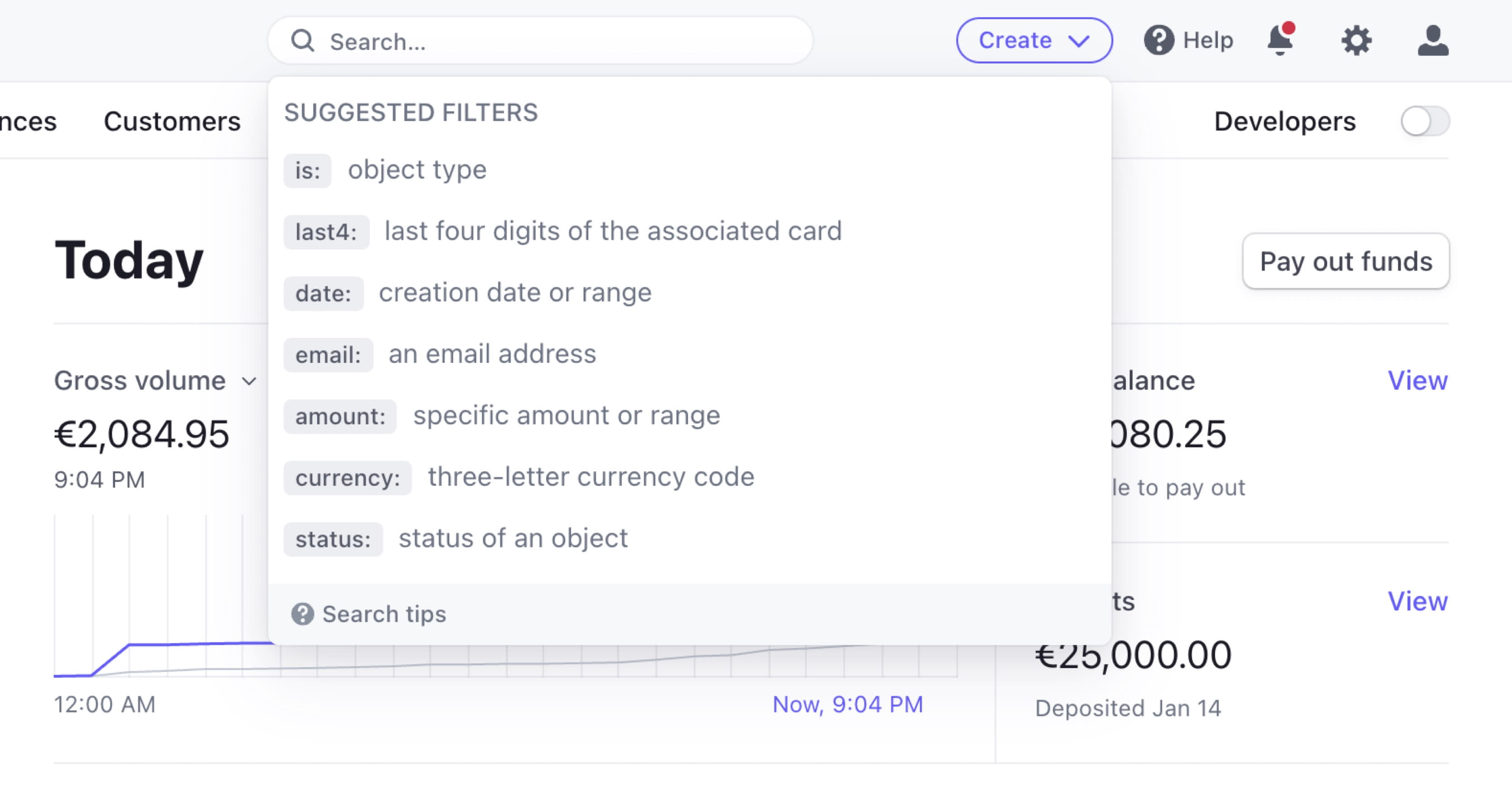
Stripe follows a similar pattern, with suggested filters and search tips that allow expert users to not only search, but also reduce the scope of search straight away. It might be a bit too complex for new users, but just what is needed for experts.
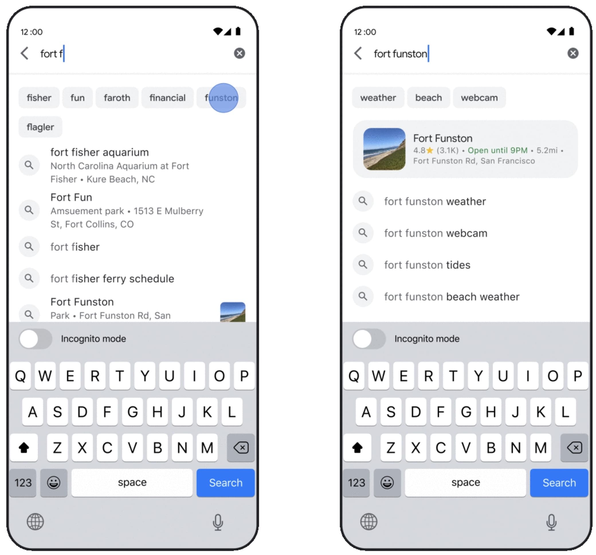
5. Support Keyboard Navigation #
It’s worth stating that a good autocomplete UX always supports keyboard navigation. Usually users would use Up/Down keys to navigate the list, and Enter to submit a search query. This of course requires a selected search query to be highlighted during navigation in the list, and the search suggestion should be announced by screen readers as well.
Autocomplete from start to finish, a thorough guide by Adam Silver.
You can find an example of an accessible autocomplete component in Adam Silver's article on Building an accessible autocomplete control, along with the markup, CSS, JavaScript and a working demo.
Wrapping Up #
Autocomplete can do much more than just highlighting keyword suggestions. By showing suggestions on focus, using tap-ahead suggestions, exposing users to relevant details from the search box and allowing experts to make the best out of the results before even executing search, we can make autocomplete more efficient and relevant.
The main benefit of autocomplete is the increased speed of accurate and relevant input. Once users know that there is autocomplete, and understand how it works, we can help them increase task completion rates and task completion speed. And that’s something not many component can do as well as autocomplete does.