Drag-and-Drop UX: Guidelines and Best Practices
Guidelines for designing a better drag-and-drop UX. With practical guidelines on accessibility and design states.
Drag-and-drop is not a trivial user interaction. It’s messy, inaccurate and comes in plenty of flavors — from design states to interaction modes. Yet when we think of drag-and-drop, we typically think of a simple drag’n’drop file upload — which is only one of the many contexts where drag-and-drop appears.
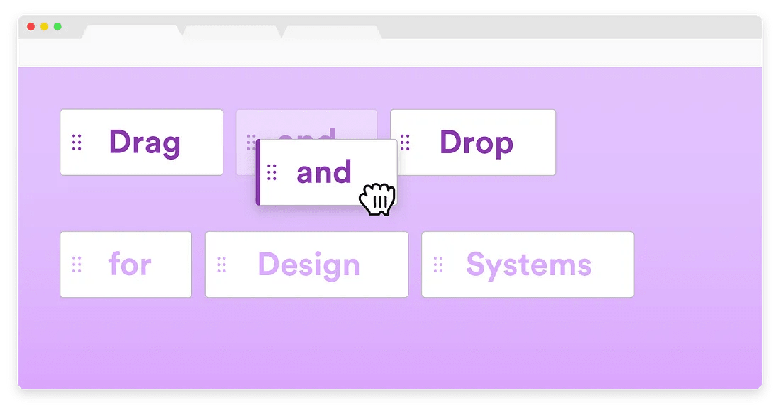
Drag-and-drop requires cursor changes and a “ghost” image of the component. From Drag and Drop for Design Systems by Grace Noh.
Yet every time we need to re-order a list, or move around cards, or reshuffle columns in a fancy enterprise table, we’ll probably be dealing with drag-and-drop interactions. And too often, they will feel too sluggish, too difficult to use and absolutely inaccessible. Let’s fix it.
You can find more details on navigation and interaction design in usability chapters in the video library, with a new UX training coming in September 2023.
1. Drag-And-Drop Should Resemble Physical Movements #
It’s not surprising that many users expect drag-and-drop to feel very much like the offline experience of moving physical objects from one place to another. With it come expectations around everything from lifting an item and moving it to spotting available “drop zone” and eventually dropping an item there.
In fact, there are plenty of states to consider:
-
states for components: resting, lifted/grabbed, in transit, dropped, erroneous and successful.
-
states for the drop zone: empty, hidden, revealed, disabled, ready and contentful.
-
other states: changes in drag handle and grab cursor, but also adjustments of drop shadows and drop targets.
Each of these states must be designed with affordance in mind, and provide instant feedback for the changes made — whether they are possible or not.
2. Use The Right Cursors and Grab Handles #
If a UI component doesn’t provide any clues about its support of drag-and-drop, we shouldn’t really expect users to discover it on their own. This is similar to right-click interactions which, without any clues, often have a very low discovery rate. With drag-and-drop, the cursor should change on hover to indicate that tapping or clicking will initiate a grab.
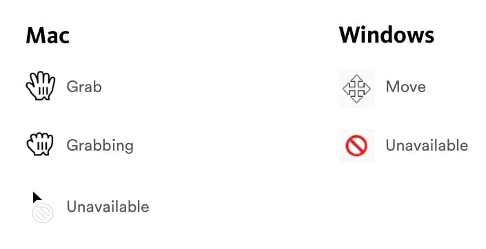
Cursors we can use to indicate drag-and-drop on Mac and Win. From Drag-and-Drop in Design Systems.
This isn’t enough though. Hover alone assumes that users will discover it on their own, which will not be the case for keyboard users. The component must also be focusable and include a focused state — along with controls to move the component. To be on the safe side, we can clearly indicate for each item that it can be dragged by adding a “grab” or “move” handle on it.
The mouse cursor could change to indicate that an item is being dragged — from the “move” or “grab” cursor (which indicates something can or is to be moved) to the “grabbing” cursor (which indicates that something is being moved).
Usually there is no need to reinvent the cursor and design an entirely new set of drag-and-drop icons.
3. Elevate Lifted Items With Drop-Shadow and Tilting #
Whenever we are moving an item from one place to another, we almost instinctively follow a pattern that we are used to in physical spaces, too. We lift an item, move it, make space for it, drop it to its new spot. Each of these movements is familiar and obvious — and on the web, we can imitate it, too.
In UI terms, that means “lifting up” an item towards a user once it has been grabbed, in the z-dimension. Not only does the item then stand out from the others; the elevation also indicates that the item’s state has now changed. In fact, it could be achieved in a few different ways:

Tilting cards on drag action when moving items in Trello.
-
Add a drop-shadow to add depth and elevation,
-
Add an outline around the component,
-
Slightly tilt the object (Trello pattern displayed above),
-
Leave a “ghost” image where the component used to be.
Whatever options you choose to use, consider also using indentation with some horizontal and vertical offset, so the item appears quite different from the items that are currently in place. This will help avoid confusion when you need it the least.
4. Collapse Large Items Into Summaries #
And here comes the never-ending question: as the item is being dragged, when do we actually remove it from its original position? This seems like a question with an obvious answer, but there are 5 important considerations which every drag-and-drop experience might need to consider:

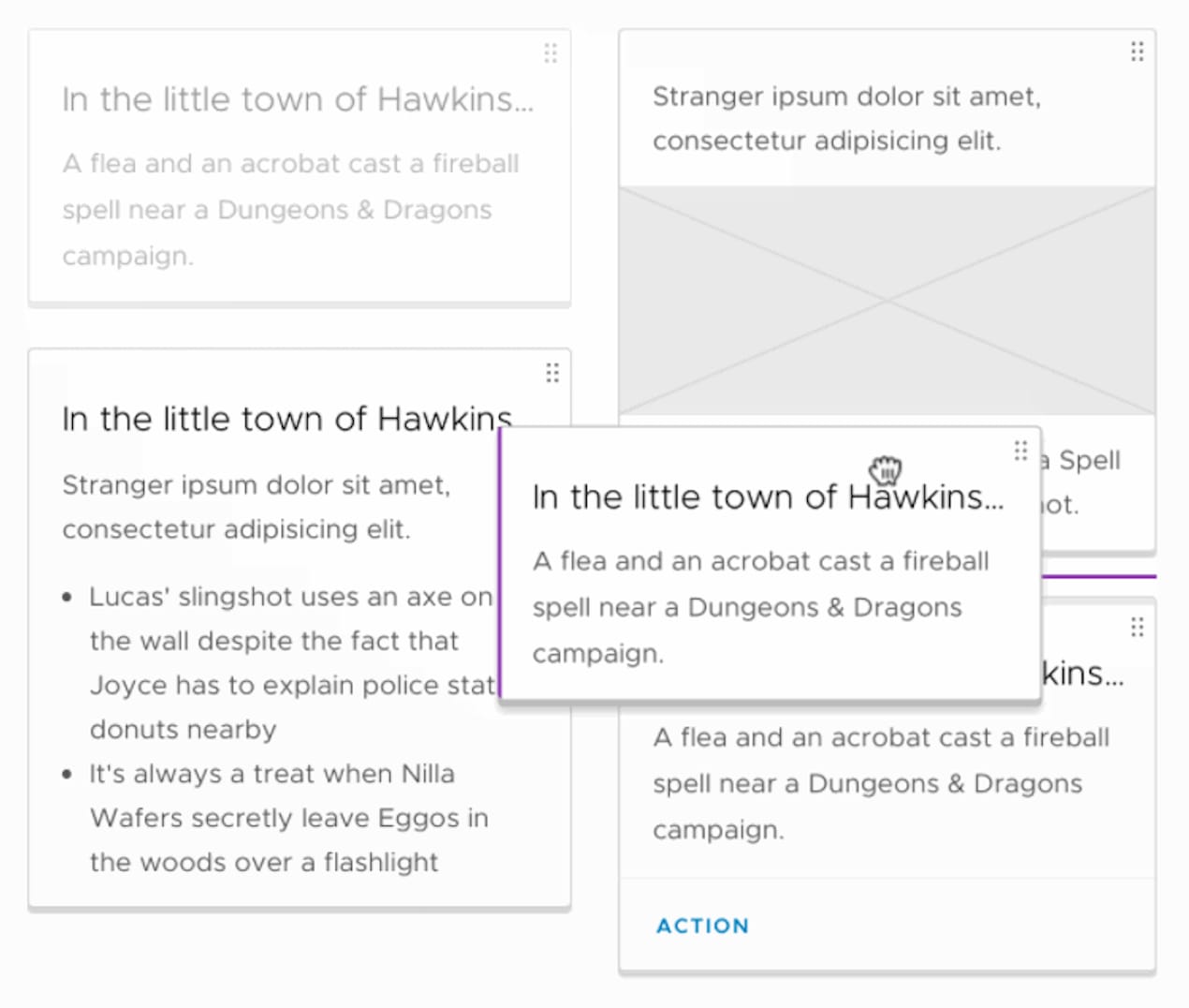
Collapse a grabbed item into a summary as it’s being moved. Example: Gmail.
-
A dragged item should follow user’s movements immediately.
-
Always leave a ghost image of the component to indicate where it used to be.
-
As the item is being moved, make sure it stands out from the rest of the list.
-
For large items, collapse them into a summary of the contents.
-
Remove the ghost image on drop, but support undo.

Google Drive shows where the folder used to be, what is in transit and highlight an area which would capture it once it’s dropped. No surprises here.
The summary pattern seems to work best when we are moving large columns, rows, files or large chunks of data as otherwise they would pollute the entire screen. For smaller items, such as relatively small cards or list item, we don’t need to collapse into summaries, and can move the item directly across the screen.
5. Reshuffle Items Center-Out #
As items are travelling across the screen, eventually we also need to either “capture” them in a drop zone, or move other content out of the way to make room for them. Usually we change the drop zone to a "ready” state to indicate that it’s ready to capture the dropped content.
With other components, we usually push items out of the way and use a visual indicator to cue the change (with a horizontal line or a temporary empty card). Both give users a preview about where the item will land once it’s dropped.
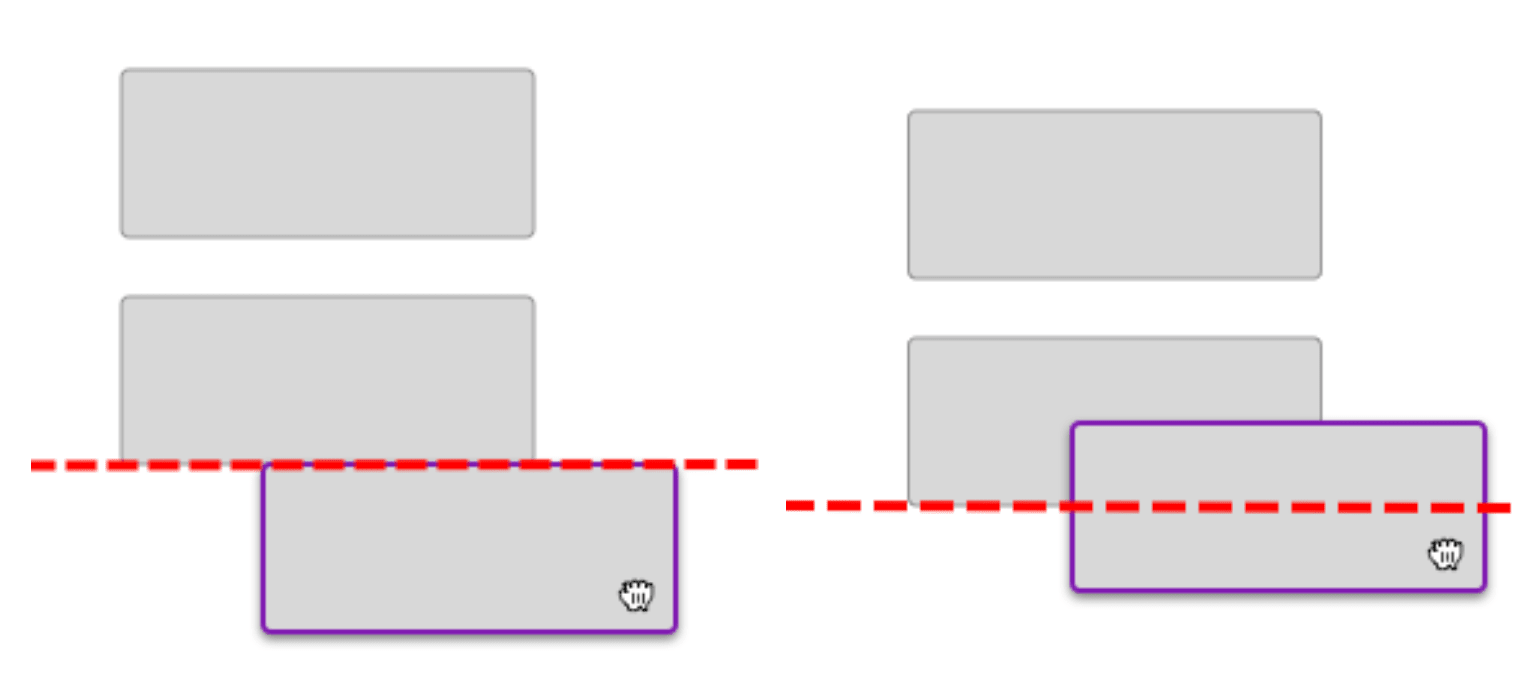
When to reshuffle items? One option is when one item cross the vertical center of the other one. Source: Norman-Nielsen Group.
The most complex question, however, is when exactly we should start pushing out components to make space for a new one?
Many implementations start moving items out when their edges meet, but it might be a little premature. An alternative option is to move an item out of the way once the center of the dragged component overlaps the edge of the other component — this might be a slightly stronger intent that the user has made up their mind.
6. Use Magnetism To Snap Objects Into Place #
Drag-and-drop is inherently inaccurate, so whenever an item can be comfortably dropped, we might want to make it obvious to users. We could do so with a slightly different outline of a dropzone that the target area is ready for the drop.
Even better if we can animate the drop with a short transition (100ms) into its new home position, so it feels like it snaps an object into place.

A file upload drop zone with a red dotted line indicating where the actual drop zone interaction border is, despite it being invisible to the user. Source: Norman Nielsen Group.
Typically a dotted or dashed area indicate that an item will be safely captured once it’s dropped. Notice how on Dropbox (pictured below), a file is collapsed into a summary, indicating just how many files there are and they type of the file as well.

Large dashed area in blue on Dropbox indicates a dropzone.
7. Allow Users To Undo #
Mistakes are inevitable, and eventually items will end up in wrong places. To help users recover from these mistakes, we might want to support an option to “Undo” the last action and restore the initial position of the item. It could be as simple as an “Undo” button that remains visible until the user moves on to the next operation. It could also be a stack of last changes that users could revert back to.

Drag-and-drop isn’t a trivial interaction, so we can help users recover from mistakes by adding an option to Undo.
8. On Mobile, Use Action Buttons #
Because drag-and-drop is inaccurate, an alternative way to prevent errors or mistakes is by providing an option to select one or multiple items and move them by using a dedicated “Move to” button, as it’s used in some mobile applications (see below). That’s a simple way to make drag-and-drop more accessible in general, but it is extremely useful especially on narrow mobile screens.

GMail uses a “Move to” button on mobile, creating fewer avenues for mistakes. Source: Norman Nielsen Group.
9. Accessible Drag-And-Drop #
There is a common assumption that drag-and-drop can’t be accessible. But there are some implementations that make the interaction fully accessible without a mouse. On mobile, sometimes interface use a subtle haptic “bump” to indicate that an object has been grabbed.
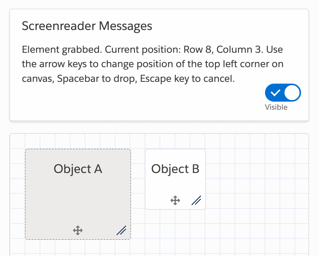
Salesforce’s accessible drag and drop pattern library supports screenreader messages.
Keyboard users need to be able to focus on handle icons and receive screen reader messages about the changes they are about to make, implemented with ARIA live regions. The actual drag-and-drop experience need to be implemented with keyboard keys.

Keyboard users need to be able to focus on handle icons and receive screen reader messages about the changes they are about to make, implemented with ARIA live regions.
The Salesforce implementation allows users to use Tab/Shift+Tab to navigate to an item, press Space to enter into drag mode, then use Down/Right, Up/Left arrow keys to select a new position and then press Space to drop item in new position. For each of them, we also need to design a separate state.
Wrapping Up #
Indeed, drag-and-drop is not a trivial interaction. Hopefully the pointers listed above will help you design slightly better and more accessible drag-and-drop UX without making users confused about just how painful and slow the experience is.
Here’s a quick summary of the pointers mentioned above:
-
Users should feel like they are moving physical objects.
-
Design states for components and drop zone areas.
-
Dragged items should move towards users in the z-dimension.
-
Animate the drop of an item (100ms) into its new home position.
-
Add shadows and elevation to make interaction obvious.
-
Simulate a “magnetic” effect that snaps objects into place.
-
Reshuffle when a center of a dragged item overlaps an edge.
-
Collapse large components into summaries during transit.
-
Keep handle icons accessible and support screen readers.
-
Support Spacebar to pick up, Arrow keys to move, Space to drop.
-
Use grab-handle icons and adjust system cursors.
-
Use a haptic “bump” to indicate grabbing on mobile.
Further Resources #
Of course, the techniques listed above barely scratch the surface. Here are some fantastic resources all around drag-and-drop, from design considerations to technical implementations and ready-to-use libraries:
-
Drag and Drop UX Best Practices, by Ceara Crawshaw
-
Drag and Drop UX for Design Systems, by Grace N.
-
Building a Drag and Drop UI, by Graeme Fulton
-
Rethinking Drag and Drop, by Alex Reardon
-
Drag–and–Drop: How to Design for Ease of Use, by Page Laubheimer
-
Drag and Drop Order UX Pattern, by Glen Lipka
-
Major Interaction Patterns for Accessible Drag and Drop, by Jesse Hausler
Happy drag-and-dropping, everyone!

