How To Design For Autistic People
UX guidelines for designing for autistic people, with do’s, don’ts and things to keep in mind.
Nearly 1% of the global population is autistic. Yet often it’s not obvious how to consider the needs of autistic people in the design process. Let’s change that.
Below are some general UX guidelines, do’s and don’ts to design better UX — for autistic people and everybody else. Most of these guidelines are universal, and improve the experience for everyone.
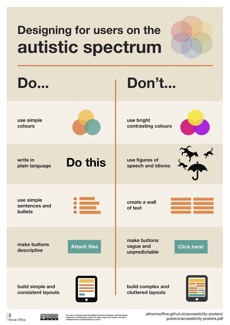
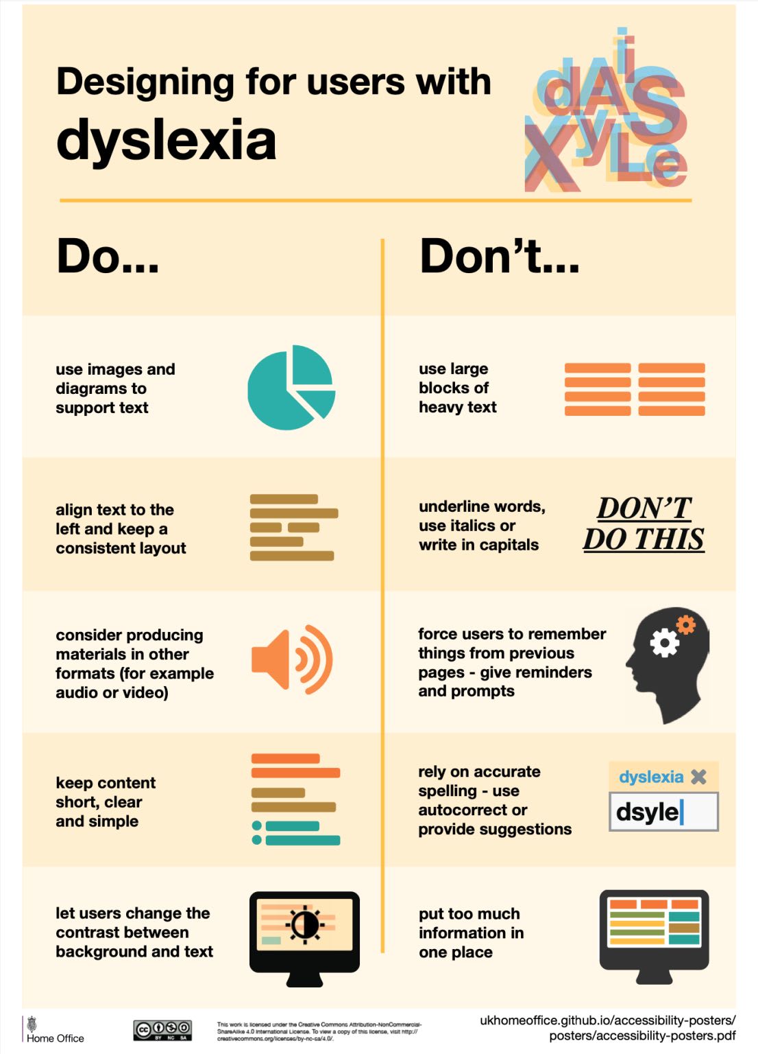
Design guidelines on how to design for autistic people (PDF), from a wonderful series of inclusive design posters by Gov.uk. Large view.
There Is No Single “Autistic Experience” #
Essentially, autism is a different way of experiencing the world. The experience is usually intense and tangled. However, every person on the autism spectrum experiences the world differently.
Oftentimes with their own superpowers in fast learning or keen attention to details, and sometimes with enormous frustration about the busy and noisy world. In fact, 40% of autistic people have an anxiety disorder.
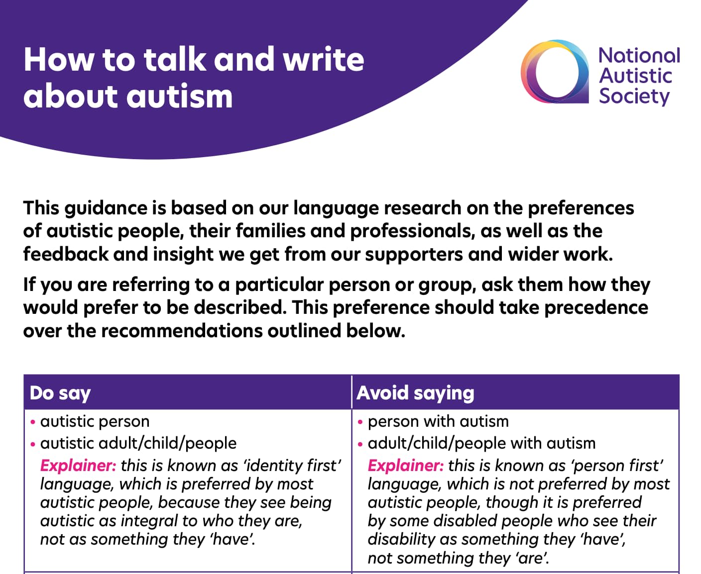
How To Talk And Write About Autism (PDF), a wonderful resource with examples, do’s and don’ts, by National Autistic Society in the UK.
One can’t grow out of autism, and all autistic children usually grow up into autistic adults. As autists, we usually have a low tolerance to uncertainty and lack of control. Autistic people are also strongly sensitive to bright colors and high contrast — and tend to be very literal, so it’s hard to infer meaning that’s not obvious.
Guidelines To Design For Autistic Users #
🚫 Avoid bright contrasting colors and high luminance.
🚫 Avoid figures of speech and idioms (verbal or visual).
🚫 Avoid animations that are hard to control.
🚫 Avoid non-conventional scrolling behaviour (parallax).
🚫 Avoid time countdowns, time outs, a sense of urgency.
🚫 Don’t rely on jargon, abbreviations, sarcasm, idioms.
✅ Show all content about a subject on a single page.
✅ Use soft, muted colors and avoid pure white or black.
✅ Add text labels to icons and avoid icons-only buttons.
✅ Allow users to save and return to forms later.
✅ Respect user’s reduced motion preferences.
✅ Support email/chat as communication options.
✅ Autistic children tend to be visual learners.
✅ Autistic adults prefer well-structured text.
You can find further guidelines and examples in Designing For Autistic People: A Guide by Irina Rusakova.
Wrapping Up #
We can rarely design one single perfect experience for absolutely everyone. But by involving a diverse group of users in usability testing, we can make our products more accessible for absolutely everyone.
Whenever you can, involve colorblind users, autistic people and people with disabilities into testing — you will always learn useful insights. That might be a few hours of work for us, but it might be absolutely life-changing for other people — and that’s worth it every single time.
Useful Resources #
- Designing For Autistic People: A Guide, by Irina Rusakova
- How to Talk and Write About Autism (PDF Guide)
- Design For Autistic People: Existing Research, by Irina Rusakova
- Designing For Users On The Autistic Spectrum (PDF)
- Usability Testing with Autistic People, by Varnagy-Toth Zsombor
- The Pattern Seekers (Book), by Simon Baron-Cohen
- Connecting with the Autism Spectrum (Book), by Casey Remrov Vormer
You can find more details on design systems in the new chapters of the video library on Smart Interface Design Patterns 🍣 — with a live UX training that’s coming up later this year.