How To Design For Users With Dyslexia
For dyslexic users reading might take longer, especially for large blocks of heavy text, with italics, capitals and flashing images. Let’s explore some useful resources and design considerations for dyslexic users.
Dyslexia can take different shapes. Different people are in a different place on a continuum, but for some dyslexic users reading might take longer, especially if text has many large uninterrupted blocks, italics, words written in uppercase and flashing images.
It’s difficult to give general advice when it comes to dyslexia, but here are some key points that are quite helpful — along with further resources, articles and toolkits.
Things To Keep In Mind #
- For some users, reading can take up to 3× as long.
- Some users might confuse b, p, d and n, u and m, w.
- Remembering words between screens might be difficult.
- Users are heavily distracted by flashing images/sounds.
- Difficulty to read analog clocks, directions, numbers.
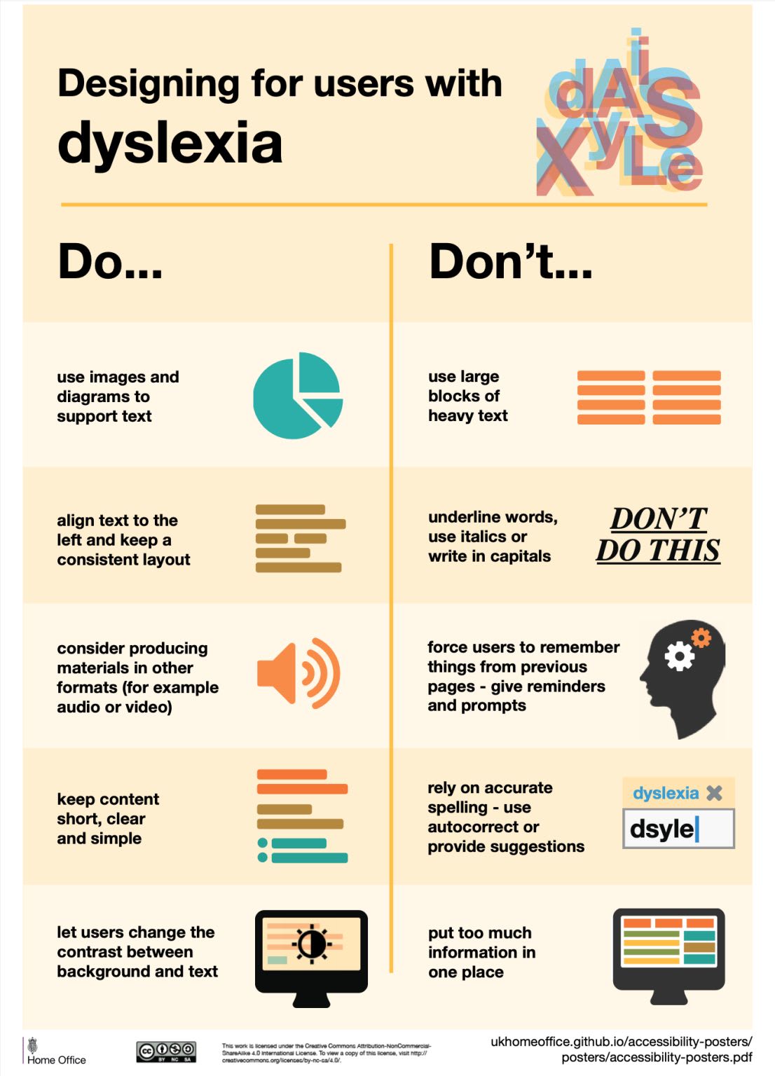
Designing for users with dyslexia (PDF), an accessibility poster by Gov.uk.
Things To Avoid #
- Avoid dynamic, moving or flashing images.
- Avoid heavy underlines, uppercase and italics.
- Don’t force users to remember; give reminders instead.
- Avoid text justification and align text to the left.
- Avoid long columns for reading (use 45–65 chars per line).
Things To Do #
- Support accurate spelling with autocomplete.
- Let users change the contrast between background/text.
- Simple sans-serif fonts with generous spacing work well.
- Use dark grey instead of black, and soft colors instead of white.
- Consider text-to-speech, Bionic reading and dark mode.
Better For Everyone #
It goes without saying that the design guidelines above are general pillars of good design. They are better for everyone — and they help us design digital experiences that are more reliable and usable, and make it much more difficult to make mistakes.
Ultimately, our job is to help people get where they want to be, without segways or retours along the way. Most of the time it means two simple things: maximize clarity, minimize distractions. It works for everyone — and creates helpful and respectful designs that people appreciate and use.
Useful Resources #
-
Designing With Dyslexia, by Alex Morris
-
Dyslexia Accessibility Guidelines, by Eva Katharina Wolf
-
Design For Dyslexic Users, by Pradipto Chakrabarty
-
Design for Customers With Dyslexia, by Kate Hughes
-
What Makes a Typeface Accessible, by Gareth Ford Williams
-
How to Write With a Dyslexic Audience in Mind, by Trisha Dunbar