Usability Pitfalls Of Carousels UX
We all have our opinions about carousels, and usually not very good ones. This has a number of good reasons. But it doesn’t mean that we can’t design a better carousel experience.
Carousels don’t have a good reputation, and rightfully so. They have plenty of accessibility issues, often exhibit low click-through rates and people frequently scroll past through them. Add to it small progress dots with tiny tap areas, barely visible labels and a bit of parallax, and you have a quite troublesome design pattern in your hands.

Teatr Lalka, a puppet theater from Poland, with a creative, dynamic, and accessible approach to highlighting the position in the carousel.
However, carousels can be quite effective, especially when we want to highlight key features or options, but lack space to display them all at once. They work well when users want to explore plenty of options, browse through reviews, dive into image galleries or closely examine product features.
So how do we design better carousels? We provide better context by replacing progress dots with labels, thumbnails and better prev/next-buttons.
Replace Progress Dots With Better Labels #
We are very much used to progress dots in carousels, but there are some good reasons why we might want to avoid them. Sometimes users desperately try to click on them, and because these dots are incredibly small, navigation is slow and requires a lot of precision. This results in a feverish combination of rage clicks (or taps), mistakes, and unexpected jumps back and forth.
Stripe Press includes short horizontal lines, each representing a section on the site. The labels appear only on hover.
Progress dots aren’t a particularly effective way to entice users to click through the carousel. They don’t communicate much; definitely not what each dot represents, nor what users should be expecting while sliding through the carousel.


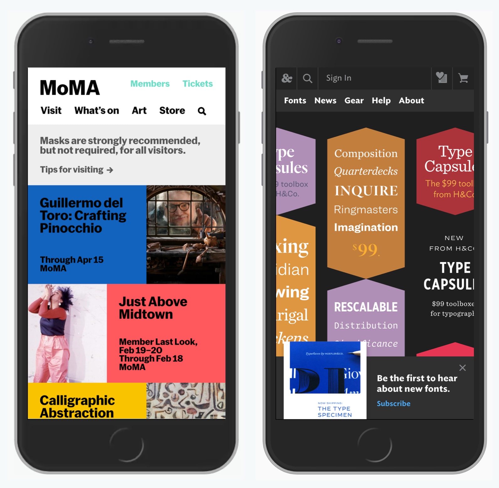
A good way to encourage navigation through the carousel is by adding more context to it. We can replace lifeless dots with labels, thumbnails and video previews. Interesting examples of it in action are on Creative Denmark and Weber Grill Original, with key video highlights and photos accordingly.
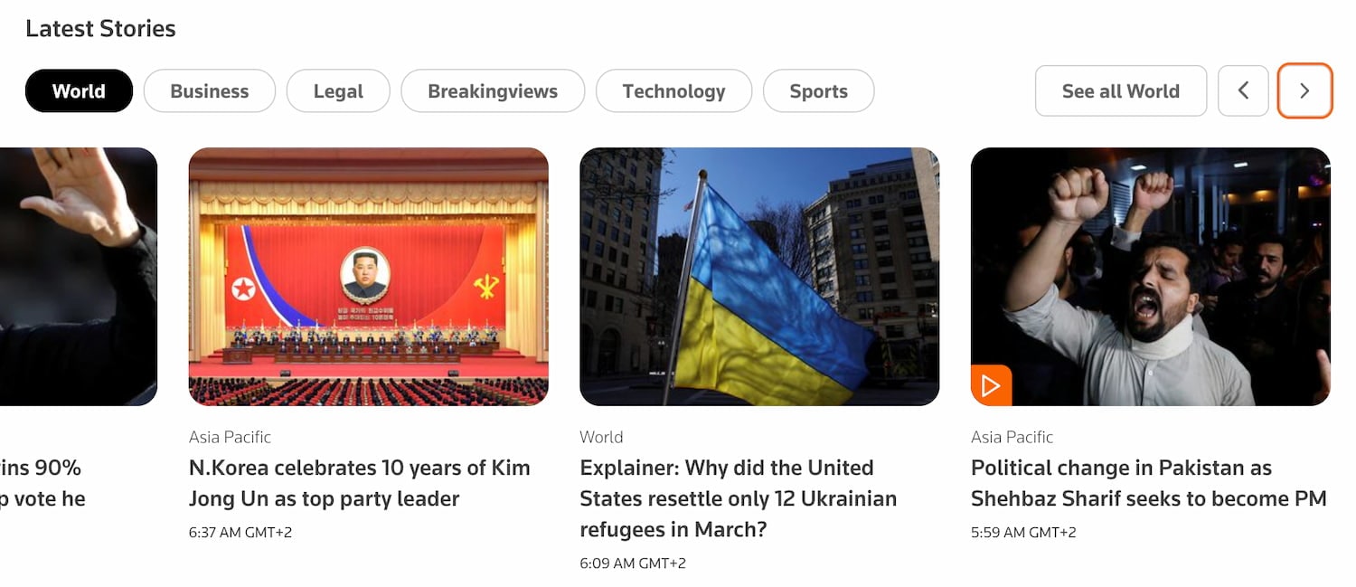
Additionally, we can use filters, tabs and prev/next buttons that allow users to choose the content in the carousel, just like the designers of Reuters.com did.
Better Position of Prev/Next Buttons #
In design, we want to minimize errors and mishaps as far as possible. At the same time, we want to speed up navigation within the carousel as far as possible, and this means minimizing the distance between opposite actions: in our case, that’s moving forward and backward.

On Ritual.com, prev/next-buttons are always grouped.
One useful pattern is to group arrows in the carousel. This allows users to move in both directions quickly, without heaving to re-calibrate their pointer or their fingers, or tab through items.

On desktop, group buttons above the carousel (still Ritual.com in the example above). If the buttons live on the slices of the carousel, it might cause misclicks and accidental jumps to wrong pages. And if the buttons live under the carousel, they might not be noticed in time, especially if carousel slices are tall.
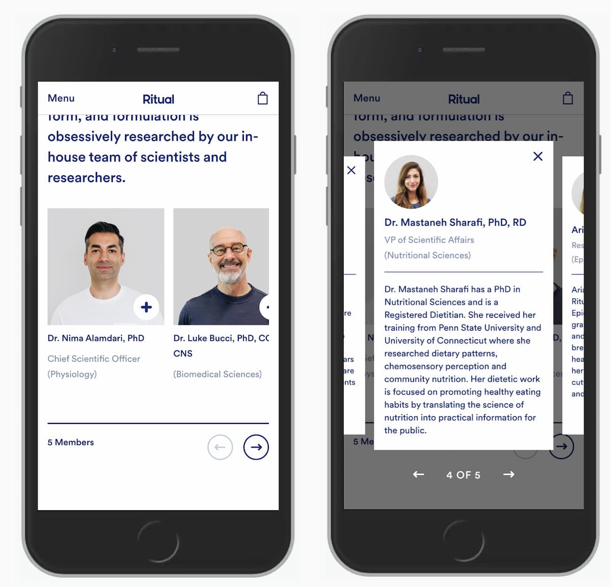
On mobile, group buttons under the carousel. Otherwise, every time a user interacts with the buttons, especially when they are spaced out across the edges of the carousel, they’ll be covering the content of the carousel with their fingers. And when centered vertically, users might end up with plenty of rage taps.
Wrapping Up #
When designing your next carousel, consider replacing progress indicators with labels or thumbnails. Indicate the current slice of the carousel. Include and group prev/next buttons and display them above or below the carousel. Avoid auto-advancing if you can, and if you can’t, add a delay of 7s and allow users to pause rotation.
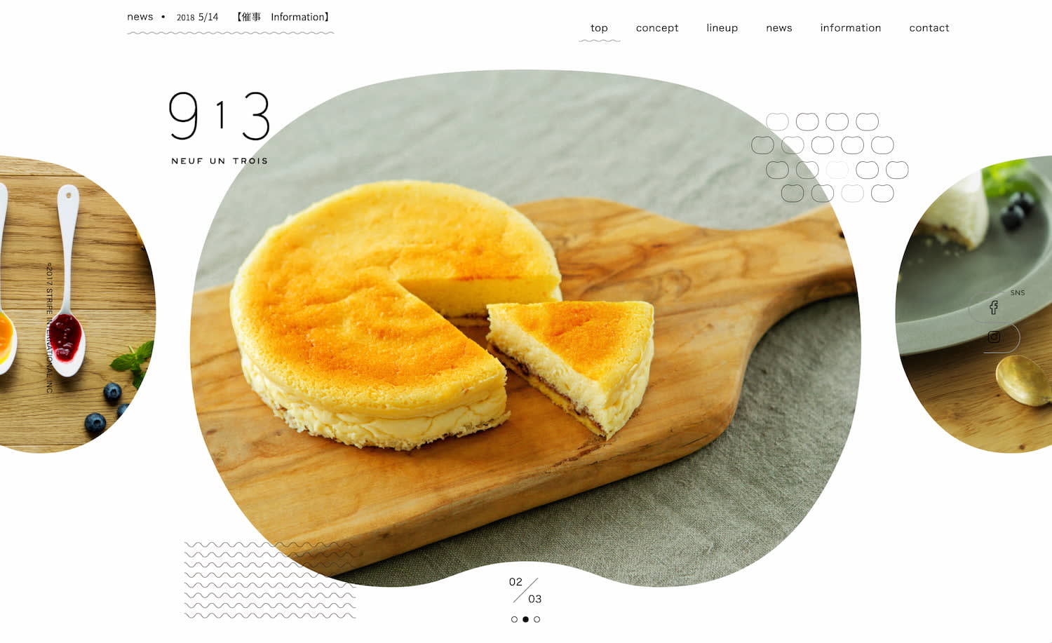
913 restaurant provides an information scent for prev/next slides.
A much more detailed article about all the fine details of carousels will be published on Smashing Magazine, so please take a look if you are interested.