Error Messages UX
When errors should live above input fields and why toast error messages usually aren't a very good idea.
When we design interfaces, we rarely think about error messages first. But a strategic and thorough design of these messages can be critical for businesses — especially if they struggle with high abandonment. Error messages can make or break the experience in situations when things go south.
Errors are everywhere, and so are error messages. They are of course common in web forms, but also in complex tables, contradictory filters and failed interactions. They can be small error notes and large error summaries; short tooltips and lengthy toast messages. So how do we choose the right ones? Let’s start from the basics.
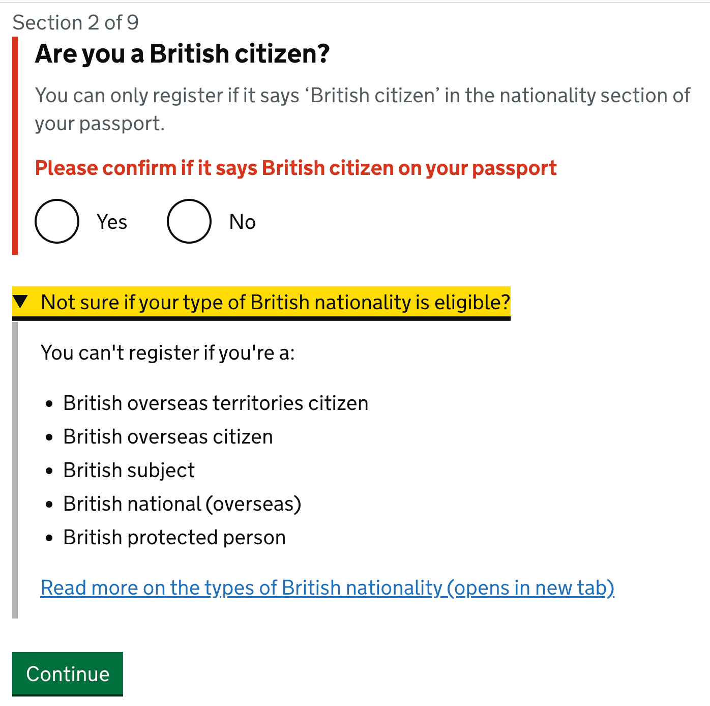
1. Never Rely On Color Alone #
With error messages, we almost subconsciously think of bold red text. That’s indeed common, but often not enough to indicate to users that something is wrong.
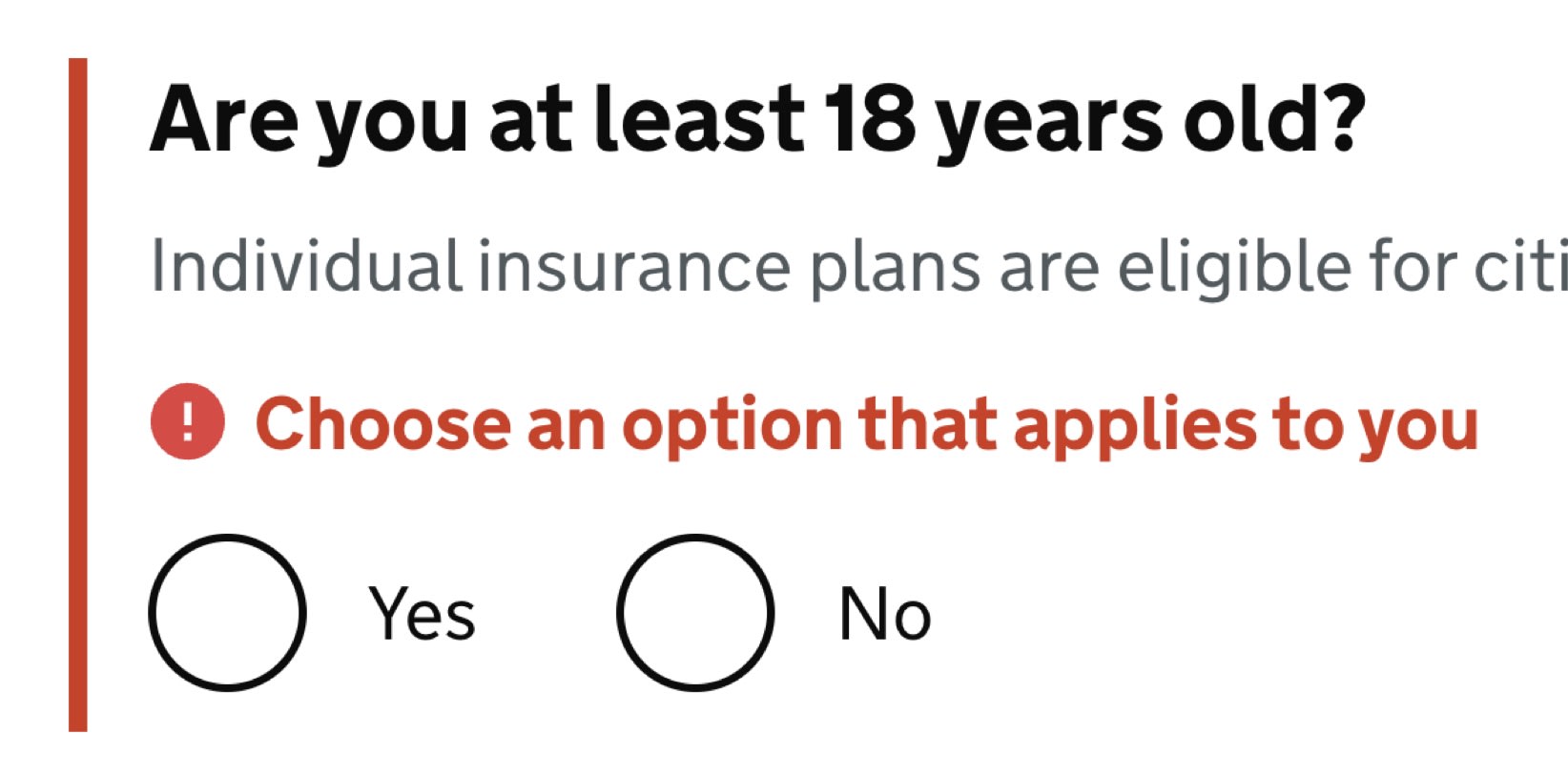
The Error message component on Gov.uk can’t be improved much: the message is clear, fair and with an icon pointing attention to the message.
Due to color vision deficiencies, it’s a good idea to always complement error messages with an icon, e.g. white exclamation mark on a red background — next to the error messages, or within the input field.
Error messages in the Carbon Design System by IBM. Error messages appear above the buttons on tap/click.
As you can see in the first example, we can highlight the entire section, along with the field, label, the hint, the error message and the input field — e.g. with a thick vertical line next to it. We might also display an error summary on the top of the page, with the links to the problematic areas in the form.
2. Never Cover User’s Input #
When we display error messages, we convey to users that there is a problem, but also try to guide users to a solution. This, however, requires the ability to consult the error as the error is being fixed. In other words, users would be able to edit the input field while also reviewing the error message(s) provided to them.
When inline validation meets error recovery. A common example when the message covers the content. Via UX Design World.
So far so good. However, things become quite complicated once we also have a tooltip in play. When a tooltip is open, users might lose sight of both the error message and the input. Should they desire to be able to see all 3 pieces of information at once, they’d be out of luck.
When a tooltip blocks the content, an example from the Carbon Design System.
We can fix it relatively easily. First of all, we avoid tooltips that open on hover, and display the tooltip text only once tapped or clicked. That means that a tooltip text will never disappear automatically, and will have to be closed manually.
Then, we use the details component and inline accordions as an alternative to tooltips. Hence, we make space for the content of the tooltip to expand between the label and the other content, so nothing will be covered. The error message would appear at all times as well, next to the input field.
The details component, with the details appearing on tap/click.
This way, we show all 3 pieces of information at the same time — and users always have a choice to select what exactly they’d like to see. Is it too much? Maybe. But that’s a great option to keep in mind: at least to always display the input field and the error at the same time without them being overlapped by the tooltip.
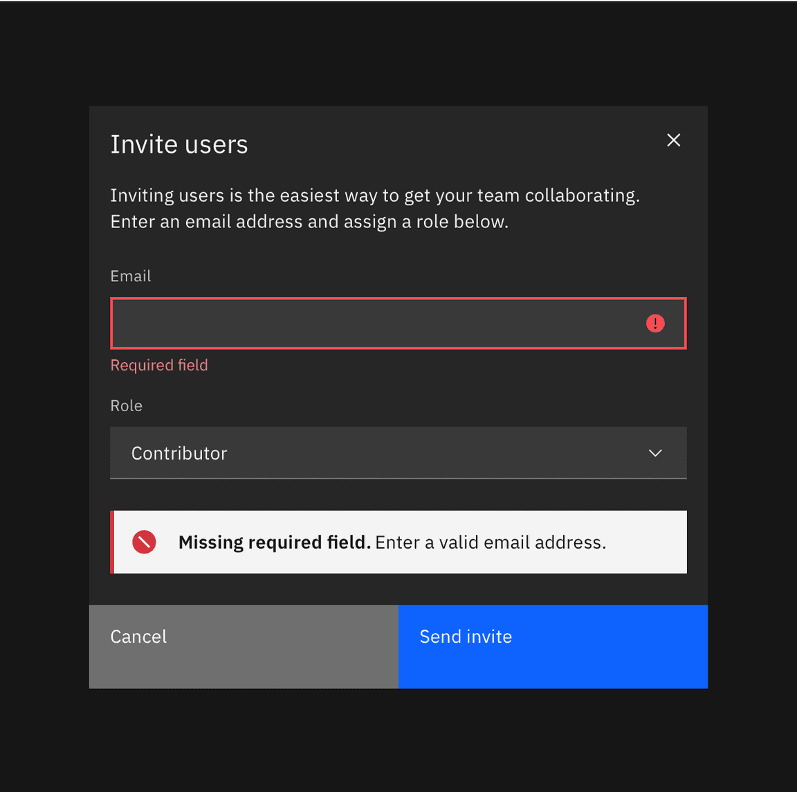
3. In Forms, Display Error Messages Above Input #
Now this might sound a little bit confusing at first. Usually error messages are sitting conveniently under the input field, or perhaps — less frequently — on the right side of it. As it turns out, there are a few accessibility issues that come as a cost of these conventions.
-
Users of a magnifying software might miss the error message when it’s located on the right,
-
On mobile, users might not be able to see the error message under the input because it will be covered by the virtual keyboard,
-
When editing input, error messages might be covered by browser’s autofill or input’s autocomplete suggestions.

Displaying error messages above input fields typically helps us avoid accessibility issues listed above. The cost of it, though, are layout shifts: with every new error appearing dynamically, the entire form has to shift vertically as we need to make space for the error message to appear. But sometimes it might be very much worth it.
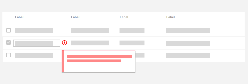
4. In Tables, Display Error Messages Inline #
When displaying error messages in tables, it might be a good idea to consider alternative approaches as otherwise we would end up with a lot of layout shifts for each row.
One of the simpler patterns is to display the error message in the same row where the content lives. In that case, the error message is more likely to live under the input field, not above it. Lengthy error messages could be collapsed and expanded with an accordion.
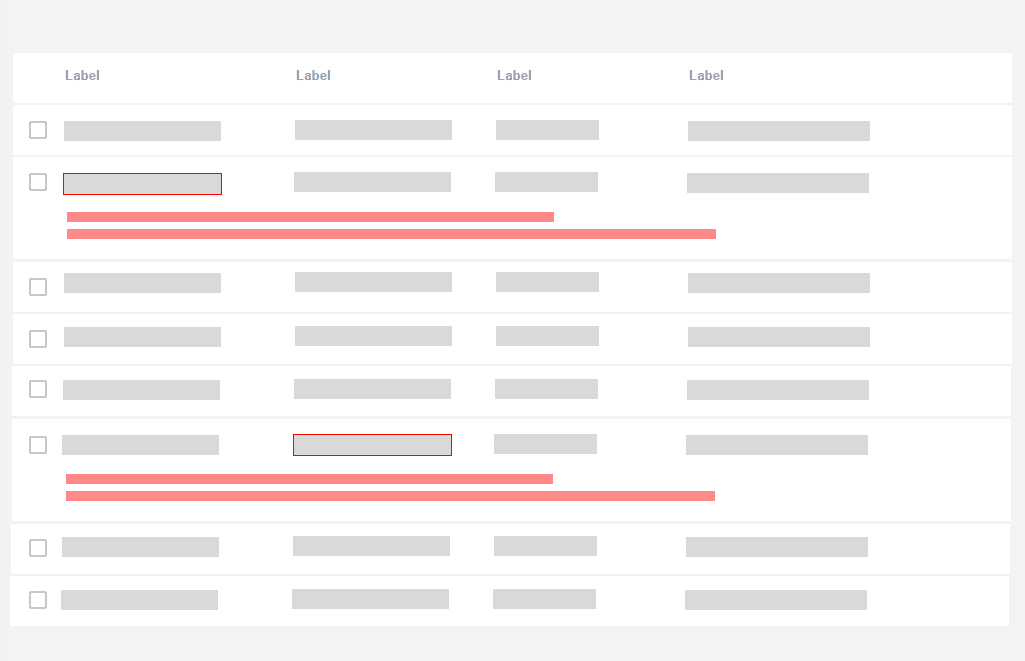
Error messages could live in the same row where the erroneous content lives. Image source: UX Design World.
If the same error affects multiple rows, we might want to highlight the rows that contain errors and display an error message at the very top of the page that would explain the error and what needs to be done to fix it.
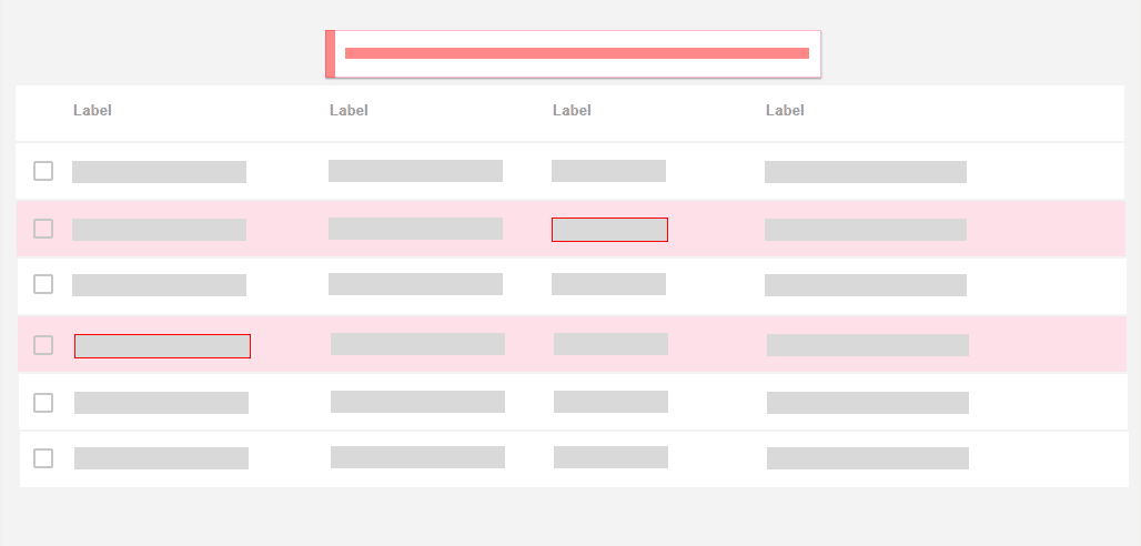
If an error appears multiple times, and its simple to explain, it might be a good idea to show it on the very top of the page. Image source: UX Design World.
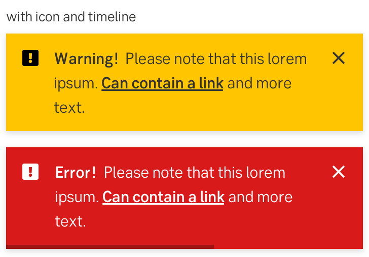
5. Don’t Rely on Toast Error Messages #
But what about good ol’ toast error messages? Those animated notifications, informing users about change of status of the system with floating messages. They might be uncommon for forms, but they frequently appear in tables and enterprise dashboards.
There are a few common usability issues with toast error messages:
-
Users often don’t get a chance to fully read or understand the error message before it has disappeared, and there is no way to restore it or keep it floating.
-
Toast messages typically appear on the edges of the screen, and usually it’s quite far away from the erroneous input. There is a disconnect between the error message and the input, and it’s rarely possible to read the error message and correct the mistake at the same time.
-
Lengthy toast messages usually block large areas of content that a user might be relying on — and potentially even the input that has caused the error.
-
Toast messages need to be announced to screen reader users while also allowing them to bring the focus back and forth between the error message and the erroneous input.
-
With toasts, we usually don’t have enough space to provide a detailed help using images or videos, and have to rely on plain text and links to external help pages.

This might not be ideal: error messages appearing as toasts in a complex UI.
If anything, toasts should be persistent if displaying information that can be acted upon, and users should be able to manually dismiss the notification.
Personally, I’d definitely stay away from error messages as toasts, even if they are persistent. The more we can connect an error with its cause, the less likely it is to be overlooked. And the better we can explain how to solve the error next to its cause, the faster users will understand what they need to do.
6. Allow Users to Override Error Messages #
No single validation library will be extremely reliable and bulletproof for all the edge cases, so eventually some percentage of your customers will be left out there in the woods, trying to figure out what to do next to proceed. That’s quite suboptimal.
Aggressive validators cost money. Especially when they come in tandem with disabled buttons that literally block users without telling them what exactly needs to be done to fix the issue.

Overriding address validator might be a very good idea.
For cases when a validator might be too restrictive, we can allow customers to override validator’s warning. We will get some wrong addresses as a result of that. But as a business, we need to measure just how much money we are losing due to increase in service desk inquiries vs. how much money we gain by allowing people to find a way to proceed even although the interface doesn’t want to play along. More often than not, it’s worth it.
While this pattern works flawlessly for address input and telephone input, it probably won’t work for any input that needs to follow a particular convention — such as the length and checksum of an IBAN number or a credit card number. There, instead of giving customers a carte blanche, we need to meticulously review the input and guide them towards what exactly the problem seems to be. And help them resolve it.
Wrapping Up #
At the first glance, dealing with error messages might not sound like a big deal. However, as we dive into fine details, there are plenty of considerations that might either cause high abandonment or help people resolve issues quickly.
With these guidelines, we should be better off when boosting our error messages UX. And if you can’t really do much around the way errors appear in your product, explore what you can do to replace generic error messages with helpful ones. This might be a small change with a huge impact that will eventually show up in large business KPIs dashboards.
