Filtering UX
Filters can be complex and intricate, especially in enterprise environments. Let’s figure out how to make them slightly less annoying and slightly more usable.
Filters are everywhere. They are used in pretty much every interface that features more than a handful of data points. It’s not necessarily just the sheer amount of data that is difficult to make sense of though; it’s the complexity and lack of consistency that the data usually entails.
That requires some solid filtering — such a common scenario in data grids, enterprise dashboards, vaccine tracking and public records registries. Too often, however, filters require too much work — too much scrolling, too long to wait for the results to come back, too many pages to browse through.
So if we wanted to improve our filters, how would we do that?
Never Auto-Scroll Users On A Single Input #
You probably have been in a similar situation before. On Dell.com, as you choose your laptop features, only a single input is registered at a time. If you happen to be selecting multiple options quickly, only the last input will be applied.
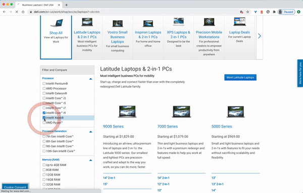
Dell’s filters aren’t very responsive. If you tap fast, you’ll need to have a bit of luck for all your filter inputs to be registered successfully.
And as an input is registered, the page refreshes, jumping the customer all the way to the top of the filtering sidebar. That means that the more filters you want to use — and usually navigate from top to bottom — the more you’ll have to keep scrolling down to find the right filter. That’s annoying.
In fact, even if you’d like to specify just 6–10 features this way, you’ll need to embark on a quite stubborn scrolling fight against the auto-scroll, with only a single filter registered at a time. It is possible to tap or click on multiple filters at a time, but in this case unfortunately the UI won’t respond as expected.
Never Freeze The UI On A Single Input #
Every time we freeze the UI on a single input, we actively slow down our customers in expressing their intent. We actually make it a bit more cumbersome for them to specify what they are interested in, prioritizing the display of results over the input. This seems to be a wrong prioritization though. Let’s take a look at the example below.
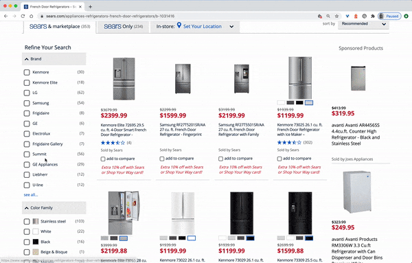
It’s common for customers to want to set multiple filters right after another. Freezing the UI on every single input slows them down and makes it just a bit more difficult. Example: Sears.com.
At Sears.com, every time a selection is made, not only is the UI fully blocked; the users are also pushed to the top of the page. That’s especially frustrating for filters that include accordions (“see more” link in “Brand”, for example). With every new filter, the user has to scroll down and open the accordion to find that particular attribute that they want to select.
It’s remarkably common for customers to add multiple filters quickly, sometimes in the same category. The behavior of the UI doesn’t support this intent well. What’s the alternative? Manual "Apply" button? That’s one option. But we could also do something else.
Decouple Filters and Search Results #
We could decouple the parts of the UI and render both of them separately. In that case, on every filter input, matching results could be updated in parallel, while the filters always remain accessible and at the same place. With every new filter input, the user would see a flash of new content streaming in.

Filters and search results decoupled on University of Stockholm.
The University of Stockholm above shows that pattern in action. As we select filters in the left sidebar, they get applied in the background while we can keep selecting more and more filters should we choose to do so. The product list gets updated at the same time. There is never a disabled state as new content appears in the list of matching results every time the data gets back from the server.
It’s worth emphasizing at this point that every input in the filters area needs to be registered by the UI, and then applied to the product list. We’ve noticed that for many customers that’s an expected behavior, unless you keep a floating “Apply” button close to the filters area.
Display Filters Above The Results #
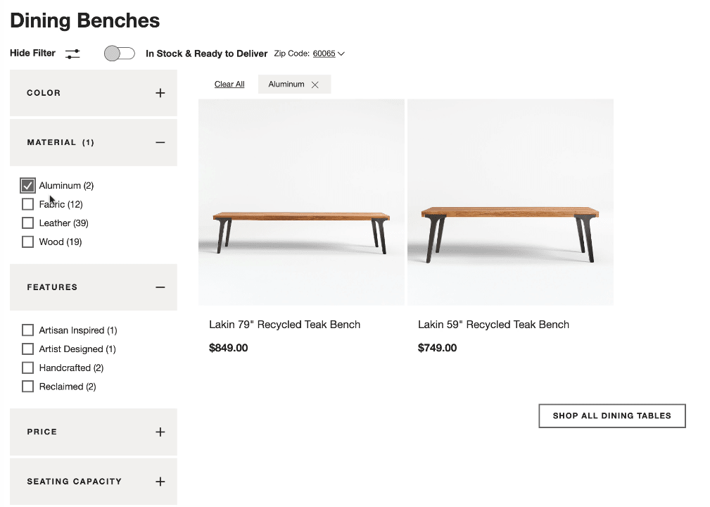
To avoid layout shifts altogether, we can display applied filters *above the product results. That would keep the filtering area stable and predictable during the entire user interaction. In fact, it doesn’t have to be visible at all times. Crate & Barrel, in the example below, allows customers to hide and show filters on demand, while applied filters are added to the dedicated area above products. Note that an option to clear all filters is available as well. (The product page has changed since the video was recorded though.)
Another option is to turn all filter sections into overlays and display them on tap/click above the results. In fact, you could even use floating filters, so as a customer scrolls down the page, the filters are still accessible all the time.
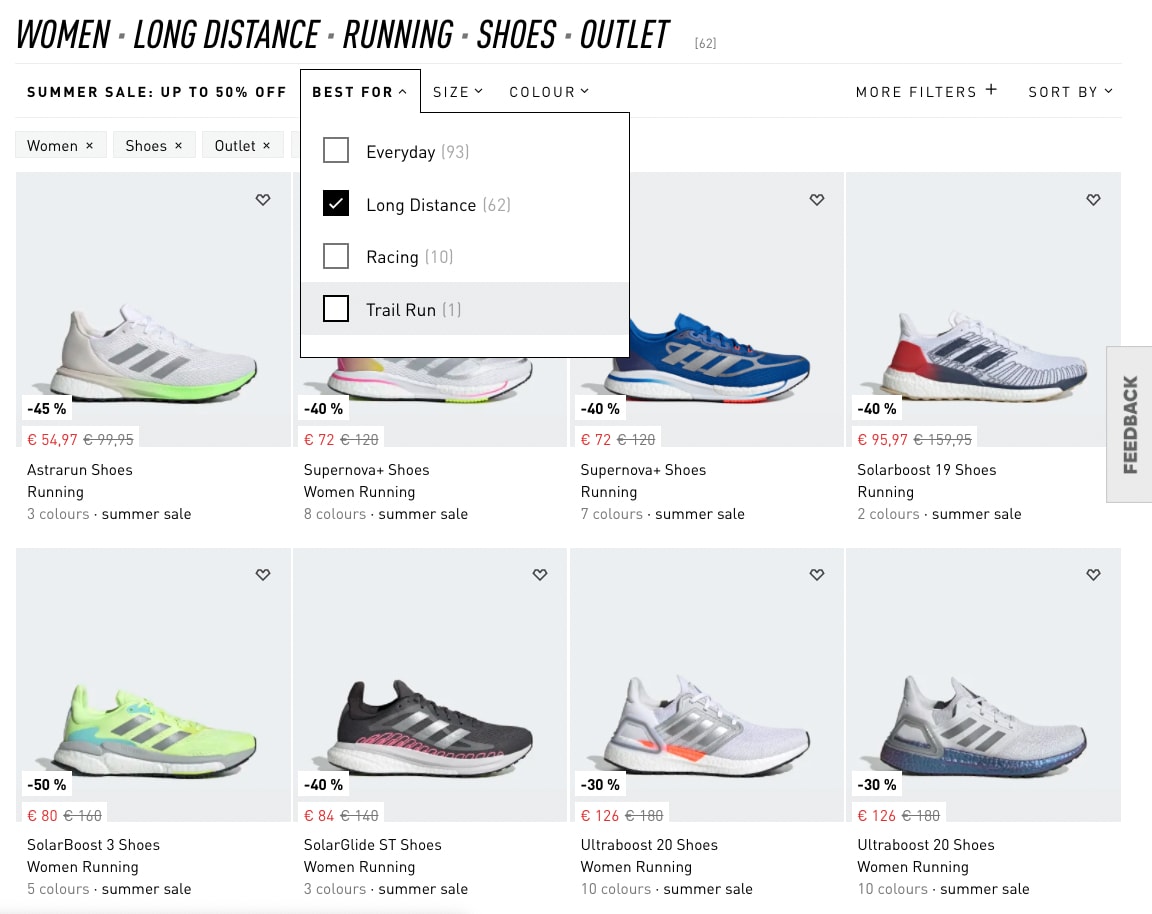
An example of this pattern is Adidas (see the image below). The filters bar is persistent; even as users are scrolling down the page, the filter overlay won’t close automatically — it requires user’s input, again handing over the control to the user.
However, it does close automatically once one of the filters is selected. If the user wants to select multiple filters, they have to re-open the same filter group over and over again. Keeping the filters visible until the user chooses to apply them might be a better idea. Still, the result: no layout shifts, no frustrating scrolling in narrow corridors, and filters are always accessible.
A Case For The "Apply" button #
It almost feels a little bit archaic to have an “Apply” button for filters in times when we are getting used to seamless and smooth interactions. However, if we want to drive customers towards a manageable range of relevant results, there is hardly a better way of doing so than displaying the number of results as soon as possible.
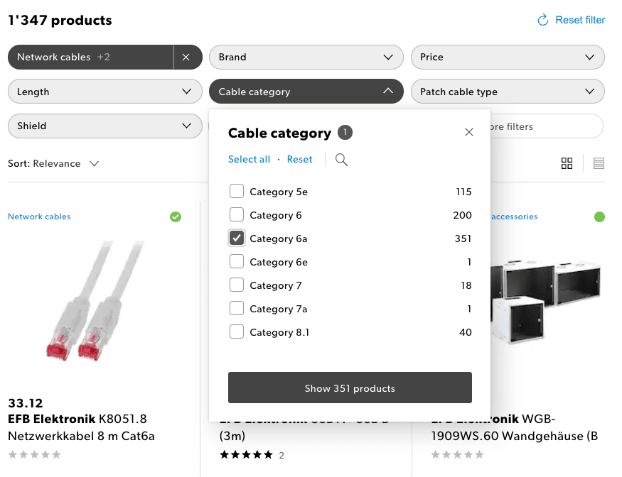
Everything in one: on Galaxus.ch, filters are displayed above product results, a filter overlay appears on tap/click, and the overlay doesn’t disappear unless the user chooses to dismiss it.Everything in one: on Galaxus.ch, filters are displayed above product results, a filter overlay appears on tap/click, and the overlay doesn’t disappear unless the user chooses to dismiss it.
We could allow customers to refine filters until they get to that range. Galaxus.ch provides a first-class experience when it comes to filtering. The filters are displayed above product results; a filter overlay appears on tap/click. No slowdowns, fast response times and a lovely integration of active filters with the filters area. A great reference example that is worth considering when designing any kind of filter.
In general, having an “Apply” button along with real-time updates of the content area seems to be working best. It really combines the best of both solutions: showing results immediately when they arrive, while keeping filters accessible at all times.
Avoid Split-Screens On Mobile #
The issues that we’ve explored in the article apply equally to large and small screens. However, on small screens, and especially on slow connections, these issues become even more critical. Most of the time, interfaces tend to block the entire UI on a single filter input, causing massive delays for customers on the go.

The usual suspects: blocking the UI and splitting the screen: Walgreens, Nordstrom, Crutchfield. (Large preview)
In general, though, it might be a better idea to experiment if a full-page overlay for filters would perform better. It gives more space to experiment with a multi-column view, or perhaps even display a swipeable area to choose filters without having to move between separate pages.
In fact, using accordions that could collapse and expand instead of bringing the user to a separate page might be a good idea — similar to what we’ve discussed with mega-dropdowns.
Better options for displaying filters: Myntra and Tylko. (Large preview)

Good reference examples: Galaxus.ch, Wayfair and Lacoste. (Large preview)
Having an “Apply” button in all these examples is a good idea, and you can make it slightly more useful by adding the amount of products as a label on the button and keeping the button sticky at the bottom as the user is scrolling down.
Wrapping Up #
Too often the filtering experience on the web is broken and frustrating, making it just unnecessarily difficult for customers to get to that shiny comfortable range of relevant results.
When designing the next filter, take a look at some of the common issues that you might want to avoid, and hopefully avoid all the frustration that comes from broken and inaccessible implementations.
-
Customers often want to set a number of filters of the same type. Never auto-scroll users on a single input and never collapse a group of filters automatically.
-
Never freeze the UI on a single input, and never make your customer wait for an interface to respond back when setting filters.
-
Always update filters and show results asynchronously, so that on every filter input, matching results could be updated asynchronously, while the filters always remain accessible and at the same place.
-
Always avoid layout shifts on filter input and consider displaying filters above the results.
-
On mobile, “Apply”-button could be sticky at the bottom of the screen. Update the count of products and show them on the button.