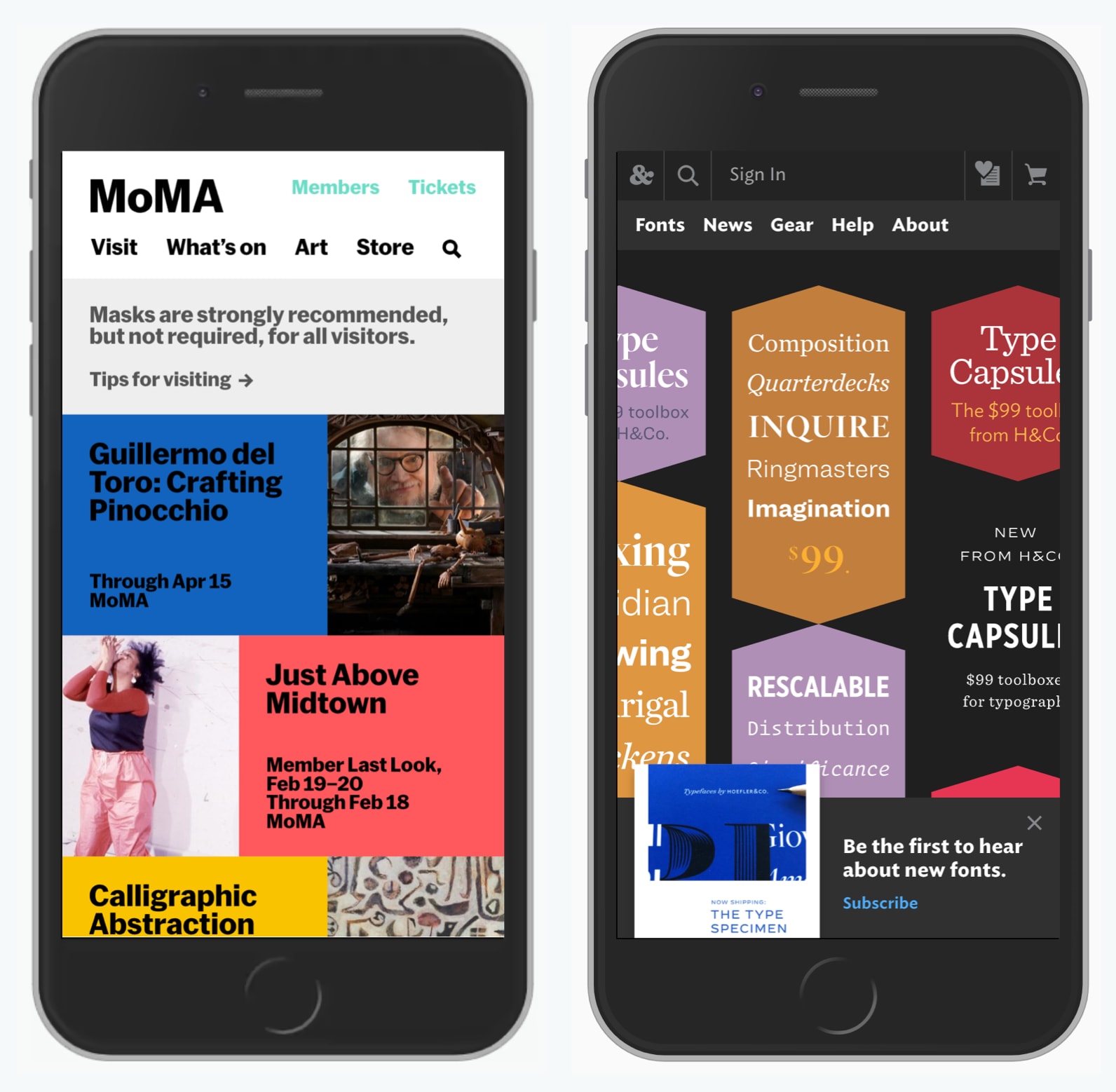
Navigation

Designing Better Links UX
Too often it’s difficult to tell what is a link, and what isn’t. Let’s explore a few usability guidelines with link underlines, focus, active and visited states, and link accessibility.

Language Selector UX
How difficult can it be to design a bulletproof language selector? We need to avoid redirects, decouple our presets and allow for overrides. It doesn’t sound too complicated, but it can be.

Infinite Scroll UX
We all have our opinions about infinite scroll, and usually not very good ones. This has a number of good reasons.

Navigation Queries UX
In UX, we can use navigation queries, evaluation journeys, A-Z index and tap-ahead autocomplete to help users get where they want to be, faster. Let’s find out how.
