Designing A Better Birthday Input
We don’t need date-pickers and drop-downs for birthday input. Surely it can be much simpler than that, so let’s figure it out.
Every time you apply for a job application, open a bank account or book a flight, you probably will be typing in your date of birth. As designers, we don’t just care about the completion rates, but also completion times and the accuracy of input.
We also want to support browser’s auto-fill and minimize mistakes. To achieve the last goal, we often rely on a date-picker-widget (native or custom) or a group of drop-downs.
It turns out that both solutions are suboptimal, and unnecessary — and they often cause more accessibility issues that can be avoided with a much simpler technique.
The Pitfalls Of Native Date Pickers #
Unfortunately, native date pickers, prompted by <input type="date">, come along with plenty of accessibility nightmares. At the moment of writing, when used out-of-the-box, they aren’t a very accessible choice for pretty much any kind of date input. Not only are there plenty of screen reader issues, but also focus and layout issues as well as confusing and generic error messages.
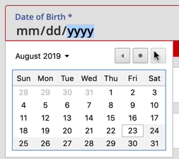
A calendar view with very strict input requirements. Accessible only for mouse users. The keyboard input is disabled. It took me 52 seconds (!) to provide my birthday. (Video preview)
On top of that, many implementations disable keyboard input altogether, requiring customers to use a native date picker’s calendar widget exclusively to reduce mistakes. Without a keyboard input fallback, users have to embark on a long-winded journey between days, months and years, taking up dozens and dozens of taps or clicks.
As humans, we usually know our birthday, and we don’t really need to look it up in a calendar. Yet the interface requires us to navigate between dates, and then find our date in the calendar overview once we get there. This is useful when booking a flight, but not very useful when typing a birthday.
The Pitfalls of Drop-Downs #
Compared to native date pickers, drop-downs seem to be much faster and easier to navigate. They are accessible by default, plus rather than navigating between months and years, it’s enough to locate the right numbers in 3 lists — days, months and years.
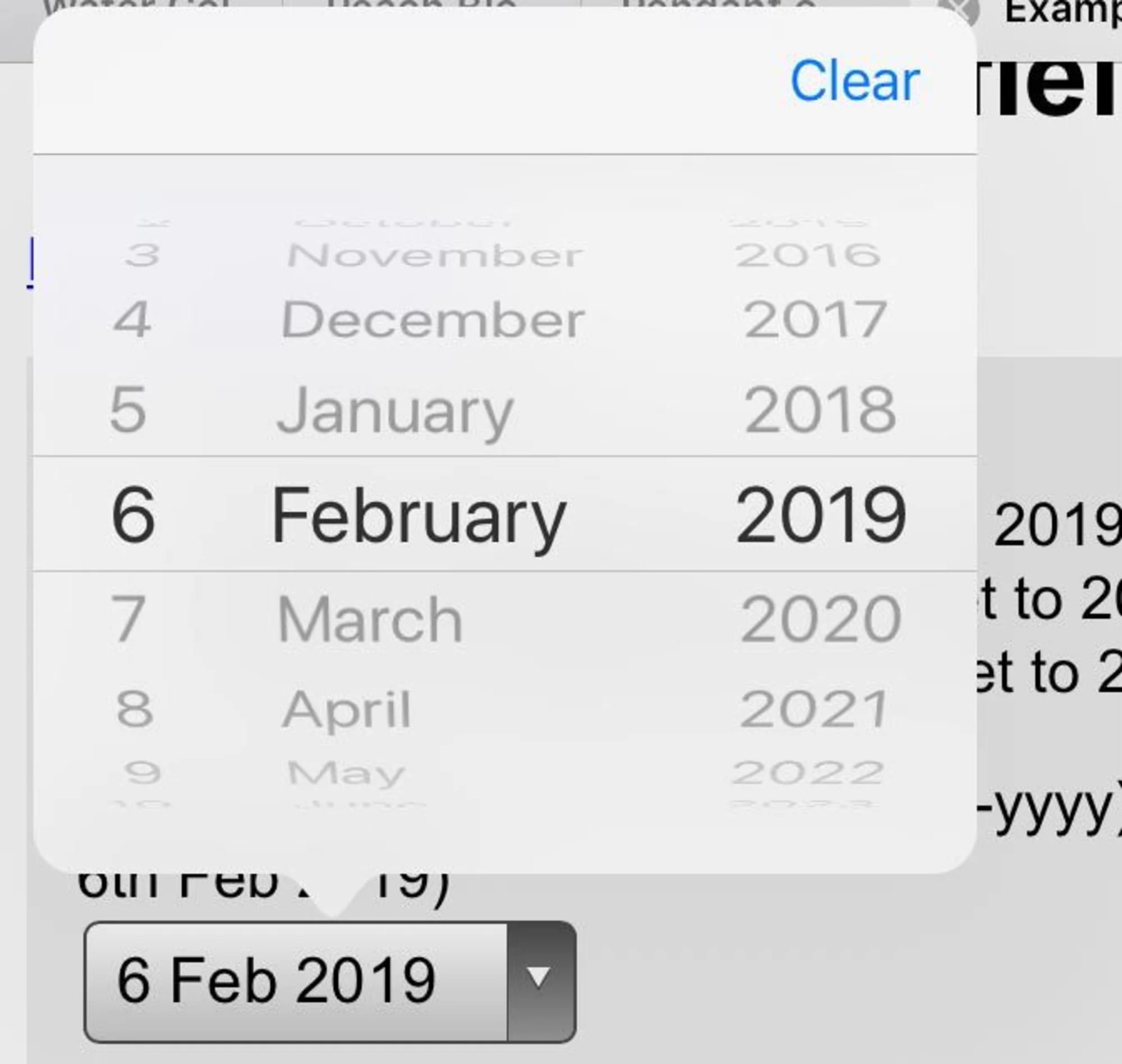
The iOS calendar reels are shown after tapping onto the date control. (Image source)
But drop-downs are still slow. They have zooming issues. Pinching scrollable options is tiring. They take up a lot of space. The list of years is long. And when specifying the input, we need to tap the control, then scroll (usually more than once), find and select the target, and continue to the next dropdown. It’s not exhilarating either.
That’s why dropdowns are considered the UI of last resort, and usually replaced with buttons (e.g. for filters), toggles, segmented controls, or autocomplete boxes. Dropdowns can be useful for a long list of selections; but “operating” them takes a lot of time, and it’s not comfortable either.
The Default Values Dilemma #
And then there is a question about default values. While with dropdowns we default to no input whatsoever (mm/dd/yyyy), with a date picker we need to provide some starting point. In the latter case, ironically, the “starting” date usually happens to be just around the date of when the form is filled. This doesn’t appear optimal of course, but what should be the right date? We need to start somewhere, right?

When a date-picker with default values makes sense: when booking flights or vacation. Open sourced by AirBnB. (Video preview)
Well, there really isn’t a right date. We could start early or late, 3 months ago or tomorrow, but in the case of a birthday picker, all of these options are pure guesswork. And as such, they are somewhat frustrating: without any input, customers might need to scroll all the way from 1901 to the late 1980s, and with some input set, they’ll need to correct it, often jumping decades back and forth.
No matter what choice we make, we will be wrong almost all the time. This is likely to be different for a hotel booking website, or a food delivery service, and plenty of other use cases — just not birthday input.
Designing A Better Birthday Input #
If somebody asks you for your birthday, you probably will have a particular string of digits in mind. It might be ordered in dd/mm/yyyy or mm/dd/yyyy, but it will be a string of 8 digits that you’ve been repeating in all kinds of documents since a very young age.
We can tap into this simple model of what a birthday input is with a simple, single-input field which would combine all three inputs — day, month, and year. That would mean that the user would just type a string of 8 numbers, staying on the keyboard all the time.

Using one input for a date is ambiguous and difficult to validate. Using multiple inputs for date is not ambiguous, and much easier to validate. Designed by Adam Silver. (Large preview)
However, this approach brings up a few issues:
-
we need to support auto-formatting and masking,
-
we need to explain the position of the day/month input,
-
we need to support the behavior of the Backspace button across the input,
-
we need to support jumps into a specific value (e.g. month),
-
we need to minimize rage clicks and navigation within the input to change a specific value on mobile devices,
-
If auto-making isn’t used, we need to come up with a set of clean-up and validation rules to support any kind of delimiters.
In his book on Form Design Patterns, Adam Silver argues that using multiple inputs instead of one input is rarely a good idea, but it is a good option for dates. We can clearly communicate what each input represents, and we can highlight the specific input with focus styles. Also, validation is much easier, and we can communicate easily what specific part of the input seems to be invalid, and how to fix it.
To explain the input, we’d need to provide labels for the day, month and year, and perhaps also show an example of the correct input. The labels shouldn’t be floating labels but could live comfortably above the input field, along with any hints or examples that we might want to display. Plus, every input could be highlighted on focus as well.

Design pattern, as suggested by Gov.UK team. (Jump to the demo)
Over the years, I couldn’t spot a single problem with this solution throughout years of testing, and it’s not surprising the pattern being used on Gov.uk as well.
When You Need A Date Picker After All #
While the solution above is probably more than enough for a birthday input, it might not be good enough for more general situations. We might need a date input that’s less literal than a birth day, where customers will have to pick a day rather than provide it (e.g. “first Saturday in July”).
For this case, we could enhance the three input fields with a calendar widget that users could use as well. A default input would depend on either the current date, or a future date that most customers tend to choose.

Adam provides a simple code example for the Memorable date pattern in his NoStyle Design System.
Adam provides a simple code example for the Memorable date pattern in his NoStyle Design System. It solves plenty of development work and avoids plenty of accessibility issues, and all of that by avoiding tapping around calendar widgets or unnecessary scrolling around dropdown wheels.
Wrapping Up #
Of course, a good form control depends on the kind of date input that we are expecting. When we ask our customers about their date of birth, we are asking for a very specific date — a very specific string, referring to an exact day, month, and year.
In that case, a drop-down is unnecessary. Neither is a calendar look-up, defaulting to a more-or-less random value. If you do need one, avoid native date pickers and native drop-downs if possible and use an accessible custom solution instead. And rely on three simple input fields, with labels and explanations placed above the input field.