Billboard Navigation Design Pattern
Navigation doesn’t have to be hidden behind a menu. If it matters, we need to show it and do so prominently.
Not every navigation item is equally important. Some items are more important or more frequently used, so they might deserve a little bit more spotlight in your navigation. In fact, if some items are more important than others, we can use the billboard pattern and display them more prominently.
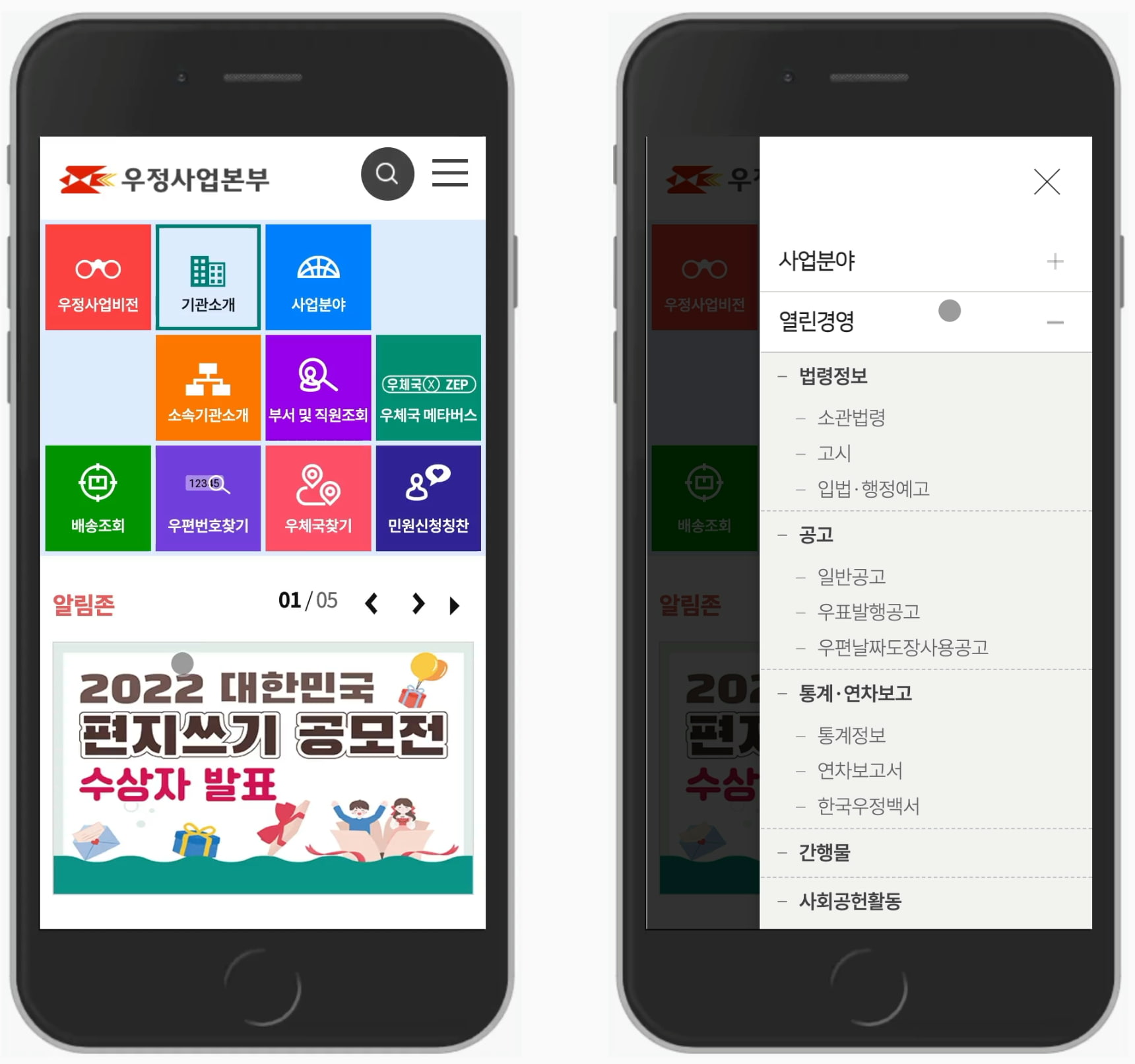
Korean Post Mosaic #
Korea Post uses a colorful mosaic-alike grid on desktop and on mobile to guide visitors straight to the main features of the site. There is also a big mega-drop-down-hover menu, yet the front and center of the experience is all about the most important tasks that people perform on the site — on the homepage and on the category pages.

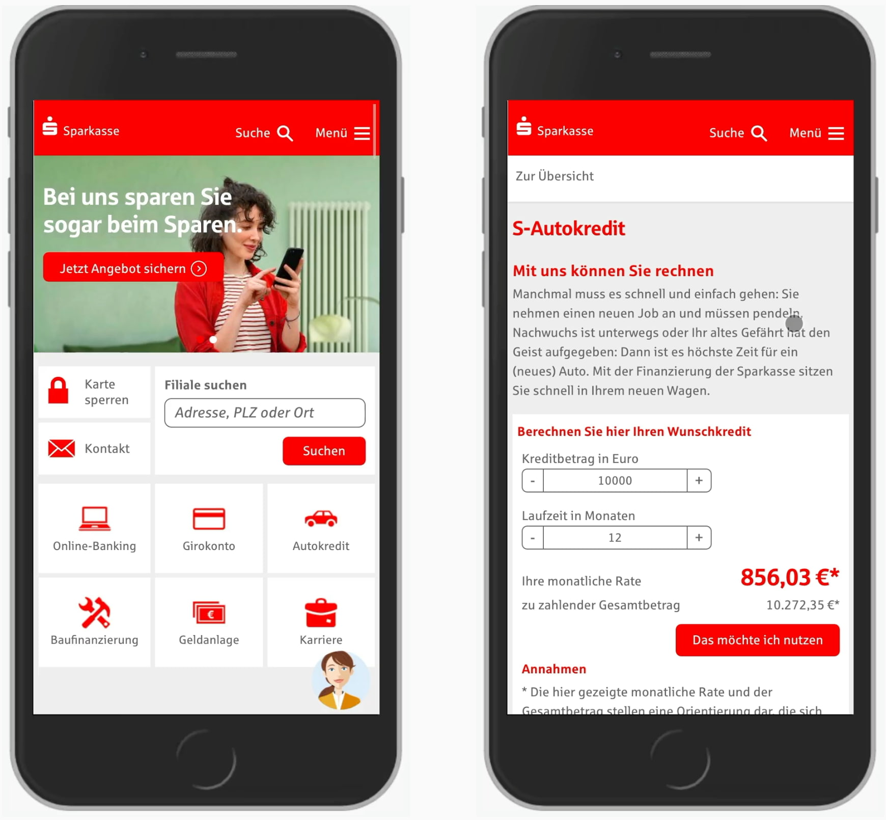
Sparkasse Mosaic #
Sparkasse, a German bank, uses a similar approach with important features presented as a mosaic-grid of larger buttons both on desktop and on mobile, along with some features getting slightly less attention. The order of features should be defined by how critical or important the tasks are (for users and for business).

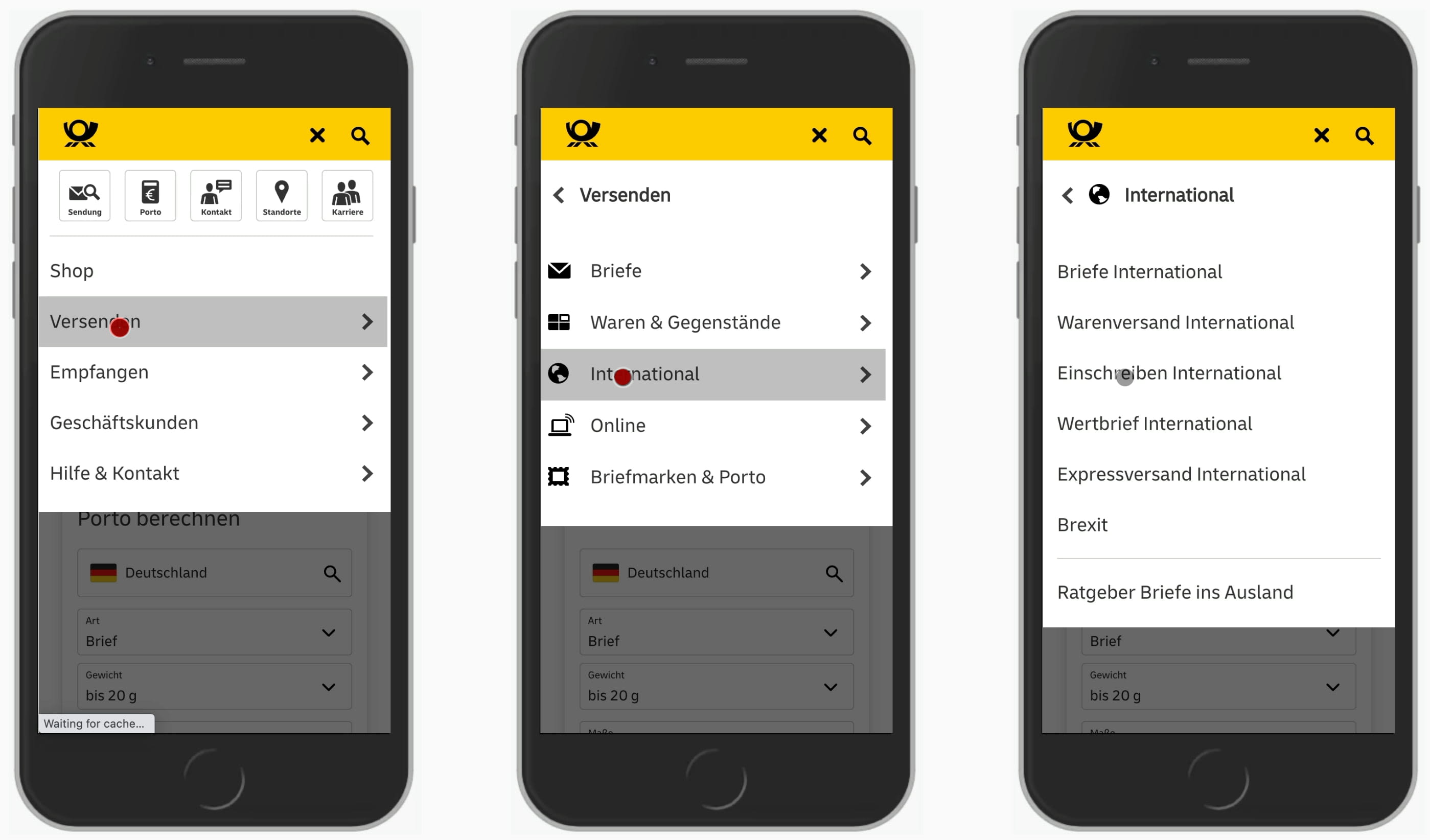
Deutsche Post Billboard #
In their mobile navigation, Deusche Post features most important tasks prominently as 5 large buttons above the regular navigation. The highlighted features stand out; they appear differently than the rest of the navigation and are always displayed when a user opens the navigation drawer.
eCommerce Billboards #
Otto, one of the major retailers in Germany, focuses on lage buttons both on category pages and in the main navigation. As the first choice of category is the most critical one, the first level navigation items include illustrations — presented in a two-column grid.

This pattern is actually quite common in eCommerce as it seems to better drive engagement in a seemingly endless list of options, and Coolblue, Zalando and Target use it, too.


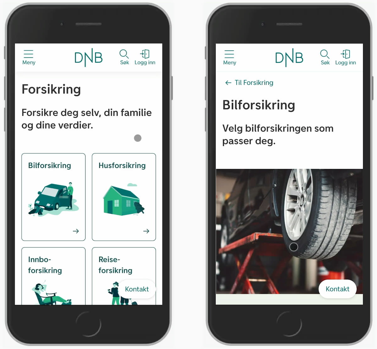
Insurance Billboards #
Typically, a billboard includes plenty of cards, and often with illustrations. They don’t have to appear only on the homepage though; on DNB and Folksam, many category pages display large signposts with available options, like in the examples below.

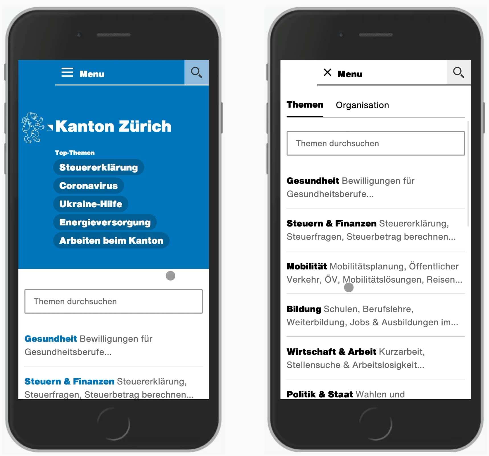
Top Topics #
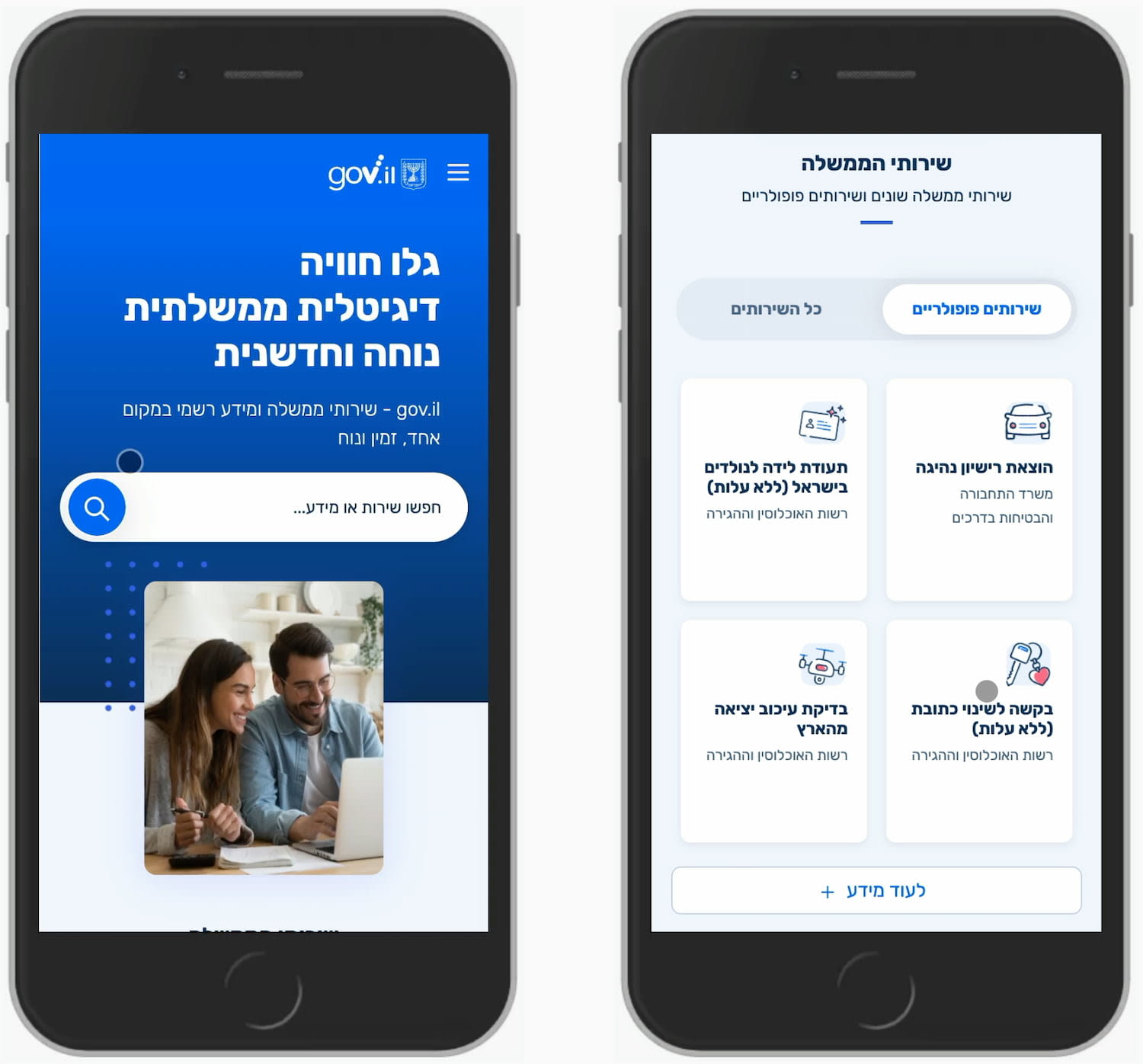
Sometimes we don’t need to highlight main features, but it might be a good idea to highlight top topics. Kanton Zürich, the public service of the Zurich county in Switzerland, and Gov.il do just that: the prominent area on the top are links or cards to the most important topics that visitors might find useful at the moment.
Summary #
If something requires more attention, we don’t necessarily need flashy animations or large carousels. We can just show the navigation more prominently. If it’s important, it shouldn’t be hidden behind a menu-button. That’s where the billboard pattern helps: as a grid, list of cards or just plain links.
We just need to be very careful of what goes on a billboard and what doesn’t. Sometimes it can change over time, but when top tasks don’t change, the billboard shouldn’t change either. Either way, the billpoard pattern can help in focusing on what matters, and avoiding distractions when they are unnecessary.