Onboarding UX
You've just signed up for a service, yet here it comes — the disruptive, annoying, attention-demanding onboarding tutorial.
You've just signed up for a service, yet here it comes — the disruptive, annoying, attention-demanding onboarding tutorial. It’s right there, asking for attention; yet chances are high that you will never find out what it was all about because you’ll be swiftly dismissing it with the "skip" link.
How do we deal with onboarding UX? What's the right way to explain our beautifully crafted new features or hidden treasures that our interface provides? Let's figure it out.
1. Slowly Guide Users To Small Success Moments #
While many onboarding tutorials focus on explaining how to locate some features, it might be a good idea to change the perspective and focus on bringing users to first success moments instead. The learning of the features and their location in the interface, then, happens gradually, slowly, step-by-step, but on the side.
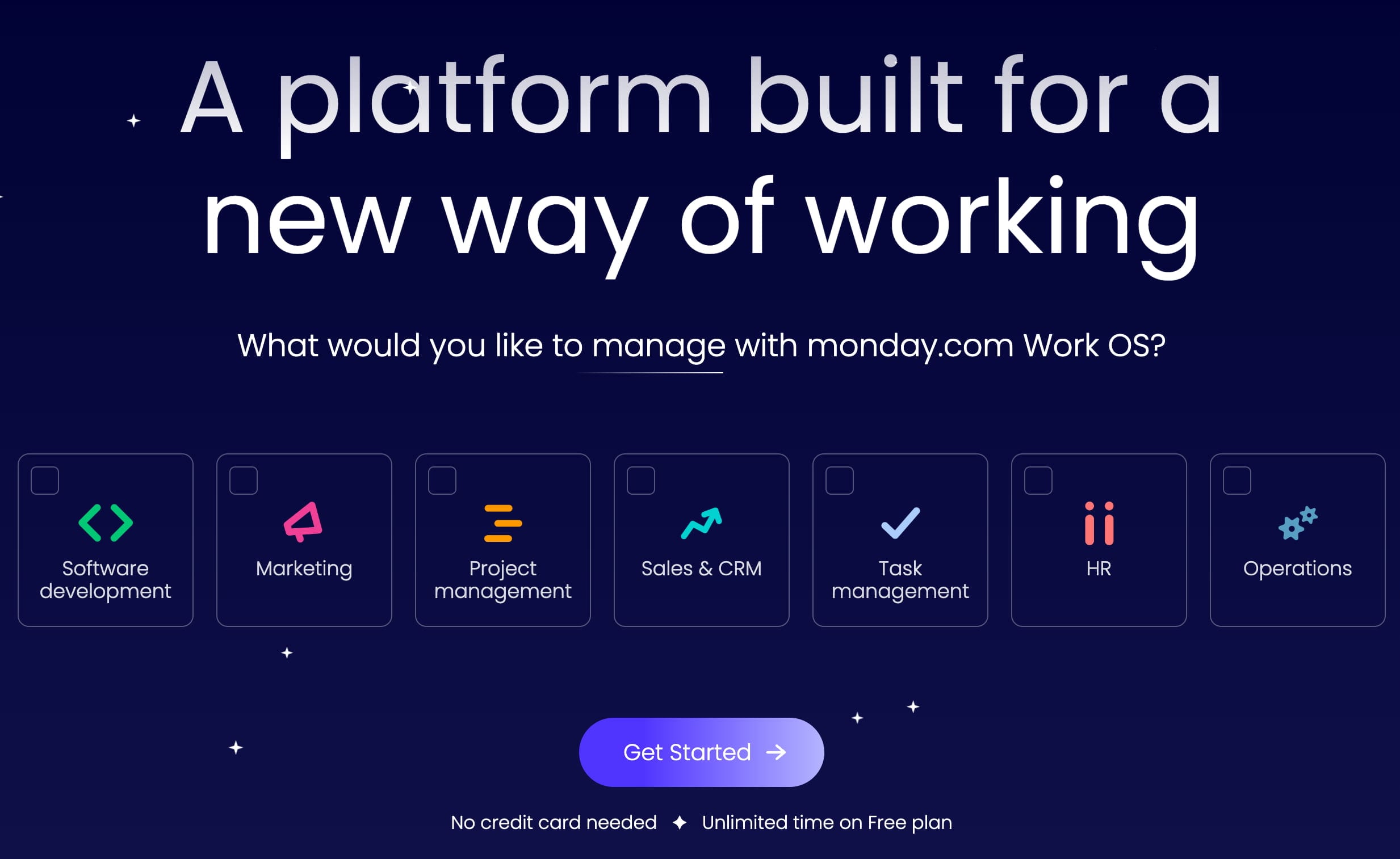
Monday.com and Notion bring users to success moments: users are asked to specify their context first; then they get one of the pre-made templates that's customized for their needs.
The goal is simple: we shorten the time to relevance as much as possible. For our various use-cases, we create and suggest presets and templates that will bring them to a good starting point faster. That's how Monday.com's onboarding works. No interactive tutorials or feature highlights — just a streamlined way to get to the first success moments. This works well.
2. Avoid Interactive Tutorials and Walkthroughs #
Anything that keeps users away from using the product is an unnecessary distraction. That’s why tutorials and walkthroughs are often dismissed almost instinctively. Instead, we'd be better off showing hints only if we are absolutely confident that they are going to be well-received and highly appreciated.
To do that, we need to time our onboarding hints well. We carefully choose and writte our hints and choose the right times and places for just-in-time-hints (Luke Wroblewski). In fact, features usually don't come out of nowhere: they address particular pain points and help users solve particular tasks.
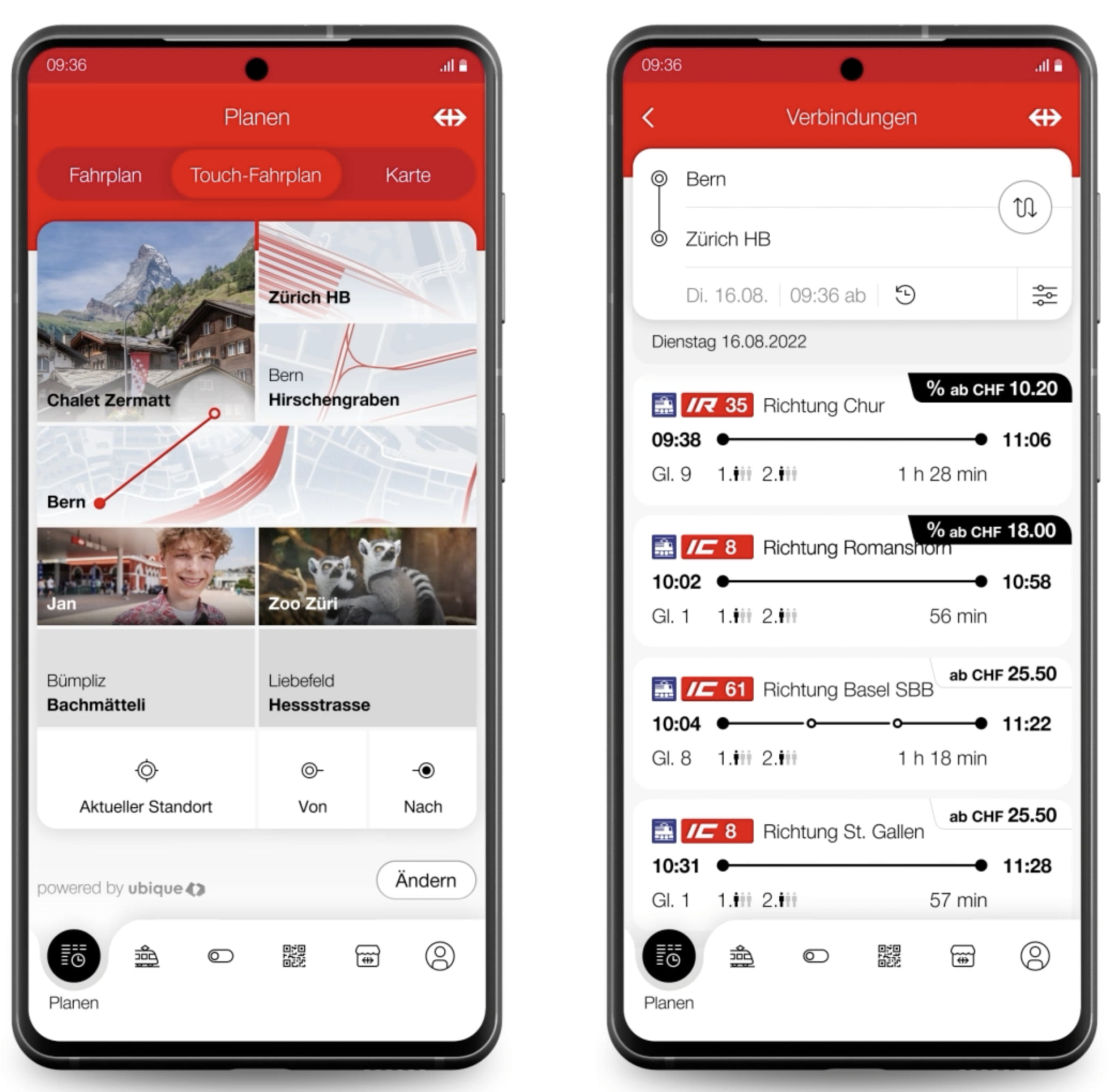
SBB Touch-Fahrplan allows users to connect two locations with a line: that’s the input. First time, users are educated how to connect the lines — and only about that feature. Video and detals.
We can tap into situations when users lose time by doing repetitive tasks, or make the same mistakes, and frame a feature as something that can help them solve tasks better and faster. We meticulously choose the right timings for each feature, and show hints when needed.
3. Collapsible Onboarding Checklist #
Probably one of the best ways of teaching users how to use the interface well is via a collapsible checklist. We use a non-modal dialog with up to 7 accordions that guide users through the necessary steps to complete the set-up or use the service. The onboarding checklist never blocks the UI, can be hidden, deferred — and restored later.
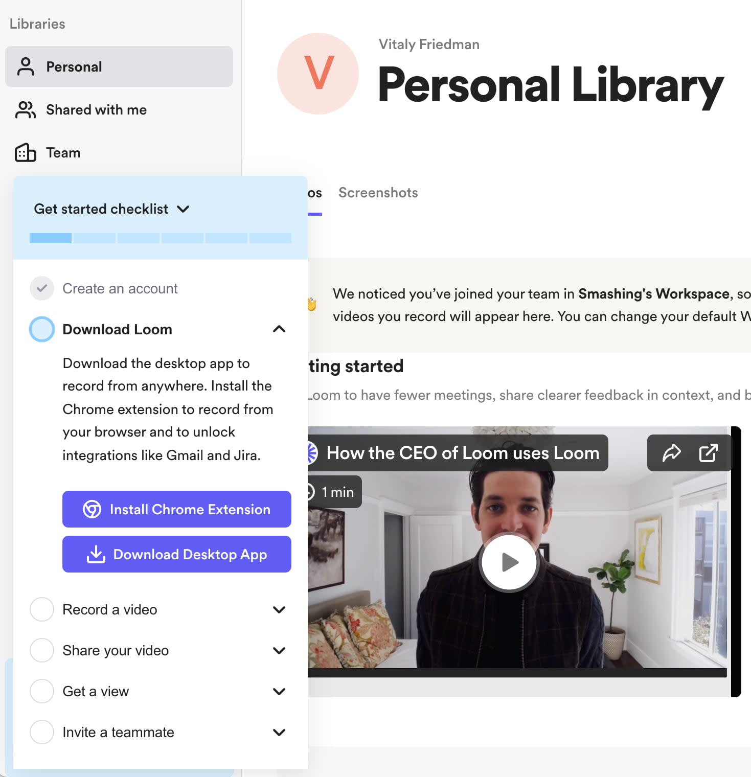
Loom makes onboarding optional; it can be collapsed and restored, if needed.
Loom's onboarding UX is a great example of getting onboarding right. Six simple steps, clearly labeled, eacy to check, easy to hide and restore — with a progress indicator on the top. That's how it could be done.
4. Prepare Users With a Custom Prompt #
If we need user’s permissions for location or notifications, need their consent, or would love to show them a few new features, why don't we politely ask users first if it would be OK for them?
Instead of showing anything disruptive immediately, we explain why we need their input before prompting any OS prompt. Users then have to activate a UI button first before interacting with the OS modal. At least a modal wouldn’t come as a big surprise, and is likely to have more positive responses.

Lime never shows OS prompts for permissions or notifications right away: it always prepares users with a well-integrated and clear messaging. It’s only on click that an OS prompt is displayed. That’s polite and respectful.
Wrapping Up #
If a feature is obvious, you might not need to explain it at all. As it turns out, the more integrated and "regular" a button appears, the more likely it is to be perceived as an integral part of the interface, and hence be used. Instead of highlighting the new feature, make it more subtle.
A "new" badge along with a very subtle background change might be perfectly enough. A single popover at the bottom of the screen might also work well. Anything beyond that might not create the desired result. And: as Adam Fard suggests, educate users incrementally, by structuring your suggestions in bite-sized chunks, so that users find them easy to learn.
Useful Resources #
-
Mobile App Onboarding, by Nielsen Norman Group
-
UX Onboarding Patterns, by Eve Weinberg,
-
UX Onboarding Checklist by Adam Fard,