Infinite Scroll UX
We all have our opinions about infinite scroll, and usually not very good ones. This has a number of good reasons.
We all have our opinions about infinite scroll, and usually not very good ones. This has a number of good reasons.
With infinite scroll, the sheer number of options is often overwhelming. There is no easy way to navigate between the “old” and “new” segments in the list. We don’t have any control about when and how many items appear. We can’t really bookmark a location and return to it later. The scrollbar keeps jumping. The footer is hard to reach. And there are plenty of accessibility and performance issues that go along with it.

All of these issues are just poor usability. So it’s not surprising that we often disregard infinite scroll as a fashionable technique which produces more problems than solutions.
However, usability tests show that every now and again infinite scroll can work well, especially when users browse on a site a lot. The speed of displaying results is significantly higher, and so is engagement. Can we make infinite scroll better?
Yes, we can.
Bookmarking a Position #
The easiest way to improve infinite scroll is by marking the breaks between “new” and “old” items in the list. When a new batch comes in, we separate the items visually and allow users to jump to the position of the list on next visit.

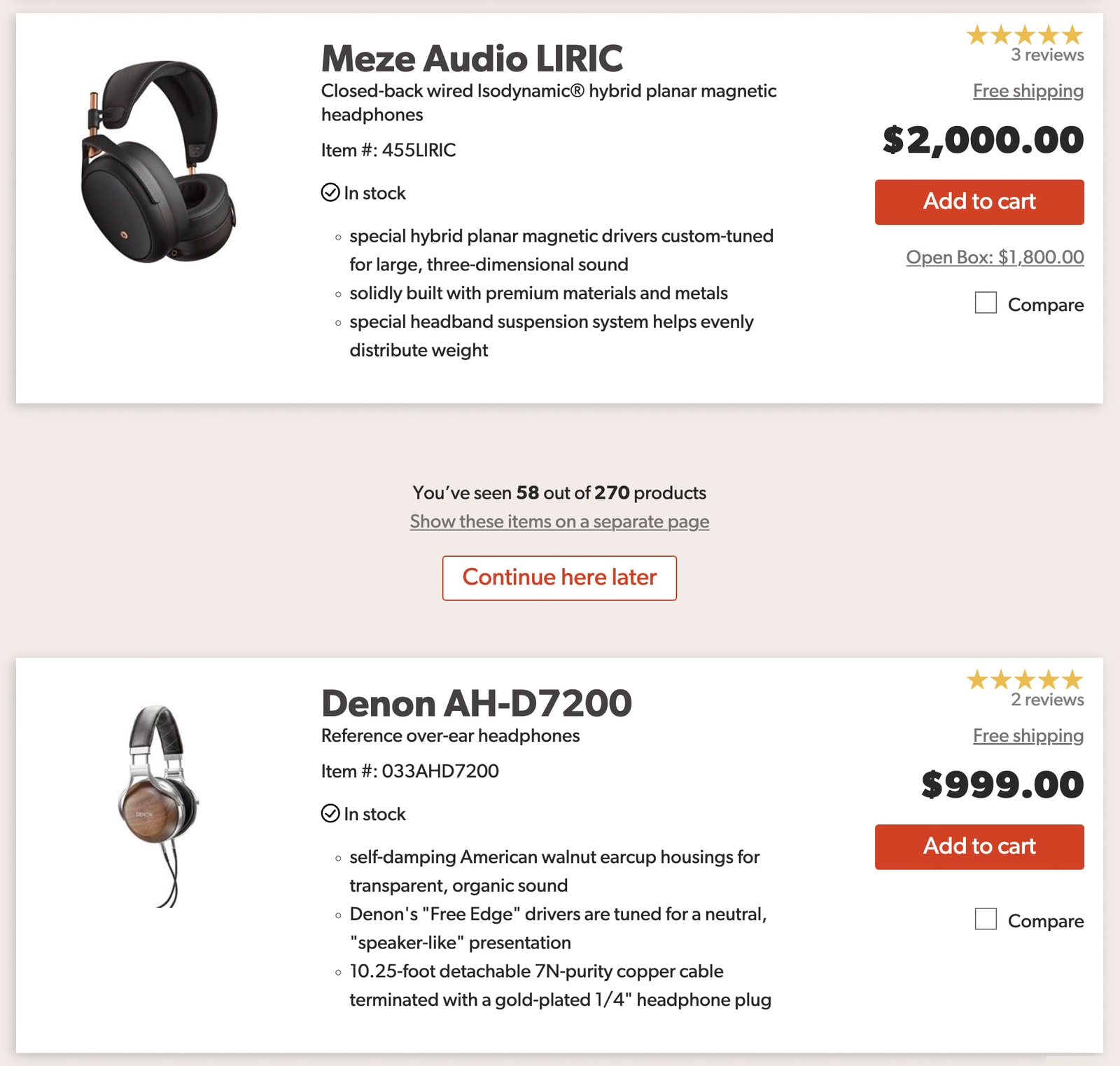
We could allow users to mark the current position in the list and continue browsing later. A mock-up, based on Crutchfield.com.
We could also allow them to copy a link to the current position. And perhaps even send it via email-so we could send them a reminder later, too.
Footer Reveal #
We could integrate a footer reveal: a little helper that would stay persistent at the bottom right bar, and display the footer if needed while the rest of the page uses infinite scroll. You can find a good example on Popmeals (no infinite scroll in use at the moment).

Combine Pagination and Infinite Scroll #
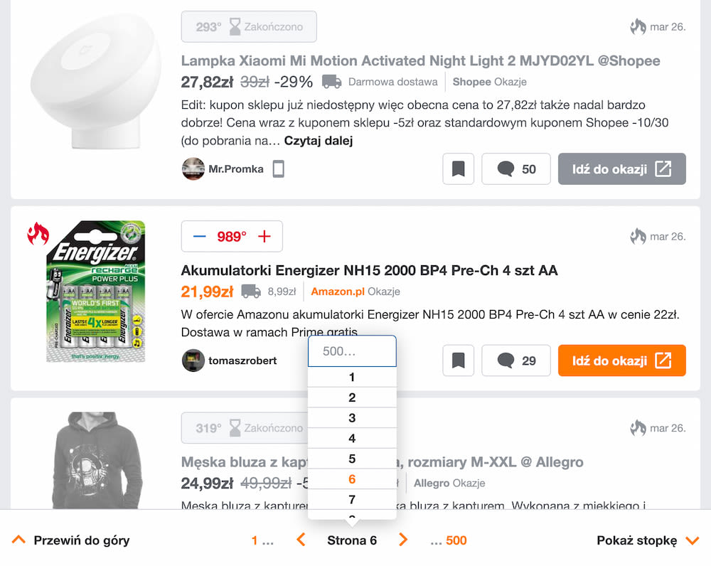
As users scroll down a page and items are loaded in, we can present it as dynamic pagination to users (see Pepper.pl). On scroll, the URL of the page changes and the page number is updated in the sticky bottom bar. Users can also navigate to a specific page in a pagination drop-down. And of course an accordion opens up a footer on tap or click as well.

Combining pagination and infinite scroll on Pepper.pl
Scrollbar Range Intervals #
We can make scrollbars more helpful by adding dynamic labels that are spaced out vertically. These would indicate to users where they current are and where they can jump to. As users keep scrolling down, the labels would be shifting as the scrollbar is growing. Could be used by any criteria a user has chosen to sort the items by. Mock-up by Baymard Institute.

Pinning Sections on a Mini-Map #
We could make it even more useful by allowing users to pin, or bookmark, areas of interest in the list, so they can return to favorites faster. An interesting prototype of such an experience is Minimap experiment (currently works only in Firefox), created by Rauno Freiberg, along with many other wonderful experiments.

Wrapping Up #
With these techniques, we’ve solved most problems that infinite scroll is known for. However, it might seem like a lot of work just to make infinite scroll better. Well, infinite scroll is not for every website, and if it is used, it always needs to be complemented with proper filtering, sorting and search.
The ideas highlighted here are just that-ideas. Some of them might fail miserably in your tests, while others might perform fairly well. But: if you absolutely need to make infinite scroll work, there are ways and workarounds to do so-it’s just not as straightforward as it might appear at first.


