We Don’t Need Hamburger Icons
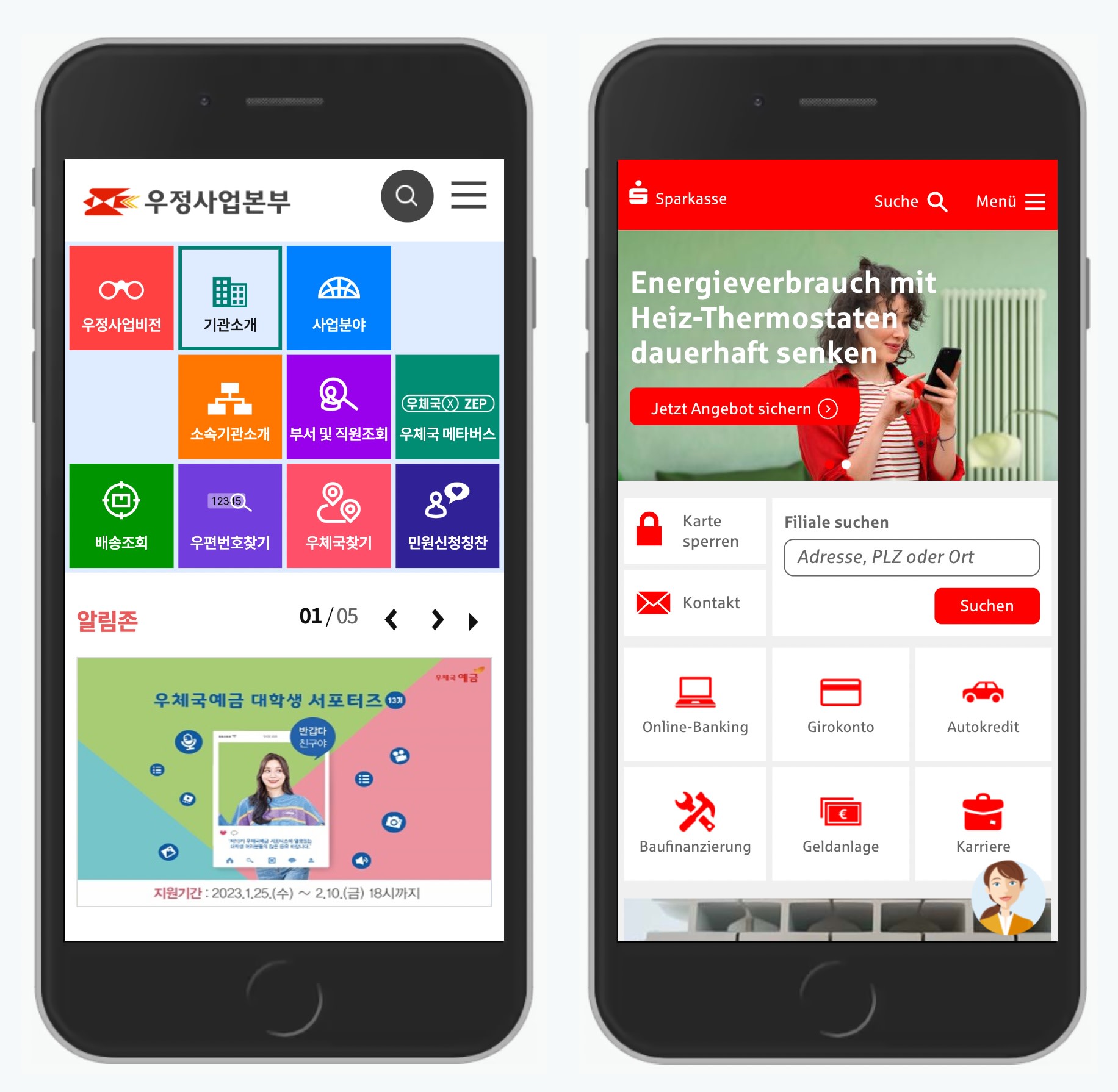
Do we really need a hamburger icon? Probably not. A simple “Menu” button never fails. It has an information scent. It’s universally understood.
There are many flavors of hamburger icons out there. From chocolate cakes and hot dogs to fries and veggie burgers. They all hide navigation, oftentimes critical navigation that users need to comfortably use the site.
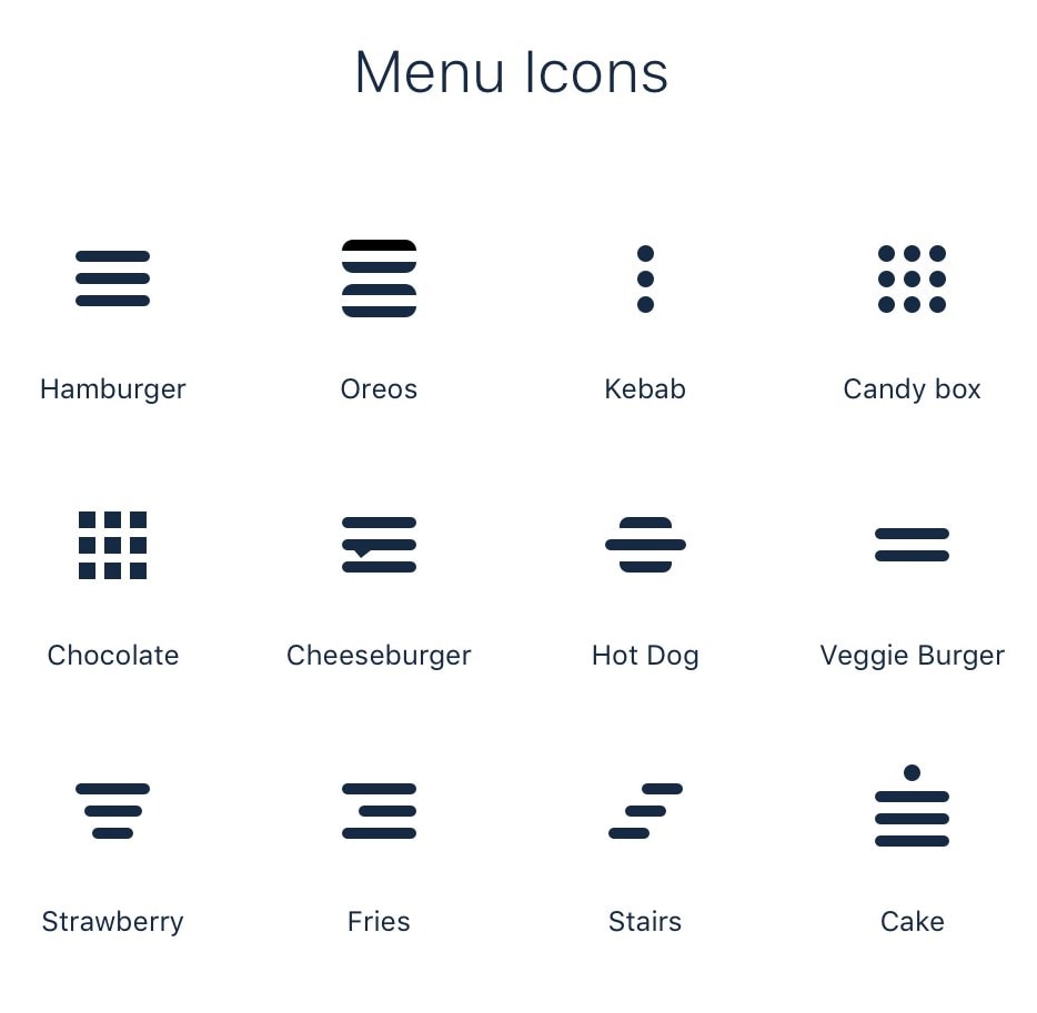
Hamburger icons come in many flavors. Designed by Alex Münch.
But not in a single usability session did they help users navigate faster than a boring, dull yet remarkably efficient “Menu” button. No icon, just a button with a text label. Perhaps with a chevron pointing down to indicate a drop-down behavior (as pictured below).
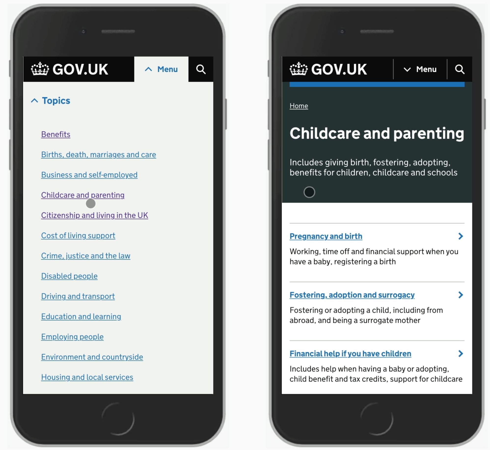
A simple “Menu” button never fails. It’s large, so it’s always easy to tap and click. As a button, it’s perceived as interactive. It works for frequent and inexperienced users. It works for teenagers and senior citizens. It has an information scent. It’s universally understood.
Simpler is always better. Obvious always wins. And it makes it damn hard for anybody to make a mistake, accidentally or not.
So no hamburgers or fries for me, I’m afraid. Consider me old-fashioned, but I’m going to stick with the “Menu” button for the time being.
