A Guide To Designing For Mobile (iOS, Android)
Guidelines and pointers for mobile design for iOS and Android — with useful resources on layout, grid, colors, typography, icons and components for iOS and Android.
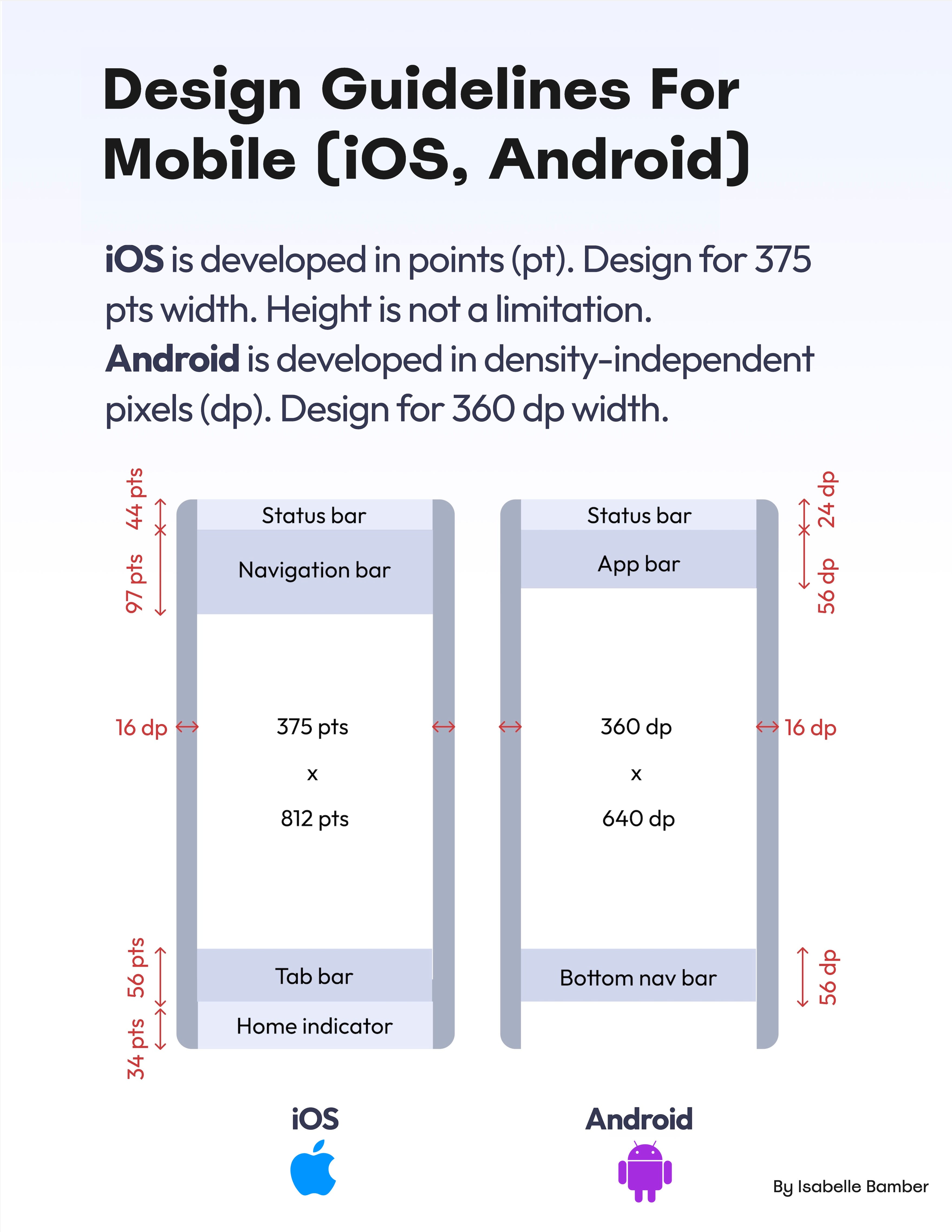
When it comes to designing for mobile, there is always quite a bit of confusion between all the different units, guidelines and measurements in iOS and Android. Here’s a quick cheat sheet (PDF) to help you get started with your mobile app design.
Key Takeaways #
- For Android, the most recent design language is Material 3.
- For iOS, it’s Human Interface Guidelines (HIG) for iOS 17.
- iOS apps are designed in pt, Android apps in dp.
- When designing for iOS, start with 375×812pt.
- When designing for Android, start with 360×640dp.

Designing For Mobile (iOS, Android) (PDF), a cheat sheet kindly shared by Isabelle Bamber.
- iOS: “Back” is in the bottom left, Android: top left.
- iOS: “Add” action is top right, Android: FAB is bottom right.
- iOS: Primary text and forms at least 17pt, tab bar at least 10pt.
- Android: Primary text and forms at least 14sp, labels at least 11sp.
- Tap targets: 11mm+ (31pt/42px) on the top of the screen.
- Tap targets: 12mm+ (34pt/46px) at the bottom of the screen.
Further Reading #
-
A Comprehensive Guide To Designing For iOS, by Anastasia Prokhorova
-
iOS vs. Android UI Guidelines, by Isabelle Bamber
-
Layout Grid in Mobile App Design, by Andrii Zhulidin 👽
-
Modern iOS Navigation Patterns, by Frank Rausch
-
A Complete Guide To iOS Design Guidelines, by Erik Kennedy
-
iOS vs. Android App UI Design, by Erik Kennedy
-
iOS 16 UI Kit for Figma, by Joey Banks
-
Material 3 Android 13 UI Kit (Figma), by Eduardo Pratti
-
Mobile UX: Study Guide, by Raluca Budiu
-
Mobile Usability: Tap Target Sizes Cheatsheet, by yours truly
-
Touch Design for Mobile Interfaces (Book), by Steven Hoober


