Color Contrast Cheat Sheet PDF
Practical guidelines on minimum color contrast for better legibility, along with helpful tools and useful resources.
Poor color contrast is the most common problem on the web. Here are some useful guidelines for text and buttons, with minimum contrast recommendations for better legibility, a few color contrast tools and useful resources.
How Color Contrast Is Calculated #
In general, color contrast captures the difference in brightness between two or more colors. We often use it to measure how well one foreground color works against a background color. Under the hood, the contrast is calculated using relative luminance of colors.
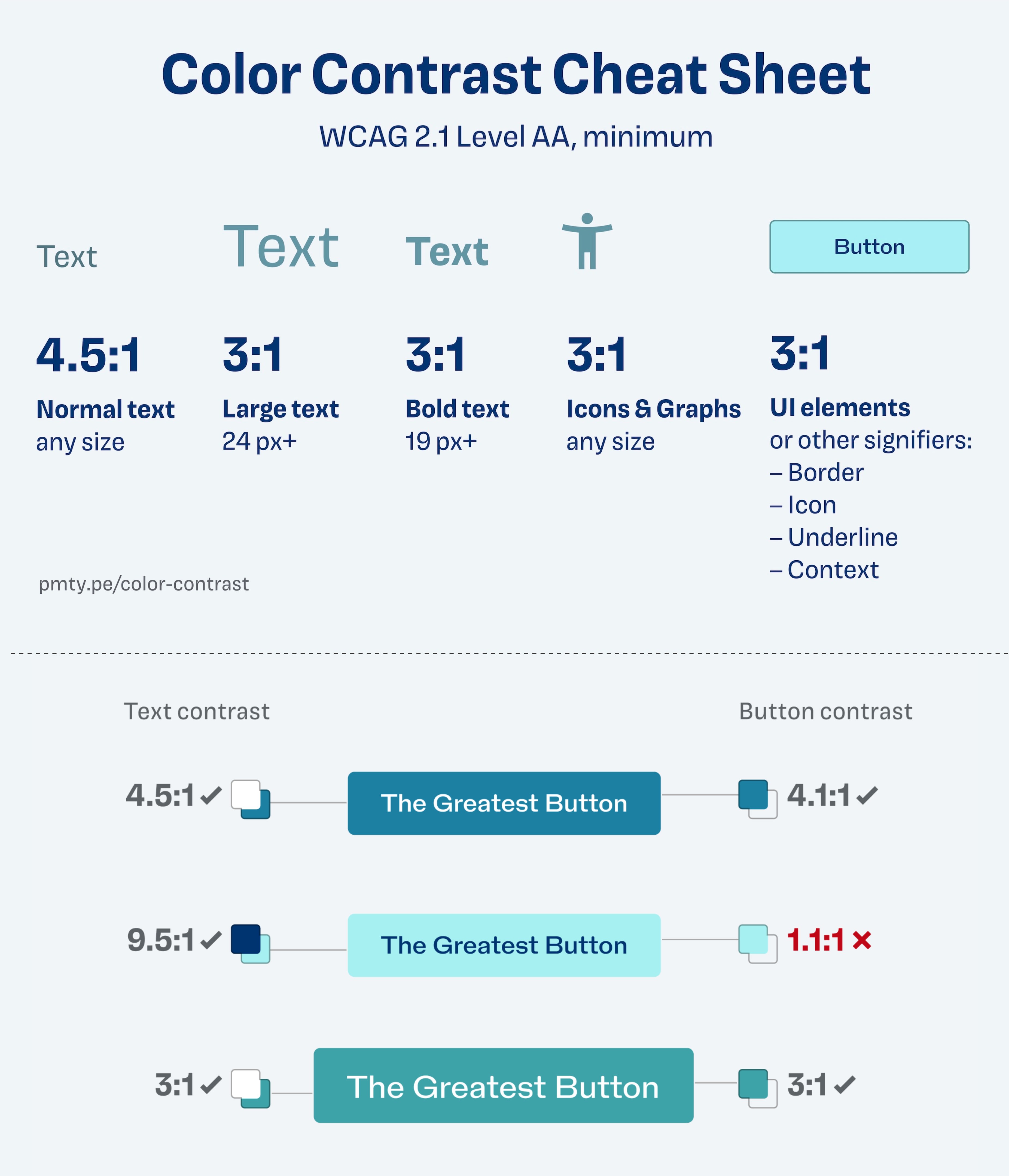
Color Contrast Cheat Sheet PDF (scroll to the bottom), kindly shared by Oliver Schöndorfer. Large view.
The greater the difference in luminance, the higher the contrast ratio. And the higher the contrast ratio, the better the readability. For example, white-on-white has the 1:1 contrast ratio (minimum), black-on-white is 21:1 (maximum).
However, we don’t need extreme color contrast though. In practice, moderate contrast between these extremes usually works best. We use color contrast to ensure legibility and color differentiation in our UIs. Keep in mind that a high color contrast alone isn’t sufficient for colorblind people.
WCAG 2.1 Level AA, Minimum Contrast Cheat Sheet #
✅ Level AA is considered the industry standard today
✅ 4.5:1 for regular text vs. background (7.1 for AAA)
✅ 3:1 for text larger than 24px (4.5:1 for AAA)
✅ 3:1 for bold text larger than 19px (4.5:1 for AAA)
✅ 3:1 icons and graphs of any size
✅ 3:1 UI elements, buttons, borders, underlines
Please keep in mind that these guidelines are minimum recommendations, and color contrast is one of the many factors that contribute to better accessibility. We might want to add a border to create boundaries for our UI components. And it is a good idea to add an icon or an underline to clearly mark interactive components.
You can find more details and a cheatsheet PDF in the end of Oliver’s article (email is required).
Useful Color Contrast Tools #
- Colorable Accessibility Tool
- Random Accessible Color Schemes
- Closest Accessible Colors Generator
- Accessible Color Contrast Grid
- Accessible Brand Colors Generator
- A11y Color Contrast in Figma
- Leonardo Color Palette Generator
- Color Blind Figma Plugin
- Stark Accessibility Plugin for Figma
Useful Articles on Color Contrast #
- Fix Color Contrast – Web Accessibility for Text & UI Design, by Oliver Schöndorfer
- Color Accessibility: Tools and Resources, by Stéphanie Walter
- An Interactive Guide To Colors and Contrast, by Nate Baldwin
- The “Dark Yellow Problem” in Color Palettes
- Designing Accessible Color Systems (Stripe case study), by Daryl Koopersmith, Wilson Miner
- Accessible Palette: Stop Using HSL for Color Systems, by Eugene Fedorenko
- Color Contrast Guidelines With APCA, by Lisa Charlotte Muth