Accordion Icons: Which Ones Work Best?
Research shows there's a real difference between carets, arrows and plus icons for accordions — and why split menus, where the icon and the label link to different actions, are the most harmful pattern of all.
What icon is the most reliable to show expansion and collapsing for accordions? Is there really any noticeable difference between carets, chevrons, arrows and triangles?
Well, research from NN/g shows that there is some difference indeed. But what's more interesting is that split menus are harmful, why it's better to not have icons and text labels link to different actions, and why the caret is the safest icon choice. Let's dive in.
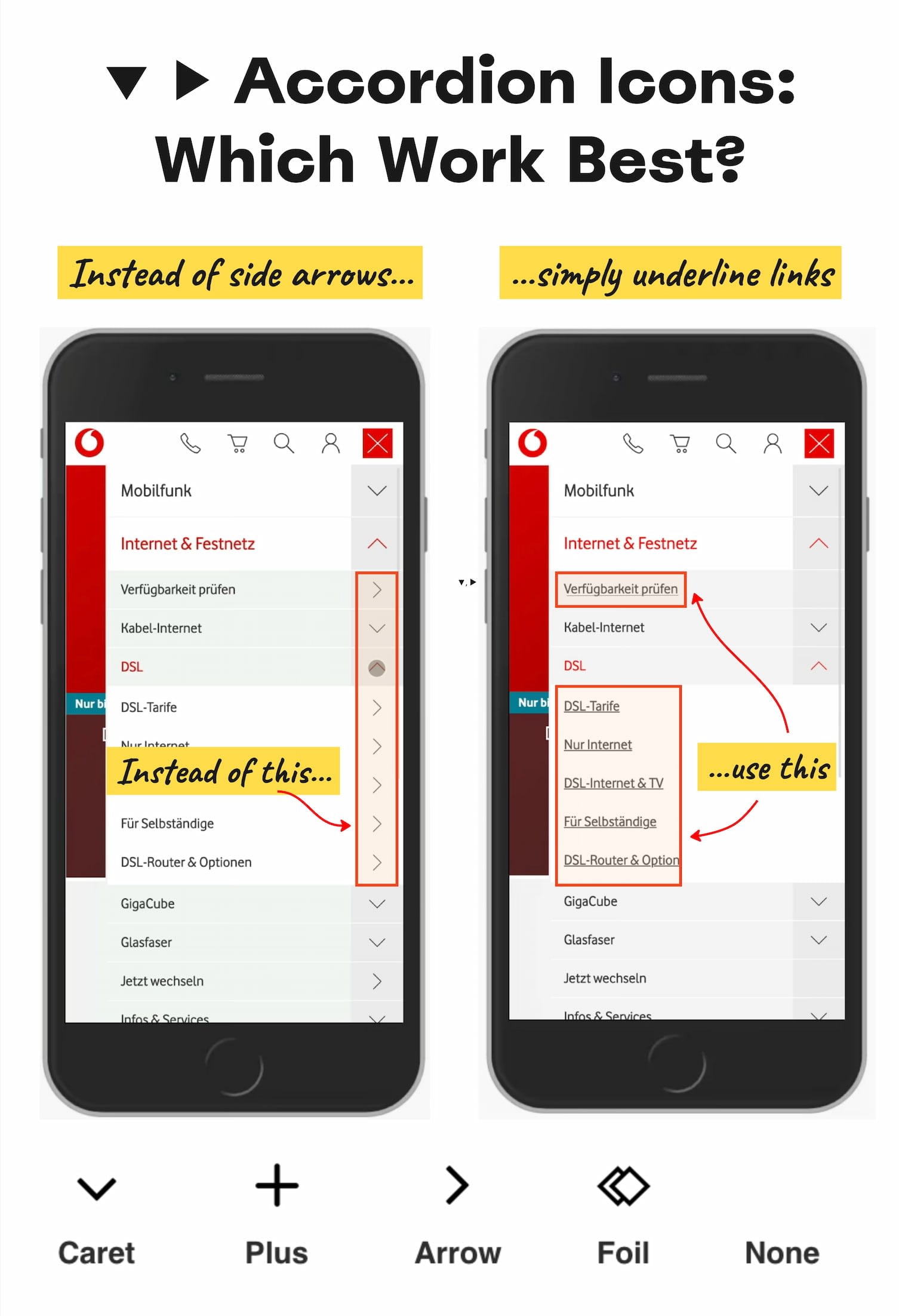
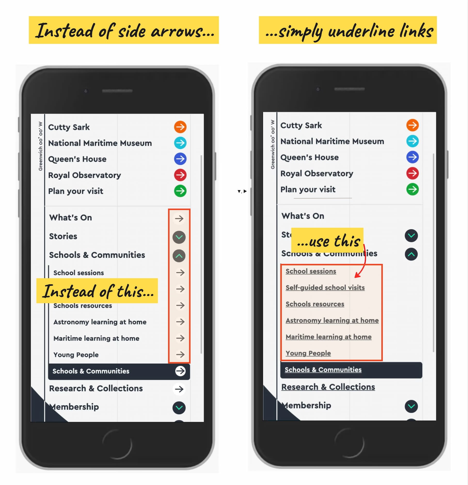
Research from NN/g on which accordion icons work — and which create confusion. If it's a link, underline it. If it opens an accordion, use a caret. It's that simple. Large view.
No Icon Means "Opening The Page" #
The findings aren't very surprising: without any icon in use, users expect that tapping on the menu item would take them directly to a new page. Users often struggle with custom icons, as they don't clearly signal that they'll open an accordion. And people tend to tap fairly equally on the icon and on the label for most icons.
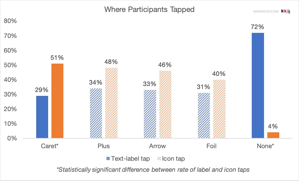
Participants were equally likely to tap on either the text label or the icon, except for the caret, where people tapped more on the icon. From the NN/g study on accordion icons.
Many designs tend to slightly overcomplicate things by adding arrows and carets pointing everywhere, depending on the state of the accordion. But typically we don't need to use an arrow to indicate a link to the category.
People tend to tap fairly equally on the icon and on the label — which means the icon choice affects the whole hit area, not just the visual signal. From the NN/g study on accordion icons.
The rule of thumb is very simple: if it's a link, the easiest and most effective way is to simply underline it — without any arrow, caret or other icon. Perhaps it's not particularly exciting, but it works flawlessly every single time.
Confusing Behavior With Arrows ▶ And Split Buttons #
Using a right-facing arrow icon ▶ isn't associated with an expectation of going directly to a new page. And having the same icon pointing down ▼ doesn't necessarily imply that an accordion is going to open on tap or click.
It's a good idea to avoid split buttons for accordions — where the text label links directly to a page, but the icon opens the accordion. Instead, it's much more reliable to allow users to tap on a main category to expose the menu; and to access the category page, add a link to it inside the menu itself.
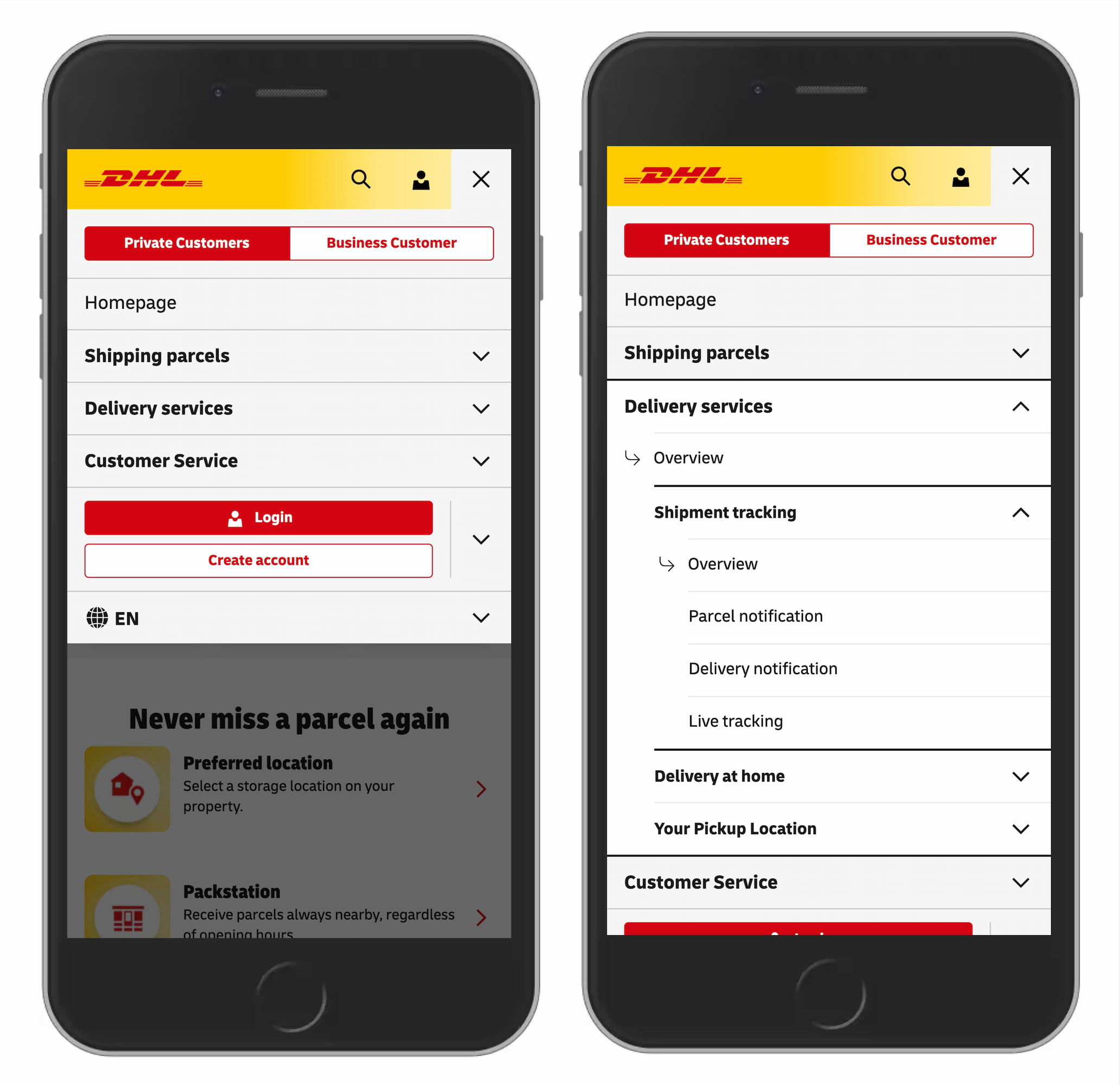
An accordion navigation from DHL: no unnecessary arrows, no split menus, with an "Overview" link in each section. DHL.de.
Plus +/− And Arrows ↓/↑ Are Understood, But Can Be Misread #
For accordions, we typically use +/− or arrows ↓/↑ to signal expanded and collapsed states, and typically it works well. However, both have many different interpretations. Plus + can mean anything from saving for later to adding to cart to zooming in, and it can be particularly confusing for multi-level navigation, with many levels open at the same time.
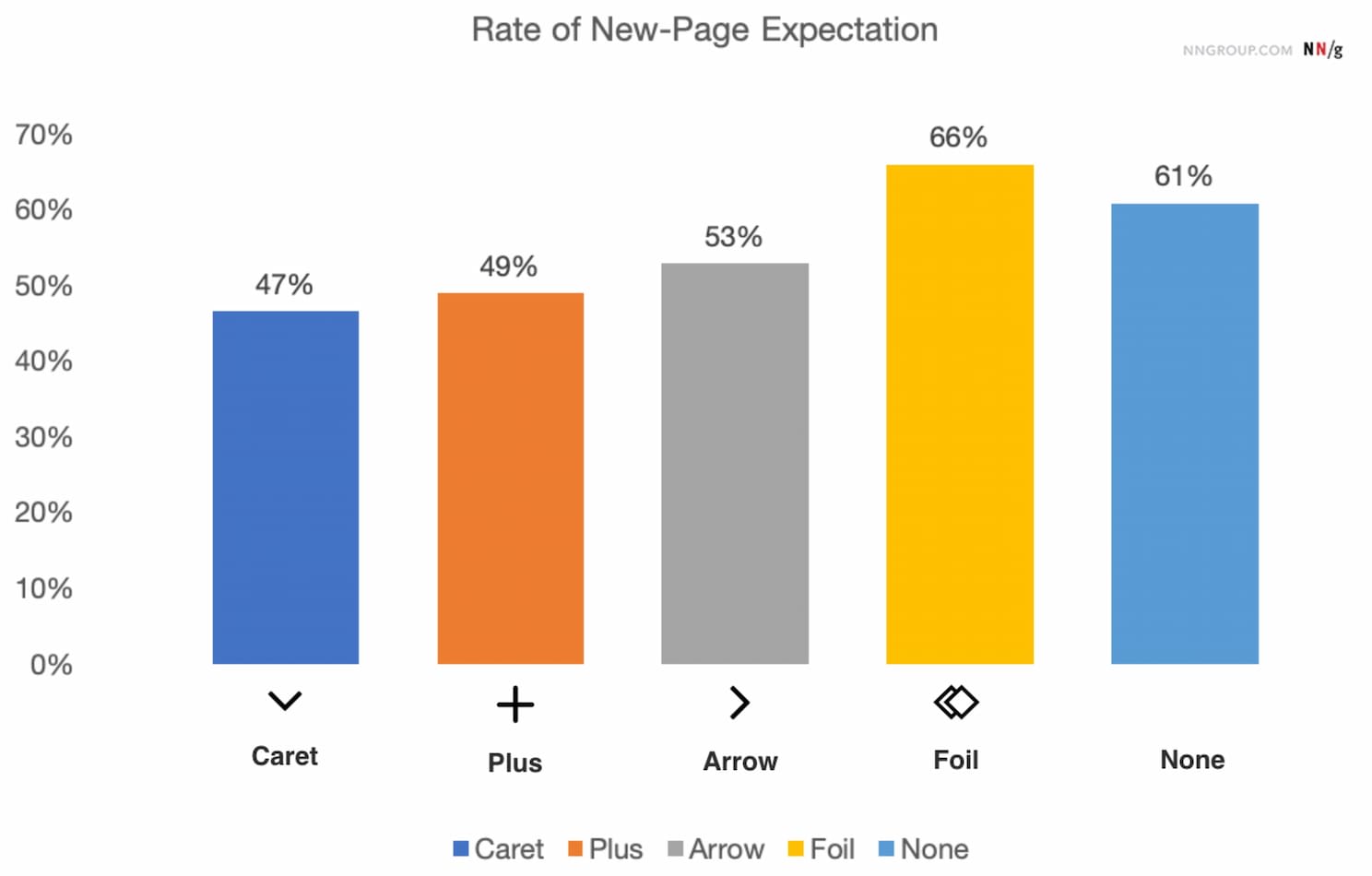
What users actually expect: more people expect a new page when clicking on an arrow, but even more when no icon is provided at all. From the NN/g study on accordion icons.
Arrows ↓/↑ can mean scrolling, sliding or jumping to the next match, but also jumping to a particular portion of a page. Both plus and arrows are well-understood and work, but depending on the design they can be confusing — mostly because they are overloaded.
Wrapping Up #
The safe choice is to use the caret or triangle pointing down ▼ by default, and change it to a caret pointing up, or sideways ▶, on interaction. If you need an alternative, +/− typically works well too.
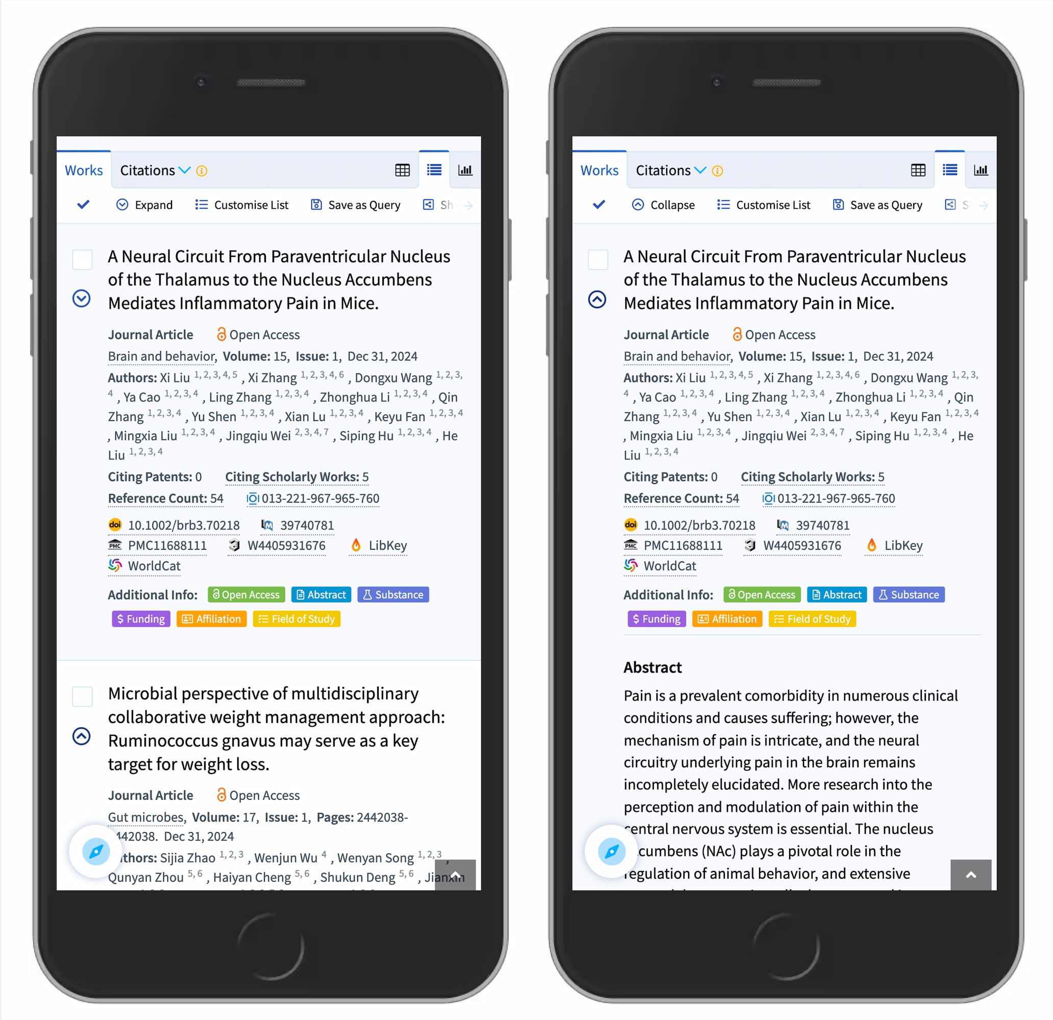
The caret working well for search results expansion. Lens.org uses a caret-down to indicate collapsible items.
But we certainly don't need any further icons or arrows to indicate where a link goes. The same goes for split menus, which often produce more mistakes than they help with. Instead, use one button or dropdown that does exactly one thing — shows all options and allows users to drill down.
And if you need a direct link, link the title directly to the page and underline it. More often than not, simpler is better.
Useful Resources #
- Accordion Icons: Chevron, Triangle, Plus, or Arrow?, by Nielsen Norman Group.