2-Page Login Pattern, And How To Fix It
UX challenges of 2-page logins forms, what problem they solve and an alternative design with a slightly better UX.
Why do we see login forms split into multiple screens everywhere? Instead of typing email and password, we have to type email, move to the next page, and then type password there. This seems to be inefficient, to say the least.
Let’s see why login forms are split across screens, what problem it solves and how to design a better experience for better authentication UX (video).
The Problem With Login Forms #
If there is one thing we’ve learned over the years in UX, it’s that designing for people is hard. This applies to login forms as well. People are remarkably forgetful. They often forget what email they signed up with, or what service the signed in with last time (Google, Twitter, Apple etc.)
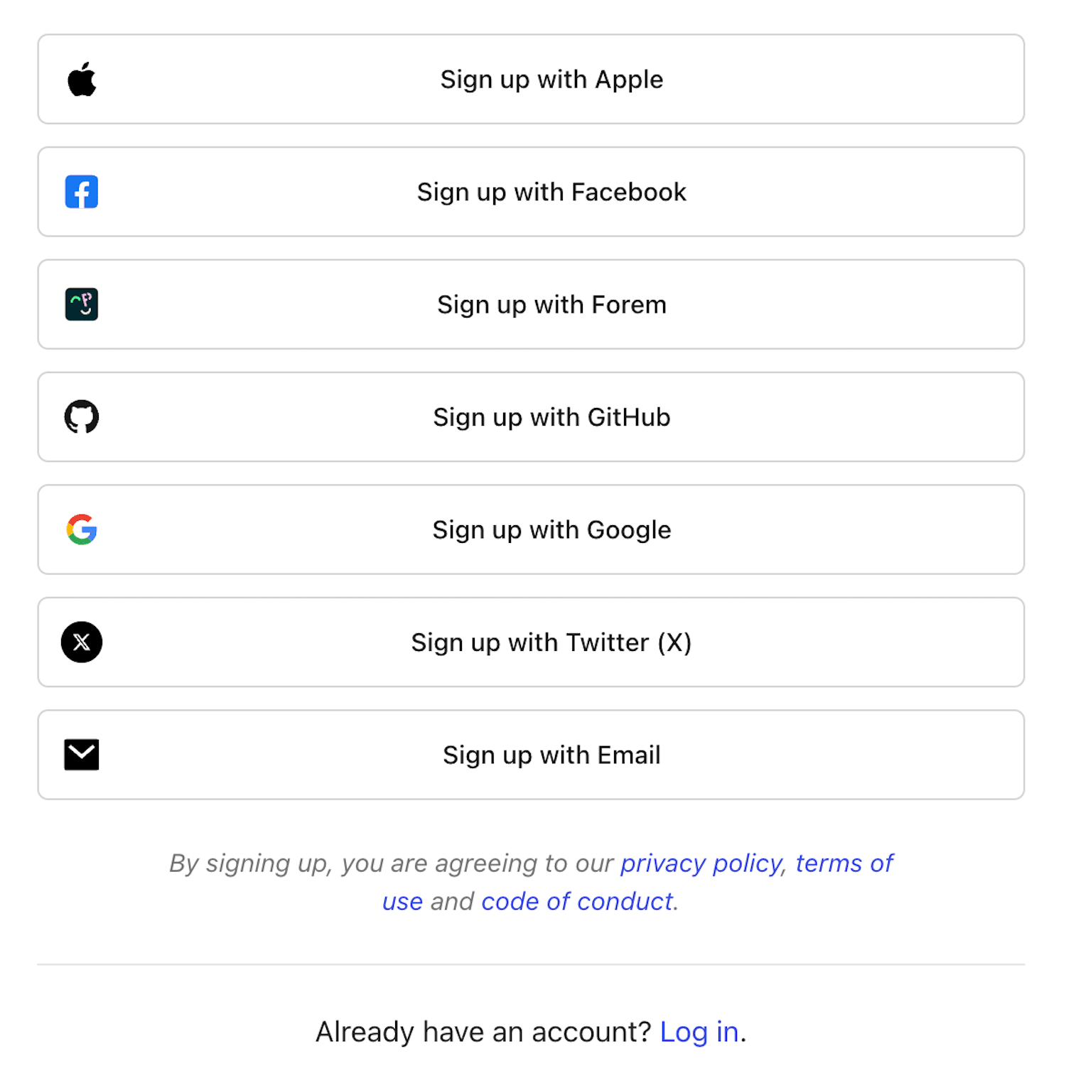
One of the many: plenty of login options to choose from, and people usually don't remember their last choice.
One idea is to remind customers what they've signed in with last time, and perhaps make it a default option — however, it reveals directly what user’s account was, which might be a privacy or security issue:

Highlighting what a user has signed in with last time. An example from Spectrum (no longer available). Large view.
What if instead of showing all options to all customers all the time, we ask for email first, and then look up what service they used las time, and redirect customers to the right place automatically? Well, that’s exactly the idea behind 2-page logins.
Meet 2-Page-Logins #
You might have seen them already. If a few years ago most login forms asked for email and password on one page, these days it’s more common to ask only for email first. When the user chooses to continue, the form will ask for password, in a separate step. Brad explores some problems of this pattern.

2-page-login at Shopify: email first, the rest later. Image source: Brad Frost
A common reason for splitting login form across pages is Single Sign-On (SSO) authentication. Large companies typically use SSO for corporate sign-ins of their employees. With it, employees only log in once every day and only use one set of credentials, which improves enterprise security.
The UX Intricacies of Single Sign-On (SSO) #
SSO also helps with regulatory compliance, and it’s much easier to provision users with appropriate permissions, and revoke them later at once. So if an employee leaves, all their accounts and data can be deleted at once.
To support both business customers and private customers, companies use 2-step-login. Users need to type in their email first, then the validator checks what provider the email is associated with, and redirects users there.
Users rarely love this experience. Sometimes they have multiple accounts (private and business) with one service. Also, 2-step-logins often break autofill and password managers. And for most users, login/pass is way faster than 2-step-login.
Of course typically there are dedicated corporate login pages for employees to sign in, but they often head directly to Gmail, Figma etc. instead, and try to sign in there. However, they won’t be able to log in as they must sign in through SSO.
Bottom line: the pattern works well for SSO users, but for non-SSO users it results in a frustrating UX.
Alternative: Conditional Reveal of SSO #
There is a way to work around these challenges (see the image below). We could use a single page look-up with email and password input fields as a default. Once a user has typed in their email, we detect if the SSO authentication is enabled.
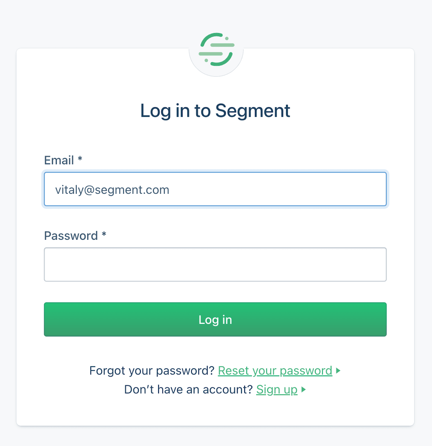
An alternative: show email and password by default at first. Large view (+ video preview).
If Single Sign-On (SSO) is enabled for that email, we show a Single Sign-On option and default to it. We could also make the the password field optional or disabled.
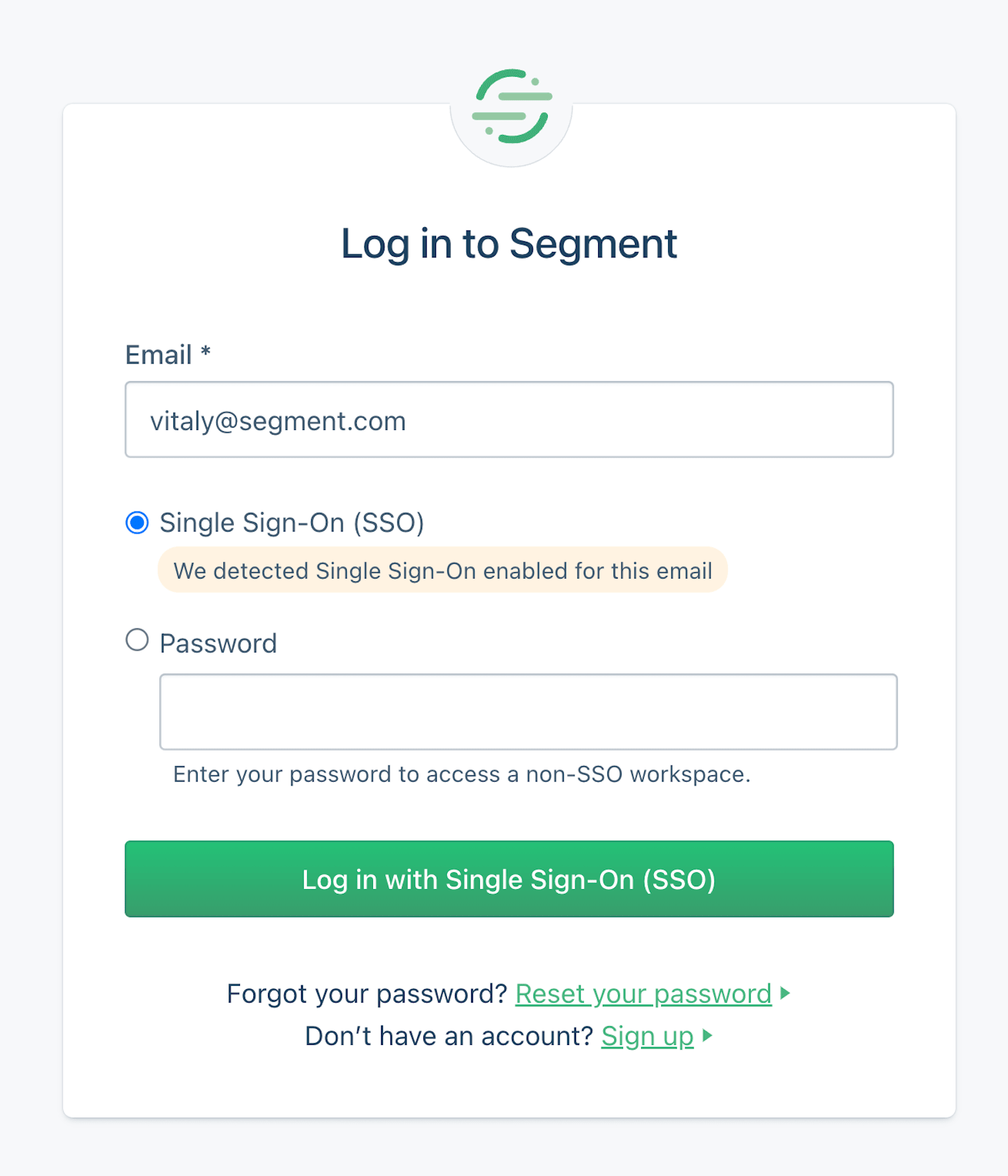
An alternative: show email and password by default at first. Large view (+ video preview).
If SSO isn’t enabled for that email, we proceed with the regular email/password login. Not much hassle, but saves trouble both for private and business accounts.
Key Takeaways #
🤔 People often forget what email they signed up with.
🤔 They also forget auth service they signed in with.
🤔 Companies use Single Sign-On (SSO) for corporate sign-in.
🤔 Individual accounts still need email and password for login.
✅ 2-step login: ask for email, then redirect to the right service.
✅ 2-step-login replaces “social” sign-in for repeat users.
✅ It directs users, rather than giving them roadblocks.
🤔 Users still keep forgetting the email they signed in with.
🤔 Sometimes users have multiple accounts with 1 service.
🚫 2-step-logins often break autofill and password managers.
🚫 For most users, login/pass is way faster than 2-step-login.
✅ Better: start with one single page with login and password.
✅ As users type their email, detect if SSO is enabled for them.
✅ If it is, reveal an SSO-login option, and set a default to it.
✅ Otherwise proceed with the regular password login.
✅ If users must use SSO, disable password field — don’t hide it.
Wrapping Up #
Personally I haven’t tested the approach but it might be a good alternative to 2-page logins — both for SSO and non-SSO users. Keep in mind though that SSO authentication might or might not require a password, as sometimes login happens via Yubikey or Touch-ID or third parties (e.g. OAuth).
Also, eventually users will be locked out: it’s just a matter of time. So do use magic links for password recovery or access recovery, but don’t mandate it as a regular login option. Switching between applications is slow and causes mistakes. Instead, nudge users to enable 2FA: it’s both usable and secure.
And most importantly: test your login flow with the tools that your customers rely on. You might be surprised how broken their experience is if they rely on password managers or security tools to log in. Good luck, everyone!
Useful Resources #
- When To Use A Two-Page Login, by Josh Wayne
- Don’t Get Clever With Login Forms, by Brad Frost
- Why Are Email And Password On Two Different Pages?, by Kelley R.
- Six Simple Steps To Better Authentication UX, by yours truly
