Frequently Asked Questions UX
The best FAQ is the one that doesn’t exist, as long as we answer user’s questions where they have them. UX guidelines to keep in mind when designing an FAQ page.
Barely any website can escape the curse of the FAQ section. Even seemingly simple products eventually grow roots as the user base expands. Sadly, the web is not a particularly friendly place, and so users have all kinds of doubts, objections, questions and concerns — and they need to be addressed.

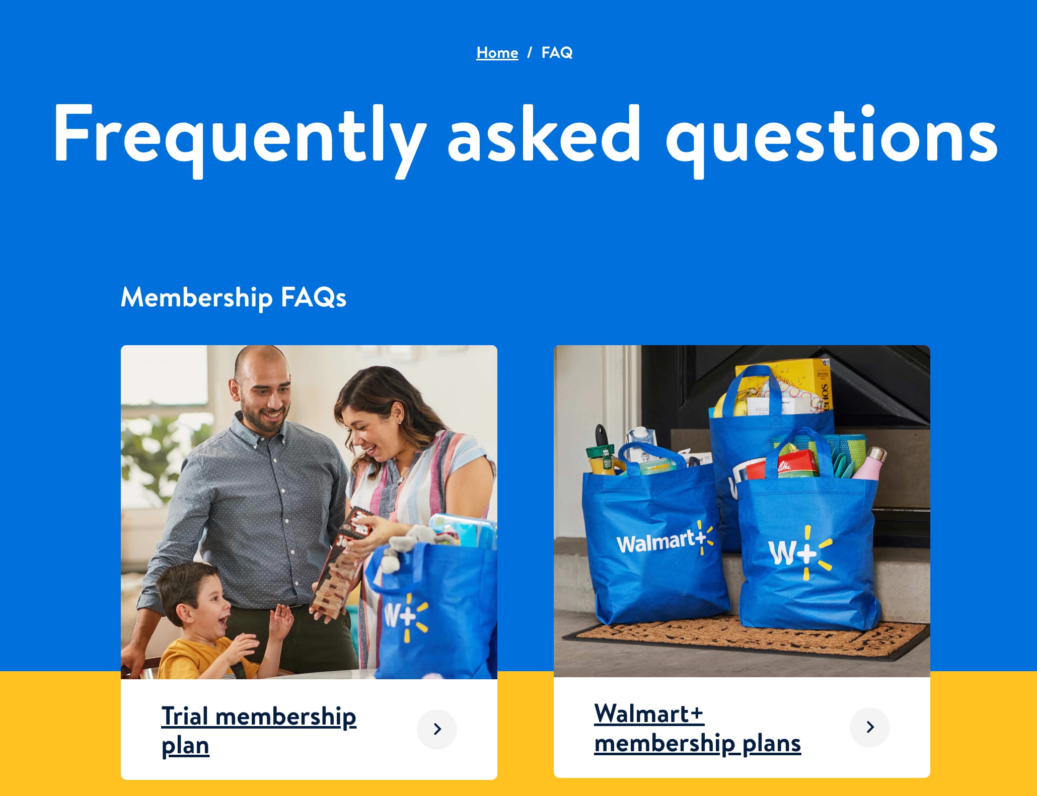
Walmart FAQ hub highlights multiple FAQ guides, depending on the topic of interest, sometimes with one-line answers.
But are FAQs a good solution to do just that? Not necessarily. Let’s explore some of the issues that FAQs have, and how to actually help customers find what they need. You can find more details on that in the usability chapters in the video library.
Usability Pitfalls With FAQs #
We’ve learned to rely upon dedicated FAQ sections over the years, and users seem to understand the concept very well. However, on an FAQ page they typically scan questions for a specific keyword, or use in-browser search to find what might be relevant for them.
The questions format, however, doesn’t aid in quick navigation to the answer. And with accordions, the answers usually aren’t accessible without opening each accordion.

On Airtable Help Center, there are no FAQs. Instead all topics are presented as cards, front-loaded with keywords.
This reveals some significant usability issues:
-
FAQ is unlikely to help if customers don't know if a particular piece of content or feature exist on the site. People don't call support about tools they don't know exist.
-
FAQs are too slow to use: they are convenient for writers, but take significantly more time for users to scan and understand.
-
FAQs lead to duplication: as multiple pages repeat the same information, they pollute search,
-
FAQs are difficult to navigate: they force content designers to group content by general type or format, rather than task (e.g. toolkits, resources, videos),
-
FAQs need to be actively maintained: customer’s questions change frequently, and multiple sections of the site must be updated.
-
FAQs also have governance issues: every piece of content needs an owner, but it’s difficult to assign an owner to an FAQ page spanning multiple topics.
In general, just like PDFs, FAQs are examples of organization-centric form of navigation and content. Since many customers don’t know how the organization is structured and how it works, they often experience issues finding an answer in a myriad of poorly organized questions.
The Best FAQ Isn’t Even There #
Typically FAQs emerge because users can't easily find a particular piece of information on the site, and keep sending similar questions to the service desk — after all, these questions are “frequently asked”.
However, this isn't really an indicator that an FAQ section is needed, but rather that IA, navigation and search aren't working very well. Before setting up an FAQ page, we can try to find a way to show answers where users actually expect to find them.

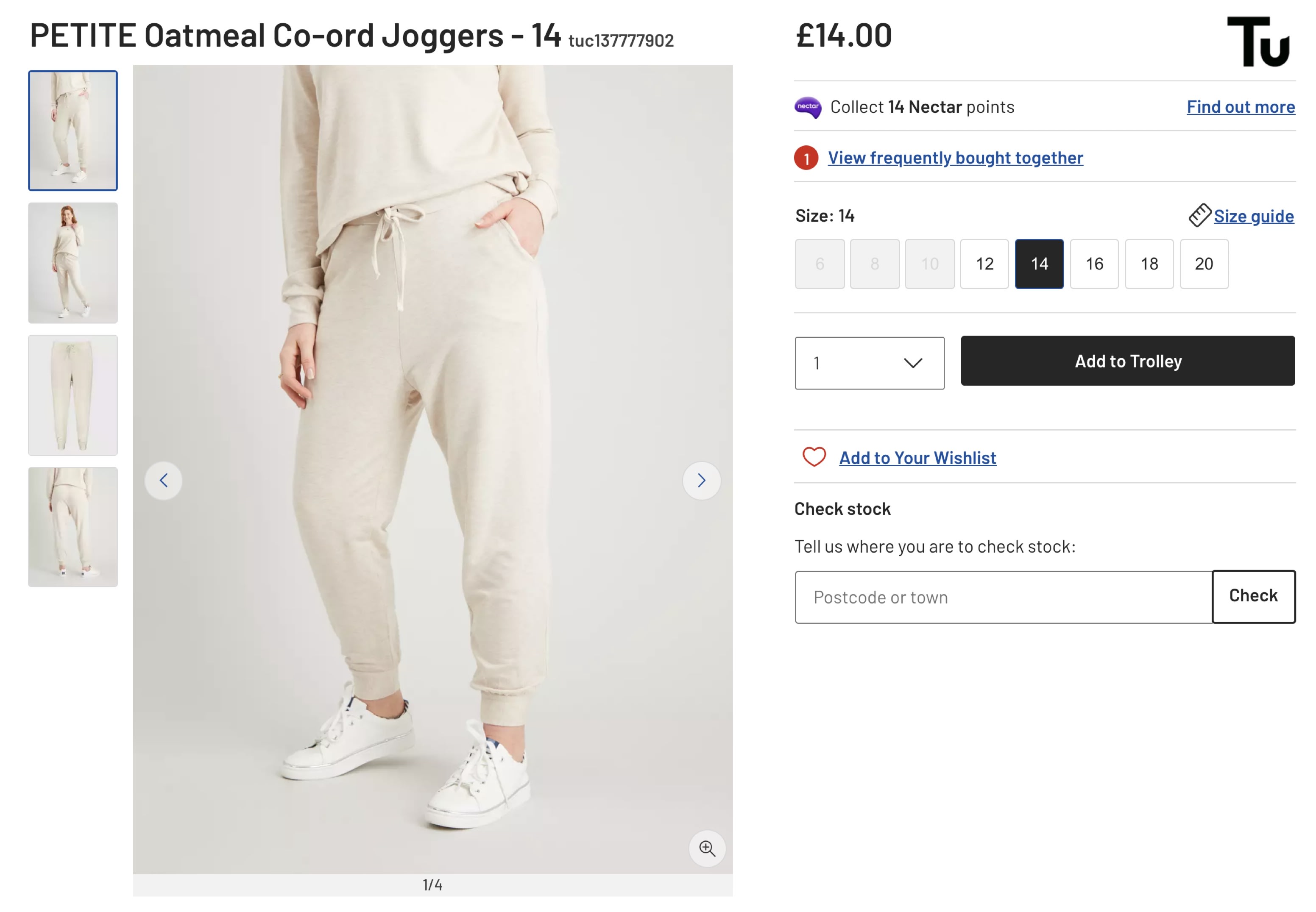
In the eCommerce example above, we leave customers with plenty of unanswered questions. We need to highlight all the details about taxes and fees, delivery times, shipping costs, returns policy and payment options — as prominently as possible. But we don’t really need an FAQ for that — we could show them right away (pictured below ↓).

We might need to do a bit more work. We could break down the pieces of content and publish relevant content where people naturally look for it. We also might need to iterate on IA, navigation design, labels and layout with top tasks and tree testing.

There are no FAQs on AirBnB. Instead, topics with short headlines and front-loaded keywords.
And once it all set in motion, we might set up help hubs, or if absolutely necessary, an FAQ page as a temporary solution.
A Well-Designed FAQ #
But what if we do need an FAQ after all? Of course we need to group questions by topics, and probably design them as accordions. Displaying all answers as is would work with in-browser search, but it might make the page too lengthy to be usable.

Here are some of the useful features of FAQ pages that you might want to consider:
-
Include the FAQ link in the footer of each page,
-
Include a table of contents (perhaps sticky),
-
Alternatively, group accordions in a split-menu (as displayed above),
-
Use autocomplete search to find specific details in the FAQ might be helpful,
-
Add jump-links with an option to go back to the overview,
-
Allow customers to open multiple questions at once,
-
Instead of long passages of text, use bulleted points and shorter, concise sentences,
-
Front-load questions with keywords as far as possible,
-
Validate the quality of FAQ with a “Did this answer your question?” prompt?
-
For longer FAQs, or those with complex answers, screenshots, or videos, you might want to set up separate answer pages (or topic pages).
Wrapping Up #
FAQs are difficult to navigate and maintain, but they do gather critical information in one single place, and hence can be helpful. But we need to measure just how helpful they are.
Measure how much traffic your FAQ page has and how often people mark answers as helpful. Establish a regular maintenance review for the content of the page as it might be something that users heavily rely on.
You might not need an FAQ page after all. Perhaps you could break down the answers to each question within the interface. Or perhaps you could create a help hub, or a full support guide with how-to articles, screenshots and videos, dedicated Q&A blog posts and a decent autocomplete. This might be much more efficient than a never-ending list of nested FAQ sections.


