How To Design Complex Data Tables (+ Figma Kits)
With practical techniques and useful Figma toolkits to help users find and compare data faster.
Complex data tables are difficult to get right. They always come along with filters, sorting, customization options, batch actions, cell states, pagination, and a huge amount of data. Their purpose is to help people find insights, by comparing data points across rows and columns.
Yet navigating a table is often painfully slow and frustrating, especially on mobile. Let’s explore practical techniques and useful Figma toolkits to help users find and compare the right data faster, without relying on endless horizontal scroll.
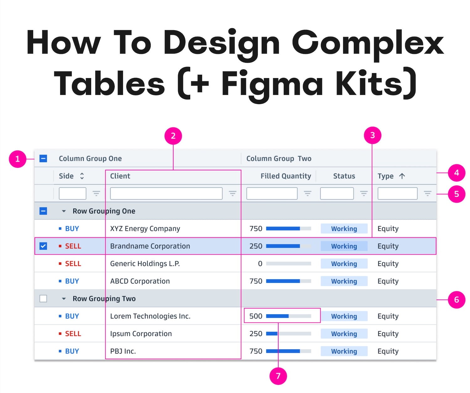
Architecting a complex data table is quite an adventure. Wonderful work by Goldman Sachs team.
Setting Up The Table Architecture #
✅ First, design a feature tree. #
Before we dive into all the fine details, we need to first understand what features, states, and accessories we actually need. Slava Shestopalov has put together a tree of table features — a practical overview of what can go into complex tables, along with all features, states, and accessories that might need to be considered in the design process.
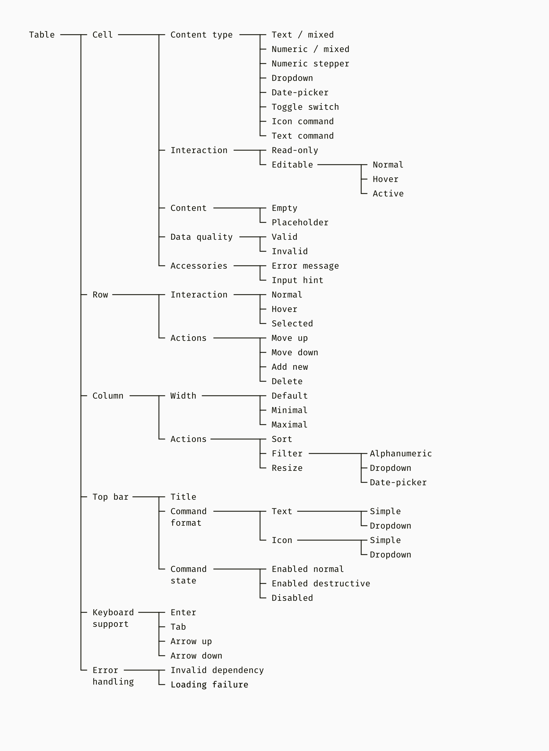
A comprehensive tree of table features. Neatly put together by Slava Shestopalov.
✅ Decide on the functionality you need. #
We start by observing, collecting, and prioritizing user needs. Based on them, we define a full set of complex functionality — such as drag-n-drop, resizing, reshuffling, or multi-sorting. These features will require separate accessibility considerations as all draggable controls must be keyboard-accessible due to WCAG 2.2 AA requirements.
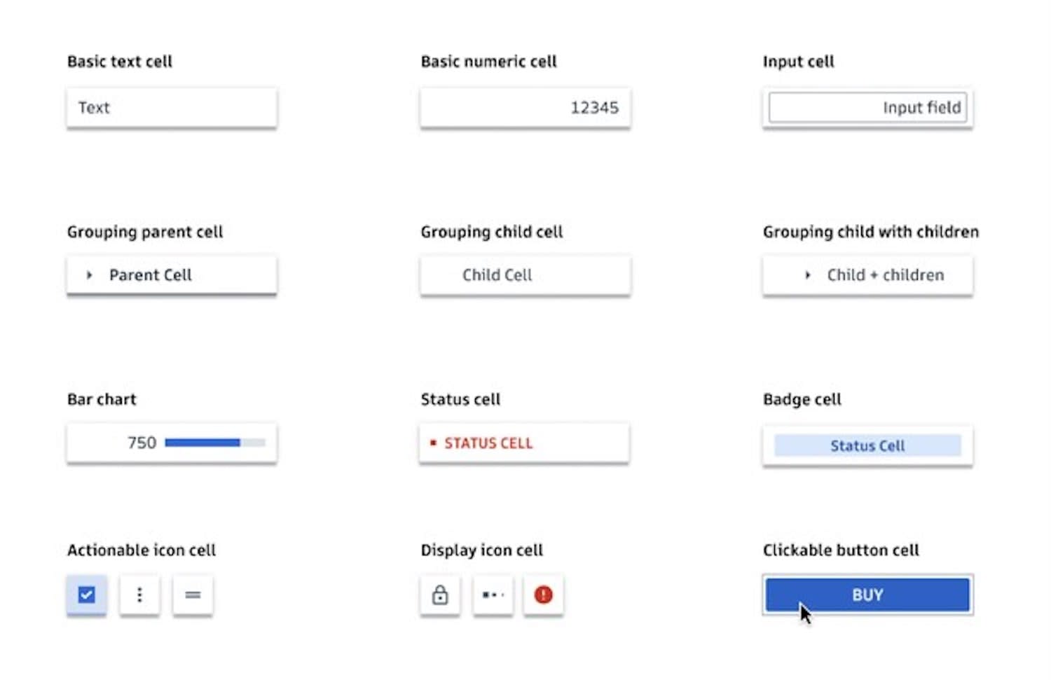
The different types of cells, from the (incredible!) Goldman Sachs Design System.
✅ Define your table cells. #
Then, we define the different types of table cells. Some of them will be available to everyone, others will have restrictions applied to them. So we discuss permissions and logic, such as read-only, comment-only, or editable.
We explore filtering, sorting, and customization features — most notably, showing and hiding columns. We discuss sticky headers and columns. And for each of them, we set default values, presets, and templates.

The different types of data cells in action — from read-only to editable.
✅ Next, interaction design and accessibility. #
Eventually, we move to the fine little details of the data table design. Things like truncation, wrapping, stretching, and resizing rules. We look at interaction design with validation rules and error messages. Some tables might require very long technical titles or localization, so stress test your design with very long and very short titles — this might also require compact, comfortable, and condensed modes.

Data table designs with a dedicated “Actions” button might perform better than hover actions.
Once we are there, consider accessibility — moving within the table with keyboard alone, but also supporting keyboard for drag'n'drop and navigation within the table. And: Whenever possible, you might want to try to avoid row hover actions. They often cause errors and rage clicks. Instead, use a standalone button (“Actions”) or few buttons on each row instead.
✅ Regroup data, add a filter. #
For row actions, you might be better off with a bottom sheet (edit, delete, move). A helpful way to make the content more accessible is by re-grouping data from columns across multiple rows (pivoting).

For nested filters, you might want to consider an overlay with horizontal stacking instead of a tree.
You could also combine columns within vertical accordions (stacked columns) and add a sticky filter in each column to help users navigate faster. Finally, if you do use pagination, show it above and below the data list.
✅ Think about data alone, not structure. #
An exercise I always dive into is to think about the data alone, rather than its tabular structure. We explore how to aggregate data and perhaps span it across fewer columns. We show only what users really need, then show more on tap.

Data table designs with a context menu often has discoverability issues. You will need an indicator or use a select dropdown instead.
While doing so, try to leave out unnecessary data and details and eliminate repetition. For example, we could abbreviate dates, long labels, units of measure, and currency. Replace statuses and permissions with icons and badges.
Adjusting For Mobile #
We often assume that customers expect data tables to appear exactly the same on mobile and on desktop. That’s not necessarily true. What they do expect is that features they heavily rely on for their work exist in all environments — but these features don’t have to work or look exactly the same.

Row-column data tables are terribly inefficient on mobile — you might want to consider cards instead. Example: Goldman Sachs Design System.
In general, row-column data tables are terribly inefficient on mobile — that’s where users often struggle, making mistakes and scrolling back and forth to make sure that they are looking at the right piece of data.
✅ Design the navigation on mobile. #
We often assume that users need to rely on the entire data table to make decisions or find insights. But the nature of some tables might require a very different solution. For some tables, users might not need the entire table — they need to navigate between a few filtered rows or columns at a time.
Support navigation within the cells and rows. By Joe Winter.
In that case, you might need to support navigation within the table by helping users explore specificic data points faster. A common way to achieve that is via tabs or dropdown together with cards, as displayed in a case study by Joe Winter.
✅ Allow users to show and hide columns. #
It’s worth noting that users rarely navigate through all columns in the table. So let them show and hide columns, for example with a “Columns” button. There, let them also re-arrange, lock, and reset columns. You could use tabs above the table to change the view, or use tabs within the table to jump between columns.

Clever: Use tabs within the data table to navigate its columns. By Netty Konovalova
Data Tables Figma Kits #
Designing data tables in Figma from scratch is remarkably tedious and time-consuming. You can get off the ground with a few helpful kits, kindly shared and released by the community:
- How To Design Data Tables In Figma (+ Figma Kit), by Jordan Hughes
- Goldman Sachs Data Grids UI Kit, by Goldman Sachs
- Designing Tables In Figma With Real Data, by Christine Vallaure
- Figma CSV Table Generator Plugin
- Table Creator Figma Plugin, by Gavin McFarland
- Table Builder Figma Plugin, by Fabian Nart and Natasha Dudler
- Reusable Dynamic Table Components, by Natalia Brochero
- Copy-Paste Data From CSV/Excel Figma Plugin
- Interactive Data Table Figma Kit, by Alvish Baldha
- Table Design System Figma Kit, by Valeriya Desire
Useful Resources #
Designing Data Tables #
- Complex Data Table Features Tree, by Slava Shestopalov
- Data Grids and Tables Figma Kits, by Goldman Sachs
- Carbon Design System: Data Table
- NordHealth Design System: Complex Tables
- Designing Tables For Reusability, by Ada Rafalowicz and Havana Nguyen
- Complex Tables Design Patterns, by Andrew Coyle
- How Screen Readers Navigate Data Tables, by Léonie Watson
- Enterprise UX: Data Tables, by Stéphanie Walter
Designing Data Tables On Mobile #
- Complex Data Tables On Mobile, by GE HealthCare
- Designing A Complex Table For Mobile, by Joe Winter
- AT&T Enterprise Table On Mobile, by Douglas Kelshaw
- Shopify Data Tables On Mobile, by Tetsuro Takara
- Designing Mobile Tables, by Steven Hoober
A huge thank you to all the contributors, authors, and designers who spend time and effort and energy into making these resources available for everyone to use! 👏🏼👏🏽👏🏾