Designing Better UX For Left-Handed People
10% of people are left-handed, yet most products aren’t designed with them in mind. Let’s change that.
In times when we are figuring out how to design AI interfaces, it’s important to stay focused on what truly matters — people. After all, no technology is useful without real value for real people — and inclusive design is the foundation of it.
In the world today, roughly 10% of people are left-handed. Yet most products — digital and physical — aren’t designed with it in mind. Let’s change that, and explore what it means for us.

The best option to support interaction for both hands is by placing key actions at the bottom center of the screen. An illustration, based on Steven Hoober's research.
Left-Handedness ≠ “Left-Only” #
It’s easy to assume that left-handed people are usually left-handed users. However, that’s not necessarily the case. Because most products are designed with right-handed use in mind, many left-handed people have to use their right hand to navigate physical word.
From very early childhood, left-handed people have to rely on their right hand to use tools and appliances like scissors, openers, fridges etc. That's why left-handed people tend to be ambidextrous, sometimes using different hands for different tasks, and sometimes using different hands for the same tasks interchangeably.

Challenges for left-handed people: when a foldable desk for writing is located on the right. Better: pull it up to the center.
In the same, right-handed people aren’t necessarily right-handed users. It’s common to be using a mobile device in both left and right hands, or both, perhaps with a preference for one. But when it comes to writing, a preference is stronger.
Challenges For Left-Handed Users #
With digital products, most left-handed people tend to adapt to right-handed tools which they use daily. Unsurprisingly, many use their right hand to navigate the mouse. However, it’s often quite different on mobile where left hand often preferred.
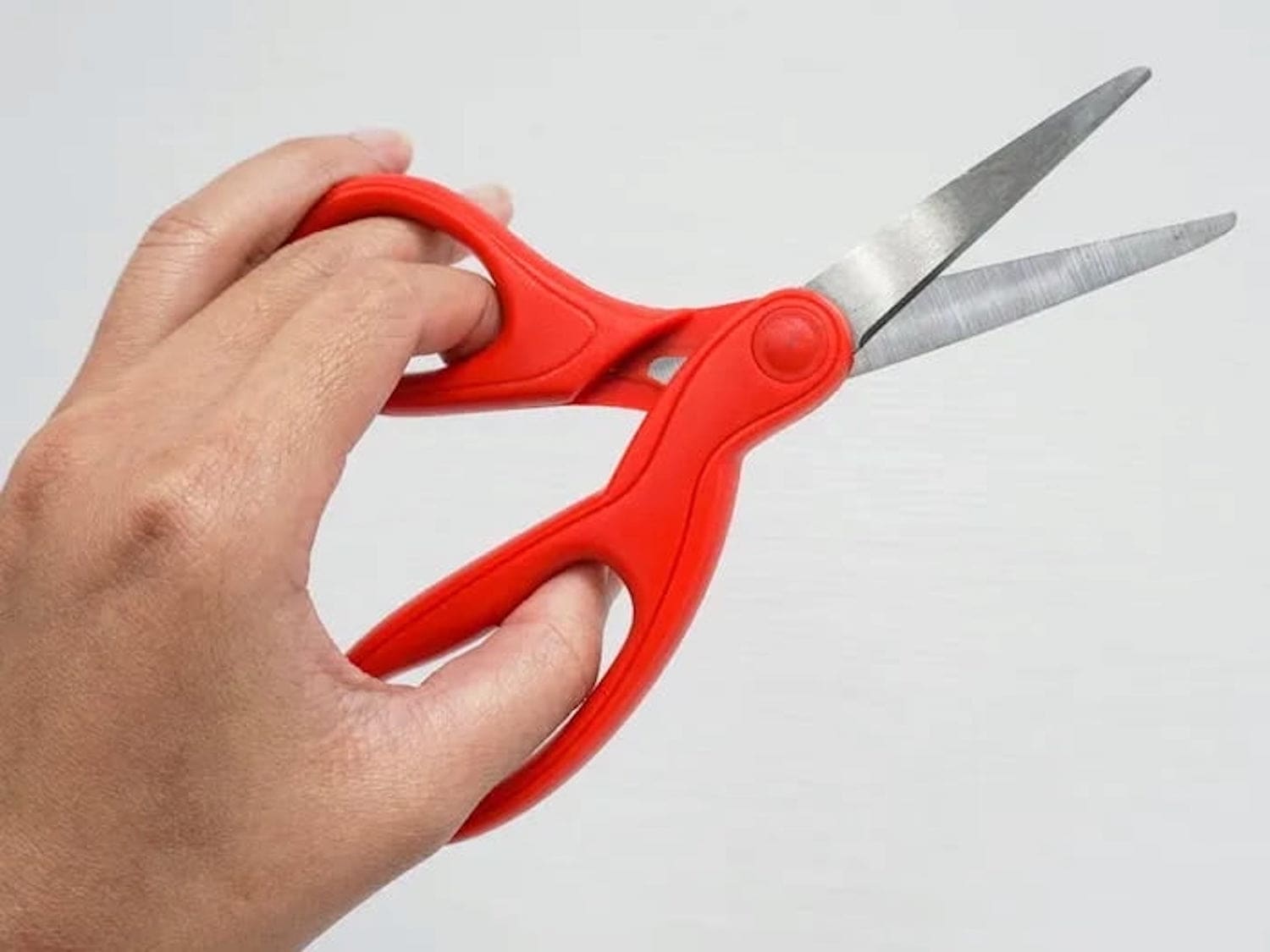
Challenges for left-handed people: using “regular” scissors with the left hand can be difficult for left-handed users.
✅ 13% of people in NL, US, UK, Canada are left-handed.
🤔 Most products are designed exclusively for the right hand.
🤔 Less demand for left-handed items → they cost more.
🤔 Many left-handed users don’t keep their mouse on the left.
✅ 1% people use both hands equally well (ambidextrous).
🚫 Don’t make design decisions based on left/right-handedness.
✅ Allow customizations based on user’s personal preferences.
✅ Allow users to re-order columns (incl. the Actions column).
✅ In forms, place action buttons next to last user’s interaction.
✅ Keyboard accessibility helps everyone move faster (Esc).
Usability Guidelines To Support Both Hands #
As Ruben Babu writes, we shouldn’t design a fire extinguisher that can’t be used by both hands. Think pull up and pull down, rather than swipe left or right. Minimize distance to travel with the mouse. And when in doubt, align to the center.
🤔 Bottom left → better for lefties, bottom right → for righties.
🚫 With magnifiers, users can’t spot right-aligned buttons.
✅ On desktop, align buttons to the left/middle, not right.
🤔 On mobile, most people switch both hands when tapping.
✅ Key actions → put in middle half to two-thirds of the screen.

Opposite-Handed UX test can be helpful to test how good the UI is — also known as “left-handed oil test” for physical products.
A simple way to test the mobile UI is by trying to use the opposite-handed UX test. For key flows, we try to complete them with your non-dominant hand use the opposite hand to discover UX shortcomings.
For physical products, you might try the oil test. It might be more effective than you might think.
Good UX Works For Both #
Our aim isn’t to degrade the UX of right-handed users by meeting the needs of left-handed users. The aim is to create an accessible experience for everyone. E.g. a better experience for left-handed people also helps right-handed people who have a temporary arm disability.
And that's an often-repeated but also oftern overlooked universal principle of usability: better accessibility is better for everyone, even if it might feel that it doesn’t benefit you directly in the moment.
Useful Resources #
- Discover Hidden UX Flaws With the Opposite-Handed UX Test, by Jeff Huang
- Right-Aligned Buttons Aren’t More Efficient For Right-Handed People, by Julia Y.
- Mobile Accessibility Target Sizes Cheatsheet, by Vitaly Friedman
- Why The World Is Not Designed For Left-Handed People, by Elvis Hsiao
- Usability For Left Handedness 101, by Ruben Babu
- Book: Touch Design For Mobile Interfaces, by Steven Hoober