A Practical Guide To Design For Children
How to design for children aged 3–12, with insights into user behavior, considerations for parents and practical UX guidelines.
Children start interacting with the web when they are 3–5 years old. How do we design for children? What do we need to keep in mind while doing so? And how do we meet the expectations of the most demanding users you can possibly find: parents? Well, let’s find out.
Embrace Playing, Encourage Small Wins #
Designing for children is difficult. Children tend to lose focus and motivation. They quit when they get bored, and they move on if they can’t get anywhere quickly enough. They need steady achievements. So as designers, we need to appreciate, reward, and encourage small wins to develop habits and support learning — with progress tracking and gamification.
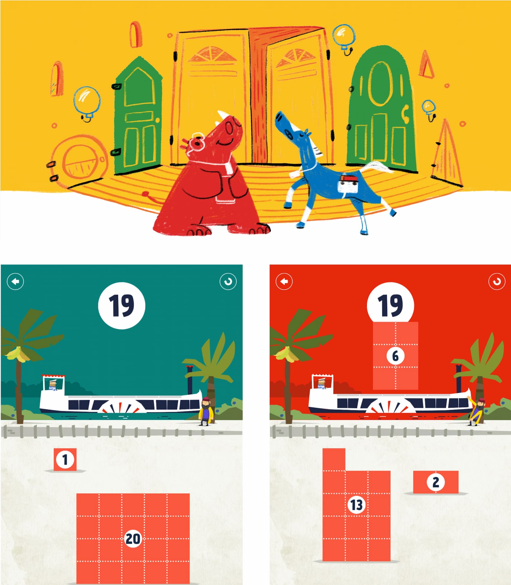
Vibrant, colorful and playful: Fiete Math, a well-designed game for children.
As Deb Gelman, author of Design for Kids discovered, children communicate volumes by how they play, what they choose to play with, how long they choose to play with it, and when they decide to play with something else. Yet they don’t get as disappointed when something isn’t working. They just choose to browse or play something else.
Most importantly, we can’t design for children without testing. Even better: bring children to co-design their digital experiences, and bring parents to co-design reliable guardrails. With a fun, smart, and safe product, parents will spread the word about you faster than you ever could.
Always Focus On A Two-Year Age Range #
As designers, we should always keep in mind that “children” represent a very diverse range of behavior and abilities. There are vast differences between age groups (3–5, 6–8, and 9–12) — both in terms of how users navigate, but also how we communicate to them.
In general, when designing for children focus on a two-year age range, max. These days, children start interacting with the web at the age of 3–5. And the very first interactions they learn are swipe, scroll, video controls, and “Home”.
Getting Parents On Board #
Whenever you are designing for children, you always design for parents as well. In fact, parents are the most demanding users you can find. They have absolutely no mercy in reviews, requests, complaints and ratings on the stores.
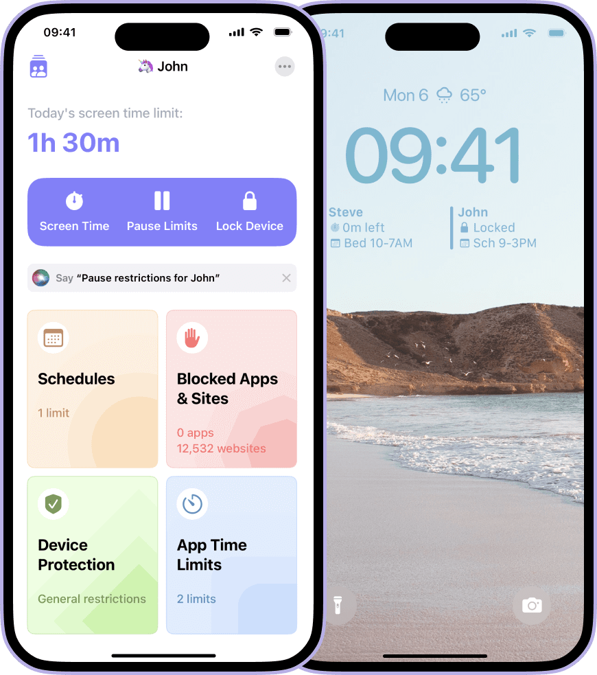
Something that parents need to rely on: Grace, a parental control app.
That’s not surprising. Parents need safety guarantees, regulations and certifications — a sort of reassurance that you treat their safety and privacy seriously, especially when it comes to third-party integrations or advertising. In fact, they are often willing to pay for apps more just to avoid advertising.
Parents often value reviews from teachers, educators, doctors, and other parents like themselves. And they need to have parental controls to set specific time limits, rules, access and permissions.
As Rodrigo Seoane has pointed out in an email, a major concern to keep in mind is “how the majority of initiatives for kids rely on and create dependencies on extrinsic motivations. The reward model keep their attention in the short term, but as a core gamified mechanic it is problematic in the long run, reducing their cognitive capacity and creating a barrier to develop any intrinsic motivation.” So whenever possible, design to increase intrinsic motivation.
Design Guidelines For Children-Friendly Design #
- Design large text (18–19px) with large tap targets (min 75×75px).
- Use typefaces that approximate how children learn to write.
- Translate text into attractive visuals, icons, sounds, characters.
- Avoid bottom buttons as kids tap on them by mistake all the time.
- Children expect feedback on every single action they perform.
- Don’t patronize: show age-appropriate content for the age range you’re designing for.
- Be transparent: children can’t distinguish ads or promotions from real content.
- You’re always designing for both children and parents.
- Parents are the most demanding users you can find. They have no mercy in reviews and ratings.
- Design parental controls for time limits, rules, access.
- Instead of extrinsic rewards, design to increase intrinsic motivation.
Useful Resources #
- Things to Consider When Designing for Children, by Jasmine Bilham
- Design Considerations for Little Fingers, by Andrew Smyk
- How to Create a Product Children Will Love, by Mariia Kasym
- Designing For Children (7-part series), by Catalina Naranjo-Bock, Jonathan Evans, Paul Osborne
- Children’s UX: Usability Issues in Designing for Young People, by Katie Sherwin, Jakob Nielsen
- Usability Testing With Children, by Alita Joyce
- Designing Web Interfaces For Kids, by Trine Falbe
- Designing Apps For Young Kids (Medium paywall), by Rubens Cantuni
- Designing For Children (PDF guidelines), by Gerry Gaffney, James Hunter
- The Definitive Guide to Building Apps for Kids, by Tanya Junell
- Useful Resources When Designing For Children
Digital Toolkits For Children #
- UX Research Toolkit For Playtesting With Kids (UX Methods)
- Designing With Children (Workshops and Case Studies)
- Co-Design With Kids Toolkit
- Playful by Design Toolkit
- DeCID Handbook For Displaced Children
- Designing For Children’s Rights Guide
Books and eBooks #
- Designing For Motivation (Pocket Guide), by Anamaria Dorgo, LxD Lab
- Designing Digital Products For Kids, by Rubens Cantuni
- Design For Kids, by Deb Gelman
- Designing Spaces For Children, by Nathalie Dziobek-Bepler
