How To Make Your UX Research Hard To Ignore
Why research is often ignored, practical techniques on how to make it easier to agree with and what to do when data disagrees.
In the early days of my career, I believed that nothing wins an argument more effectively than strong and unbiased research. Surely facts speak for themselves, I thought.
If I just get enough data, just enough evidence, just enough clarity on where users struggle — well, once I have it all and I present it all, it alone will surely change people’s minds, hearts, and beliefs. And, most importantly, it will help everyone see, understand, and perhaps even appreciate and commit to what needs to be done.
Well, it’s not quite like that. In fact, the stronger and louder the data, the more likely it is to be questioned. And there is a good reason for that, which is often left between the lines.
Research Amplifies Internal Flaws #
Throughout the years, I’ve often seen data speaking volumes about where the business is failing, where customers are struggling, where the team is faltering — and where an urgent turnaround is necessary. It was right there, in plain sight: clear, loud, and obvious.

Good research doesn't just uncover troubles; it also amplifies internal flaws and poor decisions. Wonderful illustration by José Torre
But because it’s so clear, it reflects back, often amplifying all the sharp edges and all the cut corners in all the wrong places. It reflects internal flaws, wrong assumptions, and failing projects — some of them signed off years ago, with secured budgets, big promotions, and approved headcounts. Questioning them means questioning authority, and often it’s a tough path to take.
As it turns out, strong data is very, very good at raising uncomfortable truths that most companies don’t really want to acknowledge. That’s why at times research is deemed “unnecessary,” or why we don’t get access to users, or why loud voices always win big arguments.

UX Research in B2B: when you don’t have access to users. Large view.
So even if data is presented with a lot of eagerness, gravity, and passion in that big meeting, it will get questioned, doubted, and explained away. Not because of its flaws, but because of hope, reluctance to change, and layers of internal politics.
This shows up most vividly in situations when someone raises concerns about the validity and accuracy of research. Frankly, it’s not that somebody is wrong and somebody is right. Both parties just happen to be right in a different way.
What To Do When Data Disagrees #
We’ve all heard that data always tells a story. However, it’s never just a single story. People are complex, and pointing out a specific truth about them just by looking at numbers is rarely enough.
When data disagrees, it doesn’t mean that either is wrong. It’s just that different perspectives reveal different parts of a whole story that isn’t completed yet.

What to do when qual and quant disagree, a very practical guide by Archana Shah.
In digital products, most stories have 2 sides:
- Quantitative data ← What/When: behavior patterns at scale.
- Qualitative data ← Why/How: user needs and motivations.
- ↳ Quant usually comes from analytics, surveys, and experiments.
- ↳ Qual comes from tests, observations, and open-ended surveys.
Risk-averse teams overestimate the weight of big numbers in quantitative research. Users exaggerate the frequency and severity of issues that are critical for them. As Archana Shah noted, designers get carried away by users’ confident responses and often overestimate what people say and do.
And so, eventually, data coming from different teams paints a different picture. And when it happens, we need to reconcile and triangulate. With the former, we track what’s missing, omitted, or overlooked. With the latter, we cross-validate data — e.g. finding pairings of qual/quant streams of data, then clustering them together to see what’s there and what’s missing, and explore from there.
And even with all of it in place and data conflicts resolved, we still need to do one more thing to make a strong argument: we need to tell a damn good story.
Facts Don’t Win Arguments, Stories Do #
Research isn’t everything. Facts don’t win arguments — powerful stories do. But a story that starts with a spreadsheet isn’t always inspiring or effective. Perhaps it brings a problem into the spotlight, but it doesn’t lead to a resolution.

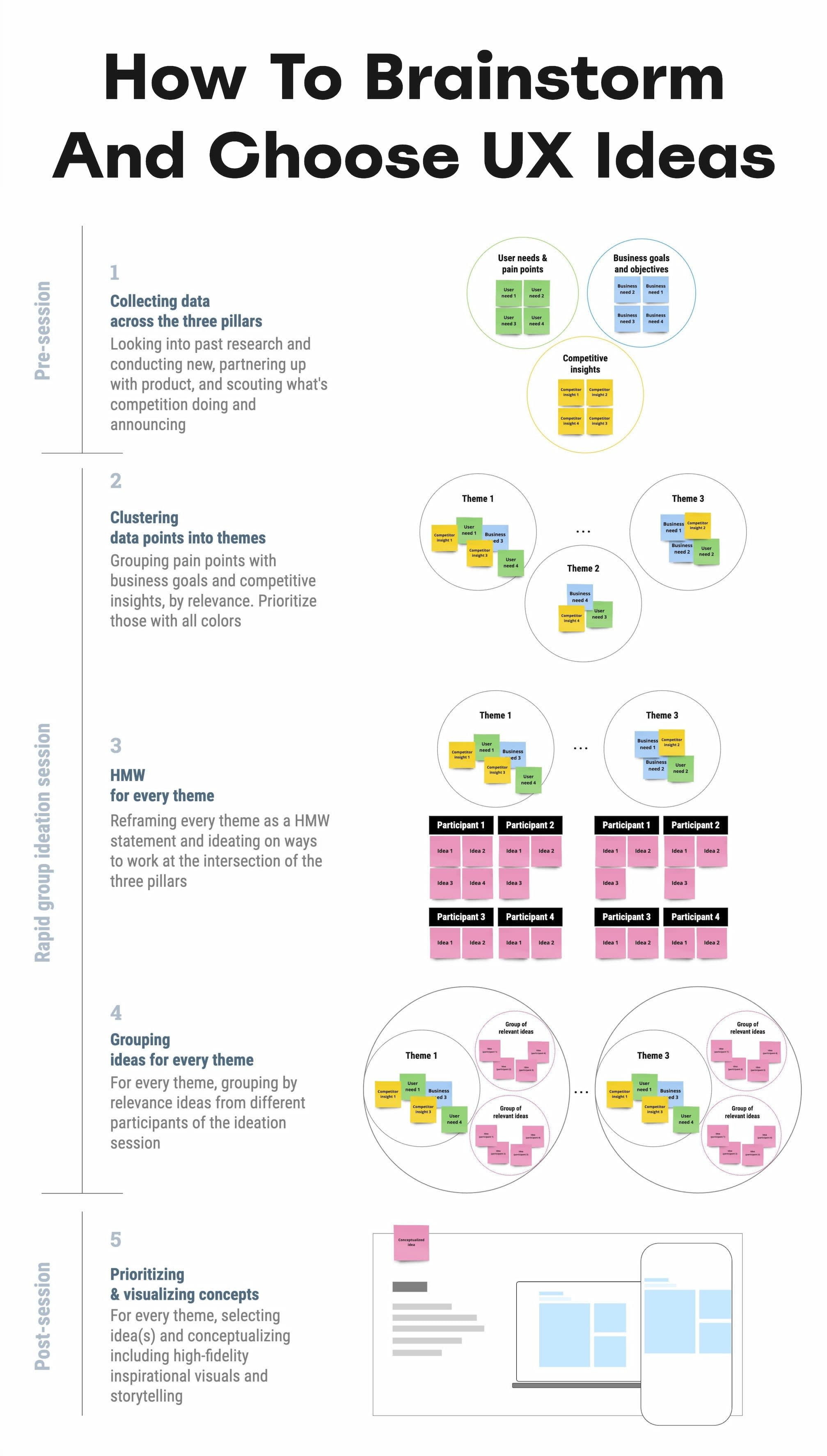
Presenting research is more than presenting findings. It must be wrapped inside of an actionable story. Wonderful illustration by José Torre.
The very first thing I try to do in that big boardroom meeting is to emphasize what unites us — shared goals, principles, and commitments that are relevant to the topic at hand. Then, I show how new data confirms or confronts our commitments, with specific problems we believe we need to address.
When a question about the quality of data comes in, I need to show that it has been reconciled and triangulated already and discussed with other teams as well.
A good story has a poignant ending. People need to see an alternative future to trust and accept the data — and a clear and safe path forward to commit to it. So I always try to present options and solutions that we believe will drive change and explain our decision-making behind that.

A useful little helper to understand what stakeholders truly care about. User Centered Design Canvas could be applied to stakeholders.
They also need to believe that this distant future is within reach, and that they can pull it off, albeit under a tough timeline or with limited resources.
And: a good story also presents a viable, compelling, shared goal that people can rally around and commit to. Ideally, it’s something that has a direct benefit for them and their teams.
These are the ingredients of the story that I always try to keep in my mind when working on that big presentation. And in fact, data is a starting point, but it does need a story wrapped around it to be effective.
Wrapping Up #
There is nothing more disappointing than finding a real problem that real people struggle with and facing the harsh reality of research not being trusted or valued.
We’ve all been there before. The best thing you can do is to be prepared: have strong data to back you up, include both quantitative and qualitative research — preferably with video clips from real customers — but also paint a viable future which seems within reach.
And sometimes nothing changes until something breaks. And at times, there isn’t much you can do about it unless you are prepared when it happens.
“Data doesn’t change minds, and facts don’t settle fights. Having answers isn't the same as learning, and it for sure isn't the same as making evidence-based decisions.” — Erika Hall
Useful Resources #
- How to Present Research So Stakeholders Sit Up and Take Action, by Nikki Anderson
- What To Do When Data Disagrees, by Subhasree Chatterjee, Archana Shah, Sanket Shukl and Jason Bressler
- Mixed-Method UX Research, by Raschin Fatemi
- A Step-by-Step Framework For Mixed-Method Research, by Jeremy Williams
- The Ultimate Guide To Mixed Methods, by Ben Wiedmaier
- Survey Design Cheatsheet, by yours truly 👍
- Useful Calculators For UX Research, by yours truly 👍
- Beyond Measure, by Erika Hall 👍
Useful Books #
- Just Enough Research, by Erika Hall
- Designing Surveys That Work, by Caroline Jarrett
- Designing Quality Survey Questions, by Sheila B. Robinson


