Cards vs. Lists vs. Tables vs. Data Grids
How do we decide between different data display patterns? Choosing the right one heavily depends on user tasks and data density.
How do we display data in our products? Typically, we decide between a list, table, card or data grid. They might appear quite similar at first, but they all differ, and each serves a distinct purpose — depending on user tasks and data density.
Recently I stumbled upon the Collection Components page from the Oracle Redwood design system. It goes in all the fine detail explaining the differences and similarities between all options. Let's explore how to make the right choice.

Fine nuances make a difference between a data table (on the top) and data grid (on the bottom). Source. Large view.
Choosing The Right Data Display Component #
The choice shouldn't be guided by intuition, but driven by the type and scope of user tasks and data density. Each option works best for different interactions and volume of data.
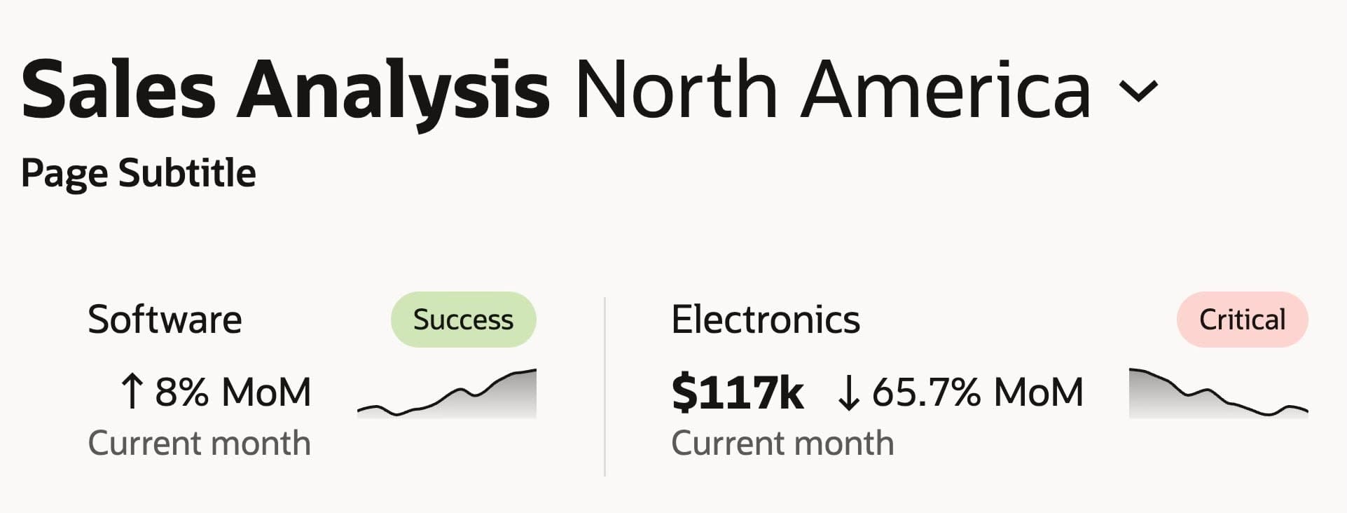
Cards on display in a sales analysis dashboard. Source. Large view.

Comparison of lists, tables, and data grids by task. Source. Large view.
- Cards show standalone chunks of data, options or records.
- Lists show key data for fast vertical scanning (read-only).
- Tables show detailed data for fast structured overview or side-by-side comparison.
- Data grids are large tables with frequent data edits and complex interactions.
Matching Layouts to User Needs #
When we choose a collection component, it ends up housing not just data, but also features that users need to navigate or explore the data. All options typically have some sort of filtering, sorting, search and selection.
Here's a small cheat sheet I use to make a choice between cards, lists, tables and data grids:
- Cards are for manageable data sets. Use for key data highlights with small data sets. Comparison is hard, but easy to scan and digest.
- Lists are for fast scanning of small data sets. Use when displaying only key data, but it won't work for extensive deep-dives.

List in action. Application's approval page with financial transactions and job offers. Source. Large view.
- Tables for scanning/comparing of large data sets. Use to help users find patterns, compare, make small edits (inline).

Data table in action for editable employee records. Source. Large view.
- Data grids for editing and deep drill-downs / analysis. For frequent edits, data manipulation, Excel-experience.

Data grid for an invoice management dashboard. Source. Large view.
Optimizing for Interaction and Editing #
Actually, the type and frequency of user interactions decides if a table or a data grid is a better choice.
When user edits are small and isolated (see below), a plain table often works well. When the primary goal is to interact with data and manipulate data, choose data grid. And when users need key highlights only, cards and lists work just fine.

Small and isolated user edits in a data table. Personal information form with error warnings on a UI. Large view.
A question on how to present data really depends on the nature and frequency of user tasks, and the features that your users benefit from. Multi-sorting, pivot mode and batch actions are helpful for data grid, but can be quite overwhelming for a simple list.
Wrapping Up #
Many products need something between table and data grid. But they tend to overcomplicate things with too many zombie features — never learned and never used. Those features are often helpful for specific types of users (often power users), but not so helpful for everyone else.
What might work better isn't adding new features that make the UI more difficult to understand and learn. It's establishing better roles and permission levels — with just the right amount of customization and prioritization.
Again, most of the time, mapping out user tasks and data density is all our design decisions really need. We must know what users do, how often they do it and what volume of data we'll be dealing with. And once we do, we start small and add more features when needed.
Useful Resources #
- Cards vs. Lists vs. Tables vs. Data Grids, by Oracle Redwood Design System team
- Oracle Redwood (Figma + Docs), by Oracle
- Enterprise Design Patterns, by Oracle Redwood Design System
- All UI collections, by Oracle
- All guidelines, by Oracle Redwood Design System
- AI Guidelines, by Oracle Redwood Design System
- Gantt Displays, by Oracle
- Data Authoring, by Oracle
- Foldout Layout (PDF), by Oracle
- Columns Configuration (PDF), by Oracle
- Data Grid, by Oracle
- AG Grid Design System, by AG Grid
- Aviva Design System, by Aviva
- DHL Brandhub, by DHL
- Doctolib Oxygen Design System, by Doctolib
- eBay Playbook, by eBay
- GE Healthcare Ethos Design System, by GE Healthcare
- Goldman Sachs Figma, by Goldman Sachs
- MetLife Design System, by MetLife
- Nordhealth Design System, by Nordhealth
- Intuit Content Design, by Intuit
- OpenBridge Design System, by OpenBridge
- SAP Fiori Design System, by SAP
- ServiceNow Now Experience Design System, by ServiceNow
- Visa Design System, by Visa
- Watson DocPlanner Design System, by DocPlanner
- Workday Canvas Design System, by Workday
- Designing Complex Data Tables, by Vitaly Friedman
- Designing Sorting UX, by Vitaly Friedman
- Designing Filtering UX, by Vitaly Friedman
- Enterprise Design Systems (Figma, Docs), by Vitaly Friedman
- Badges vs. Pills vs. Chips vs. Tags, by Vitaly Friedman
- Hidden vs. Disabled vs. Read-Only, by Vitaly Friedman

