Badges vs. Pills vs. Chips vs. Tags
How are badges and chips different? Which ones do we need in our design system? How to choose the right one?
Sometimes design conversations take slightly more time and effort than needed. One of the frequent conversations is circling around badges, pills, chips and tags.
How are they different? What purpose do they serve? Which ones do we need in our design system? And how to choose the right one? Well, let’s find out.

A collection of badges and tags from Base design system, by Uber.
Badges vs. Tags #
We distinguish between static and interactive UI components. Some of them communicate and visualize data, while others prompt actions — from navigation and selection to input and filtering. While they often appear very similar, to avoid confusion, we need them to be quite distinct, and easy to tell apart.
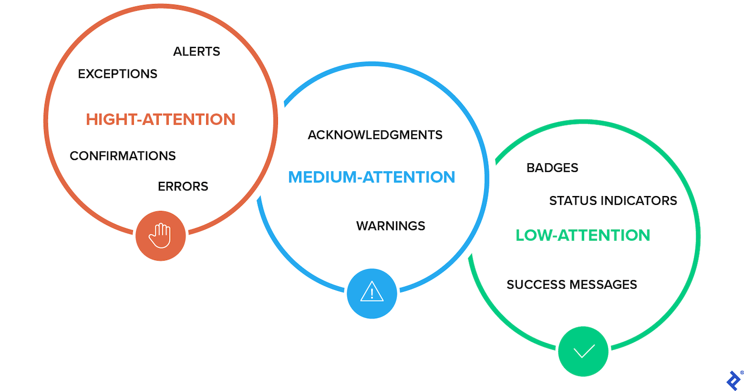
Badges Are Static Labels #
Badges are always static components. They relay status and updates (e.g. draft, new, pending, -7%↘), they highlight changes and are subtle indicators for main content. As such, they aren’t used for navigation.

The different shades of badges: categorized by status, propagation, priority, sentiment and other attributes as part of the ongoing effort for Emplifi Design System. By Lukas Vilkus.
Tags Can Be Static or Interactive #
Tags, on the other hand, can be static or interactive. Static tags show topics with keywords and labels (e.g. AI, Accessibility). Interactive tags are often used for links, filters, selection and actions.
They come in many different flavors:
- Display-only tags ← visually represent categories (keywords, labels, details).
- Data tags ← numerical data, reading time, file size (e.g. PDF 262 KB).
- Filter tags ← show active filters, with an option to remove and clear.
- Selection tags ← filter content and input information (also called chips or pills).
Chips and pills are merely visual style conventions for interactive tags. Their naming comes from their appearance. As it happens, on rare occasions they are static, and that’s where the confusion with badges and static tags comes from.
Design Systems Only Need Badges and Tags #
While there is quite a bit of confusion about the difference between all these variants, design systems typically distinguish between 2 of them — static indicators (usually badges, pills, data tags) and interactive links or buttons (usually action/selection tags, filter tags, chips).
For feedback indicators, notification counts and status updates, we use badges. For interactive indicators and filters that can be edited or removed, we use tags — which are also sometimes called chips. Of course often they function as radio buttons or checkboxes. And most of the time, that’s all you really need.

Badges are static, while tags can be static or interactive. Visualized by Adham Dannaway.
Design Distinct Styles For Both Components #
Confusion comes when static and interactive components share the same or similar visual style. Don’t design non-interactive components to appear like buttons. And don’t design interactive components to appear similar to static labels.
Also, prefer adjectives or nouns for non-interactive tags. Use 48×48px as a minimum touch target size on mobile. And ideally use at least 8px spacing between interactive elements to prevent mistaps.
Avoid Generic Names #
When naming these components, try to be as explicit as possible to avoid confusion down the line. “Filter tags” are more obvious than “filters” or generic “tags”.
Also, “Status badges” are way more obvious than “badges” or “pills”. It should work for everyone — designers, engineers and end users — as long as static labels don’t look like interactive buttons, and the other way around.
Badges and Tags in Design Systems #
Useful Resources #
- Designing A System For Badges, by Lukas Vilkus,
- Design System Dilemmas: Badges, by Dean Harrison
- Guide To Chips and Badges, by Uxcel