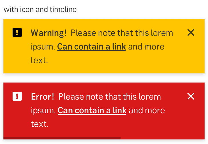
Designing A Time Zone Selection UX
How to design an effective time zone selection that is easy to scan and understand, with a UX checklist and useful resources.
Designing a time-zone selection is hard. Not only are time zones difficult to scan and understand; they also change over time, with or without daylight saving at different times, and there is no universal way of organizing and displaying them.
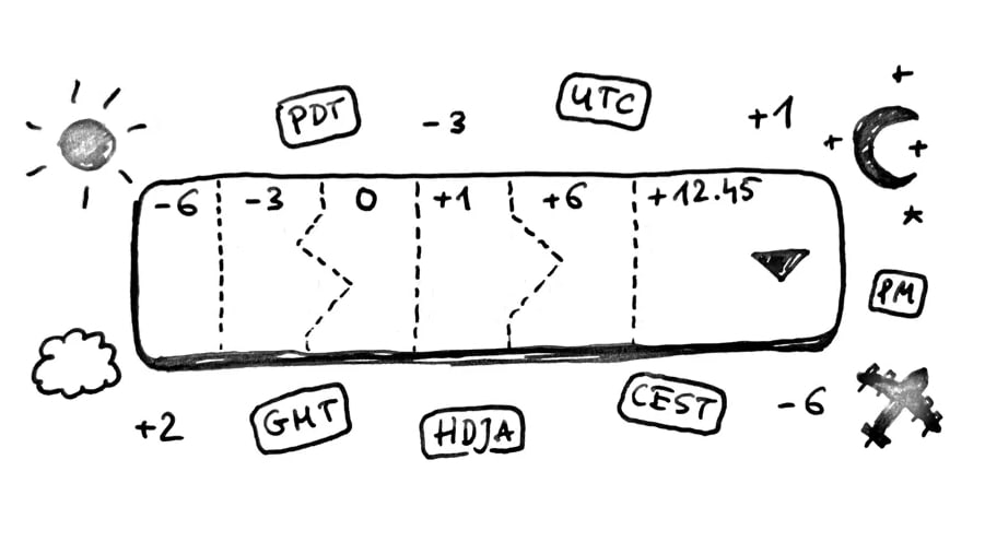
Time zones are hard, a wonderful article by Łukasz Tyrała with details about time zones and tips for better time-zone selection UX.
And then there are dozens of time zones and hundreds of mysterious abbreviations — UTC, GMT, DST, CET — which sometimes change, and sometimes not. Ironically, users often need most time when choosing the right time zone. How do we make it easier for them? Let’s figure it out. (You can find more details on that in the usability chapters in the video library.)
1. Use a Complete List of Time Zones #
In total, there are 352 time zones around the world, with 245 different abbreviations (as defined by the Time Zone Database). Of course time zones evolve over time; they get changed or deprecated, so it shouldn’t be surprising to discover that our legacy applications might be showing some time zones which are no longer relevant.
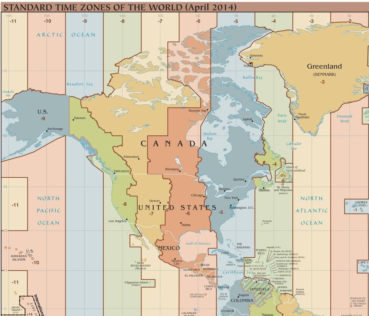
A section of time zones around the world: download the complete list.
Of all the different time zones, Coordinated Universal Time (or UTC) is the one reliable, true compass for time definition. It never changes and serves as a constant time of reference, in which other time zones are relative. It’s also seen as a successor to the Greenwich Mean Time (GMT). Unsurprisingly, it will have to make its appearance in our time-zone selection UI.
2. Users Think in Their Local Time #
Because UTC is standardized, we should be able to rely on it and display just that. However, as it turns out, users often don’t think about UTC at all. Nor do they understand time zones, or the difference between UTC and GMT, or when and where daylight saving times are. However, GMT in general is better understood than UTC.
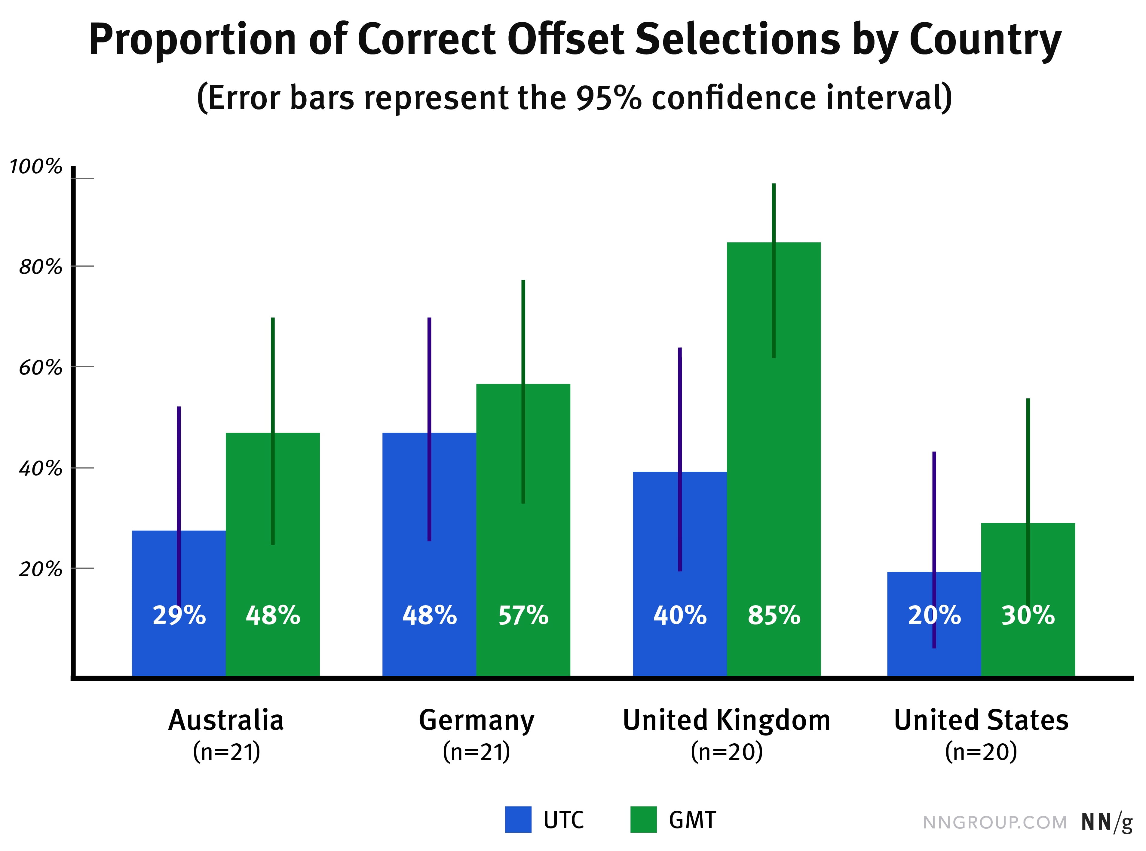
Time Zone Selectors UX study. All groups had more correct selections in GMT than UTC. But it was statistically significant only in UK.
Instead, users typically think about the local time in their city, or in their region. And when arranging a call or meeting, they need to look-up the time for a specific date in a specific location where their partner will be connecting from. In fact, the selection of a city is way more important than time zones.
3. Always Add Autocomplete For Location #
It’s not surprising that scrolling through the endless list of countries and time zones isn’t particularly exciting. So whenever possible, include autocomplete to allow users to type their city or country and locate the needed time zone faster.
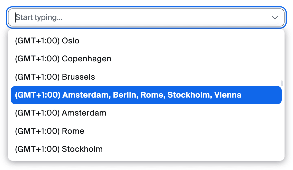
Always encourage users to start typing. When placeholders matter: “Start typing” might work better than “Select” as users might scroll instead.
Most people will be searching for a specific city, but they can type larger areas — counties, states and localities — as well. This typically means that we need to support cities and countries as a minimum. And if a country has more than one time zone, we need to highlight distinct time zones for each country match.
4. Show Current Times in Locations #
Sometimes selecting a time zone is only one part of the story though. What if a user needs to make a decision about the right timing as well? We can display the current time on location to help there.
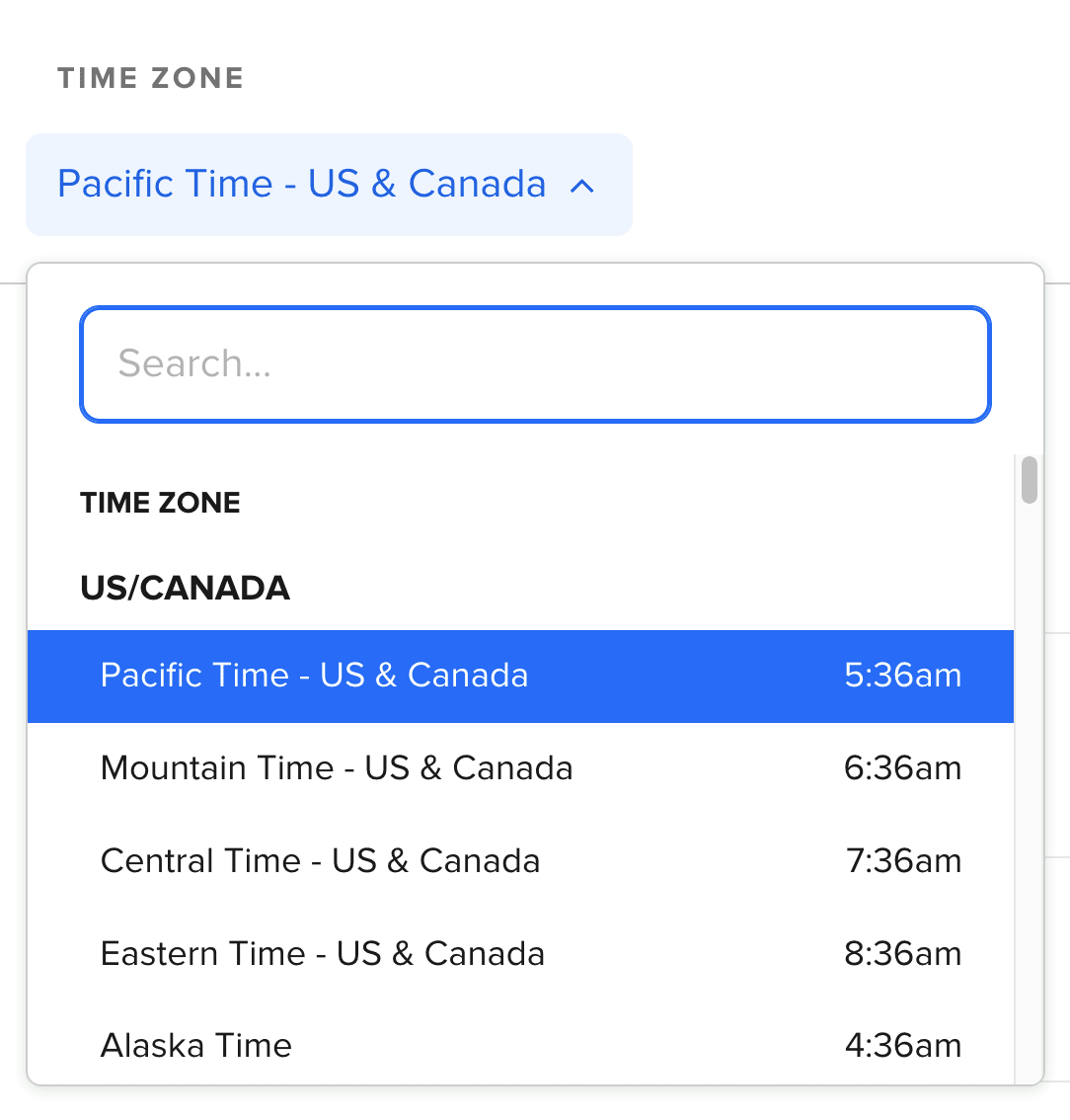
No UTC/GMT times are displayed on Calendly. Instead, they show the current time on location instead. Source: NN Group.
5. Detect and Suggest User’s Time Zone #
Based on current user’s location and their past selections, we can suggest a time zone that is most likely to work for the user. These suggestions would be displayed above the list for quick access. Of course, IP detection is never bulletproof, so we need to always include a way to override the suggestions as well.
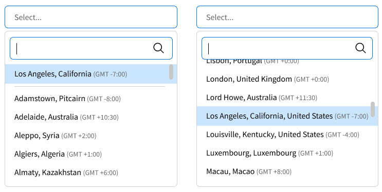
We can suggest a time zone based on user’s current location and their preferences. Source: NN Group.
6. Sort Countries Alphabetically, Not By UTC/GMT Offsets #
Since many users orient themselves in time zones through cities and countries, we could sort time zones options alphabetically, by country and at least large cities. We still need to provide UTC/GMT offsets or current time as well.
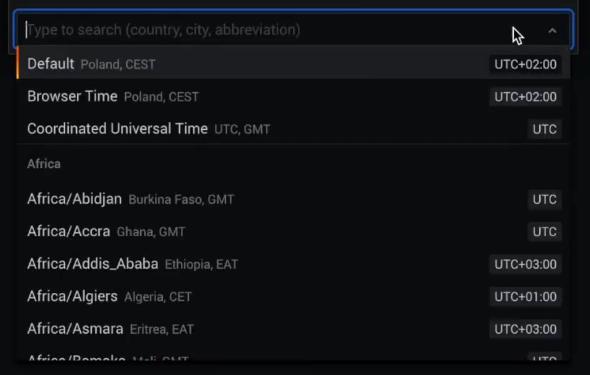
A sophisticated time zone selection UX in Grafana.
In Grafana, users can search by region, country, city, UTC offsets time zone abbreviations or use default settings. All cities and countries are sorted alphabetically and grouped into continents.
Time Zone Selection UX Checklist #
Our goal is to drive users towards an accurate selection, faster. To do that, we can embed a few little details into our interfaces:
-
Detect and suggest user’s time zones.
-
Support typing for city, country, locality, UTC offset.
-
Always show current times in locations.
-
Use a placeholder "Start typing..." or "Search..."
-
Display local time zone names (CEST, PST etc.).
-
Sort counties and cities alphabetically.
-
Don’t sort time zone options by UTC/GMT offsets.
-
Surface critical details (calendar availability, weather conditions, custom preferences etc.)
-
Keep your timezone database up-to-date.
Useful Resources #
-
A Complete Timezone List, a list with grouping by timezone, in TypeScript.
-
Standard Time Zones Of The World (as of April 2014).
-
It’s Time We Addressed Time-Zone Selectors, a wonderful usability study by Norman-Nielsen Group.
-
On Time, Time Zones, and Software, a fantastic write-up all around time zones, UX and implementation details by Łukasz Tyrała.
Wrapping Up #
Sometimes allowing users to type instead of scrolling is much faster. Time-zone selection is just an example of that. This also goes for country selectors, sliders and sometimes even navigation. The challenge is to hide complexity by showing users things that matter and hiding things that do not.


