Reviews And Ratings UX
It’s not just about bright orange stars: here’s everything a customer needs to build trust for a product.
When we make purchasing decisions, we often rely on expertise from people like us who have already purchased that item. And so we seek user ratings, often looking for a high enough review score and a good number of reviews.
In fact, 95% of users rely on reviews to make their decisions and learn more about how well a product fits their needs. Unfortunately, too often the way we design reviews and ratings UX confuses and frustrates users, rather than helping them.
Let’s fix that.
1. Always Show Decimal Ratings and Total Number of Reviews #
Many services use bright orange stars as indicators of how great or poor the experience has been. However, there are vast differences and nuances between “4 stars”- and “5 stars”-experiences, which are somehow getting lost between two aggressively rounded scores.

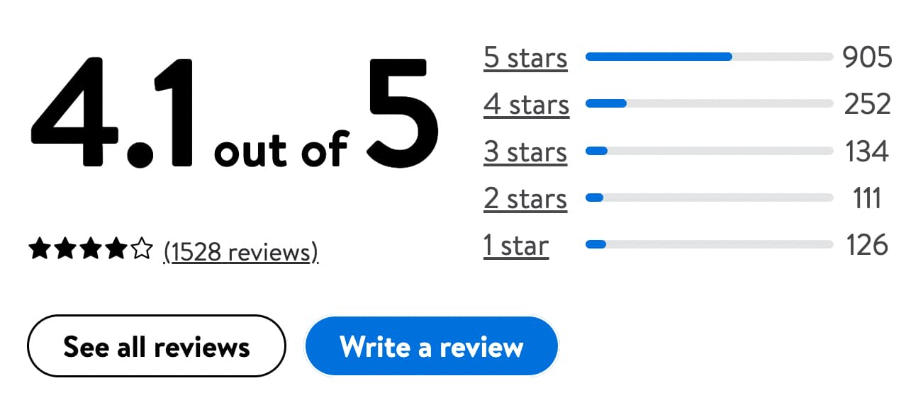
Walmart highlights both decimal ratings and the total number of reviews, as well as the distribution of ratings
To provide a slightly better assessment, our rating scores could be a bit more precise. As a general rule, it’s always a good idea to display a decimal average score (e.g. 4.1 out of 5) and the total number of reviews (1528 reviews) together.
The decimal average score provides a more granular estimate, while the total number of reviews guarantees a high enough number of reviewers contributing to that score.
Is there a perfect score? Well, as long as your product’s score is somewhere between 4.5 and 4.9 (with a high enough number of reviews), you probably shouldn’t worry too much. But: don’t feel too tempted to hit that score as it’s not the only detail that customers pay attention to.
2. Display a Full Rating Distribution Summary #
In addition to bright yellow stars, we’ve learned to rely on distribution summaries for ratings. They explain the relation of high-score reviews vs. low-score reviews, and give customers a more granular overview of how good the product is for most people.

The pattern that seems to perform best: a lot of positive reviews and a good number of negative reviews. Source: Flipkart
As customers, we do so by looking for specific patterns in the rating distribution summary. In it, we need to find a lot of positive reviews, and enough negative reviews. Most importantly, there must be enough negative reviews to give customers pointers about the most negative experience that they might have. Products that match that perfect pattern usually appear most trustworthy and perform best.
In user research, this “perfect” pattern is called the J-shaped distribution pattern. The distribution resembles a capital letter “J”, with a small spike of the most negative reviews (★), a flat middle ground (★★, ★★★) and a high spike of the most positive ones (★★★★★). However, as it turns out, it’s not really that perfect and conceals some troubles for businesses.
3. Break Rating Distribution Summary by Product Attributes #
Showing a distribution summary isn’t enough. For example, a customer might be in interested in how long battery life is, or how sophisticated a particular feature is. To learn both, they’ll need to sip through dozens or even hundreds of reviews, often without any success.

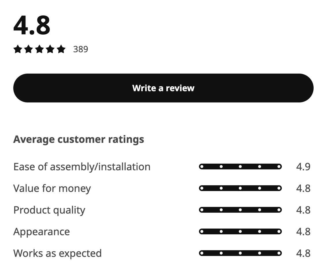
Ikea provides individual ratings for each part of the experience. This goes for every individual review as well.
For each standalone product attribute — appearance, value for money, product quality, battery life etc. — we could gather and highlight average scores, based on user reviews. When a customer chooses to provide their feedback, we could ask them to evaluate specific qualities of the product, and then calculate a separate average score for each attribute.

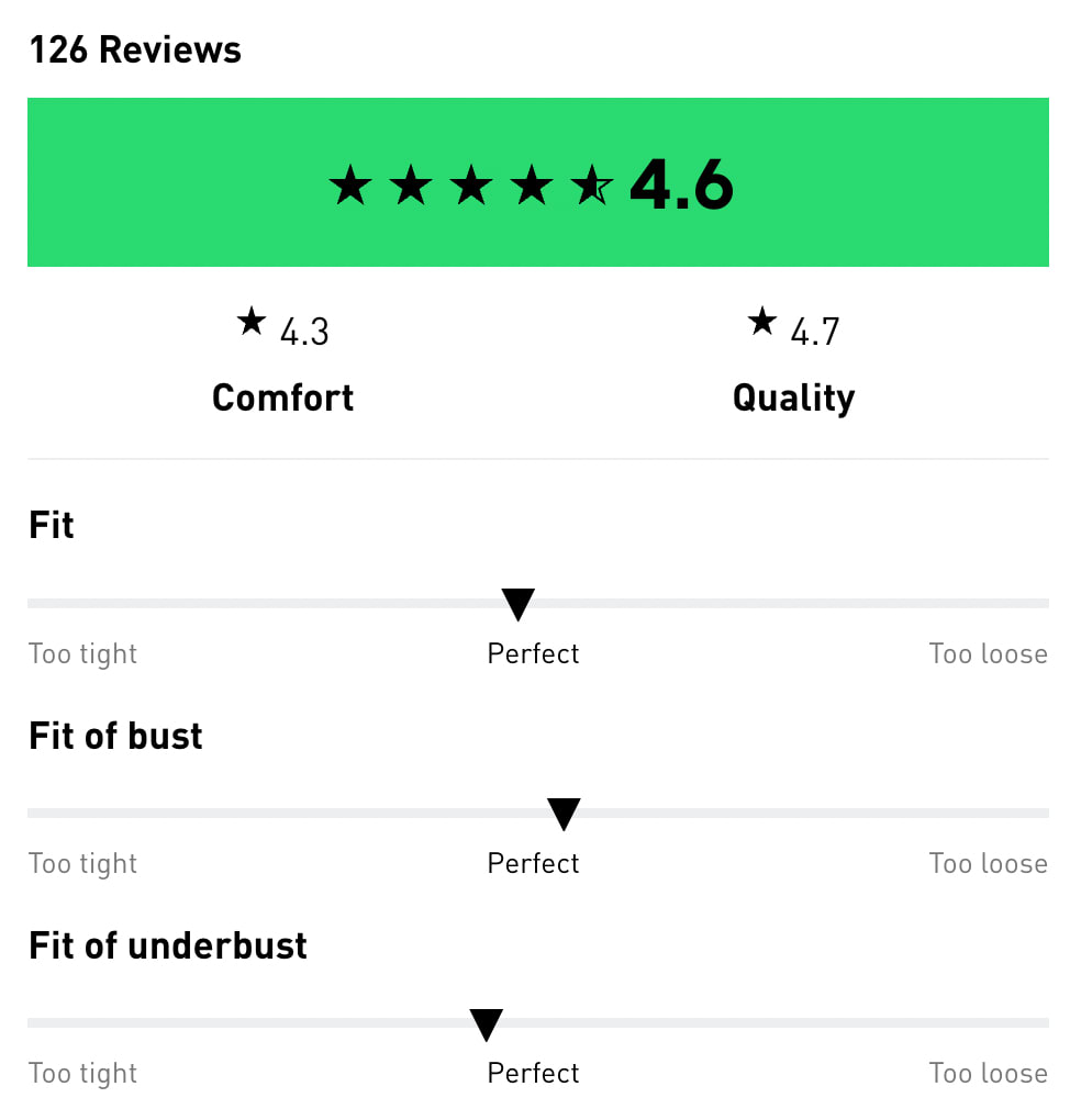
On Adidas, customers can explore ratings and reviews for comfort, quality, fit and support, and filter reviews by commonly used tags.
4. Allow Users To Mark Helpful Reviews #
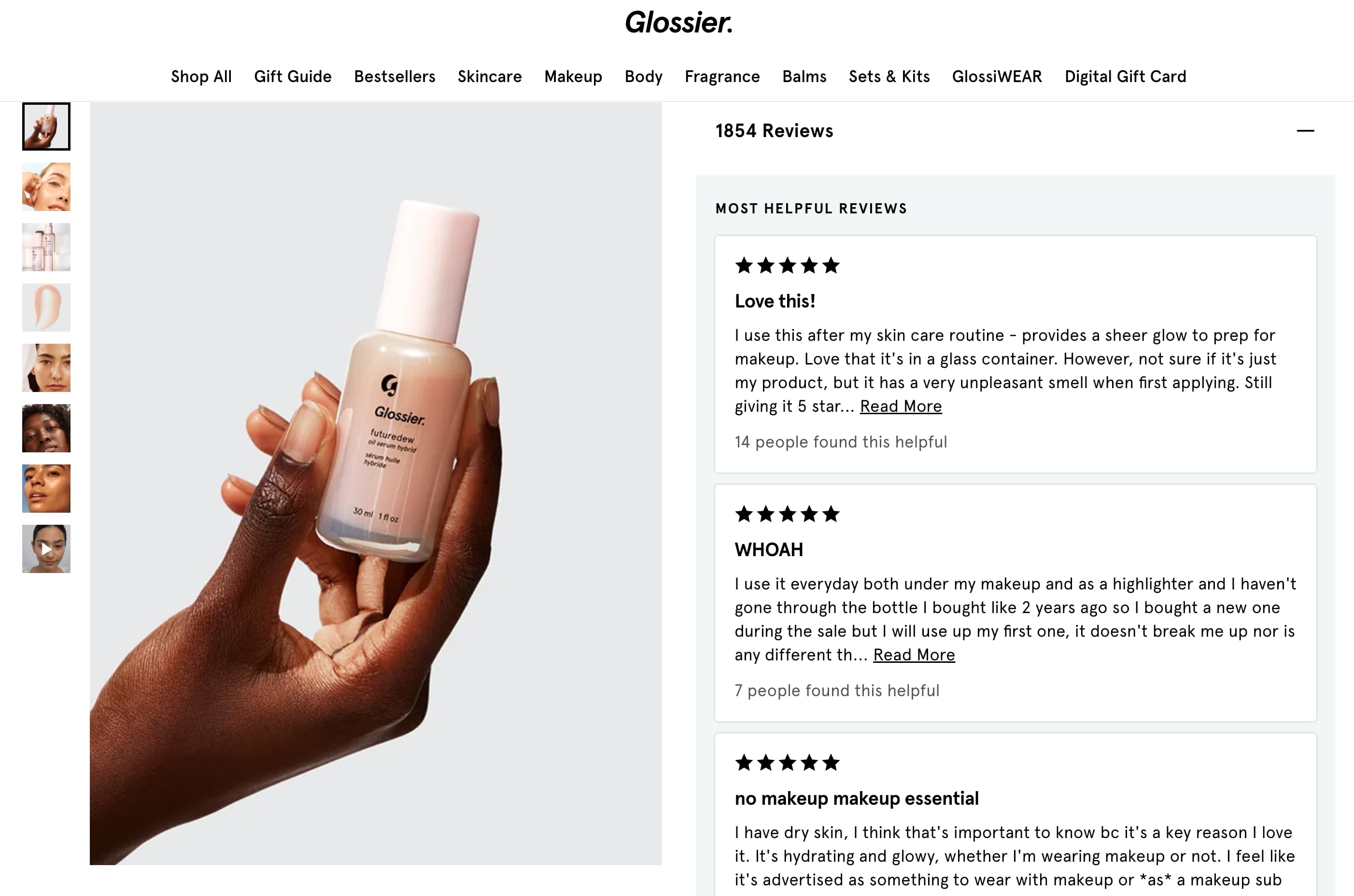
Not every review is helpful. Some reviews appear very generic, others lack important details, and others again focus too much on irrelevant details. To make sure that relevant reviews get surfaced to the top of the reviews list, we could kindly prompt users to mark if they find a review helpful — both for positive and negative reviews.

On Glossier, most helpful reviews are highlighted at the very top of the “Reviews” section.
Marked reviews — a few of each kind — could then be highlighted on the top of the reviews section, along with the number of users who found them helpful. This dramatically boosts trustworthiness and reduces time to relevance as highlighted reviews have been validated by other customers. This appears authentic and builds trust.
5. Reward Users For Negative Reviews #
The more specific negative reviews are, the easier customers can discard irrelevant details and reach that threshold of trust. Especially if negative reviews simply don’t apply to them.

iHerb.com highlights the most helpful positive and the most helpful critical review at the very top of the “Reviews” section.
You probably will need some negative reviews to appear trustworthy; they will, in fact, increase conversion and boost customer’s confidence. That’s why encourage customers to write detailed, honest negative reviews — and ask them to be very specific about the “bad” parts of the experience and update the review if they’ve been resolved.
The more detailed and the more useful the review, the higher should be reward points and coupon codes. Counter-intuitive, but you might be surprised how well it might impact your sales.
Wrapping Up #
Getting user ratings right requires quite a bit of work. We need to gather and highlight relevant reviews, present distribution charts properly and allow users to use filters, tags or search to faster find useful reviews.
In general, every review should have:
-
average score presented with decimal numbers,
-
overall number of ratings,
-
distribution chart of ratings,
-
customer’s unedited product photos,
-
ratings for individual features (size, fit, support etc.),
-
(#) of reviews for intermediate values (1.0, 2.0, 3.0, 4.0, 5.0),
-
tags and filters to find relevant reviews,
-
personal details that will help customers find people like them in the reviews,
-
date of publishing,
-
how many people find it helpful,
-
how many customers (%) recommend the product.
Sounds like a lot of effort — and it actually is. The impact of a proper user rating design can be remarkable and drive your sales efforts much stronger than any other campaign could have.
And once it’s done, it will work for you long-term, building up a community of people who trust your brand and recommend it online and offline. And without any doubt — that’s very much worth the effort.
Useful Resources #
-
UX tips: featuring customer reviews to increase conversion rates by Sepre Boyer,
-
User Ratings Design UX Research by Baymard Institute,
-
How To Design User Rating and Reviews by Nick Babich,
-
The Problem of J-Curves (in Online Ratings Systems), by Sav Sidorov.