Pricing Plans UX
How do we design pricing plans on mobile? We can get away with a few friendly accordions, tabs and by focusing on key highlights and differences between the plans.
We often dismiss pricing plans as if they were quite straightforward to design. In fact, how difficult can it be? We just have a few options with a few features marked as available or unavailable, the pricing, and a few CTAs along the way.
Problems occur at latest when we think about mobile, with pricing plans becoming difficult to explore and differences in plans becoming difficult to decipher. Let’s change that.
Focus on Roles and Key Highlights #
Every pricing plan starts with a description of features. But when there are hundreds of features, making sense of them is becoming difficult and overwhelming. Usually it’s not really necessary. Instead, we could try to indicate to customers who the plan is designed for. Plus, we could add a show/hide pattern to show (and hide) more features if needed.

We can also focus on key highlights, key differences and intended roles for each plan. Kissflow, Airtable, Chargebee.
On Kissflow, no details are displayed at all: instead each plan is focused around a defined role. On Airtable, users can show/hide more features if interested. And on Chargebee, a separate overlay with all features shows up when clicked. Neither design shows all features by default.
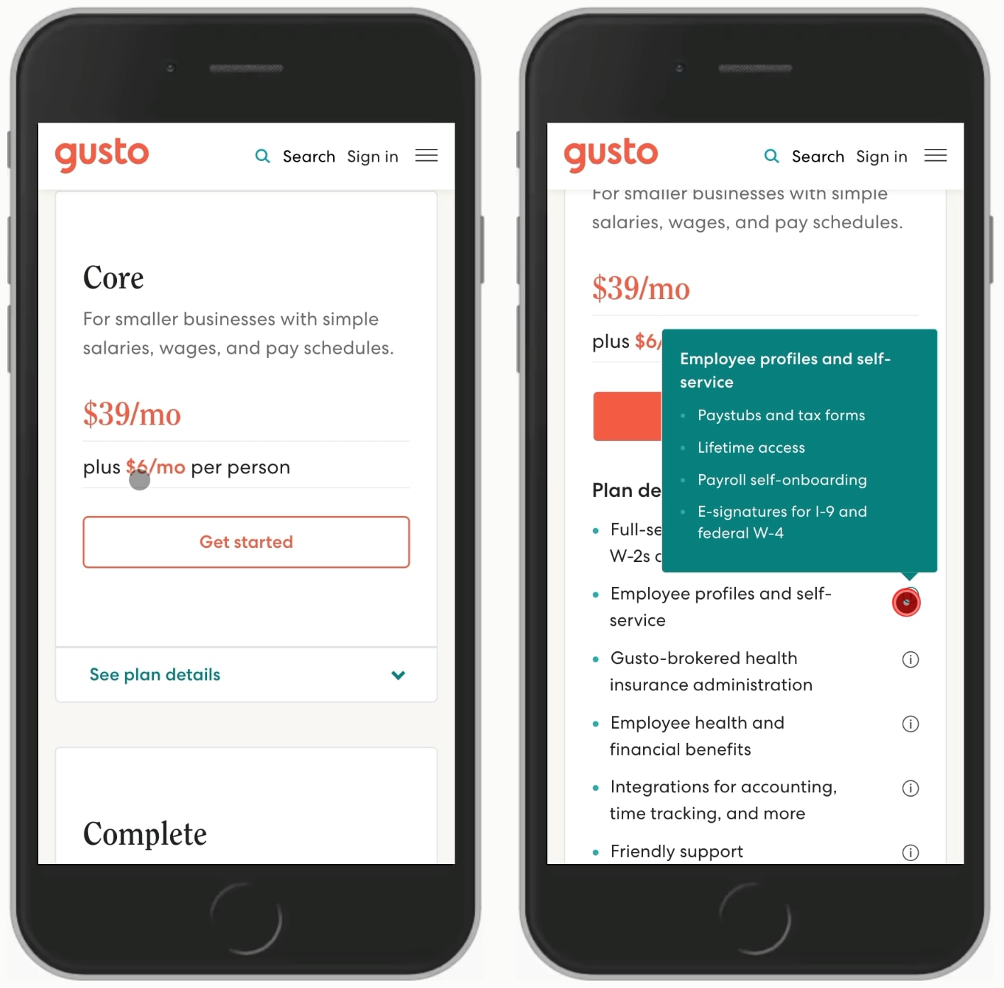
For each plan, Gusto reveals plan details within an accordion on click/tap. The main focus is on key features and the pricing. Everything is accessible, but only if needed. A good reference example to keep close.
Avoid Horizontal Feature Comparison Tables #
We've looked into feature comparison tables already, but in generalm horizontal scroll for tables is quite difficult to get right. Users tend to get lost in a large table, often not knowing what represents what and what exactly they are looking at.

Showing a full feature comparison table can be difficult to get right.
In Contentful and Hotjar above, it's not easy to understand what features we are comparing. There is no sticky bar referring to a particular plan, so it's quite easy to get lost. In general, it's worth testing alternatives to this kind of layout.
Grouping Plans With Tabs or Accordions #
We could allow users to navigate through the different features of different plans with accordions or sticky tabs. While it's not ideal for comparing, it's useful to allow users to quickly jump between the plans and find a good fit for them.

We can neatly group features with tabs or accordions. It doesn't make features easier to compare, but makes plans easier to understand.
Asana features accordions, with each open card displaying the pricing and some key features of each plan. On Twilio Segment, a visualization is used to highlight features of Free, Team and Business plans. And on Cloudflare, sticky tabs and a feature selector provide jumps between plans and for features within each plan.
Comparing Without Tables #
If you have a complex set of pricing plans, or need a feature comparison side-by-side, we could use a customizable table to allow users to select two plans at a time. That's what Dropbox does on their pricing page. Zendesk attempts to show all 4 pricing plans with accordions for each feature. This could be an option too.

Comparison is possible, but can be quite challenging with more than 2 options at a time. Dropbox and Zendesk.
Customizing Plans #
Not many people prefer the hard work on comparing features in a pricing plan. To reduce the amount of data to display, we could ask users what is it that they are interested in, ask them to specify their intent and suggest a recommended plan based on their preferences.

No need for guess if we can ask for intent. This helps us nudge users towards a best-fit plan for them.
Jira and Monday.com ask for the type of work and the number of users to suggest a plan, and Intercom suggests plans based on the type of business that is interested in purchasing one of the plans.
Wrapping Up #
Not all of these options will work of course, but they are great solutions to keep nearby when you want to test a few options for that magical landing page. It's probably a good idea to replace feature comparison tables on mobile with a combination of tabs and accordions, and nudge users towards an option that would be a best fit based on their preferences.
