Design Guidelines For Better Notifications UX
Practical techniques on how to make notifications more useful, less annoying and more engaging. Never trust people who get only 1 scoop of ice cream.
Friendly note: get a friendly UX bundle for Smart Interface Design Patterns 🍣 and Measuring UX 🍎 — with live UX training coming up. Jump to table of contents.
In many products, setting notification channels on mute is a default, rather than an exception. The reason for that is their high frequency which creates disruptions and eventually notifications fatigue, when any popping messages get dismissed instantly.
There is a good reason for it: high frequency of notifications. In usability testing, it’s the most frequent complaint, yet every app desperately tries to capture a glimpse of our attention, sending more notifications our way. Let’s see how we could make the notifications UX slightly better.
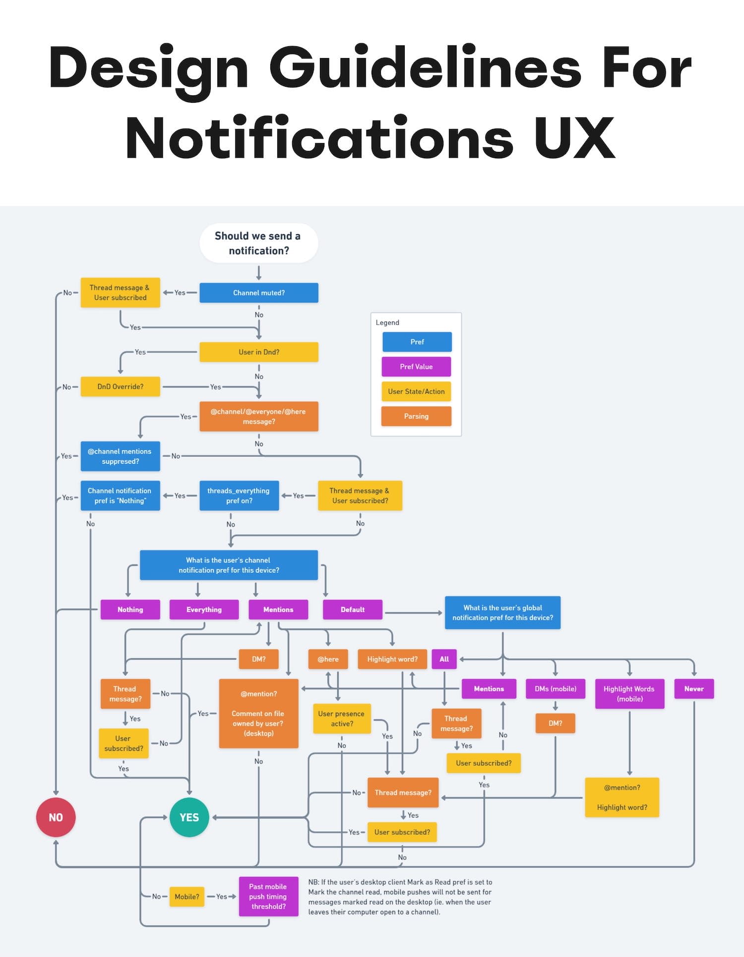
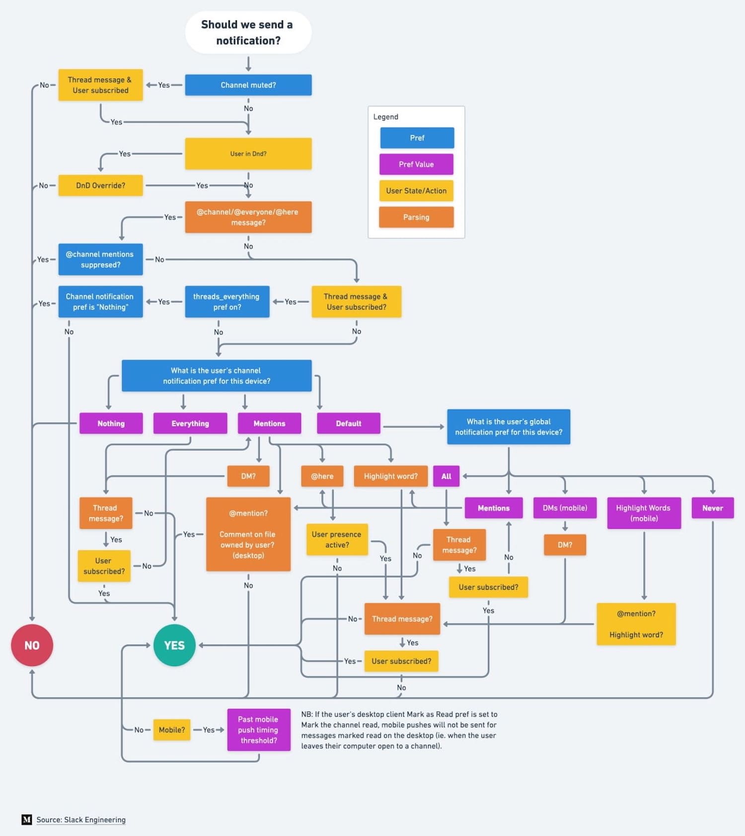
Decision tree for when to send and not to send a notification, on Slack.
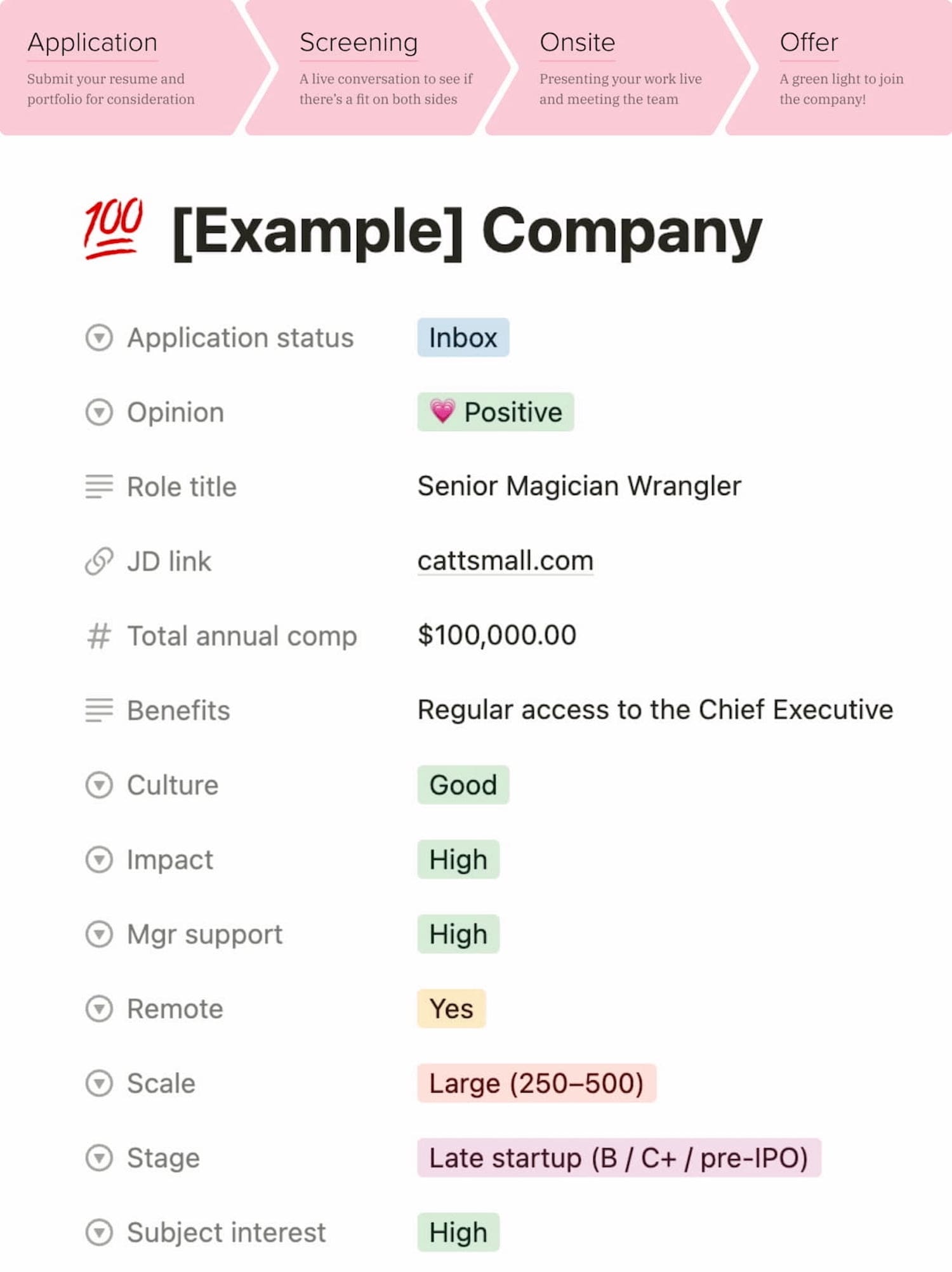
A Guide to Design Interview Journey, by (wonderful!) Catt Small.
1. The Many Faces of Notifications #
Notifications are distractions by nature; they bring a user’s attention to a (potentially) significant event they aren’t aware of or might want to be reminded of. As such, they can be very helpful and relevant, providing assistance, and bringing structure and order to the daily routine. Until they are not.
Not every communication option is a notification. As Kim Salazar rightfully noted, status communication often relies on validation, status indicators and notifications. While they are often considered to be similar, they are actually quite different.
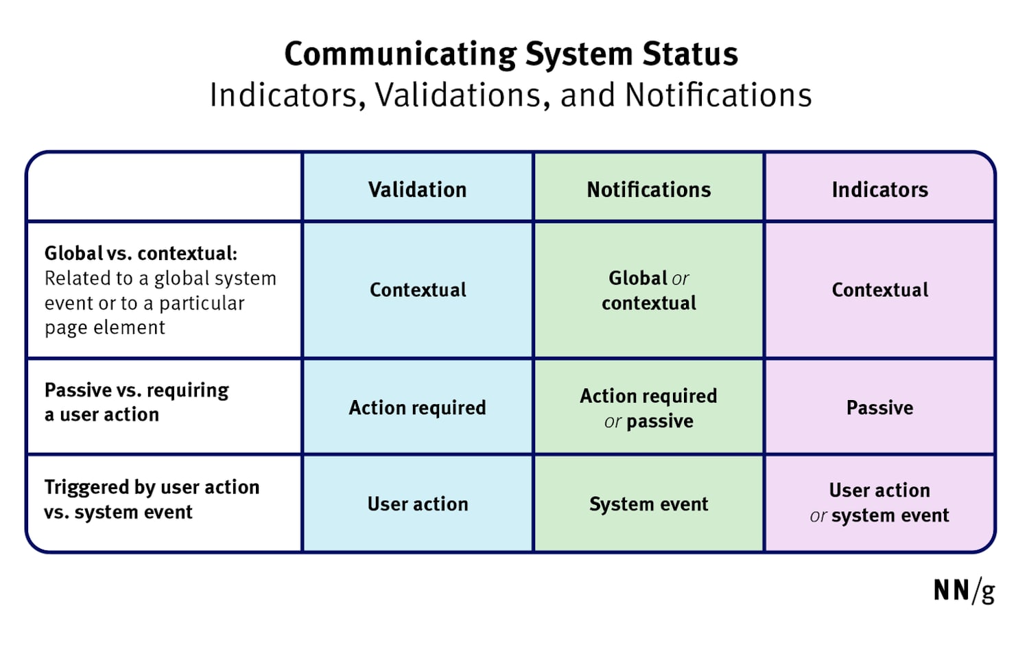
Notifications are informational messages that alert the user of general occurrences within a system.
In general, notifications can be either informational (calendar reminders, delay notifications, election night results) or encourage action (approve payment, install an update, confirm a friend request). They can stream from various sources, and can have various impact.
- UI notifications appear as subtle cards in UIs as users interact with the web interface — as such, they are widely accepted and less invasive than some of their counterparts.
- In-browser push notifications are more difficult to dismiss, and draw attention to themselves even if the user isn’t accessing the UI.
- In-app notifications live within desktop and mobile apps, and can be as humble as UI notifications, but can take a more central role with messages pushed to the home screen or the notifications center.
- OS notifications such as software updates or mobile carrier changes also get in the mix, often appearing together with a wide variety of notes, calendar updates, and everything in between.
- Finally, notifications can find their way into email, SMS, and social messaging apps, coming from chatbots, recommendation systems, and actual humans.
But: we don’t pay the same amount of attention to every notification. It can take weeks until they eventually install a software update prompted by their OS notification, or just a few hours to confirm or decline a new LinkedIn request.
2. Not Every Notification Is Equal #
The level of attention users grant to notifications depends on their nature, or, more specifically, how and when notifications are triggered. People care more about new messages from close friends and relatives, bank transactions and important alerts, calendar notifications and any actionable and awaited confirmations or releases.
A variety of triggers (or) origins of information, from a Critical Analysis of Notification Systems by Shankar Balasubramanian (Gmail team).
People care less about news updates, social feed updates, announcements, new features, crash reports, promotional and automated messages in general. Most importantly, a message from another human being is always valued much higher than any automated notification.
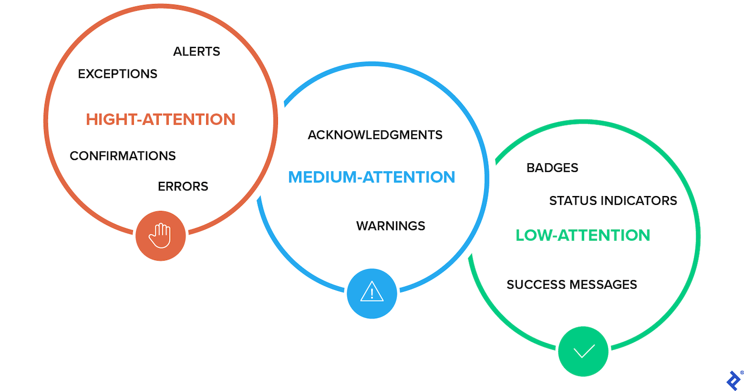
3. Design For Levels Of Severity #
As Sara Vilas suggests, we can break down notification design across three levels of severity: high, medium, and low attention. And then, notification types need to be further defined by specific attributes on those three levels, whether they are alerts, warnings, confirmations, errors, success messages, or status indicators.
A variety of triggers (or) origins of information, from a Zendesk Mapping Tone by Shankar Balasubramanian (Gmail team).
High Attention
- Alerts (immediate attention required)
- Errors (immediate action required)
- Exceptions (system anomalies, something didn’t work)
- Confirmations (potentially destructive actions that need user confirmation to proceed)
Medium Attention
- Warnings (no immediate action required)
- Acknowledgments (feedback on user actions)
- Success messages
Low Attention
- Informational messages (aka passive notifications, something is ready to view)
- Badges (typically on icons, signifying something new since last interaction)
- Status indicators (system feedback)
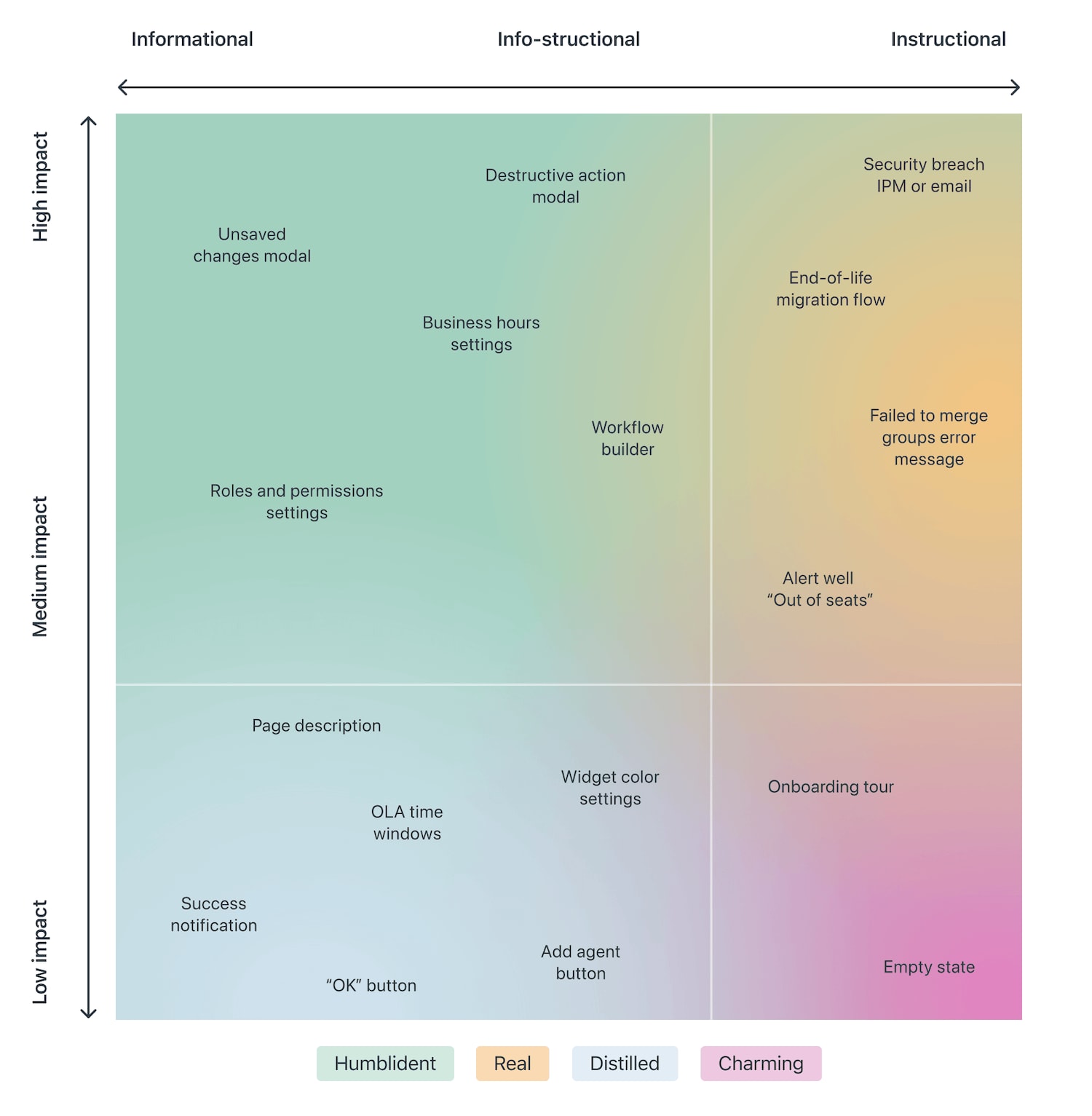
Taking it one step further, we can map the attention against the type of messaging we are providing — very similar to Zendesk's mapping tone above, which plots impact against the type of messaging, and shows how the tone should adjust — becoming more humble, real, distilled or charming.
So: notifications can be different, and different notifications are perceived differently; however, the more personal, relevant, and timely notifications are, the higher engagement we should expect.
4. Start Sending Notifications Slowly But Steadily #
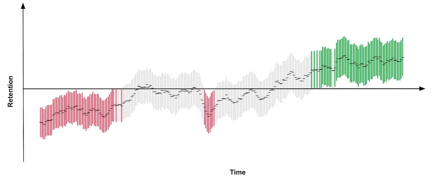
It’s not uncommon to sign up, only to realize a few moments later that the inbox is filling up with all kinds of irrelevant messages. That’s exactly the wrong thing to do. A study by Facebook showed that sending fewer notifications improved user satisfaction and long-term usage of a product.
Initially, once the notification rate was reduced, there was indeed a loss of traffic, but it has “gradually recovered over time”, and after an extended period, it had fully recovered and even turned out to be a gain.
A good starting point is to set up a slow default notification frequency for different types of customers. As the customer keeps using the interface, we could ask them to decide on the kind of notifications they’d prefer and their frequency.
Send notifications slowly, and over time slowly increase and/or decrease the number of notifications per type of a customer. This might work much better for our retention rates.
5. Don’t Rely On Generic Defaults: Set Up Notification Modes #
Typically users can opt in and opt out from every single type of notification in their settings. In general, it’s a good idea, but it can also be very overwhelming — and not necessarily clear as of how important each notification is. Alternatively, we could provide predefined recommended options, perhaps with a “calm mode” (low frequency), a “regular mode” (medium frequency), and a “power-user mode” (high frequency).
How Slack decides to send a notification, incredible documentation on when to trigger a notification on Slack.
As time passes, the format of notifications might need adjustments as well. Rather than having notifications sent one by one as events occur, users could choose a “summary mode,” with all notifications grouped into a single standalone message delivered at a particular time each day or every week.
That’s one of the settings that Slack provides when it comes to notifications; in fact, the system adapts the frequency of notifications over time, too. Initially, as Slack channels can be quite silent, the system sends notifications for every posted message.
As activities become more frequent, Slack recommends reducing the notification level so the user will be notified only when they are actually mentioned.
6. Make Notification Settings A Part Of Onboarding #
We could also include frequency options in our onboarding design. A while back Basecamp, for example, has introduced “Always On” and “Work Can Wait” options as a part of their onboarding, so new customers can select if they wish to receive notifications as they occur (at any time), or choose specific time ranges and days when notifications can be sent.

On Basecamp, new customers can select if they wish to receive notifications as they occur, or choose specific time ranges and days when notifications can be sent.
Or, the other way around, we could ask users when they don’t want to be disturbed, and suspend notifications at that time. Not every customer wants to receive work-related notifications outside of business hours or on the weekend, even if their colleagues might be working extra hours on Friday night on the other side of the planet.
7. Allow Users To Snooze Or Pause Notifications #
User’s context changes continuously. If you notice an unusual drop in engagement rate, or if you’re anticipating an unusually high volume of notifications coming up (a birthday, wedding anniversary, or election night, perhaps), consider providing an option to mute, snooze, or pause notifications, perhaps for the next 24 hours.
This might go very much against our intuition, as we might want to re-engage the customer if they’ve gone silent all of a sudden, or we might want to maximize their engagement when important events are happening. However, it’s easy to reach a point when a seemingly harmless notification will steer a customer away, long term.
In “Designing Notifications For Apps”, Shashank Sahay explores different notification models and when to use which.
Another option would be to suggest a change of medium used to consume notifications. Users tend to associate different levels of urgency with different channels of communication.
In-app notifications, push notifications, and text messages are considered to be much more intrusive than good ol’ email, so when frequency exceeds a certain threshold, you might want to nudge users towards a switch from push notifications to daily email summaries.
Wrapping Up #
As always in design, timing matters, and so do timely notifications. Start slowly, and evolve your notification frequency depending on how exactly a user actually uses the product. For every type of user, set up notification profiles — frequent users, infrequent users, one-week-experience users, one-month-experience users etc.
And: whenever possible, allow your users to snooze and mute notifications for a while, and eventually you might even want to suggest a change of medium used to consume notifications. And when in doubt, postpone, rather than sending through.