How To Name Design Tokens in Design Systems
Naming is hard! How do we name and organize design tokens in our design systems? Let’s take a look at some do’s, don’ts, guides and examples to get started.
Design tokens represent small, repeatable design decisions. Instead of using exact HEX or px-values, we refer to a token which name describes how and where they are used. It makes it much easier to update the design by changing one value in one place and not breaking anything else in-between.
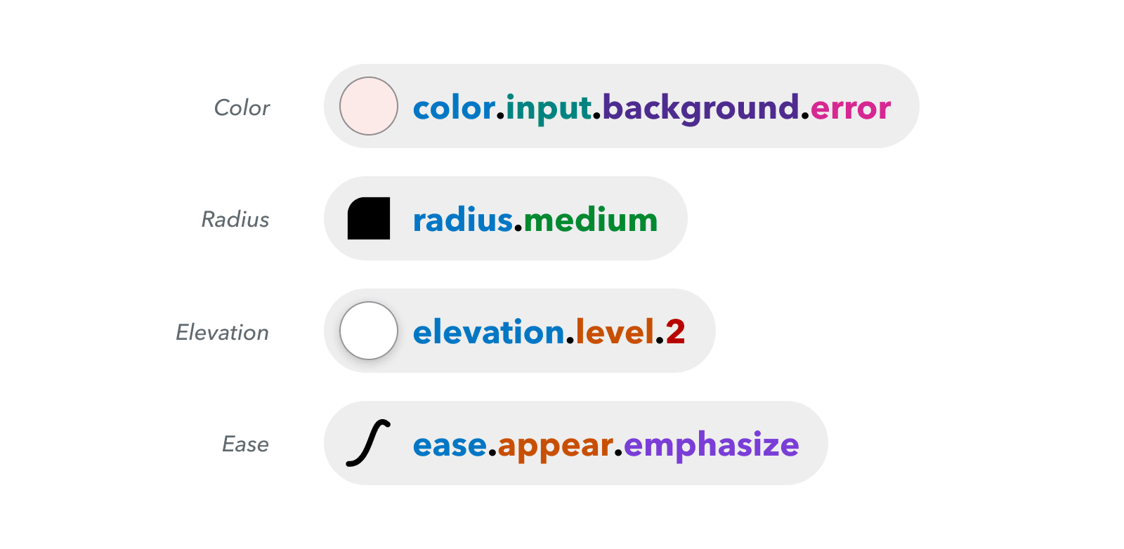
Creating a flexible design token taxonomy for Intuit’s Design System, a thorough case study by Nate Baldwin.
We break apart every single UI component into standalone tokens. The more specific these tokens are, the more confidence we have in using and changing them across the product. But the more generic the tokens, the more flexibility we have in using them. In fact, components tokens is where most design system teams struggle.

Taxonomy and naming conventions, from [type][element] to [state][index].
Naming patterns are exhibited via naming levels — e.g. {namespace}-{category}-{role}-{modifier}-{theme}). Common levels are category, concept, property, variant/scale and state. Regular design systems typically use a few levels, but large multi-platform systems might have as many as 5–6 naming levels.
The Different Flavors of Design Tokens #
Good tokens explain what they do (e.g. badge-background-color-hover). However, tokens come in different flavors and shades, and it’s not uncommon to have multiple levels of design tokens referencing each other:
- Raw values are the actual design choices (#147AF3).
- Primitives (global tokens) are used across the system (blue-800).
- Semantic (alias tokens) reference other tokens (accent-visual-color).
- Component tokens apply to UI components (button-accent-color).
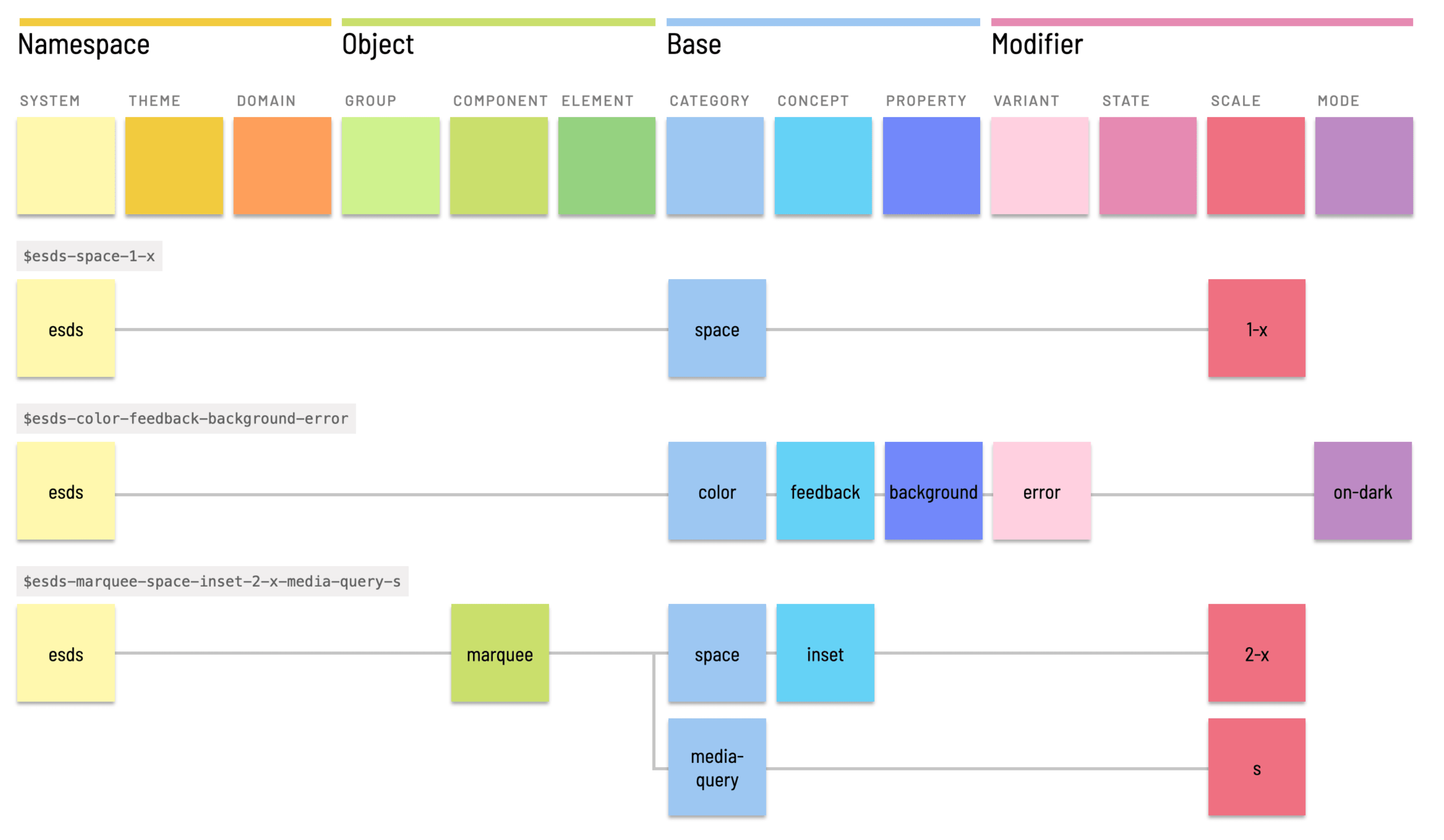
Naming Tokens in Design Systems, a very thorough introduction by Nathan Curtis.
Things To Keep In Mind #
- We use naming levels to add context to tokens: e.g. {context}-{role}-{modifier}.
- Namespaces might help, too: e.g. {namespace}-{concept}-{role}-{modifier}.
- E.g. --n-feedback-alert-success, --n-checkbox-control-size-large.
- Frequent levels are category, component, property, variant/scale, state, mode.
- Namespaces (system, theme, domain) are prepended first.
- Base levels (category, property, concept) are a backbone in the middle.
- Modifiers (variant, state, scale, mode) tend to be appended last.
- Regular systems use 2–4 levels, large systems can use many more.

Supercharge your Design System with Design Tokens, a friendly guide by Jishnu Hari.
Useful Examples of Design Tokens #
The larger the design system, the more likely they designers are to use design tokens. The examples below include very thorough documentation on design tokens, and some guidelines when to use which. Just a few options from my bookmarks.
- Naming Conventions and Design Tokens at Nordhealth
- Goldman Sachs Color Tokens System
- Sainsbury's Luna Design Tokens
- NewsKit Design Tokens and Style Presets
- Twilio Design Tokens Guidelines
- Github Design Tokens Guidelines
- Design Tokens at Atlassian Design System
- Design Tokens at Pinterest
- Shopify's Polaris Design Tokens
- If... Design Tokens
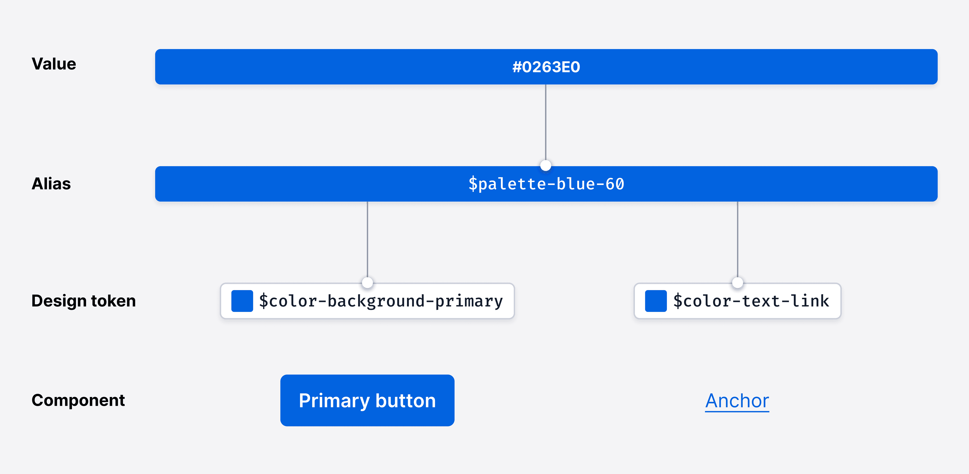
Design Tokens in the Paste Design System, with a structure chart documenting design decisions.
Useful Resources #
- Naming Tokens in Design Systems, by Nathan Curtis
- Practical Guide to Naming Design Tokens, by Lukas Oppermann
- Supercharge Your Design System with Design Tokens, by Jishnu Hari
- Figma Tokens Plugin, by Jan Six
- Design Tokens 101, by Romina Kavcic
- Guide To Design Tokens and Naming Conventions, by Romina Kavcic
- Design Tokens For Intuit’s Design System, by Nate Baldwin
- Friendly Guide to Design Tokens (+ Figma template), by Specify
- Naming Tokens in Design Systems (Figma Kit), by Marta Conde
- Design Tokens in Figma: How to Get Started, Today (Video), by Jan Six
- Everything on Design Tokens, by Stuart Robson
You can find more details on design systems in the new chapters of the video library on Smart Interface Design Patterns 🍣 — with a live UX training that’s coming up later this year.

