Designing Multi-Lingual UX
Eventually, labels get too lengthy, web forms start breaking and we have to fix dates, word order, pluralization, photos and gender pronouns. Let’s explore some things to keep in mind when designing multi-lingual UX.
If you ever had to design a multi-lingual website, you probably know the drill. Usually it’s not just a matter of translation. Eventually, labels get too lengthy to work everywhere, and we need to dedicate a lot of attention to currencies, dates, different word order, pluralization, colors, and gender pronouns.
We need to think about how to stress test our designs in various contexts, and a proper localization strategy is needed as various versions of sites will be ready at various times.
Designing a language selector isn’t as straightforward as one might think. We’ve just published a comprehensive UX guide on just that.
1. Defensive Design Mindset #
Internationalization is hard. As we rarely know how much content will go into every given components we need to design with a defensive mindest in mind. That means considering special use cases and edge cases early.

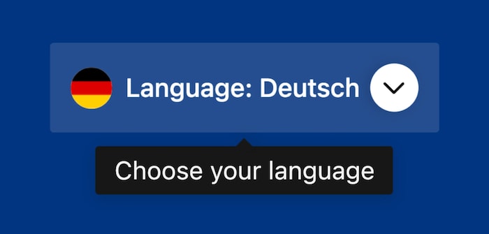
Defensive design helps us stay on track when we don’t know in which context our design will be used. Image by Ahmad Shadeed.
These are the questions I ask myself when working on any multi-lingual website:
-
What if we double the number of navigation items?
-
Can we use a show/hide pattern to show less if we need to?
-
What if the headline is much longer, or much shorter?
-
What if all images/videos have a wrong aspect ratio?
-
Do our fonts support accent characters?
-
Can we serve different illustrations to different audiences?
-
Is our code base prepared for right-to-left interfaces
Surely we need to first know what countries we are designing for. In her wonderful talk on International Is The New Mobile First (video, 50 mins), Robyn Larsen highlights how much attention we need to spend to everything from wording to photography when preparing a product for a new market.
A reliable way to stress test just how defensive an interface actually is, is pseudolocalization — and that’s probably one of the first techniques that is likely to come up in conversations about multi-lingual UX.
2. Testing With Pseudolocalization #
With pseudolocalization, we test an interface before a translation is ready. We accent each character yielding a visibly different but still legible string. For example, French texts are on average 20 percent longer than English ones, while Japanese texts are 30 to 60 percent shorter. So we can simulate translation-induced expansion and add extra characters and make each word 40-50% longer to see if the layout still works well.

Localizing Slack, a lovely case study on internationalization at scale.
Personally, I always try looking into very long and very short titles, extremely wide and extremely tall images and the content in German, Cyrillic and Arabic or Hebrew. This requires also to observe if dates and currencies are displayed properly, and ideally hand over the design to a native speaker to see if the leading and whitespace work well as well.

Pseudoloc, a Figma plugin, inspired by Netflix case-study.
There are a few tools for pseudolocalization. For example, Pseudoloc and Psuedo Localizator are Figma plug-ins, and Pseudolocalize! is a free online tool that does the same thing for any paragraph of text.
3. Designing For Global Audiences #
To be prepared for the unexpected, it’s a good idea to leave enough room for longer translations and avoid putting text in narrow columns. We have to be careful with our icons and metaphors. But sometimes we need to go a little bit beyond that. We also need to address cultural characteristics in UX.

Different audiences are different. Jenny highlights just how different the cultures are around the world.
In her incredible two-part article series “UX Design Across Different Cultures”, Jenny summarized what she has learned from designing for various cultures. Once you know the culture of the audience that you are designing for, your design decisions will have to consult and address cultural characteristics of that audience. Jenny also goes into detail of conducting usability tests, measuring data, and localizing copy.
Part 2 looks into researching mobile device usage in emerging markets, researching local UI patterns and creating personas of local users. Jenny also highlights many of these findings in her talk on Design for users across cultures (video, 35 mins).
Wrapping Up #
Personally, the most important thing to design for global audiences is to question every single assumption made in the interface. The wording, the buttons, the visuals, the layout. Our design has to be defensive and flexible enough to accommodate for major changes across languages and cultures.
That’s not an easy fit, but it has a lovely side effect of helping us migrate our design to any other environment with a bit more confidence. And even if the interface will not be translated to other languages, it will be resilient enough for any kind of edge cases that happen in every single project. And that’s something worth striving for.