Designer’s Guide To Redesign, Step-By-Step
Good redesigns are evolutions, not revolutions. Useful guidelines on when and how to redesign, how to avoid pitfalls and how to help users embrace the new design.
Redesigns are often expensive, time-consuming and incredibly risky. Of course sometimes big-bang-redesigns are necessary, yet more often than not they can be avoided with a series of strategic incremental changes. Here are a few things to keep in mind before launching a big-scale redesign effort.

How to redesign, a step-by-step guide, a comprehensive guide by Taras Bakusevych.
Users Don’t Like Change If They Don’t See Value In It #
Personally, I always suggest to avoid redesign projects whenever possible. They are extremely costly, complex and time-consuming ventures — and too often without valuable outcome for end users. Instead, we need to seek where we can increase the value and apply our design efforts to that area.
As Jared Spool argues, we often think that users don’t like change. Yet users go through small and big changes all day long. What users don’t like are breaking changes. Sudden interruptions. Blockers. Bad surprises. Changes that they don’t understand and can’t see any value in. That’s what we need to avoid.
Redesign Step-By-Step Process #
A few years ago, Taras Bakusevych has written a wonderful practical guide on how to redesign to avoid pitfalls and deliver value fast. If you are getting into a redesign project, that's a fantastic practical guide to follow.
1. Build A Shared Understanding #
We start by building a shared understanding of what we are trying to achieve. We interview stakeholders, check their expectations, interview dev and support teams. We capture insights, thoughts and suggestions and define jobs to be done.

Start with building shared understanding: with stakeholder interviews, user interviews and study of your target audience. From a comprehensive guide by Taras Bakusevych. Large view.
2. Audit and Deconstruct Existing Design #
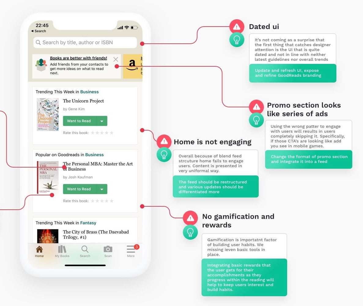
Then, rather than starting from scratch, we start deconstructing the existing design. We look out for patterns and flows that users understand and use frequently, and we study research and testing that has been done so far.

We deconstruct an existing design by watching out for frequent flows that users understand and rely on. By Taras Bakusevych. Large view.
3. Gather Evidence From UX Research #
Once we know where we stand, we need to explore where we want to head to. We gather evidence from UX research done so far, pain points that we are aware of, the problem areas that we need to address. That's where speaking to customer success and support can also be valuable.
4. Prioritize Key Problem Areas and Features #
It might be a good idea to create a simple prioritization matrix where we list features and pros of competition, identify key problem areas and find improvement opportunities. Before jumping into any design, we map the value vs. the effort on an impact matrix to set priorities.

We create a matrix with features and pros of the competition, identify key problem areas and search for improvement opportunities. By Taras Bakusevych. Large view.
5. Start Ideating and Sketching, But Test Early #
Eventually we start exploring, ideating, sketching. We come up with good candidates for improvements. We create low-fidelity storyboards and test new flows in early stages with actual customers. Then we develop a design language and apply it to critical pages or flows to test again. We iterate and keep testing.

Test early and often. We use storyboarding to sketch out ideas, then test them with actual users or customers. By Taras Bakusevych. Large view.
6. Bring Stakeholders On Board As Early As Possible #
While doing so, it’s a good idea to involve stakeholders in the design process as early as possible. Show them what you are working on. Record a weekly 1-min videos explaining the process. Explain why some decisions are made. Circulate it in your internal newsletter. Listen to the feedback, you will need to show that you’ve considered it later.
7. Design Presentation Shouldn't Have Big Surprises #
Eventually, you'll have to present and get a sign-off on a new design and the new direction. Ideally, by the moment you'll make a big presentation, you will already have an informal green light from your stakeholders. Show results from the testing. Show video snippets and audio clips of people struggling with the current design. Explain how the new design is better.
8. Don't Ask For Opinions, Ask For Agreement #
But: don't ask for opinions. Ask if people in the room agree with the direction the new design is taking, and if not, why not. You will need senior support to carry your new design in action. So as you evolve the new design, keep them in the loop.
9. Roll Out Slowly and Incrementally #
Roll out slowly. Add changes incrementally. Give users control over when change affects them and allow to change back to the old design at least temporarily. Most importantly, show the specific value that a new design brings to them. And then test again, review results and evolve — and prepare your customer service way ahead of time.
You Might Not Need A Redesign #
You might need to revamp email newsletters. Or improve your product pages. Or optimize for repeat business. Or address a new market. Or better cater to older audiences. Or just invest in a better search. These are typically much more urgent issues that everybody will benefit from.
But if you do, break up changes in small increments and roll out gradually. There shouldn’t be any big surprises and revelations with the redesign. Good redesigns are evolutions, not revolutions. Refine slowly as you go, and you’ll be surprised that users might not even notice that you’ve redesigned at all.
Key Takeaways #
- Avoid big-bang redesigns unless absolutely necessary.
- Always prefer incremental changes over a major overhaul.
- Clean-up, archive, delete, update. Simplify first.
- Build on top of already existing behavior patterns.
- Give users control over when change affects them.
- Give an option to try a new design now and later.
- Allow to change back to the old design at least temporarily.
- Don’t pack a lot of change in all at once.
- Users accept changes if they see value in them.
- Keep the old way of working first, and transition slowly.
- Highlight and explain changes to returning users.
- Show to users how the change benefits them.
- Prepare your customer service way ahead of time.
Further Reading #
-
Users Don’t Hate Change, But Our Design Choices, by Jared Spool
-
How To Redesign, A Step-By-Step Guide, by Taras Bakusevych
-
How to Redesign, The Right Way, by Paul Boag
-
How To Run A UX Redesign Workshop, by Sarah Jee Watson
-
Extraordinarily Radical Redesign Strategies, by Jared Spool
-
Radical Redesign or Incremental Change?, by Hoa Loranger


