Seven Fantastic Design Systems
Fantastic design systems with great guidelines, examples, do’s and don’ts, decision trees and flow charts.
Nobody is surprised by design systems these days. A novelty just half a decade ago, they have become an established part of the design process, helping teams bridge the gap between design and code.
I'd love to share with you some of the useful features of design systems that I keep referring to often in my work — and hopefully they can boost your design system, too.
1. Accessibility and Naming Conventions #
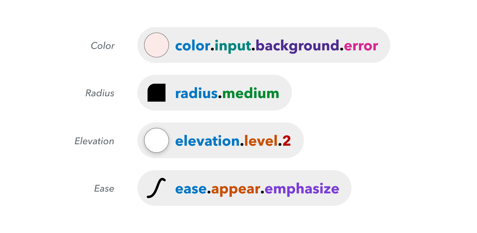
Nordhealth is created for healthcare applications for clinics and practices, and as such, it’s heavily focused on accessibility. There are also dedicated guides to naming conventions and localization guidelines. Plus, there is a plenty of customization options, themes and a fully-fledged CSS framework. Unfortunately, the Figma toolkit isn’t open-sourced yet.


2. Branding and Multi-Lingual Design #
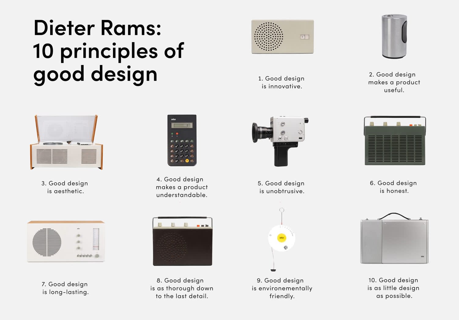
Olympics Design System is focused on branding and identity design, but also provides examples of ilustrations and graphic elements. It shows how to manage multi-lingual challenges and how to use typography, with plenty of good and not-so-good examples and many guidance notes along the way.


3. Comprehensive, Live Examples #
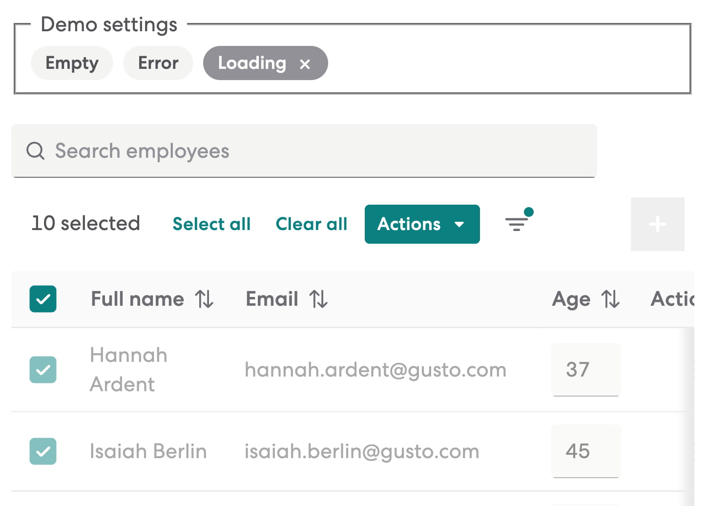
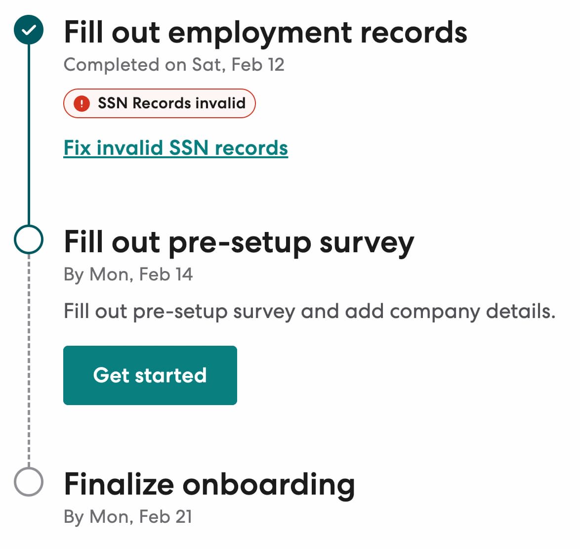
Workbench Design System is a wonderful design system by Gusto, with usage guidelines, do's and don'ts, visual explanations and implementation details. What really stands out to me are very, very comprehensive live examples that explain how exactly components should be used in different contexts.
The developers have also built a Gusto Workbench VS Code Extension with common snippets for their UI components.
4. Content Guidelines and UX Writing #
Deutsche Bahn Design System is a lovely design system with content guidelines, accessibility considerations, components and contextual examples of components in use. It also provides a number of guidelines around UX writing (in German) and helpful visual guides to accessibility and logo.


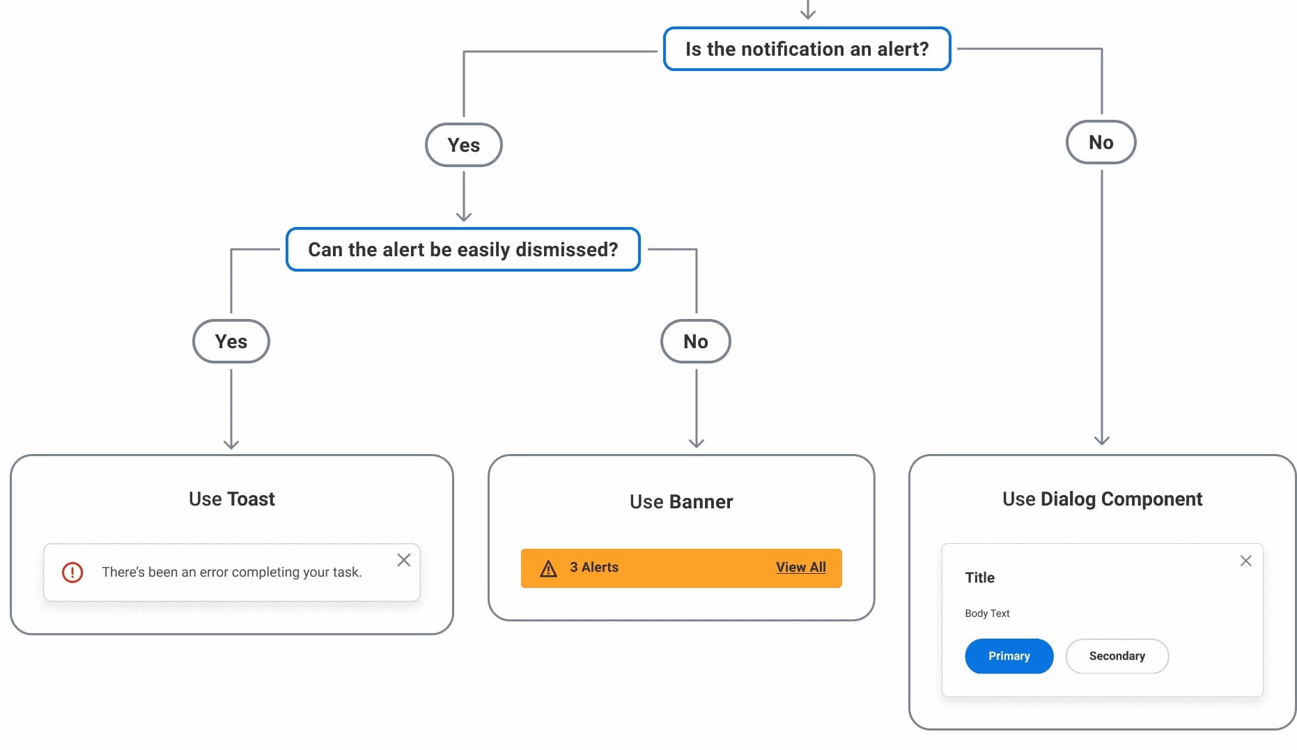
5. Decision Trees and Flow Charts #
Workday Design System seems like a regular design system with content guidelines, UI components, patterns and accessibility guidelines. However, what really stands out to me are decision trees and flow charts that are used to help designers and developers make a decision around a particular component or how it could be used.

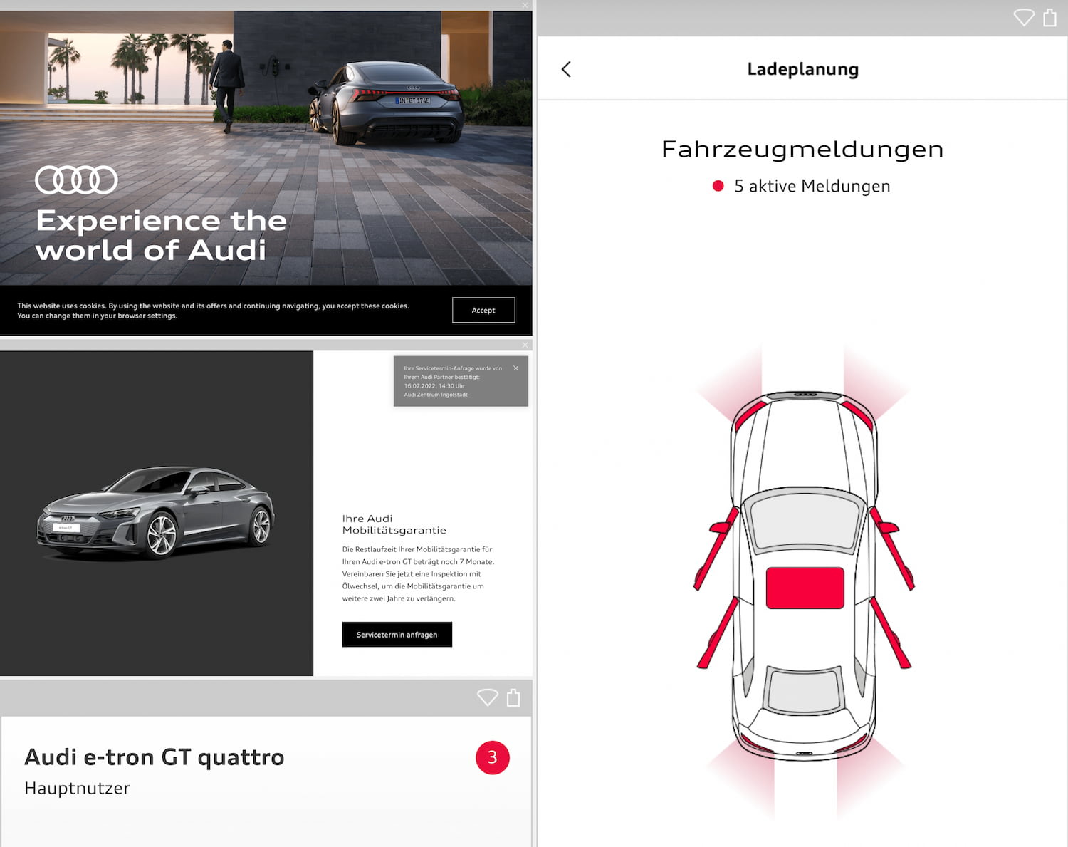
6. Visual Examples of Do’s and Don’ts #
Audi Design System has been around for a while. Along with brand appearance guidelines and UI components, one useful feature it provides is a comprehensive set of visual examples of how a component should and shouldn’t be used in Audi’s interfaces. There is also a freely available Audi UI Kit for Figma and Sketch UI library.

7. Free Design Systems Figma Kits #
Design Systems Figma Kits is a growing repository of freely available Figma kits of design systems — grouped, organized and searchable. Additionally, I can only recommend Gov.uk design system Figma kit, focused specifically on complex user journeys and web forms.

And That’s A Wrap! #
Obviously there is no reason to copy-paste an existing design system, but we can get inspired for features and the ways to present do’s and don’ts, for various contexts. I hope that some of these examples will be helpful for your work.