A Guide For Designing For Older Adults
One billion people aged 60+ live today, and it’s growing faster than any other age group. Here are some key points to consider to design experiences that are more accessible and inclusive for older adults.
Avoid Wrong Assumptions #
- Don’t assume that older adults struggle to use digital.
- You don’t need to strip the design to bare minimum.
- Avoid general stereotypes and assumptions about elderly people.
- Most users are healthy, active and have a solid income.

How To Write Better Microcopy For Older Adults highlights practical examples of designing interfaces with older adults in mind.
Things To Keep In Mind #
- Older adults often read and analyze every word (Stroop effect).
- Shades of blue/purple and yellow/green are difficult to distinguish.
- Visuals with a similar contrast are harder to tell apart.
- Often struggle with precise movements and text input.
- Users are more likely to perform actions they didn’t mean to.
- They take more time and need more control over the process.
- They often view error messages as a personal failure.
Things To Avoid #
- Avoid disappearing messages: let users close them.
- Avoid accessibility overlays; they are often inaccessible.
- Avoid long, fine drag gestures and precision.
- Avoid floating labels and use static field labels.
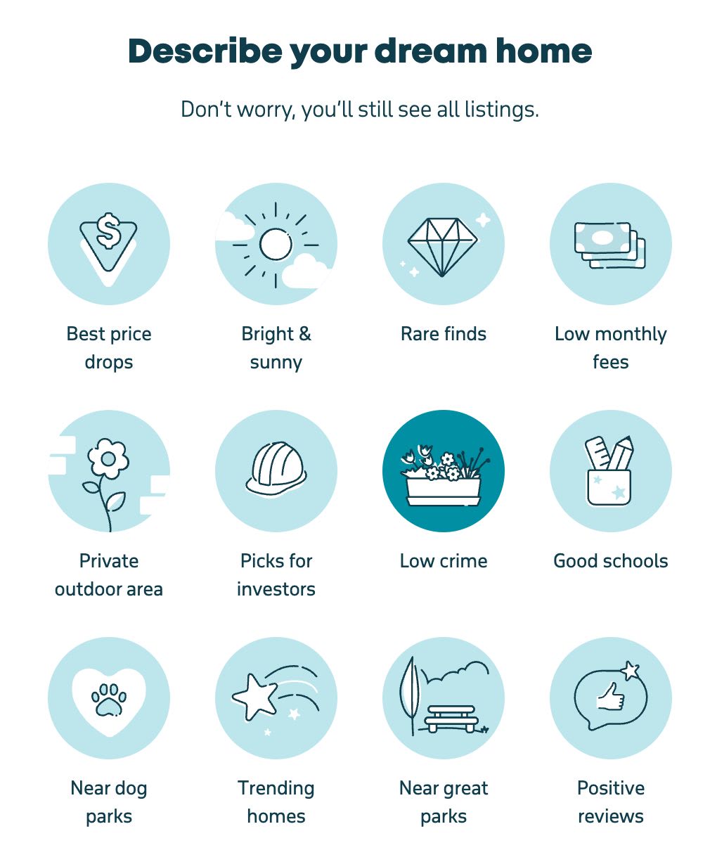
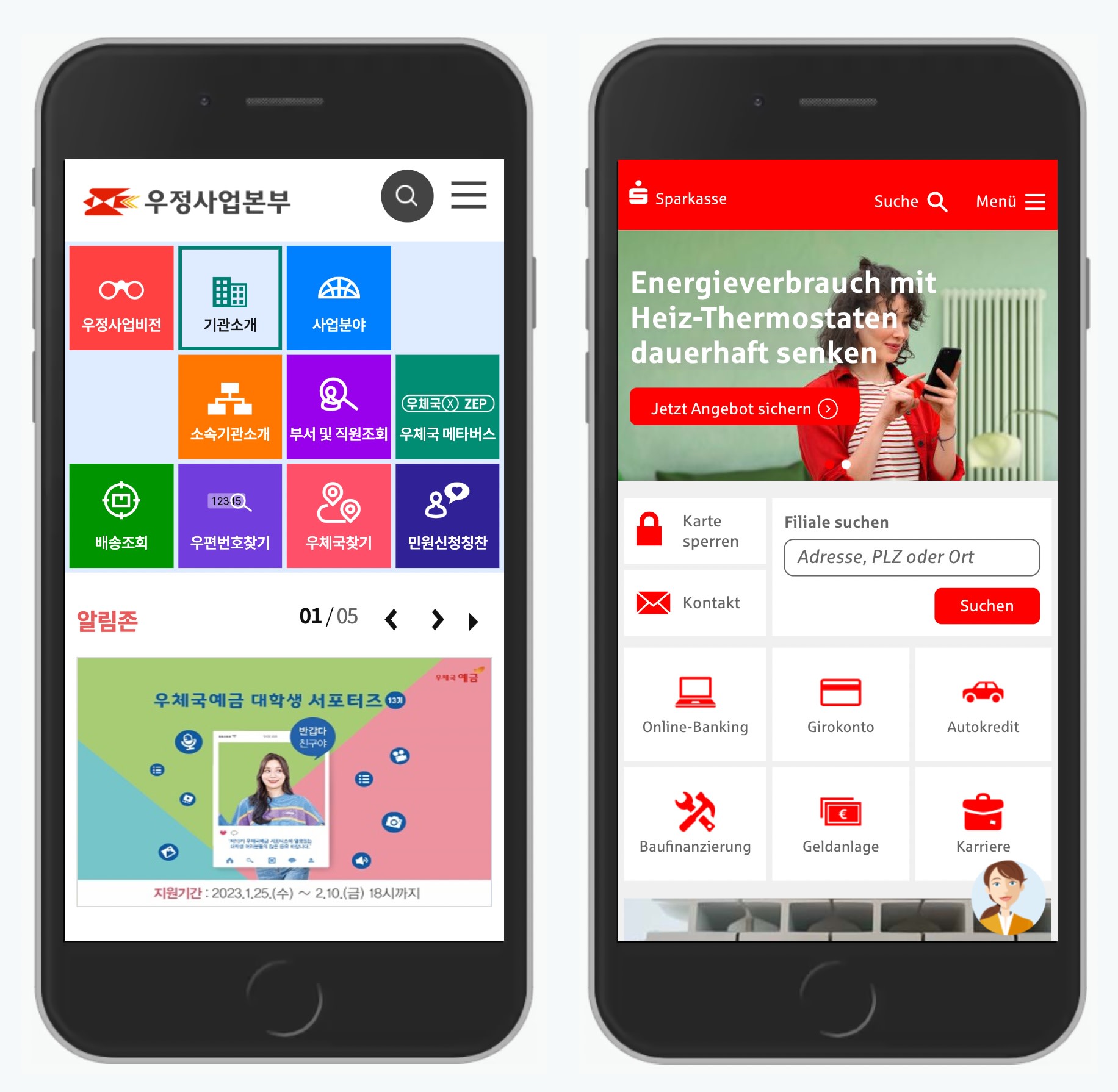
- Don’t rely on icons alone: add descriptive labels.
- Ask for explicit confirmation for destructive actions.
- Add a "Back" link in addition to browser’s “Back” button.
- In forms, present one question or one topic per screen.
Useful Resources #
-
So, You’re Managing a Design Team, by Alex Mandel
-
How To Write Better Microcopy For Older Adults, by Michal Halperin Ben Zvi (PhD.) and Kinneret Yifrah.
-
What You Can Learn From Older Adults About Accessible Design, by Becca Selah
-
A Guide to Interface Design For Older Adults, by Sergei Polyuk
-
Designing User Interfaces for an Aging Population, by Jeff Johnson and Kate Finn
-
Age-Friendly Digital Design Toolkit (PDF guide, email required)
-
Voice Design Strategies for the Elderly Population, by Shyamala Prayaga
-
Creating Online Environments That Work Well For Older Users, by Barry Rueger
-
Usability Testing With Older Adults, by Megan Chan
Wrapping Up #
We should be careful not to make our design decisions based on assumptions that are often not true at all. We don’t need a “barebones” version for older users. We need a reliable, inclusive product that helps people of all groups feel independent and competent.
Bring older adults in your design process to find out what their specific needs are. It’s not just better for that specific target audience — good accessibility is better for everyone. And huge kudos to wonderful people contributing to a topic that is often forgotten and overlooked.


