Design Metrics and KPIs
In usability testing, high frequency is the most common complaint, yet every single product desperately tries to capture a glimpse of our attention, sending more and more notifications our way. Let’s see how we could make the experience around notifications slightly better.
Many organizations focus primarily on data coming from their analytics. This usually includes beautiful dashboards with data points and graphs on bounce rates, exit rates, time spent on site, navigation funnels and most used features or pages. Design KPIs are driven by numbers that don’t have any context and relate to an "average user" that doesn’t really exist.
That’s a very traditional approach that has its roots in an assumption that the more users stay on the site, the more satisfied they are with the experience on the site. As it turns out, often the opposite is true.
Don’t get me wrong: analytics is useful to identify trends and changes in user behavior, but it alone doesn’t provide us with insights on what exactly users are actually doing on the site. For example, some tasks might require a lot of reading and a lot of user’s input to be completed, but for others just a brief scan of a page might be perfectly sufficient to get a big picture.
Some users might find an answer to their question already in a rich snippet provided by a search engine. And on some pages, the content might be organized so well that there is absolutely no need to linger on the site longer than a few seconds.
With a better design, fewer people get lost, and more people find what they need. So it shouldn’t be surprising that as website owners, we might end up with reduced traffic and increased bounce rates. Usually this would be quite a warning sign, but it shouldn’t be — as long as we increase user satisfaction and reduce task completion times.
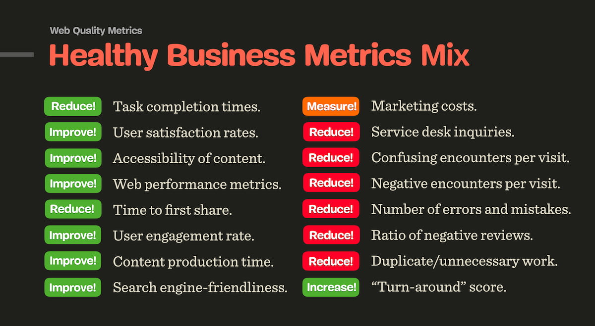
In my work, we tend to define design KPIs by focusing on two fundamental metrics:
-
how many people find what they are looking for,
-
how much time they need to find what they are looking for.
In detail, these attributes could be measured and tracked across a variety of user’s touch points:
-
top tasks completion rates for internal and external users,
-
top tasks completion times on or off the website,
-
overall satisfaction with the content and the experience on the site,
-
rate of errors and mistakes in navigation, search and data input (e.g. filters, forms, search queries),
-
accuracy of data successfully submitted by users (how difficult do we make it to make mistakes),
-
frequency of dead ends (404s, empty search/filtering results, lock-out rates in forms due to poor validation),
-
time to production, or how quickly users can publish quality content that matches all content and design requirements stipulated by our guidelines,
-
time to bugfixing, or how quickly teams can fix an issue surfaced in a production environment,
-
engagement rate, e.g. how effectively do we communicate messages to users or inform them about our campaigns (CTR rates, time to share).
-
web performance, in terms of response times, Core Web Vitals, response to search/filtering queries, autocomplete etc.,
-
search-engine friendliness, e.g. average position in search results, the amount of rich snippets etc.

Healthy business metrics mix. Large view.
To define design KPIs, we can rely on Top Tasks, the most frequent tasks that users do on a website or in an application. For usability testing, we come up with tasks and test them with the same audience segments over time (preferably at least once every 3 months). Based on that, we measure success rates and completion times.
The metrics listed above are much more focused around the actual user experience and user behavior, rather than on ambiguous data points that change heavily based on the specifics of what users are looking for and how and when they use the environment.
It’s worth noting that the definition of design KPIs should have a significant impact on how the quality of work done by content and engineering teams is measured. Rather than focusing on the amount of produced pages or websites, bounce rates or click rates alone, we should be aligned towards producing quality content that is useful for people consuming that content.


